Playground
An archive of curiosity and experiments
This space is a collection of personal projects created purely for the love of the process. Looking back over the last two decades, I can see how these early experiments with 3D forms, typography, and tactile materials became the foundation for my professional practice. This is where my ideas begin.
Mick
Circles
2025

Precision Geometry
This project was an experiment in refining the visual language of my Querkles series. While the original books lean into a more organic, hand-shaded feel, I wanted to see what would happen if I rendered the same concept with absolute mathematical precision.
By using perfectly weighted, clean-edged circles, the portrait of a young Mick Jagger emerges from a field of rigid geometry. Up close, the image dissolves into a beautiful, abstract pattern of intersecting rings


Kanye
Rings
2020
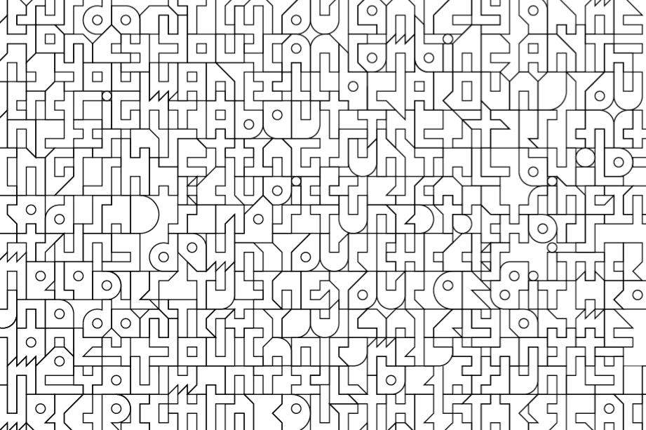
Spaghetti Sans
Typography
2018
" width="160.08438030102607px"><path d="M 12.702 4.565 C 12.202 4.465 10.602 4.465 9.602 4.565 C 9.202 3.665 8.702 2.765 8.102 1.965 C 7.202 0.465 9.702 -0.835 10.702 0.665 C 11.502 1.865 12.202 3.165 12.702 4.565 Z M 3.902 10.265 C 9.902 4.865 22.102 7.665 25.302 20.365 C 24.402 19.265 23.002 18.065 21.302 17.265 C 20.302 15.265 18.902 13.565 17.202 12.365 C 17.102 12.265 14.002 9.865 9.802 10.765 C 6.402 11.465 3.902 14.065 3.202 17.465 C 2.302 17.965 1.202 18.765 0.202 20.065 C -0.398 17.165 0.202 13.565 3.902 10.265 Z" fill="rgb(255, 255, 255)" height="20.36528872800818px" id="OkBAOk8Pg" transform="translate(3.361 144.94)" width="25.301713921488044px"/><path d="M 22.247 15.3 C 21.547 12.2 20.447 10.1 17.547 8.6 C 17.447 7.6 17.447 6.6 17.447 5.6 C 17.947 5.8 18.347 5.9 18.747 6.1 C 22.947 8 24.147 11.4 24.847 15.9 C 24.547 15.8 23.247 15.5 22.247 15.3 Z M 12.047 13.2 C 11.747 11.7 11.647 10.6 11.547 9.1 C 11.447 7.3 11.347 5.3 11.347 3 C 11.347 2.1 11.247 1 11.247 0 C 12.447 0.1 13.247 0.4 14.047 0.8 C 14.047 1.7 14.147 2.6 14.147 3.5 C 14.247 6.3 14.247 8.1 14.347 9.8 C 14.447 11.4 14.747 12.7 15.047 14 C 13.647 13.7 12.847 13.5 12.047 13.2 Z M 4.647 10.3 C -0.753 16.2 6.647 28.1 16.547 30.1 C 16.447 31 16.347 32 16.247 32.9 C 4.847 30.9 -2.053 18.6 0.547 10.8 C 1.247 8.6 2.647 7 4.747 6 C 5.747 5.5 6.847 5.1 8.047 4.9 C 8.047 5.3 8.147 7.6 8.147 8 C 6.747 8.5 5.547 9.3 4.647 10.3 Z" fill="rgb(255, 255, 255)" height="32.90000009536743px" id="Rg8Cea8qG" transform="translate(3.915 158.906)" width="24.847242736816398px"/><path d="M 28.848 13.3 C 33.048 18.4 36.048 23 43.648 27.9 C 44.448 29.2 45.648 31.1 45.848 31.5 C 45.648 31.6 45.248 31.7 44.948 31.8 C 38.548 28.4 33.148 23.4 28.848 17.7 C 27.348 15.8 25.948 13.9 24.348 12.3 L 23.548 11.5 C 22.348 10.4 21.148 9.5 19.648 8.8 C 18.448 8.2 17.248 7.8 15.748 7.5 C 10.148 6.3 5.848 7.1 0.348 3 C 0.048 2 -0.152 1 0.148 0 C 1.248 0.8 2.448 1.5 3.948 2 C 8.748 3.9 12.448 3.5 20.048 5.8 C 23.648 7.4 26.448 10.4 28.848 13.3 Z" fill="rgb(255, 255, 255)" height="31.80000000000001px" id="rUstFK78I" transform="translate(10.114 172.906)" width="45.848402082262915px"/><path d="M 5.3 2.3 L 3.9 2.6 C 1.4 3.1 0.7 3.2 0.5 3.2 C 0.3 2.8 0.2 2.4 0 2 C 0.1 1.7 0.1 1.3 0.2 0.9 L 0.2 0.6 C 0.4 0.6 1.4 0.4 3.3 0 C 3.5 0.2 4.1 0.8 5.3 2.3 Z" fill="rgb(255, 255, 255)" height="3.1999999999999886px" id="JD6LN_Y9h" transform="translate(29.363 188.206)" width="5.300000000000011px"/><path d="M 0.552 4.2 C 0.652 3.6 0.752 3 0.952 2.4 C 1.152 1.6 1.252 0.8 1.452 0 C 2.252 0.2 2.752 0.3 3.652 0.6 C 3.452 1.5 3.252 2.6 3.052 3.5 L 2.752 5 C 2.652 5.6 2.552 6.1 2.552 6.6 C 2.452 7.8 2.352 8.8 2.352 9.8 C 2.352 12.5 2.952 15.4 4.252 17.5 C 5.552 19.7 7.552 21.2 10.252 21.2 C 11.052 22.1 12.452 23.6 13.252 24.3 C 6.152 26.4 -2.248 19.7 0.552 4.2 Z" fill="rgb(255, 255, 255)" height="24.675666666666615px" id="M9VNR6hLE" transform="translate(23.51 183.706)" width="13.252395833605064px"/><path d="M 4.8 3.7 C 6.5 6.5 8.6 8.9 11.2 10.9 C 16.2 14.8 20.9 15.6 26.6 13.1 C 27.3 14.1 27.9 15 28.4 15.6 C 20.4 19.2 13.8 16.3 9.6 13 C 7.8 11.6 6.1 10 4.6 8 C 2.8 5.7 1.2 3.2 0 0.5 C 1 0.3 2.1 0.1 2.8 0 L 3.7 1.8 C 3.9 2.1 4 2.4 4.8 3.7 Z M 34.7 8.3 C 40 5 44.3 3.4 51.8 5.4 C 50.2 6.1 48.5 6.8 46.7 7.4 C 44.2 7.3 41.8 7.8 39.6 8.8 C 38.3 9.5 37.7 9.7 36.3 10.6 C 35.9 10.1 35.5 9.6 34.9 8.7 C 34.8 8.6 34.7 8.4 34.7 8.3 Z M 57.1 6.6 C 58.4 6 59.7 5.4 61 4.9 L 60.1 5.8 C 58.7 7.1 57.5 8.5 56.1 10 L 55.8 10.2 C 53.3 11.4 51 12.4 48.7 13.2 C 46.4 14 44.1 14.5 41.3 14.7 C 40.4 14.3 39.5 13.7 38.7 13.1 C 39.9 12.4 40.6 12.1 40.7 12 C 42.9 11.9 45.4 11.3 47.5 10.7 C 50.7 9.6 53.9 8.1 57.1 6.6 Z" fill="rgb(255, 255, 255)" height="17.25977604350819px" id="i8RJl_osz" transform="translate(31.163 194.106)" width="61.000000762939464px"/><path d="M 12.8 12 C 10.5 8.4 7.6 4.8 2.9 3.5 C 1.7 2.2 1.1 1.4 0 0 C 11.1 0.4 15 10.1 18.6 16.2 C 19 16.8 19.4 17.5 19.8 18.1 C 20.7 19.4 21.5 20.5 22.5 21.5 C 24.2 23.3 26 24.5 28 25.4 C 35.3 28.4 40.6 25.6 45.6 20.4 L 46 20 C 47.3 18.6 48.7 17.1 50.1 15.7 C 57.3 8.8 66.6 7.8 75.8 5.3 C 75.2 6.8 74.6 7.7 74 8.5 C 67.2 10.3 60.4 11.5 55 15.2 L 54.9 15.2 C 52.9 16.3 50.8 18.7 49.5 20.4 C 48.2 22 46.9 23.6 45.4 24.9 C 38.7 30.9 27.3 31.1 19.7 22.5 C 17.7 20.2 16.2 17.7 16.2 17.6 C 15 15.7 13.9 13.8 12.8 12 Z" fill="rgb(255, 255, 255)" height="29.206241038859304px" id="hiaXyNcBf" transform="translate(43.463 186.706)" width="75.79999999999997px"/><path d="M 2.6 46.7 C 9.8 47.9 15.9 45.9 20.4 41.7 L 20.7 41.4 C 24 38.2 25.7 34.3 26.6 30.2 C 27.6 26 27.9 21.6 28.6 17.3 C 29.6 10.8 32.7 5.6 35.8 0 C 36.4 1 36.8 2.1 37.1 3.2 C 30.2 16.2 31.8 16.6 29.9 28.1 C 29.5 30.9 28.9 33.1 28.2 35.1 C 27 38.4 25.8 39.7 24.7 41.1 C 19.3 47.8 10.3 51.8 0 49.1 C 0.8 48.2 1.7 47.4 2.6 46.7 Z" fill="rgb(255, 255, 255)" height="49.95213295348796px" id="YKoDi5a6g" transform="translate(97.163 158.206)" width="37.09999999999998px"/><path d="M 11.1 15 C 11 14.8 10.6 11.6 7.6 7.8 C 5.1 4.6 2.6 2.9 0 0 C 2 0.4 3.8 0.8 5.8 1.5 L 7.9 3.6 C 9.7 5.5 10.9 7.1 11.8 8.8 C 14.9 14.5 15.6 23.3 14.9 29.4 C 14.1 36.2 10.3 41.1 3 44.7 C 3.3 43.7 3.5 42.3 3.7 41.4 C 13.4 35.5 13.8 26.1 11.1 15 Z" fill="rgb(255, 255, 255)" height="44.69999999999999px" id="gVq1abcvx" transform="translate(126.563 146.106)" width="15.14865742091969px"/><path d="M 16.4 16 C 23.4 18.2 32.1 16.7 40 23.7 C 60.1 41.4 41.2 84.2 19.4 82.6 C 20.1 82 21.4 80.7 22.3 79.7 C 30.1 79 36.9 72.5 42 60.9 C 45 54.3 48.9 41.5 42.1 30.5 C 37.1 22.5 29.9 21.5 21.1 19.8 C 8.9 17.8 6.3 13.8 0 2.9 C 1.7 3 1 3 3.5 3.2 C 7 9.4 9.9 14 16.4 16 Z M 36.3 17.4 C 34.9 10.4 27.8 6.2 21.1 3.5 C 20.7 2.2 20.1 0.6 19.9 0 C 29.1 3.1 39.3 9.5 39.6 19.3 C 39.1 18.9 37.4 17.9 36.3 17.4 Z" fill="rgb(255, 255, 255)" height="82.64365873139613px" id="Ol351EmTv" transform="translate(101.763 122.206)" width="48.5347692224472px"/><path d="M 21.1 27.4 C 19.1 22.8 18.5 20 17.2 16.5 C 16.1 13.4 14.9 11.1 13.3 9.3 C 13.2 9.2 10.7 5.1 2.1 3.2 C 1.7 2.5 0.7 0.9 0 0 C 10.7 1.6 15.4 5.8 18.5 12.4 C 20.8 17.2 22 23.1 24.3 28.1 C 23.1 27.9 22.1 27.7 21.1 27.4 Z" fill="rgb(255, 255, 255)" height="28.099999999999994px" id="URItiJaxM" transform="translate(98.763 107.806)" width="24.30000000000001px"/><path d="M 49 17.7 C 58.1 24.5 65.9 23.5 77.3 24.5 C 78.1 25.5 78.6 26.5 79.1 27.6 C 65.4 25.7 56.4 28 44.7 17.9 C 46.2 17.8 48.7 17.7 49 17.7 Z M 35.9 0.4 C 46.9 0.2 53.5 1.2 61.4 11.5 C 62.8 13.4 64.3 15.5 65.8 18.1 C 66.3 18.9 66.7 19.7 67.3 20.6 C 65.9 20.5 64.8 20.3 63.5 20.2 C 62.5 18.5 61.5 16.9 60.5 15.4 C 58.7 12.7 57.3 10.7 55.3 8.8 C 50.3 4.2 44.3 3.4 38.9 3.4 C 37.6 2.1 36.8 1.2 35.9 0.4 Z M 21.5 0.9 C 23 1.7 24 2.4 25.6 3.7 C 17.5 4.1 8.3 4.8 0.3 3 C 0.1 1.9 0 1 0 0 C 6.4 1.6 14.6 1.3 21.5 0.9 Z" fill="rgb(255, 255, 255)" height="27.60000076293946px" id="yNAi3mTfy" transform="translate(32.763 95.206)" width="79.10000076293946px"/><path d="M 17.71 32.5 C 22.11 50.1 46.31 41.8 56.11 40.4 C 58.21 40.1 61.31 39.8 63.61 39.6 C 67.11 39.3 70.51 39.2 73.71 39.2 C 74.81 40.2 75.21 40.8 76.11 42 C 48.01 41.2 24.11 54.6 15.81 36.4 C 14.91 34.4 14.31 32.1 14.21 29.4 C 14.11 27.4 14.11 25.1 14.41 22.5 C 14.51 21.9 14.51 21.3 14.61 20.7 C 15.41 21 16.91 21.5 17.31 21.7 C 16.91 25.2 16.81 29 17.71 32.5 Z M 10.81 26.5 C 2.51 20.6 -0.19 10.1 0.01 0 C 0.81 0.3 1.81 0.5 2.51 0.5 C 3.21 8.6 4.11 17.1 11.01 23.1 C 10.91 24.3 10.81 26.1 10.81 26.5 Z" fill="rgb(255, 255, 255)" height="46.00671247274643px" id="SLfpJOyjP" transform="translate(12.452 67.506)" width="76.11023639310797px"/><path d="M 13.9 36.9 C 20 38.7 32.1 38 45.1 48.8 C 47.2 50.5 49.2 52.5 51.5 54.8 C 53.7 57.1 52.5 55.9 54.2 57.7 C 52.8 57.8 51.3 58 50.7 58.1 C 49.1 56.3 47.3 54.5 45.5 52.7 C 42.2 49.6 39.8 47.9 37.2 46.5 C 26.6 40.7 14.3 41.4 8.3 37.8 C 4.1 35.3 1.5 31 0.4 24.6 C 0.2 23.5 0.1 22.3 0 21 C 0.9 20.8 2 20.3 2.5 20.1 C 2.8 26.4 4.5 30.9 7.5 33.7 C 7.6 33.8 9.1 35.8 13.9 36.9 Z M 4.5 0 C 3.7 3.2 3.4 5.6 3 9.1 C 2.8 9.2 0.8 10.7 0 11.2 C 0.3 7.8 0.6 4.7 1.3 1.5 C 1.8 1 2.3 0.6 2.9 0.4 C 3.4 0.2 4 0 4.5 0 Z" fill="rgb(255, 255, 255)" height="58.10000038146973px" id="T2IHwh3IT" transform="translate(18.263 46.406)" width="54.19999999999999px"/><path d="M 23.641 43.704 C 24.841 51.904 22.441 62.704 21.041 70.804 C 20.041 70.504 19.241 70.004 18.541 69.504 C 19.841 63.004 21.541 56.004 21.441 49.304 C 21.441 46.404 21.041 43.804 20.241 41.404 C 20.041 40.904 18.941 36.504 15.341 34.704 C 13.541 33.804 11.541 33.904 9.641 34.704 C 8.641 35.204 7.641 35.904 6.741 36.804 C 3.541 40.104 3.341 44.304 3.241 44.504 C 2.741 47.804 2.641 51.704 6.041 52.404 C 6.141 52.404 6.941 52.604 8.241 52.204 C 9.841 51.604 11.341 50.404 13.741 48.604 C 15.141 47.504 16.541 46.304 17.841 45.104 C 18.041 46.404 18.141 47.404 18.141 48.504 C 15.641 50.704 13.141 52.504 11.341 53.504 C 8.441 55.304 4.441 56.804 2.041 54.304 C -2.359 49.704 0.241 32.404 10.941 30.904 C 13.541 30.504 15.341 31.404 16.141 31.704 C 18.441 32.704 20.341 34.604 21.641 37.104 C 22.641 39.004 23.341 41.204 23.641 43.704 Z M 34.241 14.704 C 35.141 12.604 36.141 10.904 37.141 9.404 L 37.241 9.404 C 42.341 2.104 53.241 -3.096 60.341 2.104 C 59.341 2.804 58.741 3.104 57.841 3.704 C 54.141 1.704 48.441 3.404 44.741 6.004 C 43.241 7.004 41.941 8.204 40.741 9.604 C 39.041 11.404 37.841 13.404 36.841 15.404 C 32.641 24.004 32.241 31.204 26.241 39.604 C 26.041 38.804 25.341 37.104 25.041 36.404 C 30.041 28.704 30.941 23.004 33.641 16.204 Z M 28.341 15.404 C 22.841 18.104 18.841 22.704 16.041 28.104 C 15.341 27.904 14.841 27.804 14.741 27.804 C 17.441 21.704 21.841 16.404 28.341 15.404 Z" fill="rgb(255, 255, 255)" height="70.80418756905203px" id="oGziGJvwA" transform="translate(10.021 9.101)" width="60.34134368896484px"/><path d="M 25 2.7 C 24.5 3.6 23.9 4.8 23.6 5.4 C 14.4 3.9 6.7 11.6 3.1 20.8 C 2.1 20.9 0.9 21.1 0 21.4 C 6.3 4 18.1 1.3 25 2.7 Z M 37.1 7.7 C 37.3 8.1 37.5 8.4 37.7 8.8 C 35.6 9.1 34.1 8.9 32.4 8.4 C 32.4 8.3 32.5 8.2 32.6 8.1 C 33.3 7 33.8 6.3 34.4 5.5 C 34.8 5.6 35.7 5.7 36.3 5.7 C 36.3 5.9 36.7 7.1 37.1 7.7 Z M 41.7 2.4 C 42.2 5.5 44.2 8 46.7 8.8 C 49.7 9.7 53.4 8.3 54.1 5.1 C 55.2 4.4 55.7 4.1 56.9 3.3 C 57 4.6 57 5.9 56.5 7.4 C 54.6 12.2 45.9 13.5 41.7 8.9 C 41 8.2 40.5 7.4 40.1 6.4 C 39.7 5.6 39.4 4.7 39.3 3.7 C 39.1 2.9 39.1 2.1 39.1 1.3 C 40 0.7 40.8 0.3 41.7 0 C 41.7 0.3 41.7 0.6 41.6 0.9 C 41.6 1.4 41.6 1.9 41.7 2.4 Z" fill="rgb(255, 255, 255)" height="21.399999943059576px" id="x2QVC1mor" transform="translate(18.263 15.906)" width="56.952252722714846px"/><path d="M 11.7 11.901 C 11.3 12.201 10.9 12.401 10.6 12.701 C 8.8 13.901 8.2 14.201 6.5 15.301 C 5 16.201 3.8 17.001 1.9 18.001 C 1.2 17.601 0.5 16.801 0 15.601 C 0.3 15.401 0.7 15.201 1 15.101 C 2.4 14.401 3.8 13.601 5.1 12.801 C 6.9 11.701 8.7 10.601 10.4 9.401 C 11.7 8.501 13 7.501 14.3 6.601 C 15.5 6.801 16.5 7.101 17.7 7.501 C 15.3 9.401 13.5 10.701 11.7 11.901 Z M 0.5 2.501 C 8.9 -2.599 21.6 0.701 29.4 7.001 C 30 7.501 30.6 8.101 31.2 8.601 C 29.7 9.201 29.4 9.301 28.3 9.701 C 26.6 8.101 24.3 6.701 22.1 5.701 C 17 3.301 11.1 2.201 5.7 3.501 C 3.3 2.501 1.6 2.601 0.5 2.501 Z M 14.9 15.701 C 25 15.201 29.3 12.801 34.5 10.901 L 36.3 10.301 C 37.1 10.901 37.7 11.401 38.5 12.401 C 38.2 12.501 37.8 12.601 37.5 12.701 C 29.2 15.301 26.1 18.501 14.9 19.001 C 15 18.101 15.1 16.801 14.9 15.701 Z M 26.3 1.001 C 31.3 0.401 38.1 2.701 43.1 8.001 C 44.9 9.901 46 11.601 47 13.901 C 47.4 14.901 47.8 15.801 48.1 16.801 C 47 16.701 46 16.601 44.9 16.301 C 44.3 14.901 43.6 13.601 42.9 12.401 C 41.5 10.201 39.8 8.501 37.7 7.101 C 37 6.601 36 6.001 34.9 5.501 C 33.8 5.001 32.5 4.501 31.2 4.301 C 30 3.301 27.5 1.701 26.3 1.001 Z M 43.1 19.201 C 46.7 20.301 50.7 20.201 54.4 20.101 C 54.7 21.001 55 22.001 55.1 22.901 C 47.3 22.901 39.9 23.001 34.6 17.201 C 35.9 16.701 36.8 16.301 37.7 16.001 C 39.4 17.501 41.1 18.501 43.1 19.201 Z" fill="rgb(255, 255, 255)" height="22.901249798244898px" id="DOMPAsj18" transform="translate(63.463 3.205)" width="55.099998474121094px"/><path d="M 10.7 15.9 C 10.5 13.2 9.9 11 9.1 9.2 C 7.6 6.1 5.1 4.1 1.8 3.2 C 1.3 2.1 0.5 0.7 0 0 C 6.2 0.7 10.4 4.2 12.2 10.5 C 12.7 12.4 13 14.3 13.2 16.5 C 13.4 18.9 13.5 21.3 13.4 24.1 C 12.5 23.7 11.6 23.3 10.7 22.7 C 10.8 20.7 10.9 18.2 10.7 15.9 Z" fill="rgb(255, 255, 255)" height="24.099999999999994px" id="V22phbpVx" transform="translate(111.463 11.706)" width="13.43923048454134px"/><path d="M 9.1 11.2 C 4.1 8.6 1.7 4.8 0 0 C 0.6 0 2 0.1 2.9 0.1 C 4 2.8 5.4 5.3 7.7 7.2 C 10.5 9.5 13.4 10 14.3 10.4 C 17.9 11.3 22 11.4 25.7 11.7 C 25.8 12.8 25.8 13.7 25.8 14.3 C 20.3 13.8 14.6 14 9.1 11.2 Z M 23.4 23.9 C 23.2 24.5 22.8 25.4 22.5 25.9 C 16.2 22.4 10.6 22.6 10 15.2 C 10.7 15.5 12.3 16 13.2 16.2 C 14.5 19.8 16.6 20.1 23.4 23.9 Z" fill="rgb(255, 255, 255)" height="25.89999980926514px" id="x_wY01m2X" transform="translate(111.663 29.306)" width="25.800000000000026px"/><path d="M 11.4 29.4 C 13.1 24.8 13.9 20.2 13 15.4 C 11.6 8.2 7.3 4.3 0.4 3 C 0.3 2.1 0.2 1 0 0 C 4.2 0.7 7.4 2 9.8 4.2 C 13.7 7.5 15.7 11.7 16.1 16.9 C 16.2 18.7 16.1 20.7 15.8 22.8 C 15.4 25.4 14.7 28.1 13.6 31 C 13 32.8 12.2 34.6 11.3 36.5 C 8.8 42 8.4 42.5 7.8 42.5 C 6.8 42.5 5.7 41.5 6.3 40.3 C 7.3 38.3 8.3 36.5 9.2 34.7 C 10 33 10.8 31.2 11.4 29.4 Z M 19.4 19 C 24.1 20.8 29.1 24.4 29.4 29.5 C 29.7 34.5 25.2 42.1 14.9 36.6 C 14.9 36.5 16 33.9 16.1 33.8 C 21.1 35.7 25.8 35.8 26.6 30.9 C 26.9 28.6 26.4 24.6 19.3 22 C 19.3 21.5 19.4 20 19.4 19 Z" fill="rgb(255, 255, 255)" height="42.50000000000001px" id="A_iaLmUzn" transform="translate(127.363 23.506)" width="29.41403174900095px"/><path d="M 160.063 52.806 C 160.563 61.406 152.363 69.106 140.863 63.106 C 139.063 66.806 138.263 69.306 135.263 69.406 C 133.463 69.406 131.763 68.506 130.863 67.006 C 129.963 65.606 129.963 63.906 130.663 62.406 C 131.363 60.906 132.063 59.506 132.763 58.206 C 126.063 54.506 118.263 54.406 118.263 42.906 C 114.363 40.706 111.463 37.406 109.563 33.206 C 108.963 31.706 108.463 30.306 107.963 28.906 C 103.563 28.206 99.963 26.606 97.163 24.206 C 96.263 23.406 95.463 22.506 94.763 21.706 C 92.563 22.606 90.263 23.506 88.063 24.106 C 84.763 24.906 81.363 25.406 77.263 25.506 C 73.963 31.706 63.663 32.806 58.163 27.706 C 54.563 28.506 51.963 28.206 49.163 27.306 C 44.863 37.006 45.163 43.106 37.063 53.106 C 38.063 61.906 35.863 72.006 34.363 80.706 C 43.163 82.306 53.163 82.706 64.963 92.306 C 78.563 91.906 86.963 92.406 96.263 104.106 C 110.163 105.506 116.263 110.806 119.963 118.206 C 133.063 122.106 145.863 130.506 144.563 144.106 C 167.063 165.306 143.163 214.906 117.463 207.506 C 109.963 212.106 102.663 212.506 94.763 210.106 C 84.163 223.006 69.963 221.006 61.663 212.406 C 54.163 216.206 46.563 215.406 39.663 210.506 C 31.963 214.506 20.463 208.706 20.063 195.206 C 7.063 193.206 -1.637 179.506 1.163 169.406 C -2.437 160.506 2.863 152.506 9.663 150.206 C 9.363 149.706 9.063 149.306 8.763 148.806 C 5.263 143.706 13.363 138.806 16.763 143.806 C 18.163 145.706 19.163 147.906 19.863 150.406 C 29.763 153.906 33.863 165.406 32.263 175.706 C 32.363 175.806 32.363 176.006 32.363 176.206 C 35.963 178.006 38.663 180.706 40.963 183.506 C 53.563 182.506 58.563 190.006 64.163 199.706 C 71.263 195.206 77.263 193.806 87.563 197.406 C 92.563 195.206 96.763 193.406 102.163 193.106 C 108.463 190.706 114.863 189.806 120.563 188.106 C 121.263 185.406 121.563 182.606 121.963 179.606 C 123.363 168.306 124.863 166.206 130.863 155.106 C 127.563 151.306 125.463 150.506 121.663 145.206 C 107.963 142.906 104.663 137.006 97.863 124.906 C 88.763 124.106 81.063 121.606 72.963 113.606 C 61.763 114.706 54.963 116.906 46.163 116.906 C 37.563 116.906 29.463 114.406 25.263 105.306 C 24.363 103.206 23.763 100.706 23.463 98.006 C 12.163 91.406 8.563 78.406 9.263 65.106 C 5.063 60.006 6.163 45.706 14.063 39.606 C 18.463 24.606 30.163 11.506 45.163 15.706 C 48.463 11.406 53.163 8.306 57.763 6.806 C 64.163 -0.894 75.363 -1.394 84.663 2.006 C 92.963 -1.094 102.363 2.506 108.263 8.406 C 116.663 8.106 123.563 12.006 126.363 20.306 C 130.063 20.606 135.163 21.706 139.263 25.206 C 143.563 28.806 145.963 33.506 146.563 39.006 C 153.063 41.006 159.663 45.906 160.063 52.806 Z M 142.263 60.106 C 152.563 65.606 157.063 58.006 156.763 53.006 C 156.463 47.906 151.463 44.306 146.763 42.506 C 146.763 43.506 146.663 45.006 146.663 45.506 C 153.763 48.106 154.263 52.106 153.963 54.406 C 153.163 59.306 148.463 59.206 143.463 57.306 C 143.363 57.406 142.263 60.006 142.263 60.106 Z M 150.663 53.806 C 151.063 51.406 148.663 49.706 146.063 48.706 C 145.663 50.506 145.163 52.306 144.563 54.206 C 148.263 55.606 149.663 55.206 150.063 55.006 C 150.163 54.906 150.563 54.706 150.663 53.806 Z M 121.163 204.806 C 142.963 206.406 161.863 163.606 141.763 145.906 C 133.863 138.906 125.163 140.406 118.163 138.206 C 111.663 136.206 108.763 131.606 105.263 125.406 C 102.763 125.206 103.463 125.206 101.763 125.106 C 108.063 136.006 110.663 140.006 122.863 142.006 C 131.663 143.706 138.863 144.706 143.863 152.706 C 150.663 163.706 146.763 176.506 143.763 183.106 C 138.663 194.706 131.863 201.206 124.063 201.906 C 123.163 202.906 121.863 204.206 121.163 204.806 Z M 143.163 46.306 C 143.463 44.206 143.563 42.206 143.463 40.406 C 143.063 35.206 141.063 31.006 137.163 27.706 C 134.763 25.506 131.563 24.206 127.363 23.506 C 127.563 24.506 127.663 25.606 127.763 26.506 C 134.663 27.806 138.963 31.706 140.363 38.906 C 141.263 43.706 140.463 48.306 138.763 52.906 C 138.163 54.706 137.363 56.506 136.563 58.206 C 135.663 60.006 134.663 61.806 133.663 63.806 C 133.063 65.006 134.163 66.006 135.163 66.006 C 135.763 66.006 136.163 65.506 138.663 60.006 C 139.563 58.106 140.363 56.306 140.963 54.506 C 142.063 51.606 142.763 48.906 143.163 46.306 Z M 141.463 175.506 C 142.163 169.406 141.463 160.606 138.363 154.906 C 137.463 153.206 136.263 151.606 134.463 149.706 L 132.363 147.606 C 130.363 146.906 128.563 146.506 126.563 146.106 C 129.163 149.006 131.663 150.706 134.163 153.906 C 137.163 157.706 137.563 160.906 137.663 161.106 C 140.363 172.206 139.963 181.606 130.263 187.506 C 130.063 188.406 129.863 189.806 129.563 190.806 C 136.863 187.206 140.663 182.306 141.463 175.506 Z M 138.063 139.606 C 139.163 140.106 140.863 141.106 141.363 141.506 C 141.063 131.706 130.863 125.306 121.663 122.206 C 121.863 122.806 122.463 124.406 122.863 125.706 C 129.563 128.406 136.663 132.606 138.063 139.606 Z M 137.463 43.606 C 137.463 43.006 137.463 42.106 137.363 41.006 C 133.663 40.706 129.563 40.606 125.963 39.706 C 125.063 39.306 122.163 38.806 119.363 36.506 C 117.063 34.606 115.663 32.106 114.563 29.406 C 113.663 29.406 112.263 29.306 111.663 29.306 C 113.363 34.106 115.763 37.906 120.763 40.506 C 126.263 43.306 131.963 43.106 137.463 43.606 Z M 136.263 50.006 C 136.563 48.906 136.863 47.806 137.063 46.806 C 133.763 46.506 132.063 46.506 129.363 46.206 C 129.963 46.706 130.763 47.206 131.863 47.606 C 132.863 48.006 134.563 49.106 136.263 50.006 Z M 130.963 183.006 C 135.863 178.806 136.263 173.406 135.363 166.506 C 131.863 173.606 131.863 175.606 130.963 183.006 Z M 134.163 55.206 C 134.463 54.706 134.863 53.806 135.063 53.206 C 128.263 49.406 126.163 49.106 124.863 45.506 C 123.963 45.306 122.363 44.806 121.663 44.506 C 122.263 51.906 127.863 51.706 134.163 55.206 Z M 136.663 37.606 C 135.363 33.606 132.763 31.206 128.063 30.106 C 128.163 32.106 128.163 34.306 128.163 36.806 C 130.863 37.306 133.863 37.406 136.663 37.606 Z M 134.263 161.406 C 133.963 160.306 133.563 159.206 132.963 158.206 C 129.863 163.806 126.763 169.006 125.763 175.506 C 125.063 179.806 124.763 184.206 123.763 188.406 C 122.763 192.506 121.163 196.406 117.863 199.606 L 117.563 199.906 C 113.063 204.106 106.963 206.106 99.763 204.906 C 98.863 205.606 97.963 206.406 97.163 207.306 C 107.463 210.006 116.463 206.006 121.863 199.306 C 122.963 197.906 124.163 196.606 125.363 193.306 C 126.063 191.306 126.663 189.106 127.063 186.306 C 128.963 174.806 127.363 174.406 134.263 161.406 Z M 126.963 197.806 C 130.163 196.706 132.863 194.306 135.163 191.406 C 132.863 193.006 130.463 194.106 128.363 195.006 C 127.863 196.006 127.463 196.906 126.963 197.806 Z M 127.063 136.506 C 129.863 136.906 131.763 137.206 134.163 138.006 C 132.463 134.406 127.863 131.606 124.263 129.906 C 124.963 132.106 125.863 134.506 127.063 136.506 Z M 124.863 35.806 C 124.963 33.006 124.863 30.606 124.663 28.206 C 124.463 26.006 124.163 24.106 123.663 22.206 C 121.863 15.906 117.663 12.406 111.463 11.706 C 111.963 12.406 112.763 13.806 113.263 14.906 C 116.563 15.806 119.063 17.806 120.563 20.906 C 121.363 22.706 121.963 24.906 122.163 27.606 C 122.363 29.906 122.263 32.406 122.163 34.406 C 123.063 35.006 123.963 35.406 124.863 35.806 Z M 119.863 135.206 C 120.863 135.506 121.863 135.706 123.063 135.906 C 120.763 130.906 119.563 125.006 117.263 120.206 C 114.163 113.606 109.463 109.406 98.763 107.806 C 99.463 108.706 100.463 110.306 100.863 111.006 C 109.463 112.906 111.963 117.006 112.063 117.106 C 113.663 118.906 114.863 121.206 115.963 124.306 C 117.263 127.806 117.863 130.606 119.863 135.206 Z M 98.063 20.406 C 103.363 26.206 110.763 26.106 118.563 26.106 C 118.463 25.206 118.163 24.206 117.863 23.306 C 114.163 23.406 110.163 23.506 106.563 22.406 C 104.563 21.706 102.863 20.706 101.163 19.206 C 100.263 19.506 99.363 19.906 98.063 20.406 Z M 117.463 195.206 C 118.063 194.406 118.663 193.506 119.263 192.006 C 110.063 194.506 100.763 195.506 93.563 202.406 C 92.163 203.806 90.763 205.306 89.463 206.706 L 89.063 207.106 C 84.063 212.306 78.763 215.106 71.463 212.106 C 69.463 211.206 67.663 210.006 65.963 208.206 C 64.963 207.206 64.163 206.106 63.263 204.806 C 62.863 204.206 62.463 203.506 62.063 202.906 C 58.463 196.806 54.563 187.106 43.463 186.706 C 44.563 188.106 45.163 188.906 46.363 190.206 C 51.063 191.506 53.963 195.106 56.263 198.706 C 57.363 200.506 58.463 202.406 59.663 204.306 C 59.663 204.406 61.163 206.906 63.163 209.206 C 70.763 217.806 82.163 217.606 88.863 211.606 C 90.363 210.306 91.663 208.706 92.963 207.106 C 94.263 205.406 96.363 203.006 98.363 201.906 L 98.463 201.906 C 103.863 198.206 110.663 197.006 117.463 195.206 Z M 115.663 133.406 C 114.363 130.006 114.563 130.306 113.263 126.406 C 111.863 126.106 110.563 125.906 109.463 125.906 C 111.163 128.706 112.963 131.506 115.663 133.406 Z M 111.563 20.006 C 111.263 19.006 110.863 18.106 110.463 17.106 C 109.463 14.806 108.363 13.106 106.563 11.206 C 101.563 5.906 94.763 3.606 89.763 4.206 C 90.963 4.906 93.463 6.506 94.663 7.506 C 95.863 7.706 97.163 8.206 98.363 8.706 C 99.463 9.206 100.463 9.806 101.163 10.306 C 103.263 11.706 104.963 13.406 106.363 15.606 C 107.063 16.806 107.763 18.106 108.363 19.506 C 109.463 19.806 110.463 19.906 111.563 20.006 Z M 111.863 122.806 C 111.363 121.706 110.863 120.706 110.063 119.706 C 98.663 118.706 90.863 119.706 81.763 112.906 C 81.463 112.906 78.963 113.006 77.463 113.106 C 89.163 123.206 98.163 120.906 111.863 122.806 Z M 100.963 15.906 C 101.263 15.806 101.663 15.706 101.963 15.606 C 101.163 14.606 100.563 14.106 99.763 13.506 L 97.963 14.106 C 92.763 16.006 88.463 18.406 78.363 18.906 C 78.563 20.006 78.463 21.306 78.363 22.206 C 89.563 21.706 92.663 18.506 100.963 15.906 Z M 100.063 115.806 C 99.463 114.906 99.063 114.106 98.563 113.306 C 97.063 110.706 95.563 108.606 94.163 106.706 C 86.263 96.406 79.663 95.406 68.663 95.606 C 69.563 96.406 70.363 97.306 71.663 98.606 C 77.063 98.606 83.063 99.406 88.063 104.006 C 90.063 105.906 91.463 107.906 93.263 110.606 C 94.263 112.106 95.263 113.706 96.263 115.406 C 97.563 115.506 98.663 115.706 100.063 115.806 Z M 94.663 11.806 C 94.063 11.306 93.463 10.706 92.863 10.206 C 85.063 3.906 72.363 0.606 63.963 5.706 C 65.063 5.806 66.763 5.706 69.163 6.706 C 74.563 5.406 80.463 6.506 85.563 8.906 C 87.763 9.906 90.063 11.306 91.763 12.906 C 92.863 12.506 93.163 12.406 94.663 11.806 Z M 91.263 199.906 L 92.163 199.006 C 90.863 199.506 89.563 200.106 88.263 200.706 C 85.063 202.206 81.863 203.706 78.663 204.806 C 76.563 205.406 74.063 206.006 71.863 206.106 C 71.763 206.206 71.063 206.506 69.863 207.206 C 70.663 207.806 71.563 208.406 72.463 208.806 C 75.263 208.606 77.663 208.106 79.863 207.306 C 82.163 206.506 84.363 205.506 86.963 204.306 L 87.263 204.106 C 88.663 202.606 89.863 201.206 91.263 199.906 Z M 28.263 103.906 C 36.563 122.106 60.463 108.706 88.563 109.506 C 87.663 108.306 87.263 107.706 86.163 106.706 C 82.963 106.706 79.563 106.806 76.063 107.106 C 73.763 107.306 70.663 107.606 68.563 107.906 C 58.763 109.306 34.563 117.606 30.163 100.006 C 29.263 96.506 29.363 92.706 29.763 89.206 C 29.363 89.006 27.863 88.506 27.063 88.206 C 26.963 88.806 26.963 89.406 26.863 90.006 C 26.563 92.606 26.563 94.906 26.663 96.906 C 26.763 99.606 27.363 101.906 28.263 103.906 Z M 88.063 14.106 C 87.063 13.506 86.063 12.806 84.963 12.206 C 84.063 12.806 83.963 12.806 80.463 15.406 C 83.163 15.206 85.663 14.706 88.063 14.106 Z M 77.863 201.506 C 79.663 200.906 81.363 200.206 82.963 199.506 C 75.463 197.506 71.163 199.106 65.863 202.406 C 65.863 202.506 65.963 202.706 66.063 202.806 C 66.663 203.706 67.063 204.206 67.463 204.706 C 68.863 203.806 69.463 203.606 70.763 202.906 C 72.963 201.906 75.363 201.406 77.863 201.506 Z M 81.163 10.706 C 79.963 10.306 78.963 10.006 77.763 9.806 C 76.463 10.706 75.163 11.706 73.863 12.606 C 72.163 13.806 70.363 14.906 68.563 16.006 C 67.263 16.806 65.863 17.606 64.463 18.306 C 64.163 18.406 63.763 18.606 63.463 18.806 C 63.963 20.006 64.663 20.806 65.363 21.206 C 67.263 20.206 68.463 19.406 69.963 18.506 C 71.663 17.406 72.263 17.106 74.063 15.906 C 74.363 15.606 74.763 15.406 75.163 15.106 C 76.963 13.906 78.763 12.606 81.163 10.706 Z M 76.563 103.906 C 78.163 103.706 79.763 103.706 81.363 103.606 C 79.263 102.706 77.063 102.206 74.863 102.006 C 75.463 102.606 76.063 103.206 76.563 103.906 Z M 74.763 23.306 C 75.263 21.806 75.263 20.506 75.163 19.206 C 73.963 20.006 73.463 20.306 72.363 21.006 C 71.663 24.206 67.963 25.606 64.963 24.706 C 62.463 23.906 60.463 21.406 59.963 18.306 C 59.863 17.806 59.863 17.306 59.863 16.806 C 59.963 16.506 59.963 16.206 59.963 15.906 C 59.063 16.206 58.263 16.606 57.363 17.206 C 57.363 18.006 57.363 18.806 57.563 19.606 C 57.663 20.606 57.963 21.506 58.363 22.306 C 58.763 23.306 59.263 24.106 59.963 24.806 C 64.163 29.406 72.863 28.106 74.763 23.306 Z M 72.463 104.106 C 70.763 102.306 71.963 103.506 69.763 101.206 C 67.463 98.906 65.463 96.906 63.363 95.206 C 50.363 84.406 38.263 85.106 32.163 83.306 C 27.363 82.206 25.863 80.206 25.763 80.106 C 22.763 77.306 21.063 72.806 20.763 66.506 C 20.263 66.706 19.163 67.206 18.263 67.406 C 18.363 68.706 18.463 69.906 18.663 71.006 C 19.763 77.406 22.363 81.706 26.563 84.206 C 32.563 87.806 44.863 87.106 55.463 92.906 C 58.063 94.306 60.463 96.006 63.763 99.106 C 65.563 100.906 67.363 102.706 68.963 104.506 C 69.563 104.406 71.063 104.206 72.463 104.106 Z M 67.863 12.806 C 68.763 12.206 69.363 11.906 70.363 11.206 C 63.263 6.006 52.363 11.206 47.263 18.506 L 47.163 18.506 C 46.163 20.006 45.163 21.706 44.263 23.806 L 43.663 25.306 C 40.963 32.106 40.063 37.806 35.063 45.506 C 35.363 46.206 36.063 47.906 36.263 48.706 C 42.263 40.306 42.663 33.106 46.863 24.506 C 47.863 22.506 49.063 20.506 50.763 18.706 C 51.963 17.306 53.263 16.106 54.763 15.106 C 58.463 12.506 64.163 10.806 67.863 12.806 Z M 65.063 105.106 C 64.063 104.106 63.063 103.006 61.963 102.006 C 51.763 102.806 41.363 103.006 34.363 101.706 C 39.163 111.306 54.963 106.906 65.063 105.106 Z M 59.563 209.706 C 59.063 209.106 58.463 208.206 57.763 207.206 C 52.063 209.706 47.363 208.906 42.363 205.006 C 39.763 203.006 37.663 200.606 35.963 197.806 C 35.163 196.506 35.063 196.206 34.863 195.906 L 33.963 194.106 C 33.263 194.206 32.163 194.406 31.163 194.606 C 32.363 197.306 33.963 199.806 35.763 202.106 C 37.263 204.106 38.963 205.706 40.763 207.106 C 44.963 210.406 51.563 213.306 59.563 209.706 Z M 55.963 24.706 C 55.763 24.306 55.563 24.006 55.363 23.606 C 54.963 23.006 54.563 21.806 54.563 21.606 C 53.963 21.606 53.063 21.506 52.663 21.406 C 52.063 22.206 51.563 22.906 50.863 24.006 C 50.763 24.106 50.663 24.206 50.663 24.306 C 52.363 24.806 53.863 25.006 55.963 24.706 Z M 55.063 204.706 C 55.363 204.606 55.763 204.506 55.963 204.406 C 55.763 204.006 54.563 202.106 53.763 200.806 C 46.163 195.906 43.163 191.306 38.963 186.206 C 36.563 183.306 33.763 180.306 30.163 178.706 C 22.563 176.406 18.863 176.806 14.063 174.906 C 12.563 174.406 11.363 173.706 10.263 172.906 C 9.963 173.906 10.163 174.906 10.463 175.906 C 15.963 180.006 20.263 179.206 25.863 180.406 C 27.363 180.706 28.563 181.106 29.763 181.706 C 31.263 182.406 32.463 183.306 33.663 184.406 L 34.463 185.206 C 36.063 186.806 37.463 188.706 38.963 190.606 C 43.263 196.306 48.663 201.306 55.063 204.706 Z M 58.363 98.906 C 56.763 97.606 55.763 96.906 54.263 96.106 C 47.363 96.506 39.163 96.806 32.763 95.206 C 32.763 96.206 32.863 97.106 33.063 98.206 C 41.063 100.006 50.263 99.306 58.363 98.906 Z M 32.863 91.806 C 37.263 93.106 42.263 93.206 47.163 93.106 C 42.663 91.706 38.263 91.006 32.963 89.906 C 32.963 90.606 32.863 91.206 32.863 91.806 Z M 41.863 21.306 C 42.163 20.706 42.763 19.506 43.263 18.606 C 36.363 17.206 24.563 19.906 18.263 37.306 C 19.163 37.006 20.363 36.806 21.363 36.706 C 24.963 27.506 32.663 19.806 41.863 21.306 Z M 33.163 42.306 C 36.263 37.206 37.263 33.506 39.263 27.706 C 34.663 30.206 31.363 34.006 29.063 38.606 C 30.663 39.606 32.063 40.806 33.163 42.306 Z M 24.063 187.906 C 21.263 203.406 29.663 210.106 36.763 208.006 C 35.963 207.306 34.563 205.806 33.763 204.906 C 31.063 204.906 29.063 203.406 27.763 201.206 C 26.463 199.006 25.863 196.206 25.863 193.506 C 25.863 192.506 25.963 191.506 26.063 190.306 C 26.063 189.806 26.163 189.306 26.263 188.706 L 26.563 187.206 C 26.763 186.306 26.963 185.206 27.163 184.306 C 26.263 184.006 25.763 183.906 24.963 183.706 C 24.763 184.506 24.663 185.306 24.463 186.106 C 24.263 186.706 24.163 187.306 24.063 187.906 Z M 34.563 190.506 C 33.463 189.006 32.863 188.406 32.663 188.206 C 30.763 188.606 29.763 188.806 29.563 188.806 L 29.563 189.106 C 29.463 189.506 29.463 189.906 29.363 190.206 C 29.563 190.606 29.663 191.006 29.863 191.406 C 30.063 191.406 30.763 191.306 33.263 190.806 Z M 31.063 79.906 C 32.463 71.806 34.863 61.006 33.663 52.806 C 33.363 50.306 32.663 48.106 31.663 46.206 C 30.363 43.706 28.463 41.806 26.163 40.806 C 25.363 40.506 23.563 39.606 20.963 40.006 C 10.263 41.506 7.663 58.806 12.063 63.406 C 14.463 65.906 18.463 64.406 21.363 62.606 C 23.163 61.606 25.663 59.806 28.163 57.606 C 28.163 56.506 28.063 55.506 27.863 54.206 C 26.563 55.406 25.163 56.606 23.763 57.706 C 21.363 59.506 19.863 60.706 18.263 61.306 C 16.963 61.706 16.163 61.506 16.063 61.506 C 12.663 60.806 12.763 56.906 13.263 53.606 C 13.363 53.406 13.563 49.206 16.763 45.906 C 17.663 45.006 18.663 44.306 19.663 43.806 C 21.563 43.006 23.563 42.906 25.363 43.806 C 28.963 45.606 30.063 50.006 30.263 50.506 C 31.063 52.906 31.463 55.506 31.463 58.406 C 31.563 65.106 29.863 72.106 28.563 78.606 C 29.263 79.106 30.063 79.606 31.063 79.906 Z M 26.063 37.206 C 28.863 31.806 32.863 27.206 38.363 24.506 C 31.863 25.506 27.463 30.806 24.763 36.906 C 24.863 36.906 25.363 37.006 26.063 37.206 Z M 28.763 174.806 C 28.063 170.306 26.863 166.906 22.663 165.006 C 22.263 164.806 21.863 164.706 21.363 164.506 C 21.363 165.506 21.363 166.506 21.463 167.506 C 24.363 169.006 25.463 171.106 26.163 174.206 C 27.163 174.406 28.463 174.706 28.763 174.806 Z M 25.963 75.206 C 26.863 70.906 27.863 66.306 28.163 62.006 C 26.163 63.506 24.963 64.306 23.963 65.006 C 24.063 69.306 24.663 72.706 25.963 75.206 Z M 26.963 50.506 C 26.563 49.606 26.163 48.806 25.763 48.206 C 25.463 49.606 25.163 51.006 24.963 52.406 C 25.663 51.806 26.363 51.206 26.963 50.506 Z M 24.663 162.206 C 26.363 163.006 27.763 164.206 28.663 165.306 C 25.463 152.606 13.263 149.806 7.263 155.206 C 3.563 158.506 2.963 162.106 3.563 165.006 C 4.563 163.706 5.663 162.906 6.563 162.406 C 7.263 159.006 9.763 156.406 13.163 155.706 C 17.363 154.806 20.463 157.206 20.563 157.306 C 22.263 158.506 23.663 160.206 24.663 162.206 Z M 23.263 94.006 C 23.263 93.606 23.363 91.806 23.463 90.606 C 16.563 84.606 15.663 76.106 14.963 68.006 C 14.263 68.006 13.263 67.806 12.463 67.506 C 12.263 77.606 14.963 88.106 23.263 94.006 Z M 21.263 55.506 C 21.663 52.006 21.963 49.606 22.763 46.406 C 22.263 46.406 21.663 46.606 21.163 46.806 C 20.563 47.006 20.063 47.406 19.563 47.906 C 18.863 51.106 18.563 54.206 18.263 57.606 C 19.063 57.106 21.063 55.606 21.263 55.506 Z M 20.163 191.806 C 20.263 190.906 20.363 189.906 20.463 189.006 C 10.563 187.006 3.163 175.106 8.563 169.206 C 9.463 168.206 10.663 167.406 12.063 166.906 C 12.063 166.506 11.963 164.206 11.963 163.806 C 10.763 164.006 9.663 164.406 8.663 164.906 C 6.563 165.906 5.163 167.506 4.463 169.706 C 1.863 177.506 8.763 189.806 20.163 191.806 Z M 18.963 172.906 C 18.663 171.606 18.363 170.306 18.263 168.706 C 18.163 167.006 18.163 165.206 18.063 162.406 C 18.063 161.506 17.963 160.606 17.963 159.706 C 17.163 159.306 16.363 159.006 15.163 158.906 C 15.163 159.906 15.263 161.006 15.263 161.906 C 15.263 164.206 15.363 166.206 15.463 168.006 C 15.563 169.506 15.663 170.606 15.963 172.106 C 16.763 172.406 17.563 172.606 18.963 172.906 Z M 19.763 185.406 C 18.763 184.406 17.763 183.406 16.963 182.406 C 16.163 182.306 15.263 182.106 13.663 181.506 C 15.263 183.306 17.363 184.706 19.763 185.406 Z M 12.963 149.506 C 13.963 149.406 15.563 149.406 16.063 149.506 C 15.563 148.106 14.863 146.806 14.063 145.606 C 13.063 144.106 10.563 145.406 11.463 146.906 C 12.063 147.706 12.563 148.606 12.963 149.506 Z" fill="rgb(255, 0, 0)" height="219.3185743174971px" id="l9SGxzfEh" width="160.08438030102607px"/></g></svg>)
" width="158.54476498322828px"><path d="M 9.214 49.163 C 8.714 48.063 8.214 46.863 7.514 45.763 C 7.914 44.163 8.314 43.463 8.914 42.663 C 10.414 44.763 11.514 46.563 12.414 49.363 C 13.314 51.963 13.814 54.763 13.814 57.663 C 13.714 58.163 14.114 61.663 11.814 68.763 C 11.114 67.563 10.514 66.163 10.014 64.963 C 11.314 59.163 11.114 53.963 9.214 49.163 Z M 23.914 5.463 C 25.114 6.363 25.514 6.663 25.914 7.063 C 24.114 9.263 21.514 13.163 19.414 15.963 C 19.414 14.963 19.314 13.163 19.214 12.163 C 20.914 9.963 22.414 7.663 23.914 5.463 Z M 12.914 31.863 C 13.514 26.363 13.614 15.563 13.414 12.563 C 14.114 11.663 14.914 10.663 15.714 9.763 C 15.814 10.363 15.914 11.063 15.914 11.763 C 16.214 15.363 16.414 25.563 15.514 32.863 C 14.714 32.463 13.714 32.063 12.914 31.863 Z M 10.114 22.963 C 1.014 23.663 -3.286 7.663 2.914 1.963 C 5.214 -0.037 8.714 -0.637 11.314 0.763 C 11.214 0.863 9.614 2.663 8.214 4.363 C 4.314 3.263 2.614 6.863 3.014 11.463 C 3.214 13.663 3.914 16.363 6.314 18.663 C 7.314 19.563 8.514 20.163 10.114 19.863 C 10.014 22.563 10.114 22.963 10.114 22.963 Z" fill="rgb(255, 255, 255)" height="68.76299438476562px" id="pc7Tuji3g" transform="translate(12.965 15.212)" width="25.913527679443362px"/><path d="M 6.045 10.886 C 1.345 18.086 0.945 29.486 10.945 41.986 C 10.445 42.586 9.645 43.786 9.345 44.286 C 2.345 34.686 -2.955 24.286 1.845 12.786 C 5.745 3.486 16.745 -2.714 26.145 1.186 C 26.145 1.186 23.745 3.486 23.545 3.686 C 17.145 1.886 8.745 4.286 6.045 10.886 Z" fill="rgb(255, 255, 255)" height="44.28569331914007px" id="dlS0X6QR0" transform="translate(4.734 8.089)" width="26.144633081506097px"/><path d="M 0 23.824 C 1.2 22.324 2.4 20.824 3.6 19.424 C 5.3 17.324 7 15.524 8.6 13.724 C 10.8 11.324 13.1 9.124 15.6 6.924 C 27 -3.376 38.1 -1.176 51 6.924 C 50.4 7.224 49.8 7.624 49.1 7.924 C 47.6 7.224 45.3 6.324 43.4 5.724 C 37 3.724 30.1 -0.876 18.7 7.924 C 17.1 9.124 15.5 10.524 13.8 12.124 C 12.3 13.624 10.7 15.224 9.1 17.024 C 7.5 18.824 5.9 20.724 4.1 23.024 C 3.1 24.324 2.1 25.524 1.1 26.824 C 0.3 25.424 0.2 25.024 0 23.824 Z" fill="rgb(255, 255, 255)" height="26.824486831642552px" id="Z_iolAIXM" transform="translate(19.279 3.251)" width="51px"/><path d="M 0 3.076 C 6.8 -1.324 13.9 -0.524 21.5 2.476 C 21 2.776 19.2 3.976 18.7 4.276 C 13 2.376 7.4 1.976 2.4 4.976 C 1.7 4.476 0.9 3.876 0 3.076 Z M 59 9.476 C 59.7 10.376 60.3 11.176 60.8 11.976 C 46.6 15.076 41.9 15.476 28.9 8.976 L 29.8 8.376 C 42.9 14.976 49.5 10.576 59 9.476 Z M 52.6 4.276 C 53.9 4.876 55 5.476 56.4 6.676 C 48.8 8.276 42.8 8.176 35.7 5.376 C 36 5.176 36.7 4.876 37.2 4.676 C 42.7 6.476 47 5.876 52.6 4.276 Z" fill="rgb(255, 255, 255)" height="14.142886382990437px" id="nrv74z2dY" transform="translate(43.479 10.799)" width="60.79999961853028px"/><path d="M 13.2 17.201 C 8 15.901 4 11.801 0 8.701 C 0.9 7.901 1.8 7.101 2.1 6.901 C 2.3 7.101 2.6 7.301 2.8 7.501 C 4.6 9.001 6.2 10.301 7.9 11.501 C 14.5 16.201 19.5 15.001 26.4 10.601 C 26.5 10.501 25.8 11.001 31.2 7.501 C 42.3 0.601 56.2 -3.699 66.5 4.401 C 66.6 4.501 69.1 6.301 71.7 10.201 C 73 12.201 74 14.001 75 15.801 C 78.3 22.001 81 27.601 85.2 29.301 C 85 30.101 84.7 31.301 84.7 31.801 C 78.6 29.401 74.3 20.101 71.6 15.401 C 70.4 13.401 69.1 11.401 67.6 9.701 C 67.4 9.401 67.1 9.101 66.9 8.901 C 59 0.501 47.9 1.701 37.7 7.101 C 37 7.501 36.4 7.801 35.7 8.201 C 34.4 8.901 33 9.801 31.4 10.801 C 25.5 14.601 20 19.001 13.2 17.201 Z M 70.8 3.901 C 77.7 2.401 83.4 3.801 87.5 6.801 C 86.1 6.601 83.8 6.501 81.8 6.601 C 78.9 5.601 76.1 6.001 73.1 6.601 C 72.4 5.601 71.6 4.701 70.8 3.901 Z M 75.7 10.601 C 81.1 9.801 86.8 9.501 92 11.201 C 96.7 12.601 101.8 16.001 101.8 20.701 C 101.8 21.001 101.8 21.201 101.7 21.501 C 101.3 25.301 98.2 27.601 94.8 29.701 C 95.2 28.401 96 26.201 96.4 24.901 C 99.6 20.901 98 18.201 96.6 17.001 C 95.5 16.001 94.1 15.201 92.7 14.701 C 91.3 14.201 90 13.701 89 13.501 C 85.4 12.701 82.2 12.801 77.3 13.401 C 77 12.901 76.2 11.401 75.7 10.601 Z M 114.5 50.401 C 119 21.001 91.8 28.501 101.8 51.601 C 102.6 53.501 103.6 55.401 104.6 57.501 C 104.8 58.001 105.1 58.501 105.3 59.001 C 103.5 58.001 101.8 55.501 100.6 53.701 C 100.2 53.101 99.7 52.401 99 51.101 C 92.2 39.401 103.1 21.701 112.6 30.001 C 118 34.701 119.1 44.801 117.3 53.401 C 117.2 53.301 116.2 51.801 114.5 50.401 Z" fill="rgb(255, 255, 255)" height="59.000784606368626px" id="cK0GYZL_s" transform="translate(36.879 7.674)" width="118.10018729428757px"/><path d="M 3.073 15.3 C 1.773 21.7 4.373 27.5 7.473 33.3 C 8.273 34.6 8.873 36 10.273 38.1 C 13.673 43.3 18.073 47.8 22.973 43.9 C 23.173 44.7 23.373 45.8 23.573 47.1 C 23.073 47.4 22.573 47.6 21.973 47.8 C 20.273 48.3 18.473 48.2 16.573 47.6 C 11.273 46 8.273 40.4 5.473 35.4 C 2.673 30.4 -0.527 23.8 0.073 16.7 C 0.573 11.5 3.473 5.6 3.173 0 C 5.373 0.8 6.273 1.5 6.373 1.6 C 6.373 3.4 6.273 4.7 5.773 6.3 C 4.973 9.3 3.673 12.1 3.073 15.3 Z" fill="rgb(255, 255, 255)" height="48.120139049546175px" id="WIXchPHxe" transform="translate(124.405 24.975)" width="23.57326766211912px"/><path d="M 35.5 7.239 C 38.3 14.039 36.3 23.039 32.4 29.139 C 32.5 27.739 32.5 25.239 32.3 23.539 C 33.5 20.739 34 17.639 33.8 14.239 C 33.7 13.939 33.7 12.639 33.5 11.139 C 33.2 9.639 32.7 7.739 31.7 6.339 C 30.4 4.339 28.5 3.539 26.3 3.739 C 25.4 2.039 25.1 1.239 24.7 0.539 C 26.9 -0.361 28.9 -0.161 31 1.339 C 33.1 2.839 34.6 4.839 35.5 7.239 Z M 22.6 34.539 C 22.1 36.039 21.4 38.039 20.5 39.139 C 20.4 38.939 19.9 37.239 19.6 36.439 C 20.7 35.739 21.7 35.139 22.6 34.539 Z M 29.1 23.339 C 29.6 30.639 28.2 43.639 21.6 46.739 C 21.7 45.539 21.6 43.939 21.4 42.839 C 21.7 42.539 22.1 42.339 22.4 41.939 C 23.7 40.639 24.7 38.739 25.4 36.739 C 26.1 34.739 26.5 32.539 26.6 30.739 C 27 25.939 26.3 21.339 25.4 17.739 C 26.3 17.839 27.4 17.839 28.2 17.639 C 28.6 19.539 28.9 21.439 29.1 23.339 Z M 2 58.839 C 7.1 57.939 11.9 55.339 14.2 50.739 C 15.3 48.539 15.6 46.139 15.2 43.639 C 14.9 41.739 14.3 39.939 13.7 38.239 L 13.3 37.039 C 9.8 27.539 10 21.839 15.2 11.839 C 16 12.739 17.2 13.839 17.3 13.939 C 12.3 23.639 13.1 28.139 16.1 36.239 C 17 38.839 17.4 40.339 17.6 41.139 C 17.8 42.039 17.8 42.239 17.9 42.439 C 18.4 44.639 18.4 46.639 18 48.839 C 16.4 56.839 8.3 60.839 0 61.639 C 0.3 61.239 1 60.239 2 58.839 Z" fill="rgb(255, 255, 255)" height="61.63929157257081px" id="XL9PVeCH2" transform="translate(117.479 58.736)" width="36.808588734599546px"/><path d="M 38.1 0 C 38.1 1 37.9 1.9 37.7 2.6 C 36.2 2.6 34.5 2.7 33 2.7 C 25.9 3.1 19.4 4.8 13.4 8.4 C 11.5 7.9 10.4 7.6 9.5 7.3 C 20.6 -1.1 29.9 0.8 38.1 0 Z M 4.3 15.7 C 3.5 16.4 2.8 17.1 2 17.7 C 2 17.6 1.1 17.1 0 16.1 C 0.4 15.8 0.7 15.4 1.1 15 C 2 15.2 3.4 15.5 4.3 15.7 Z" fill="rgb(255, 255, 255)" height="17.69999999999999px" id="xhsMlXNX2" transform="translate(91.379 104.475)" width="38.099999999999994px"/><path d="M 26.6 11.6 C 29.9 8.4 32.1 4.6 34.7 0.8 C 36.1 0.5 37.5 0.2 39 0 C 37.8 1.4 36.7 2.8 35.8 4.1 C 34.3 6.1 32.3 9 31.4 10.2 C 25.9 17.3 16.9 22.5 7.8 16 C 6.4 15 5.1 13.8 3.5 12.2 C 2.2 10.9 1.1 9.9 0 8.9 C 1.3 8.5 2.2 8.3 3.7 8.2 C 4.6 9.1 5.5 10 6.4 10.8 C 8.4 12.6 9.9 13.8 11.4 14.7 C 17 17.9 22 16.1 26.6 11.6 Z" fill="rgb(255, 255, 255)" height="18.966907501738405px" id="o4ENqCKbO" transform="translate(81.379 110.975)" width="39px"/><path d="M 6.6 4.517 C 21.6 -4.183 30.4 1.917 42.4 4.417 C 41.5 5.517 40.9 6.117 40.3 6.817 C 30.3 4.517 21.9 0.417 11.5 5.117 C 8.2 6.617 5.3 8.717 2.7 10.817 C 1.7 10.317 0.9 9.817 0 9.117 C 2.1 7.417 4.2 5.917 6.6 4.517 Z" fill="rgb(255, 255, 255)" height="10.817431524701973px" id="YRCBecnQm" transform="translate(66.079 112.758)" width="42.400000000000006px"/><path d="M 45.7 17.262 C 38.4 21.362 31.7 21.362 25 17.462 C 24.3 16.962 24.6 17.462 19.9 13.762 L 19.8 13.762 L 19.8 13.662 C 17.9 12.162 15.8 10.562 13.6 9.162 C 14.7 8.662 15.5 8.262 16.6 7.862 C 20.5 10.562 24.2 14.062 28.6 16.162 C 33.5 18.462 38.4 18.462 43.9 15.562 C 44.3 15.962 45.2 16.762 45.7 17.262 Z M 4.3 3.262 C 3.9 3.562 1.8 4.662 0.8 5.262 C 0.5 4.762 0.3 4.162 0 3.762 C 1.4 3.362 2.8 3.262 4.3 3.262 Z M 10.2 3.962 C 19.2 -0.338 28 -1.138 35.4 1.562 C 34.7 1.862 33 2.662 32 3.262 C 24.4 1.262 16.2 3.862 9.3 7.562 C 7.8 8.362 6.2 9.262 4.5 10.362 C 4.3 10.162 3.7 9.662 2.6 7.962 C 7.4 5.162 10.1 3.962 10.2 3.962 Z" fill="rgb(255, 255, 255)" height="20.362610884868623px" id="YcOqPebCr" transform="translate(39.579 110.813)" width="45.70000038146971px"/><path d="M 3.001 11.169 C 2.301 15.269 2.901 19.469 2.901 20.969 C 3.301 24.369 4.101 27.669 5.601 31.169 C 5.801 31.769 6.401 33.369 8.101 36.269 L 9.601 38.969 C 10.301 40.169 11.101 41.369 11.801 42.569 C 19.301 54.669 17.801 55.169 21.701 64.369 C 22.501 66.169 23.301 67.869 24.201 69.269 C 24.301 69.469 24.501 69.769 24.701 69.969 C 28.801 76.269 36.901 82.369 44.201 77.969 C 44.701 78.369 45.901 79.269 46.701 79.869 C 38.301 85.969 28.901 80.669 22.701 72.269 C 21.501 70.669 20.501 68.969 19.601 67.169 C 17.801 63.469 14.901 55.069 11.801 48.469 C 10.001 44.769 8.101 41.769 7.801 41.269 C 7.101 40.169 6.501 39.069 5.801 37.869 C 5.501 37.169 3.701 34.269 2.101 29.869 C -0.899 21.669 -0.399 12.369 1.801 6.269 C 2.101 5.769 2.901 3.169 4.801 1.469 C 7.501 -1.031 11.801 -0.031 14.601 2.169 C 22.501 8.369 19.001 24.669 16.101 31.569 C 15.201 33.669 14.101 35.969 13.001 38.169 C 12.901 38.069 12.901 37.969 12.801 37.869 C 14.501 33.069 15.801 28.269 15.901 23.169 C 17.201 17.069 16.601 12.869 15.401 9.569 C 13.201 3.369 10.201 3.069 8.601 3.369 C 5.601 4.069 3.601 7.769 3.001 11.169 Z M 5.801 64.269 C 5.101 59.469 3.301 55.169 6.701 45.869 C 7.301 46.869 7.801 47.769 8.501 49.269 C 6.201 57.769 8.001 64.269 11.201 72.869 C 9.901 72.869 8.401 71.469 7.601 70.269 C 6.801 67.969 6.201 66.069 5.801 64.269 Z" fill="rgb(255, 255, 255)" height="82.50465362193545px" id="qM4u_UG0l" transform="translate(14.178 49.906)" width="46.70071956158907px"/><path d="M 9.875 31.8 C 2.475 30.8 -0.825 16.5 0.175 9.6 C 0.675 6.3 1.575 3.2 2.675 0 C 1.275 5 1.075 10.3 2.675 17.1 C 3.275 24.3 7.675 28.4 11.275 28.4 C 14.375 28.4 16.375 25.7 17.975 23.2 C 18.375 23.9 18.875 24.6 19.375 25.3 C 16.775 29.1 14.575 32.2 9.975 31.7 Z" fill="rgb(255, 255, 255)" height="31.799999999999983px" id="fGJZgBi5A" transform="translate(14.204 97.775)" width="19.37473432475239px"/><path d="M 7.091 49.2 C 7.291 50 8.391 52.6 9.091 56.6 C 8.191 59.3 7.591 62.1 7.591 65 L 6.791 65 C 6.891 58.5 5.091 52.4 3.391 46.4 C -1.309 30.6 -2.309 24.4 8.191 0 C 8.391 0.5 9.191 2 9.791 3.3 C 0.091 25.9 1.491 32.7 7.091 49.2 Z M 22.791 48.7 C 25.791 59.1 24.891 65.6 20.591 73.8 C 19.991 72.7 19.391 71.7 18.891 70.5 C 21.891 63.8 22.191 58.9 21.091 53.3 C 20.791 51.6 20.191 49.5 19.791 48.1 C 20.591 48 21.691 47.7 22.391 47.5 C 22.491 47.9 22.691 48.3 22.791 48.7 Z" fill="rgb(255, 255, 255)" height="73.79999999999998px" id="xswJjQG4y" transform="translate(6.488 84.675)" width="24.551389842933066px"/><path d="M 20.782 3.6 C 16.682 9.8 16.282 15.5 18.682 21.4 C 19.682 24 21.182 26.4 22.382 28.3 C 28.382 37.7 30.782 46.1 20.982 62.7 C 20.382 61.7 19.982 60.8 19.482 59.7 C 32.182 37.1 20.082 35.6 15.282 21.6 C 13.782 17.2 13.882 12.4 15.682 7.6 L 15.682 7.5 C 16.682 4.8 18.182 2.3 19.882 0 C 20.282 1.4 20.582 2.4 20.782 3.6 Z M 8.882 22.7 C 9.582 20.2 9.882 17.7 9.882 15.3 L 10.682 15.3 C 10.682 17.6 10.982 19.9 11.782 22.2 C 8.982 33.6 1.782 43.8 2.682 56.7 C 2.882 59.1 3.782 67 8.182 69.1 C 9.482 69.7 11.382 70.1 13.382 68.6 C 13.782 69.2 14.582 70.5 14.982 71.1 C 9.682 76.7 3.682 70 1.382 63.2 C -3.318 49.3 5.182 36.4 8.882 22.7 Z" fill="rgb(255, 255, 255)" height="73.18805521096581px" id="EKLQ1mZkx" transform="translate(3.397 134.375)" width="27.61243847307078px"/><path d="M 4.753 34.1 C -2.947 20.2 -0.347 10.9 5.853 0 C 6.553 1 6.553 1.1 7.553 2.7 C 2.453 12 1.053 19.6 5.353 29.3 C 6.253 31.4 7.453 33.6 8.853 35.8 C 11.753 40.3 15.253 44.4 18.253 48 C 19.453 49.2 17.653 51.4 16.553 50.1 C 13.653 46.7 10.653 43.1 8.053 39.3 C 6.753 37.5 5.753 35.8 4.753 34.1 Z" fill="rgb(255, 255, 255)" height="50.49786287605551px" id="QQEGfU19W" transform="translate(14.026 165.375)" width="18.649952905416683px"/><path d="M 140.979 72.575 C 142.879 73.175 144.679 73.275 146.379 72.775 C 146.979 72.575 147.479 72.375 147.979 72.075 C 147.779 70.775 147.579 69.675 147.379 68.875 C 142.479 72.775 138.079 68.275 134.679 63.075 C 133.279 60.975 132.679 59.575 131.879 58.275 C 128.779 52.475 126.179 46.675 127.479 40.275 C 128.079 37.075 129.379 34.275 130.179 31.275 C 130.679 29.675 130.779 28.375 130.779 26.575 C 130.679 26.475 129.779 25.775 127.579 24.975 C 127.879 30.575 124.979 36.475 124.479 41.675 C 123.879 48.775 127.079 55.375 129.879 60.375 C 132.679 65.375 135.679 70.975 140.979 72.575 Z M 140.979 32.875 C 151.279 28.875 163.479 43.875 156.479 65.575 C 159.879 75.175 155.579 88.275 149.179 94.175 C 147.879 101.375 145.379 107.175 138.479 109.375 C 135.879 119.275 125.079 123.775 114.979 123.975 C 107.779 132.775 97.579 136.375 88.179 130.375 C 80.179 135.175 72.279 136.175 63.979 131.775 C 60.779 134.175 57.679 135.875 53.279 135.875 C 48.279 135.875 43.179 133.475 38.479 128.975 C 36.179 130.575 34.279 131.975 32.579 133.475 C 35.779 144.975 34.479 152.075 29.079 161.775 C 37.679 174.975 34.979 186.175 26.279 200.275 C 28.979 204.275 32.079 207.975 34.879 211.275 C 38.879 215.975 32.079 222.375 28.079 217.775 C 25.479 214.775 22.879 211.575 20.479 208.275 C 13.179 215.075 4.779 208.275 1.579 198.775 C -3.621 183.575 5.379 169.775 9.079 156.275 C 11.379 147.875 9.079 140.175 6.679 132.075 C 4.579 125.075 2.479 117.775 3.379 109.775 C 4.579 99.375 8.879 89.875 12.979 80.375 C 9.979 71.675 10.579 62.475 12.679 55.975 C -1.021 37.775 0.379 27.375 3.579 19.675 C 8.979 6.575 23.279 1.775 33.679 6.975 C 44.379 -2.025 56.579 -2.325 69.979 6.075 C 71.279 6.875 71.979 7.375 73.779 8.475 C 82.479 4.575 94.579 1.675 104.679 9.075 C 116.579 5.775 125.479 9.375 130.379 15.875 C 138.579 18.575 144.479 25.275 140.979 32.875 Z M 154.179 61.075 C 155.979 52.475 154.879 42.375 149.479 37.675 C 139.979 29.375 129.079 47.075 135.879 58.775 C 136.579 60.075 137.079 60.775 137.479 61.375 C 138.679 63.175 140.379 65.675 142.179 66.675 C 141.979 66.175 141.679 65.675 141.479 65.175 C 140.479 63.075 139.479 61.175 138.679 59.275 C 128.679 36.175 155.879 28.675 151.379 58.075 C 153.079 59.475 154.079 60.975 154.179 61.075 Z M 149.879 87.875 C 153.779 81.775 155.779 72.775 152.979 65.975 C 152.079 63.575 150.579 61.575 148.479 60.075 C 146.379 58.575 144.379 58.375 142.179 59.275 C 142.579 59.975 142.879 60.775 143.779 62.475 C 145.979 62.275 147.879 63.075 149.179 65.075 C 150.179 66.475 150.679 68.375 150.979 69.875 C 151.279 71.375 151.279 72.675 151.279 72.975 C 151.479 76.375 150.979 79.475 149.779 82.275 C 149.979 83.975 149.979 86.475 149.879 87.875 Z M 148.379 56.275 C 148.779 52.875 148.979 46.475 146.879 43.875 C 146.179 42.975 145.079 41.975 143.979 42.075 C 142.079 42.275 137.379 46.775 141.079 56.375 C 143.479 55.275 145.879 55.275 148.379 56.275 Z M 139.079 105.475 C 145.679 102.375 147.079 89.375 146.579 82.075 C 146.379 80.175 146.079 78.275 145.679 76.375 C 144.879 76.575 143.779 76.575 142.879 76.475 C 143.779 80.075 144.479 84.675 144.079 89.475 C 143.879 91.275 143.479 93.475 142.879 95.475 C 142.179 97.475 141.179 99.375 139.879 100.675 C 139.579 101.075 139.179 101.275 138.879 101.575 C 139.079 102.675 139.179 104.275 139.079 105.475 Z M 140.679 88.575 C 141.079 83.675 140.079 78.875 139.079 75.575 C 138.879 75.475 138.479 75.375 137.379 74.775 C 133.579 82.275 133.679 85.875 135.779 92.075 C 137.779 90.775 139.379 89.675 140.679 88.575 Z M 137.979 97.875 C 138.879 96.775 139.579 94.775 140.079 93.275 C 139.179 93.875 138.179 94.475 137.079 95.175 C 137.379 95.975 137.879 97.675 137.979 97.875 Z M 138.579 29.175 C 138.579 28.875 138.679 28.675 138.679 28.375 C 138.679 23.675 133.679 20.275 128.879 18.875 C 123.679 17.175 117.979 17.475 112.579 18.275 C 113.079 19.075 113.879 20.575 114.179 21.075 C 119.079 20.475 122.279 20.375 125.879 21.175 C 126.779 21.375 128.179 21.775 129.579 22.375 C 130.979 22.975 132.379 23.675 133.479 24.675 C 134.879 25.875 136.479 28.575 133.279 32.575 C 132.879 33.875 132.079 36.075 131.679 37.375 C 135.079 35.275 138.179 32.975 138.579 29.175 Z M 135.479 107.575 C 135.879 105.375 135.879 103.375 135.379 101.175 C 135.279 100.975 135.279 100.775 135.079 99.875 C 134.879 98.975 134.479 97.575 133.579 94.975 C 130.579 86.875 129.779 82.375 134.779 72.675 C 134.679 72.575 133.479 71.475 132.679 70.575 C 127.479 80.575 127.279 86.275 130.779 95.775 L 131.179 96.975 C 131.779 98.675 132.379 100.475 132.679 102.375 C 133.079 104.875 132.779 107.275 131.679 109.475 C 129.379 114.075 124.579 116.675 119.479 117.575 C 118.479 118.975 117.779 119.975 117.479 120.375 C 125.779 119.575 133.879 115.575 135.479 107.575 Z M 130.779 46.775 C 131.179 44.675 131.979 42.475 133.079 40.475 C 131.879 41.175 131.479 41.475 130.579 41.875 C 130.379 43.275 130.379 44.675 130.779 46.775 Z M 129.079 107.075 C 129.279 106.375 129.479 105.475 129.479 104.475 C 121.279 105.275 111.979 103.375 100.879 111.775 C 101.779 112.075 102.879 112.375 104.779 112.875 C 110.779 109.275 117.279 107.575 124.379 107.175 C 125.879 107.175 127.579 107.075 129.079 107.075 Z M 126.979 110.575 L 125.279 110.575 C 124.379 111.475 123.579 112.375 122.879 113.275 C 124.379 112.675 125.779 111.775 126.979 110.575 Z M 127.579 96.975 C 123.779 86.675 123.879 79.575 130.279 67.775 C 125.579 60.775 120.679 51.375 120.979 42.875 C 113.979 40.675 109.479 32.175 105.979 25.775 C 89.079 29.375 84.879 29.775 69.079 21.775 C 64.179 24.975 59.279 28.575 53.079 28.575 C 51.779 28.575 50.479 28.475 49.079 28.075 C 46.079 27.275 43.579 25.775 41.479 24.275 C 40.379 25.675 39.279 27.275 38.179 28.775 C 37.779 29.475 37.279 30.075 36.879 30.675 C 35.479 32.575 34.079 34.575 32.479 36.375 C 32.479 40.875 32.179 45.575 31.579 50.175 C 39.679 57.575 36.979 73.875 33.279 82.775 C 32.179 85.575 30.979 87.775 29.279 91.475 C 35.679 101.875 34.979 102.775 38.379 111.475 C 41.579 110.475 45.179 110.475 48.979 111.575 C 59.979 106.575 70.679 106.275 79.379 110.775 C 85.779 108.775 90.779 109.275 96.979 110.775 C 103.879 104.975 111.679 101.975 120.679 101.675 C 122.679 100.075 124.979 98.575 127.579 96.975 Z M 122.879 33.875 C 123.779 30.475 124.679 27.075 124.179 24.175 C 121.579 23.675 119.179 23.775 115.879 24.175 C 117.779 27.875 120.079 32.475 122.879 33.875 Z M 121.579 39.475 C 121.579 38.975 121.879 37.775 122.079 36.975 C 117.879 35.275 115.179 29.675 111.879 23.475 C 110.879 21.675 109.879 19.875 108.579 17.875 C 105.979 13.975 103.479 12.175 103.379 12.075 C 93.079 3.975 79.179 8.275 68.079 15.175 C 62.679 18.675 63.379 18.175 63.279 18.275 C 56.379 22.675 51.379 23.875 44.779 19.175 C 43.079 17.975 41.479 16.675 39.679 15.175 C 39.479 14.975 39.179 14.775 38.979 14.575 C 38.679 14.775 37.779 15.575 36.879 16.375 C 40.879 19.475 44.879 23.575 50.079 24.875 C 56.879 26.675 62.379 22.275 68.279 18.475 C 69.879 17.475 71.279 16.575 72.579 15.875 C 73.279 15.475 73.879 15.175 74.579 14.775 C 84.779 9.375 95.879 8.175 103.779 16.575 C 103.979 16.775 104.279 17.075 104.479 17.375 C 105.979 19.075 107.279 21.075 108.479 23.075 C 111.179 27.775 115.479 37.075 121.579 39.475 Z M 118.679 14.275 C 120.679 14.175 122.979 14.275 124.379 14.475 C 120.279 11.475 114.579 10.075 107.679 11.575 C 108.479 12.375 109.279 13.275 109.979 14.275 C 112.979 13.675 115.779 13.275 118.679 14.275 Z M 117.179 115.075 C 118.079 113.775 119.179 112.375 120.379 110.975 C 118.879 111.175 117.479 111.475 116.079 111.775 C 113.479 115.575 111.279 119.375 107.979 122.575 C 103.379 127.075 98.379 128.875 92.779 125.675 C 91.279 124.775 89.779 123.575 87.779 121.775 C 86.879 120.975 85.979 120.075 85.079 119.175 C 83.579 119.275 82.679 119.475 81.379 119.875 C 82.479 120.875 83.579 121.875 84.879 123.175 C 86.479 124.775 87.779 125.975 89.179 126.975 C 98.279 133.475 107.279 128.275 112.779 121.175 C 113.679 119.975 115.679 117.075 117.179 115.075 Z M 106.379 119.575 C 106.979 118.875 107.579 118.275 108.479 117.175 C 96.479 114.675 87.679 108.575 72.679 117.275 C 70.279 118.675 68.179 120.175 66.079 121.875 C 66.979 122.575 67.779 123.075 68.779 123.575 C 71.379 121.475 74.279 119.375 77.579 117.875 C 87.979 113.175 96.379 117.275 106.379 119.575 Z M 104.279 22.775 C 103.779 21.975 103.179 21.175 102.479 20.275 C 92.979 21.375 86.379 25.775 73.279 19.175 L 72.379 19.775 C 85.379 26.275 90.079 25.875 104.279 22.775 Z M 103.279 122.175 C 101.979 121.875 100.679 121.475 99.479 121.175 C 98.779 121.875 97.979 122.575 96.579 123.775 C 98.479 124.275 100.579 124.075 103.279 122.175 Z M 99.879 17.475 C 98.479 16.275 97.379 15.675 96.079 15.075 C 90.479 16.675 86.179 17.275 80.679 15.475 C 80.179 15.675 79.479 15.975 79.179 16.175 C 86.279 18.975 92.279 19.075 99.879 17.475 Z M 93.379 122.175 C 94.179 121.575 94.879 120.875 95.679 120.175 C 94.779 119.975 93.379 119.675 92.479 119.475 C 92.079 119.875 91.779 120.275 91.379 120.575 C 92.479 121.575 93.379 122.075 93.379 122.175 Z M 85.279 128.075 C 84.779 127.575 83.879 126.775 83.479 126.375 C 77.979 129.275 73.079 129.275 68.179 126.975 C 63.779 124.875 60.079 121.375 56.179 118.675 C 55.079 119.075 54.279 119.475 53.179 119.975 C 55.379 121.375 57.479 122.975 59.379 124.475 L 59.379 124.575 L 59.479 124.575 C 64.179 128.275 63.879 127.775 64.579 128.275 C 71.279 132.175 77.979 132.175 85.279 128.075 Z M 80.879 123.975 C 79.879 123.075 78.979 122.175 77.979 121.375 C 75.979 122.375 73.979 123.575 72.179 124.975 C 75.279 125.775 77.979 125.275 80.879 123.975 Z M 71.579 114.075 C 72.579 113.475 74.279 112.675 74.979 112.375 C 67.579 109.675 58.779 110.475 49.779 114.775 C 49.679 114.775 46.979 115.975 42.179 118.775 C 43.279 120.475 43.879 120.975 44.079 121.175 C 45.779 120.075 47.379 119.175 48.879 118.375 C 55.779 114.675 63.979 112.075 71.579 114.075 Z M 68.379 11.175 C 69.079 10.875 69.679 10.475 70.279 10.175 C 57.379 2.075 46.279 -0.125 34.879 10.175 C 32.379 12.375 30.079 14.575 27.879 16.975 C 26.279 18.775 24.579 20.575 22.879 22.675 C 21.679 24.075 20.479 25.575 19.279 27.075 C 19.479 28.275 19.579 28.675 20.379 30.075 C 21.379 28.775 22.379 27.575 23.379 26.275 C 25.179 23.975 26.779 22.075 28.379 20.275 C 29.979 18.475 31.579 16.875 33.079 15.375 C 34.779 13.775 36.379 12.375 37.979 11.175 C 49.379 2.375 56.279 6.975 62.679 8.975 C 64.579 9.575 66.879 10.475 68.379 11.175 Z M 67.279 116.775 C 64.779 116.675 62.479 116.875 60.079 117.475 C 60.379 117.675 60.479 117.775 63.279 119.875 C 64.679 118.675 66.079 117.675 67.279 116.775 Z M 62.179 15.075 C 62.679 14.775 64.479 13.575 64.979 13.275 C 57.379 10.275 50.279 9.475 43.479 13.875 C 44.379 14.675 45.179 15.275 45.879 15.775 C 50.879 12.775 56.479 13.175 62.179 15.075 Z M 60.879 129.775 C 60.079 129.175 58.879 128.275 58.379 127.875 C 51.079 132.275 42.979 126.175 38.879 119.875 C 38.679 119.675 38.479 119.375 38.379 119.175 C 37.479 117.775 36.679 116.075 35.879 114.275 C 31.979 105.075 33.479 104.575 25.979 92.475 C 25.279 91.275 24.479 90.075 23.779 88.875 L 22.279 86.175 C 20.579 83.275 19.979 81.675 19.779 81.075 C 18.279 77.575 17.479 74.275 17.079 70.875 C 17.079 69.375 16.479 65.175 17.179 61.075 C 17.779 57.675 19.779 53.975 22.779 53.275 C 24.379 52.975 27.379 53.275 29.579 59.475 C 30.779 62.775 31.379 66.975 30.079 73.075 C 29.979 78.175 28.679 82.975 26.979 87.775 C 27.079 87.875 27.079 87.975 27.179 88.075 C 28.279 85.875 29.379 83.575 30.279 81.475 C 33.179 74.575 36.679 58.275 28.779 52.075 C 25.979 49.875 21.679 48.875 18.979 51.375 C 17.079 53.075 16.279 55.675 15.979 56.175 C 13.779 62.275 13.279 71.575 16.279 79.775 C 17.879 84.175 19.679 87.075 19.979 87.775 C 20.679 88.975 21.279 90.075 21.979 91.175 C 22.279 91.675 24.179 94.675 25.979 98.375 C 29.079 104.975 31.979 113.375 33.779 117.075 C 34.679 118.875 35.679 120.575 36.879 122.175 C 43.079 130.575 52.479 135.875 60.879 129.775 Z M 58.279 17.375 C 54.079 16.475 51.379 16.875 49.079 17.875 C 52.279 19.375 55.079 18.975 58.279 17.375 Z M 46.579 123.575 C 49.379 125.575 52.379 127.075 55.479 125.675 C 53.579 124.275 51.679 122.875 49.679 121.775 C 48.779 122.275 47.679 122.875 46.579 123.575 Z M 40.379 116.075 C 41.379 115.475 43.479 114.375 43.879 114.075 C 42.379 114.075 40.979 114.175 39.579 114.575 C 39.879 114.975 40.079 115.575 40.379 116.075 Z M 38.879 22.275 C 38.479 21.875 38.079 21.575 36.879 20.675 C 35.379 22.875 33.879 25.175 32.179 27.375 C 32.279 28.375 32.379 30.175 32.379 31.175 C 34.479 28.375 37.079 24.475 38.879 22.275 Z M 24.179 129.475 C 28.779 129.975 30.979 126.875 33.579 123.075 C 33.079 122.375 32.579 121.675 32.179 120.975 C 30.579 123.475 28.579 126.175 25.479 126.175 C 21.879 126.175 17.479 122.075 16.879 114.875 C 15.279 108.075 15.479 102.775 16.879 97.775 C 15.779 100.975 14.879 104.075 14.379 107.375 C 13.379 114.275 16.679 128.575 24.079 129.575 L 24.179 129.575 Z M 30.579 215.475 C 31.679 216.775 33.479 214.575 32.279 213.375 C 29.279 209.775 25.779 205.675 22.879 201.175 C 21.479 198.975 20.279 196.775 19.379 194.675 C 15.079 184.975 16.479 177.375 21.579 168.075 C 20.579 166.475 20.579 166.375 19.879 165.375 C 13.679 176.275 11.079 185.575 18.779 199.475 C 19.779 201.175 20.779 202.875 22.079 204.675 C 24.679 208.475 27.679 212.075 30.579 215.475 Z M 24.379 197.075 C 34.179 180.475 31.779 172.075 25.779 162.675 C 24.579 160.775 23.079 158.375 22.079 155.775 C 19.679 149.875 20.079 144.175 24.179 137.975 C 23.979 136.775 23.679 135.775 23.279 134.375 C 21.579 136.675 20.079 139.175 19.079 141.875 L 19.079 141.975 C 17.279 146.775 17.179 151.575 18.679 155.975 C 23.479 169.975 35.579 171.475 22.879 194.075 C 23.379 195.175 23.779 196.075 24.379 197.075 Z M 27.079 158.475 C 31.379 150.275 32.279 143.775 29.279 133.375 C 29.179 132.975 28.979 132.575 28.879 132.175 C 28.179 132.375 27.079 132.675 26.279 132.775 C 26.679 134.175 27.279 136.275 27.579 137.975 C 28.679 143.575 28.379 148.475 25.379 155.175 C 25.879 156.375 26.479 157.375 27.079 158.475 Z M 28.279 11.775 C 28.479 11.575 30.879 9.275 30.879 9.275 C 21.479 5.375 10.479 11.575 6.579 20.875 C 1.779 32.375 7.079 42.775 14.079 52.375 C 14.379 51.875 15.179 50.675 15.679 50.075 C 5.679 37.575 6.079 26.175 10.779 18.975 C 13.479 12.375 21.879 9.975 28.279 11.775 Z M 28.479 48.075 C 29.379 40.775 29.179 30.575 28.879 26.975 C 28.879 26.275 28.779 25.575 28.679 24.975 C 27.879 25.875 27.079 26.875 26.379 27.775 C 26.579 30.775 26.479 41.575 25.879 47.075 C 26.679 47.275 27.679 47.675 28.479 48.075 Z M 28.179 120.775 C 28.979 119.775 29.579 118.675 30.379 117.575 C 29.079 114.575 26.979 108.875 25.079 104.375 C 24.479 110.075 26.179 115.475 28.179 120.775 Z M 24.779 83.975 C 27.079 76.875 26.679 73.375 26.779 72.875 C 26.779 69.975 26.279 67.175 25.379 64.575 C 24.479 61.775 23.379 59.975 21.879 57.875 C 21.279 58.675 20.879 59.375 20.479 60.975 C 21.179 62.075 21.679 63.275 22.179 64.375 C 24.079 69.175 24.279 74.375 22.979 80.175 C 23.479 81.375 24.079 82.775 24.779 83.975 Z M 21.279 189.975 C 24.779 183.175 26.679 177.775 23.579 171.375 C 19.679 179.175 19.579 184.475 21.279 189.975 Z M 21.779 120.175 C 22.579 121.375 24.079 122.775 25.379 122.775 C 22.179 114.175 20.379 107.675 22.679 99.175 C 21.979 97.675 21.479 96.775 20.879 95.775 C 17.479 105.075 19.279 109.375 19.979 114.175 C 20.379 115.975 20.979 117.875 21.779 120.175 Z M 21.179 19.575 C 22.579 17.875 24.179 16.075 24.279 15.975 C 21.679 14.575 18.179 15.175 15.879 17.175 C 9.679 22.875 13.979 38.875 23.079 38.175 C 23.079 38.075 23.079 38.175 23.079 38.175 L 23.079 35.075 C 21.479 35.375 20.279 34.775 19.279 33.875 C 16.879 31.575 16.179 28.875 15.979 26.675 C 15.579 22.075 17.279 18.475 21.179 19.575 Z M 23.079 41.475 C 17.479 41.775 13.379 37.875 11.279 32.775 C 11.979 38.875 14.479 43.075 18.279 47.875 C 19.579 47.075 20.979 46.675 22.679 46.675 C 22.879 44.875 22.979 43.175 23.079 41.475 Z M 17.979 136.375 C 18.779 134.875 19.779 133.475 20.979 131.975 C 17.979 130.575 15.879 127.875 14.379 124.975 C 15.579 129.375 17.179 133.475 17.979 136.375 Z M 18.379 205.475 C 17.979 204.875 17.179 203.575 16.779 202.975 C 14.779 204.475 12.879 204.075 11.579 203.475 C 7.179 201.375 6.279 193.475 6.079 191.075 C 5.179 178.175 12.379 167.975 15.179 156.575 C 14.479 154.275 14.079 151.975 14.079 149.675 C 14.079 146.875 14.579 143.975 15.579 141.275 C 14.879 137.275 13.779 134.675 13.579 133.875 C 7.979 117.375 6.579 110.575 16.279 87.975 C 15.679 86.675 14.879 85.175 14.679 84.675 C 4.179 109.075 5.179 115.275 9.879 131.075 C 11.679 137.075 13.479 143.175 13.279 149.675 C 13.279 152.075 12.979 154.575 12.279 157.075 C 8.579 170.775 0.079 183.675 4.779 197.575 C 7.079 204.375 13.079 211.075 18.379 205.475 Z M 11.079 178.975 C 7.279 192.075 11.579 203.375 15.379 199.975 C 11.479 192.575 10.079 185.675 11.079 178.975 Z" fill="rgb(255, 0, 0)" height="219.36201557710476px" id="Mn8MSiWEP" width="158.54476498322828px"/></g></svg>)
" width="181.0550334309205px"><path d="M 46.7 4.152 C 47.3 4.652 48.4 5.652 48.8 5.952 C 44.8 12.652 38.2 15.952 31.8 20.052 C 27.1 23.152 24.4 24.652 19 23.052 C 21.9 22.652 24.5 21.552 26.4 19.952 C 29.4 19.052 30.3 17.552 35.3 14.552 C 39.1 12.252 42.7 10.152 45.3 6.552 C 45.8 5.752 46.3 5.052 46.7 4.152 Z M 38.1 8.952 C 37.4 9.452 36.4 10.052 36 10.352 C 33.8 7.352 31.4 5.352 27.8 5.652 C 27.4 5.052 26.6 3.952 25.9 3.252 C 31.4 1.752 34.6 4.152 38.1 8.952 Z M 25.5 8.252 C 29 14.352 24.7 17.052 24.6 17.152 C 21.5 19.852 16.8 20.652 12.6 19.152 C 13.2 18.652 14.3 17.652 14.9 17.052 C 20.4 18.552 26.1 13.352 22.7 8.752 C 20.6 5.852 14.6 3.352 11.5 3.052 C 8.7 2.852 5.8 3.052 3 3.852 C 2 3.052 1.1 2.452 0 1.852 C 9.1 -1.748 20.7 -0.348 25.5 8.252 Z" fill="rgb(255, 255, 255)" height="23.699819189581515px" id="qaXRLk36u" transform="translate(83.216 132.189)" width="48.80000000000001px"/><path d="M 27.84 0 C 28.04 0.1 29.04 0.5 30.34 1.5 C 28.44 2.9 26.64 4.4 24.94 6 C 22.14 8.5 20.94 9.7 19.04 10.9 C 14.54 13.8 6.34 17 2.34 13.7 C 1.54 13 0.94 12.2 0.54 11.2 C -0.06 9.7 -0.16 7.9 0.24 5.9 C 0.44 4.6 0.94 3.4 1.54 2.2 C 3.74 1.7 5.14 2 5.54 2 C 0.04 8.5 3.44 12.5 9.64 11.8 C 16.44 11.1 21.04 4.7 27.84 0 Z" fill="rgb(255, 255, 255)" height="15.098624231828268px" id="Uk_6WaK9l" transform="translate(71.676 140.241)" width="30.33999633789064px"/><path d="M 79.5 8.013 C 79.2 8.213 78.7 8.713 77.6 9.513 C 73 4.813 69.2 2.013 62.5 3.213 C 57.4 4.113 52.6 7.313 48.5 10.513 C 47.2 10.413 46.4 10.113 45.3 9.513 C 46.1 8.813 46.9 8.213 47.7 7.613 C 54.2 2.713 62.5 -1.787 70.3 0.713 C 72.9 1.513 76.8 5.513 79.5 8.013 Z M 58.1 12.213 C 58.1 13.013 58.2 14.113 58.4 15.013 C 54.7 16.113 51.3 17.013 47.7 16.613 C 45.3 16.313 43.2 15.513 41.3 14.213 C 41.5 12.813 41.5 11.713 41.5 10.913 C 43.5 12.713 45.9 13.713 48.9 13.913 C 52 14.013 55.2 13.113 58.1 12.213 Z M 5.9 73.313 C 6.4 75.013 3.6 75.713 3.1 74.013 C 1.6 69.213 0.2 64.013 0 58.913 C 0.6 57.613 1.2 57.013 2.8 57.013 C 2.5 62.613 4.2 68.013 5.9 73.313 Z" fill="rgb(255, 255, 255)" height="74.99057649424128px" id="T0OHOIoDQ" transform="translate(10.316 135.928)" width="79.49999923706055px"/><path d="M 22.234 0.854 C 22.334 1.954 22.334 2.954 22.134 3.954 C 14.734 6.254 7.234 -0.546 3.834 7.754 C 2.634 10.954 1.834 15.054 4.934 16.754 C 5.134 17.554 5.534 19.354 5.934 20.654 C 5.534 20.554 1.734 19.354 0.734 17.254 C -0.766 13.954 0.234 8.854 1.934 5.254 C 6.934 -5.446 14.034 4.054 22.234 0.854 Z" fill="rgb(255, 255, 255)" height="20.653607934241762px" id="mH9glTIlM" transform="translate(3.183 186.287)" width="22.29945857735846px"/><path d="M 16.6 25.2 C 18.6 33.5 20.3 40.3 14 46.2 C 11.9 48.2 8.5 50.2 5.2 51.6 C 4.7 50 4.6 49.4 4.4 48.6 C 4.5 48.6 4.5 48.6 4.6 48.5 L 5.1 48.3 C 10.8 46 14.3 42.7 15.4 38.3 C 16.4 34.3 15.4 30.9 14.2 26.4 C 15.1 26 15.9 25.6 16.6 25.2 Z M 15.2 19.3 C 15.8 20.9 15.9 21.6 15.9 21.8 C 11.2 24.3 6.9 25.5 3.3 30 C 2.3 29.8 1 29.5 0 29.4 C 3.5 24.1 9.5 22.2 15.2 19.3 Z M 13.7 16.4 C 13.2 16.7 13.5 16.5 12.4 17.1 C 12.4 16.1 12.3 15.2 12.3 14.3 C 12.7 14.8 13.1 15.3 13.7 16.4 Z M 17.5 2.3 C 17.2 3 16.9 3.8 16.7 4.5 C 16 3.4 15.3 2.5 14.9 0.3 C 15 0.3 15.1 0.2 15.1 0 C 15.5 0.4 16.8 1.7 17.5 2.3 Z" fill="rgb(255, 255, 255)" height="51.60000076293946px" id="oJCEaxC6F" transform="translate(13.116 153.541)" width="18.42180867997091px"/><path d="M 3.093 15.3 C 4.593 24.9 18.593 31.8 12.393 44.1 C 9.893 31.8 10.393 32.7 3.693 23.5 C 2.693 22.1 1.493 20.3 0.793 18.4 C -1.207 12.8 0.893 6.1 3.593 0 L 4.593 0.4 C 3.593 2.7 3.193 5.3 3.593 7.9 C 2.893 10.5 2.693 13 3.093 15.3 Z M 17.393 2 C 18.393 2.1 19.293 2.6 19.893 3.5 C 17.593 5.4 15.893 6.9 14.093 9 C 13.193 8.1 12.893 7.2 12.793 6.2 C 14.393 4.6 15.993 3.1 17.393 2 Z" fill="rgb(255, 255, 255)" height="44.099999999999994px" id="GOYCp1tjy" transform="translate(21.624 138.841)" width="19.89262447357177px"/><path d="M 18 56.35 C 21.3 58.25 23.7 62.05 23.4 68.05 C 23.2 73.15 21.1 78.45 18.5 82.85 C 16.8 85.75 14.7 88.15 12.2 90.35 C 11.9 89.75 11.3 88.45 10.9 87.85 C 15.4 83.45 18.7 77.35 19.9 71.65 C 23.8 53.95 6.5 55.35 5.9 64.75 C 5.6 69.35 9.4 73.75 16.1 73.35 C 15.8 74.35 15.4 75.25 15 76.25 C 12.6 76.15 10.3 75.55 8.4 74.45 C 5.5 72.75 3.8 70.05 3.3 66.95 C 1.9 58.25 11 52.35 18 56.35 Z M 32.8 39.95 C 32 46.35 29.1 50.95 24.5 55.65 C 24.3 54.25 24.2 53.15 24.4 51.65 C 26.3 49.45 27.7 46.95 28.6 44.35 C 30.2 42.65 31.3 41.65 32.8 39.95 Z M 24 21.95 C 24.5 23.45 24.7 23.95 25.3 26.15 C 19.4 37.35 17.4 39.55 13.2 44.25 C 9.9 47.95 8 50.25 5.6 54.25 C 3.6 55.65 2 57.55 1 59.75 L 0 59.35 C 0.3 58.75 0.6 58.05 0.8 57.45 C 6.1 45.95 13.6 44.55 24 21.95 Z M 31.7 25.75 C 30.8 27.05 30.3 27.95 29.4 28.95 C 27.7 19.75 23 12.65 23.3 5.05 C 23.7 7.95 25 10.75 27.1 12.75 C 28.5 16.95 30.1 19.65 31.7 25.75 Z M 35.2 0.45 C 34.8 2.35 34.3 4.35 33.7 6.35 C 32.4 5.15 32.6 1.95 32.9 0.15 C 33.2 0.05 34 -0.25 35.2 0.45 Z" fill="rgb(255, 255, 255)" height="90.34999962046626px" id="ftQn9VTWg" transform="translate(25.116 79.391)" width="35.20000000807364px"/><path d="M 179.816 188.741 C 182.516 193.641 180.416 199.541 177.216 203.641 C 177.416 203.941 177.616 204.341 177.716 204.941 C 180.116 210.141 172.616 214.741 169.716 209.841 C 159.516 214.741 150.016 209.541 148.616 203.341 C 148.216 201.341 148.616 199.341 149.816 197.541 C 150.216 196.941 150.716 196.441 151.216 195.941 C 150.516 195.241 149.916 194.441 149.516 193.541 C 147.016 188.441 148.016 182.741 149.316 177.541 C 145.516 179.941 141.716 179.641 138.316 176.341 C 134.516 172.641 131.516 165.641 138.716 153.341 C 137.316 154.841 135.716 155.841 134.016 156.341 C 133.116 156.641 132.316 156.741 131.416 156.741 C 128.916 156.741 126.316 155.641 123.616 153.641 C 123.016 153.241 122.516 152.741 121.916 152.041 C 121.216 152.541 119.216 153.741 118.316 154.341 C 108.916 160.241 106.316 161.241 94.916 156.041 C 93.816 155.541 92.716 155.041 91.716 154.641 C 88.416 156.641 83.316 158.841 78.616 158.841 C 76.116 158.841 73.816 158.241 71.916 156.641 C 71.016 155.941 70.416 155.041 69.816 154.141 C 64.016 155.941 59.016 157.041 53.316 154.841 C 52.216 155.541 51.116 156.241 50.016 156.741 C 49.116 159.241 47.916 161.741 46.516 164.141 C 44.416 167.741 41.716 170.741 38.516 173.341 C 38.916 175.241 39.016 177.241 38.716 179.241 C 38.316 182.441 36.916 185.441 34.816 187.941 C 35.116 191.941 34.716 197.441 29.416 202.341 C 26.916 204.741 23.116 207.041 19.316 208.541 C 19.316 208.641 20.216 210.941 18.416 212.941 C 16.216 215.241 11.516 215.341 10.116 210.541 C 6.116 210.441 2.616 208.741 1.016 205.141 C -1.984 198.641 1.916 185.441 9.316 183.541 C 12.016 177.741 16.616 175.041 22.416 172.341 C 22.116 169.441 22.116 166.641 22.316 163.941 C 21.316 162.441 20.116 160.541 19.316 158.441 C 16.816 151.141 19.716 142.841 23.016 135.641 C 25.416 130.341 28.816 126.241 32.116 122.341 C 33.816 120.441 35.416 118.441 37.016 116.341 C 41.416 110.341 44.716 103.341 47.516 97.041 C 44.916 89.541 43.316 81.641 48.616 75.041 C 49.016 74.541 49.416 74.041 49.916 73.641 C 50.516 72.241 51.116 70.841 51.816 69.541 C 53.216 66.941 54.916 64.741 57.116 62.541 C 58.016 48.541 61.916 36.041 69.316 23.141 C 70.616 20.841 72.116 18.841 73.916 17.041 C 72.816 9.941 75.616 4.941 82.016 2.941 C 84.716 2.141 87.716 2.041 90.716 2.841 C 94.016 0.341 98.016 -0.559 101.316 0.341 C 103.316 0.941 106.116 2.441 107.516 6.541 C 108.716 9.941 108.716 13.241 107.616 16.441 C 115.716 23.641 116.516 32.941 116.116 39.741 C 128.816 45.441 128.716 56.141 124.316 69.041 C 127.316 72.041 129.516 74.741 131.016 77.441 C 138.016 81.441 140.116 90.141 139.016 97.041 C 139.016 97.441 138.916 97.741 138.816 98.141 C 143.616 103.941 147.016 109.541 149.016 115.241 C 150.416 119.141 152.116 122.841 153.716 126.441 C 156.816 133.141 159.916 140.041 161.016 148.141 C 161.516 151.841 161.716 155.741 161.616 159.741 C 165.416 160.641 168.516 164.241 169.416 165.441 C 172.616 169.641 174.016 176.741 173.016 183.541 C 175.716 184.441 178.216 185.841 179.816 188.741 Z M 175.316 200.541 C 177.416 197.441 178.716 193.441 176.916 190.141 C 174.616 186.041 169.016 186.141 164.416 184.041 C 164.216 183.941 160.516 182.841 158.316 175.741 C 157.916 174.441 156.716 169.941 158.216 167.241 C 158.816 166.141 159.916 165.641 161.116 165.841 C 163.716 166.341 166.516 170.641 167.116 175.341 C 167.316 177.341 167.316 179.441 166.916 181.541 C 167.816 181.941 168.916 182.241 169.716 182.441 C 170.516 176.741 169.316 170.741 166.716 167.341 C 165.916 166.241 164.816 165.141 163.616 164.241 C 162.416 163.341 161.116 162.741 159.916 162.741 C 159.116 162.741 158.416 163.041 157.716 163.541 L 157.616 163.641 C 156.316 164.841 155.616 166.941 155.616 169.841 C 155.516 171.441 155.716 173.141 155.916 174.241 C 156.316 177.041 156.816 179.241 157.616 181.041 C 158.516 183.041 159.616 184.541 161.116 185.541 C 161.616 185.841 162.316 186.241 163.316 186.541 C 164.116 186.741 164.916 187.041 165.816 187.241 C 167.216 187.641 168.616 188.041 169.916 188.541 C 174.816 190.541 175.816 194.041 173.516 198.241 C 174.016 198.841 175.016 200.141 175.316 200.541 Z M 173.216 208.441 C 174.216 208.541 175.416 207.341 174.816 206.141 C 172.916 202.141 170.016 198.541 165.916 196.841 C 164.916 197.641 163.616 198.341 162.316 198.741 C 163.216 198.841 163.816 199.041 163.816 199.041 C 165.316 199.541 166.616 200.241 167.916 201.341 C 171.916 204.741 172.016 208.341 173.216 208.441 Z M 170.916 196.041 C 171.616 194.341 171.516 193.341 169.916 192.341 C 169.516 193.041 169.016 193.741 168.416 194.441 C 169.316 194.841 170.116 195.341 170.916 196.041 Z M 168.316 206.841 C 167.816 206.041 167.116 205.141 166.616 204.641 C 161.816 206.641 156.716 205.041 155.416 203.341 C 154.816 202.641 154.716 201.741 155.016 200.841 C 155.316 200.041 155.916 199.441 156.616 199.141 C 155.616 198.841 154.316 198.241 153.716 197.941 C 147.416 203.141 157.516 211.841 168.316 206.841 Z M 166.916 191.141 C 166.316 190.941 163.716 190.141 163.616 190.141 C 162.116 192.241 160.516 193.341 158.816 193.241 C 157.816 193.241 156.316 192.741 155.116 190.741 C 153.416 187.941 153.816 184.441 154.416 181.841 C 153.716 180.141 153.216 178.141 152.916 176.441 C 151.516 181.741 150.216 187.241 152.516 192.041 C 153.916 194.741 156.316 196.141 158.916 196.141 C 161.716 196.141 164.716 194.541 166.916 191.141 Z M 164.016 179.641 C 164.116 178.341 164.116 177.041 163.916 175.741 C 163.516 172.441 161.916 170.041 161.016 169.241 C 160.716 170.341 160.816 172.341 161.516 174.741 C 162.116 176.741 163.016 178.441 164.016 179.641 Z M 160.316 188.941 C 159.916 188.741 159.616 188.541 159.316 188.341 C 158.516 187.741 157.816 187.141 157.216 186.441 C 157.316 187.441 157.516 188.241 157.916 189.041 C 158.216 189.541 158.616 189.941 158.816 189.941 C 159.216 189.941 159.716 189.641 160.316 188.941 Z M 158.416 158.541 C 158.416 155.041 158.216 151.641 157.816 148.441 C 157.116 143.241 155.516 138.641 153.616 134.041 C 154.516 137.541 154.416 141.141 153.516 144.641 C 156.616 148.941 158.216 154.041 158.416 158.541 Z M 154.816 161.741 C 155.316 157.341 154.216 152.641 152.016 148.841 C 152.016 148.941 151.516 150.241 150.416 152.041 C 155.216 162.141 149.216 168.741 149.116 169.141 C 148.016 170.741 146.816 172.541 144.816 172.541 C 142.216 172.541 138.516 169.041 141.816 160.541 C 144.316 154.041 148.816 150.741 150.416 143.341 C 151.716 137.641 150.616 131.941 145.916 128.441 C 146.016 129.441 146.216 130.641 146.116 132.741 C 151.816 140.341 145.016 148.641 141.516 154.741 C 136.616 163.141 136.316 169.541 140.616 173.741 C 142.016 175.041 143.316 175.641 144.716 175.541 C 146.716 175.441 148.916 173.841 151.016 171.141 C 151.716 170.241 152.116 169.541 152.116 169.441 C 152.216 165.441 153.216 163.641 154.816 161.741 Z M 146.416 167.141 C 146.516 166.841 150.616 162.541 148.216 155.441 C 146.916 157.441 145.716 159.441 144.816 161.641 C 142.316 168.241 144.816 169.041 144.816 169.141 C 145.116 169.041 145.916 167.841 146.416 167.141 Z M 147.016 125.041 C 148.816 126.241 150.516 127.941 151.816 130.041 C 149.816 125.441 147.716 121.041 146.016 116.241 C 141.316 103.041 130.816 93.941 121.416 84.741 C 119.116 82.541 115.516 79.941 112.816 76.941 C 109.716 73.441 109.116 71.041 108.916 67.741 C 108.016 67.041 106.916 65.941 106.116 65.141 C 105.816 73.341 107.816 75.741 113.016 80.641 C 113.016 80.641 115.216 82.741 115.316 82.841 L 118.316 85.641 C 128.516 95.341 139.216 105.541 142.616 114.541 C 143.916 117.941 145.316 121.441 147.016 125.041 Z M 138.816 124.541 C 141.716 132.941 139.216 146.641 133.616 149.341 C 131.316 150.441 129.116 150.141 127.016 148.441 C 126.216 149.041 125.316 149.641 124.716 150.041 C 126.516 151.941 130.116 153.841 133.016 152.941 C 141.816 150.341 149.616 123.041 132.716 112.641 C 129.316 110.541 125.416 109.541 121.916 106.941 C 118.416 104.341 116.316 100.441 115.516 95.141 C 115.216 92.841 115.116 90.341 115.316 87.741 L 115.316 87.541 L 112.916 85.341 C 112.516 87.341 112.416 89.141 112.416 91.041 C 112.616 97.341 114.416 105.741 122.116 110.441 C 128.016 113.941 135.516 114.841 138.816 124.541 Z M 136.316 137.441 C 136.516 136.541 136.716 135.441 136.716 134.441 C 134.516 132.641 132.816 130.941 131.416 128.741 C 129.516 125.541 128.816 121.941 129.416 117.741 C 128.516 117.341 127.916 116.941 126.616 116.341 C 125.916 119.441 125.916 122.241 126.516 124.841 C 127.116 127.541 128.516 130.141 130.716 132.541 C 132.416 134.341 134.316 135.941 136.316 137.441 Z M 136.716 129.941 C 136.616 128.941 136.416 128.141 136.216 127.241 C 135.816 127.441 135.416 127.741 135.016 128.041 C 135.616 128.741 135.816 129.141 136.716 129.941 Z M 137.916 112.441 C 137.316 111.241 136.516 109.941 135.516 108.641 L 134.916 110.141 C 136.016 110.841 137.016 111.641 137.916 112.441 Z M 136.016 94.741 C 136.816 82.341 127.816 76.741 120.616 79.741 C 121.316 80.341 122.416 81.341 123.116 81.941 C 128.116 81.341 132.416 84.441 133.116 91.641 C 133.816 92.441 134.916 93.541 136.016 94.741 Z M 135.516 140.841 C 135.216 140.641 135.016 140.441 134.716 140.341 C 133.316 142.441 131.716 144.341 129.616 146.241 C 130.716 146.841 131.516 146.641 132.216 146.341 C 133.416 145.741 134.616 143.741 135.516 140.841 Z M 133.316 125.141 C 133.916 124.741 134.516 124.341 135.116 124.041 C 134.416 122.541 133.616 121.241 132.416 120.041 C 132.416 121.941 132.716 123.541 133.316 125.141 Z M 132.016 108.541 C 132.216 107.941 133.116 105.741 133.116 105.641 C 132.416 104.741 131.816 104.141 131.116 103.441 C 130.616 104.841 130.116 106.141 129.616 107.441 C 130.316 107.741 131.916 108.441 132.016 108.541 Z M 132.016 138.141 C 131.616 137.841 130.516 136.841 129.916 136.341 C 129.516 137.241 129.016 137.941 128.516 138.741 C 125.916 142.341 122.316 144.441 118.516 146.741 C 113.516 149.741 112.616 151.241 109.616 152.141 C 107.716 153.741 105.116 154.841 102.216 155.241 C 107.616 156.841 110.316 155.341 115.016 152.241 C 121.416 148.141 128.016 144.841 132.016 138.141 Z M 128.616 100.541 C 127.316 99.141 127.516 99.441 126.316 98.141 C 124.316 98.841 122.016 98.941 119.816 98.041 C 121.216 102.341 123.416 104.141 126.716 105.841 C 127.316 104.141 128.016 102.341 128.616 100.541 Z M 123.916 139.241 C 125.716 137.541 126.616 136.241 127.616 134.041 C 125.416 131.441 124.016 128.641 123.316 125.641 C 122.616 122.341 122.716 118.941 123.616 115.041 C 122.516 114.541 121.516 114.041 120.516 113.441 C 113.316 109.141 109.416 101.441 109.216 91.241 C 109.116 88.541 109.516 85.841 110.216 82.841 C 107.016 79.841 104.016 76.841 103.216 71.841 C 102.716 68.841 102.716 65.641 103.216 61.941 C 99.416 56.741 97.416 50.741 97.016 43.441 C 93.516 41.541 90.416 38.941 87.916 35.941 C 88.016 43.941 85.316 51.041 80.016 56.141 C 77.816 58.141 75.616 59.841 73.116 61.641 C 74.616 69.841 78.816 80.941 72.516 89.441 C 72.216 92.041 71.616 94.841 70.616 97.741 C 68.516 104.041 65.416 109.841 61.416 115.141 C 61.516 119.741 60.616 123.941 58.916 127.741 C 56.816 132.341 53.416 135.941 50.516 138.841 C 51.116 140.641 52.016 142.241 53.016 143.441 C 60.216 137.541 68.916 131.641 78.416 132.941 C 87.416 127.841 99.016 127.941 106.216 133.141 C 107.416 132.741 108.616 132.341 109.816 132.141 C 116.216 130.941 120.416 134.641 123.916 139.241 Z M 122.616 75.841 C 123.716 75.641 125.216 75.641 126.116 75.741 C 125.316 74.641 124.316 73.541 123.116 72.441 C 122.916 72.941 122.116 75.141 122.116 75.241 C 122.316 75.441 122.416 75.641 122.616 75.841 Z M 123.516 95.441 C 121.916 93.741 121.516 93.341 118.616 90.541 C 118.616 91.741 118.616 92.841 118.816 94.041 C 120.216 95.041 121.916 95.441 123.516 95.441 Z M 120.916 68.841 C 127.816 48.641 121.916 44.541 106.216 39.641 C 106.216 40.341 106.216 41.141 106.316 42.841 C 107.716 43.241 109.316 43.641 110.616 44.041 C 118.216 46.341 122.216 52.541 120.516 61.641 C 120.316 62.941 120.016 64.341 119.516 65.841 C 118.516 69.241 117.316 72.341 116.016 75.541 C 116.116 75.641 116.616 76.141 117.916 77.341 C 118.716 74.941 118.916 74.541 119.416 73.141 C 119.916 71.741 120.416 70.341 120.916 68.841 Z M 119.216 142.541 C 119.616 142.241 120.616 141.641 121.316 141.141 C 117.816 136.341 114.616 133.941 109.116 135.441 C 109.816 136.141 110.616 137.241 111.016 137.841 C 114.616 137.541 117.016 139.541 119.216 142.541 Z M 117.416 61.141 C 118.116 57.741 118.016 53.241 114.816 50.141 C 114.116 53.641 113.616 55.641 113.016 58.841 C 114.316 60.141 115.716 61.341 117.116 62.541 C 117.216 62.041 117.316 61.641 117.416 61.141 Z M 115.216 68.741 L 116.116 66.041 C 111.116 61.841 107.316 58.441 105.116 53.041 C 101.516 44.141 103.816 34.641 103.116 24.841 C 102.416 24.041 101.916 23.541 101.316 23.041 C 101.016 22.741 100.616 22.441 100.116 22.141 C 101.216 28.741 100.216 35.641 100.316 41.341 L 100.316 42.141 C 100.716 56.441 107.016 61.941 115.216 68.741 Z M 113.316 146.241 C 114.616 145.341 114.816 145.241 116.516 144.241 C 115.116 142.441 113.916 141.541 112.716 141.241 C 113.316 142.941 113.516 144.641 113.316 146.241 Z M 112.916 38.441 C 113.216 28.541 110.116 20.941 101.416 15.841 C 99.016 14.441 96.616 13.441 93.816 13.041 C 92.916 14.641 92.716 15.241 92.616 15.641 C 94.616 15.841 96.516 16.441 98.316 17.341 C 103.816 19.941 108.816 25.041 110.116 30.941 C 110.516 33.141 110.716 35.341 110.716 37.741 C 110.716 37.741 112.816 38.441 112.916 38.441 Z M 110.316 55.641 C 110.816 53.141 111.416 50.541 111.816 48.141 C 110.716 47.641 110.116 47.441 109.416 47.241 C 109.116 48.941 108.716 50.641 108.316 52.241 C 108.916 53.541 109.516 54.641 110.316 55.641 Z M 107.816 149.341 C 107.916 149.241 112.216 146.541 108.716 140.441 C 103.916 131.841 92.316 130.441 83.216 134.041 C 84.316 134.641 85.216 135.241 86.216 136.041 C 89.016 135.241 91.916 135.041 94.716 135.241 C 97.816 135.541 103.816 138.041 105.916 140.941 C 109.316 145.541 103.616 150.741 98.116 149.241 C 97.516 149.841 96.416 150.841 95.816 151.341 C 100.016 152.841 104.716 152.041 107.816 149.341 Z M 106.416 36.341 L 107.316 36.641 C 107.316 34.641 107.116 32.541 106.516 30.641 C 106.516 32.641 106.516 34.241 106.416 36.341 Z M 104.916 14.141 C 105.816 10.141 104.516 4.541 100.416 3.341 C 93.116 1.341 82.816 12.441 86.316 25.541 C 86.416 26.141 86.616 26.641 86.716 27.241 C 87.716 30.641 91.316 36.041 96.916 39.441 C 96.916 38.941 96.916 37.441 97.016 35.941 C 90.516 31.841 87.116 24.141 88.716 16.741 C 89.016 15.541 89.316 14.541 89.716 13.541 C 89.916 13.041 90.416 12.141 91.016 11.041 C 91.216 10.741 91.316 10.541 91.516 10.241 C 92.916 8.241 94.216 7.041 95.616 6.741 C 97.516 6.241 99.716 6.241 101.116 7.641 C 102.316 8.941 102.316 10.641 102.016 12.341 C 103.016 12.941 104.016 13.541 104.916 14.141 Z M 102.016 141.741 C 100.716 140.741 99.716 140.341 99.516 140.241 C 92.716 144.941 88.116 151.341 81.316 152.041 C 75.116 152.741 71.716 148.741 77.216 142.241 C 76.816 142.241 75.416 141.941 73.216 142.441 C 72.616 143.641 72.116 144.841 71.916 146.141 C 71.516 148.141 71.616 149.941 72.216 151.441 C 72.616 152.441 73.216 153.241 74.016 153.941 C 78.016 157.241 86.216 154.041 90.716 151.141 C 92.616 149.941 93.816 148.741 96.616 146.241 C 98.316 144.641 100.116 143.141 102.016 141.741 Z M 98.816 10.941 C 98.916 9.841 98.716 9.641 97.616 9.741 C 96.316 9.841 96.216 10.041 96.116 10.041 C 96.216 10.141 98.116 10.641 98.816 10.941 Z M 97.316 31.941 L 97.316 28.441 C 96.616 28.941 95.916 29.441 95.216 29.841 C 95.916 30.641 96.616 31.341 97.316 31.941 Z M 97.116 24.441 C 96.916 23.141 96.816 22.341 96.616 21.441 C 95.416 22.641 94.016 23.841 92.516 24.841 C 92.716 25.341 92.916 26.041 93.416 27.041 C 94.816 26.141 96.016 25.341 97.116 24.441 Z M 95.816 138.841 C 93.716 138.341 91.216 138.541 89.216 138.841 C 90.616 140.141 91.316 140.741 92.316 141.641 C 93.516 140.641 94.716 139.741 95.816 138.841 Z M 94.216 19.241 C 93.416 18.941 92.616 18.841 91.816 18.741 C 91.716 19.641 91.616 20.441 91.716 21.341 C 92.616 20.641 93.416 19.941 94.216 19.241 Z M 87.916 145.441 C 89.016 144.641 89.516 144.141 89.816 143.941 C 87.116 141.441 83.216 137.441 80.616 136.641 C 72.816 134.141 64.516 138.641 58.016 143.541 C 57.216 144.141 56.416 144.741 55.616 145.441 C 56.716 146.041 57.516 146.341 58.816 146.441 C 62.916 143.241 67.716 140.041 72.816 139.141 C 79.516 137.941 83.316 140.741 87.916 145.441 Z M 87.716 5.441 C 86.116 5.341 84.516 5.441 83.016 5.941 C 77.916 7.541 76.116 11.241 77.116 16.941 C 77.316 18.241 77.716 19.541 78.216 20.841 C 79.116 23.041 79.916 25.641 80.516 28.141 C 81.116 27.841 82.916 26.841 83.016 26.741 C 82.416 24.441 82.916 24.941 81.216 20.741 C 80.416 18.541 79.316 15.941 80.316 12.541 C 81.116 10.041 83.016 8.541 85.616 8.241 C 86.216 7.341 87.216 5.941 87.716 5.441 Z M 85.416 32.041 C 85.316 31.741 84.716 30.641 84.416 29.941 C 73.916 35.741 65.716 41.341 66.316 54.941 C 67.716 53.941 68.916 53.041 69.316 52.741 C 70.316 41.541 77.216 36.841 85.416 32.041 Z M 85.216 147.241 C 84.716 146.841 84.216 146.241 83.916 146.041 C 82.616 145.841 80.616 145.741 78.516 145.841 C 77.316 148.341 76.716 148.641 81.016 148.741 C 82.116 148.641 83.616 148.141 85.216 147.241 Z M 77.716 53.541 C 82.216 49.241 84.616 43.141 84.616 36.241 C 83.816 36.741 82.416 37.541 81.616 38.141 C 80.616 52.741 68.816 55.541 59.816 64.241 C 52.916 70.941 48.716 82.041 53.616 88.841 C 54.716 90.341 56.316 91.441 58.216 91.941 C 59.616 92.241 61.116 92.341 62.616 92.041 C 62.816 91.141 63.016 90.541 63.216 89.041 C 62.016 89.341 60.816 89.541 59.616 89.441 C 58.016 89.241 56.716 88.441 55.816 87.241 C 53.216 83.541 54.516 75.741 58.116 70.541 C 63.316 62.841 71.416 59.541 77.716 53.541 Z M 77.716 29.941 C 77.516 29.341 77.416 28.641 77.216 27.941 C 76.516 29.141 75.816 30.341 75.216 31.541 C 76.116 30.941 76.916 30.441 77.716 29.941 Z M 75.916 23.741 C 75.316 21.941 75.116 21.441 74.816 20.641 C 73.816 21.841 72.916 23.141 72.116 24.541 C 65.516 35.941 61.816 47.041 60.516 59.141 C 61.316 58.541 62.216 57.841 63.016 57.241 C 62.216 49.241 64.016 42.041 69.516 36.241 C 71.116 32.141 73.516 27.041 75.916 23.741 Z M 73.216 49.441 C 75.516 47.141 77.016 44.541 77.816 41.441 C 75.516 43.841 74.016 46.441 73.216 49.441 Z M 72.216 81.941 C 73.416 75.841 71.316 69.141 70.116 63.641 C 69.416 64.141 68.616 64.741 67.816 65.341 C 68.716 69.341 69.516 72.241 69.716 76.041 C 70.916 77.741 71.816 79.941 72.216 81.941 Z M 69.316 88.541 C 70.116 79.541 65.416 74.241 60.216 73.241 C 59.516 74.341 59.216 74.941 58.816 76.041 C 60.116 76.041 61.916 76.741 63.216 77.841 C 70.316 83.841 64.816 98.441 59.816 106.341 C 51.116 120.341 43.816 120.141 43.316 132.241 L 43.416 132.241 C 44.416 132.641 45.216 133.141 46.116 133.841 C 45.316 120.741 59.616 120.141 67.516 96.541 C 68.516 93.741 69.116 91.041 69.316 88.541 Z M 68.716 150.941 C 68.516 150.041 68.416 148.941 68.416 148.141 C 65.516 149.041 62.316 149.941 59.216 149.841 C 56.216 149.641 53.816 148.641 51.816 146.841 C 51.816 147.641 51.816 148.741 51.616 150.141 C 53.516 151.441 55.616 152.241 58.016 152.541 C 61.616 152.941 65.016 152.041 68.716 150.941 Z M 65.116 71.641 L 66.016 72.241 C 65.716 70.941 65.616 70.241 65.416 69.441 Z M 63.316 85.441 C 63.316 84.641 63.216 83.741 62.916 83.041 C 62.616 84.041 62.416 84.941 62.116 85.941 C 62.516 85.841 62.916 85.641 63.316 85.441 Z M 61.616 95.441 C 61.216 95.441 60.516 95.541 58.816 95.341 C 58.416 96.141 58.116 96.941 57.816 97.641 C 58.216 98.641 58.416 99.041 59.116 101.241 C 60.116 99.341 60.916 97.441 61.616 95.441 Z M 58.816 85.741 C 59.416 83.741 59.916 81.741 60.316 79.841 C 59.116 79.141 58.316 79.441 58.016 79.541 C 57.716 81.341 57.516 84.541 58.816 85.741 Z M 49.616 135.041 C 54.216 130.341 57.116 125.741 57.916 119.341 C 56.416 121.041 55.316 122.041 53.716 123.741 C 52.816 126.341 51.416 128.841 49.516 131.041 C 49.316 132.541 49.416 133.641 49.616 135.041 Z M 54.516 108.341 C 55.416 107.341 55.916 106.441 56.816 105.141 C 55.216 99.041 53.616 96.341 52.216 92.141 C 50.116 90.141 48.816 87.341 48.416 84.441 C 48.116 92.041 52.816 99.141 54.516 108.341 Z M 51.716 111.941 C 51.616 111.341 51.616 110.841 51.516 110.341 C 50.616 111.941 49.716 113.541 48.716 115.141 C 49.816 114.041 50.716 112.941 51.716 111.941 Z M 50.416 105.541 C 49.816 103.341 49.616 102.841 49.116 101.341 C 38.716 123.941 31.216 125.341 26.016 136.941 C 25.716 137.541 25.416 138.141 25.216 138.841 C 22.516 144.941 20.416 151.641 22.416 157.241 C 23.116 159.141 24.316 160.941 25.316 162.341 C 32.016 171.541 31.516 170.641 34.016 182.941 C 40.216 170.641 26.216 163.741 24.716 154.141 C 24.316 151.841 24.516 149.341 25.116 146.641 C 24.816 144.041 25.116 141.441 26.116 139.141 C 27.116 136.941 28.616 134.941 30.716 133.641 C 33.116 129.641 35.016 127.341 38.316 123.641 C 42.516 118.941 44.516 116.741 50.416 105.541 Z M 48.516 147.441 C 48.816 141.441 46.416 137.641 43.116 135.741 C 36.116 131.741 27.016 137.641 28.416 146.341 C 28.916 149.441 30.616 152.141 33.516 153.841 C 35.416 154.941 37.716 155.541 40.116 155.641 C 40.516 154.641 40.916 153.741 41.216 152.741 C 34.516 153.141 30.716 148.741 31.016 144.141 C 31.616 134.741 48.916 133.341 45.016 151.041 C 43.816 156.741 40.516 162.841 36.016 167.241 C 36.416 167.841 37.016 169.141 37.316 169.741 C 39.816 167.541 41.916 165.141 43.616 162.241 C 46.216 157.841 48.316 152.541 48.516 147.441 Z M 42.116 149.441 C 42.416 148.141 42.416 146.941 42.416 145.841 C 41.016 147.041 40.216 147.741 38.716 149.441 C 39.816 149.641 40.916 149.641 42.116 149.441 Z M 40.216 131.341 C 40.316 129.041 40.816 126.941 41.516 124.941 C 39.616 127.141 37.716 129.241 36.116 131.441 C 37.516 131.241 38.916 131.141 40.216 131.341 Z M 41.516 142.341 C 40.916 141.441 40.016 140.941 39.016 140.841 C 37.616 141.941 36.016 143.441 34.416 145.041 C 34.516 146.041 34.816 146.941 35.716 147.841 C 37.516 145.741 39.216 144.241 41.516 142.341 Z M 34.316 164.441 C 35.916 162.841 37.416 160.941 38.616 158.841 C 36.816 158.641 35.116 158.241 33.616 157.541 C 33.016 158.941 32.616 160.341 32.316 161.741 C 32.816 162.441 33.416 163.341 34.316 164.441 Z M 29.816 158.041 C 30.016 157.341 30.316 156.541 30.616 155.841 C 29.916 155.241 28.616 153.941 28.216 153.541 C 28.216 153.741 28.116 153.841 28.016 153.841 C 28.416 156.041 29.116 156.941 29.816 158.041 Z M 27.116 199.741 C 33.416 193.841 31.716 187.041 29.716 178.741 C 29.016 179.141 28.216 179.541 27.316 179.941 C 28.516 184.441 29.516 187.841 28.516 191.841 C 27.416 196.241 23.916 199.541 18.216 201.841 L 17.716 202.041 C 17.616 202.141 17.616 202.141 17.516 202.141 C 17.716 202.941 17.816 203.541 18.316 205.141 C 21.616 203.741 25.016 201.741 27.116 199.741 Z M 29.016 175.341 C 29.016 175.141 28.916 174.441 28.316 172.841 C 22.616 175.741 16.616 177.641 13.116 182.941 C 14.116 183.041 15.416 183.341 16.416 183.541 C 20.016 179.041 24.316 177.841 29.016 175.341 Z M 25.516 170.641 C 26.616 170.041 26.316 170.241 26.816 169.941 C 26.216 168.841 25.816 168.341 25.416 167.841 C 25.416 168.741 25.516 169.641 25.516 170.641 Z M 25.316 190.241 C 25.516 189.241 25.516 188.241 25.416 187.141 C 17.216 190.341 10.116 180.841 5.116 191.541 C 3.416 195.141 2.416 200.241 3.916 203.541 C 4.916 205.641 8.716 206.841 9.116 206.941 C 8.716 205.641 8.316 203.841 8.116 203.041 C 5.016 201.341 5.816 197.241 7.016 194.041 C 10.416 185.741 17.916 192.541 25.316 190.241 Z M 24.816 183.741 C 24.716 182.941 24.516 182.141 24.216 181.341 C 22.616 182.241 21.216 183.241 20.116 184.341 C 22.116 184.641 23.416 184.341 24.816 183.741 Z M 23.916 193.841 C 21.016 194.341 19.416 193.841 16.416 193.341 C 16.316 195.041 16.416 196.841 16.816 198.841 L 17.016 198.741 C 20.216 197.441 22.516 195.841 23.916 193.841 Z M 13.416 209.941 C 13.916 211.641 16.716 210.941 16.216 209.241 C 14.516 203.941 12.816 198.541 13.116 192.941 C 11.516 192.941 10.916 193.541 10.316 194.841 C 10.516 199.941 11.916 205.141 13.416 209.941 Z" fill="rgb(255, 0, 0)" height="214.47454711915904px" id="zy_bHoPBU" width="181.0550334309205px"/><path d="M 25.145 27.4 C 26.945 30.7 25.645 34.7 23.545 37.8 C 23.245 37.4 22.245 36.1 21.745 35.5 C 24.045 31.3 23.045 27.8 18.145 25.8 C 16.845 25.3 15.445 24.9 14.045 24.5 C 13.145 24.3 12.345 24 11.545 23.8 C 10.545 23.5 9.845 23.1 9.345 22.8 C 7.845 21.8 6.745 20.3 5.845 18.3 C 5.045 16.5 4.545 14.3 4.145 11.5 C 3.945 10.4 3.745 8.7 3.845 7.1 C 3.845 4.2 4.545 2.1 5.845 0.9 L 5.945 0.8 C 6.645 0.3 7.345 0 8.145 0 C 9.345 0 10.645 0.6 11.845 1.5 C 13.045 2.4 14.145 3.5 14.945 4.6 C 17.545 8 18.745 14 17.945 19.7 C 17.145 19.5 16.045 19.2 15.145 18.8 C 15.545 16.7 15.545 14.6 15.345 12.6 C 14.745 7.9 11.945 3.6 9.345 3.1 C 8.145 2.9 7.045 3.4 6.445 4.5 C 4.945 7.2 6.145 11.7 6.545 13 C 8.745 20.1 12.445 21.2 12.645 21.3 C 17.245 23.4 22.845 23.3 25.145 27.4 Z M 23.045 43.4 C 23.645 44.6 22.445 45.8 21.445 45.7 C 20.245 45.6 20.145 42 16.145 38.6 C 14.845 37.5 13.545 36.8 12.045 36.3 C 12.045 36.3 11.445 36.1 10.545 36 C 11.845 35.6 13.145 34.9 14.145 34.1 C 18.245 35.8 21.145 39.4 23.045 43.4 Z M 14.845 41.9 C 15.345 42.4 16.045 43.3 16.545 44.1 C 5.745 49.1 -4.355 40.4 1.945 35.2 C 2.545 35.5 3.845 36.1 4.845 36.4 C 4.145 36.7 3.545 37.3 3.245 38.1 C 2.945 39 3.045 39.9 3.645 40.6 C 4.945 42.3 10.045 43.9 14.845 41.9 Z" fill="rgb(255, 255, 255)" height="45.70584388891437px" id="ay18AEUfN" transform="translate(151.771 162.741)" width="25.99719378720117px"/><path d="M 57.529 125 C 57.629 125 60.229 125.8 60.829 126 C 58.629 129.4 55.629 131 52.829 131 C 50.229 131 47.729 129.6 46.429 126.9 C 44.129 122.1 45.429 116.6 46.829 111.3 C 47.129 113 47.629 115 48.329 116.7 C 47.729 119.3 47.329 122.8 49.029 125.6 C 50.229 127.6 51.729 128.1 52.729 128.1 C 54.429 128.2 56.029 127.1 57.529 125 Z M 51.729 83.3 C 52.129 86.5 52.329 89.9 52.329 93.4 C 52.129 88.9 50.529 83.8 47.429 79.5 C 48.329 76 48.429 72.4 47.529 68.9 C 49.429 73.5 51.029 78.1 51.729 83.3 Z M 45.929 83.7 C 48.129 87.5 49.229 92.2 48.729 96.6 C 47.129 98.5 46.129 100.3 46.029 104.3 C 46.029 104.4 45.629 105.1 44.929 106 C 42.829 108.7 40.629 110.3 38.629 110.4 C 37.229 110.5 35.929 109.9 34.529 108.6 C 30.229 104.4 30.529 98 35.429 89.6 C 38.929 83.5 45.729 75.2 40.029 67.6 C 40.129 65.5 39.929 64.3 39.829 63.3 C 44.529 66.8 45.629 72.5 44.329 78.2 C 42.729 85.6 38.229 88.9 35.729 95.4 C 32.429 103.9 36.129 107.4 38.729 107.4 C 40.729 107.4 41.929 105.6 43.029 104 C 43.129 103.6 49.129 97 44.329 86.9 C 45.429 85.1 45.929 83.8 45.929 83.7 Z M 45.729 64.9 C 44.429 62.8 42.729 61.1 40.929 59.9 C 39.229 56.3 37.829 52.8 36.529 49.4 C 33.129 40.4 22.429 30.2 12.229 20.5 L 9.229 17.7 C 9.129 17.6 6.929 15.5 6.929 15.5 C 1.729 10.6 -0.271 8.2 0.029 0 C 0.829 0.8 1.929 1.9 2.829 2.6 C 3.029 5.9 3.629 8.3 6.729 11.8 C 9.429 14.8 13.029 17.4 15.329 19.6 C 24.729 28.8 35.229 37.9 39.929 51.1 C 41.629 55.9 43.729 60.3 45.729 64.9 Z" fill="rgb(255, 255, 255)" height="131.0000030517578px" id="UmbOCMqOZ" transform="translate(106.087 65.141)" width="60.82910204012407px"/><path d="M 21.2 64 C 26.8 61.3 29.3 47.6 26.4 39.2 C 23.1 29.5 15.6 28.6 9.7 25.1 C 2 20.4 0.2 12 0 5.7 C 0 3.8 0.1 2 0.5 0 L 2.9 2.2 L 2.9 2.4 C 2.7 5 2.8 7.5 3.1 9.8 C 3.9 15.1 6 19 9.5 21.6 C 13 24.2 16.9 25.2 20.3 27.3 C 37.2 37.7 29.4 65 20.6 67.6 C 17.7 68.5 14.1 66.6 12.3 64.7 C 12.9 64.3 13.8 63.7 14.6 63.1 C 16.7 64.8 18.9 65.1 21.2 64 Z" fill="rgb(255, 255, 255)" height="67.83026698998205px" id="GosZ5235v" transform="translate(112.416 85.341)" width="30.284309208546063px"/><path d="M 30.5 94.8 C 30.5 95.8 30.3 96.9 30.1 97.8 C 28.1 96.3 26.2 94.7 24.5 92.9 C 22.3 90.5 20.9 87.9 20.3 85.2 C 19.7 82.6 19.7 79.8 20.4 76.7 C 21.7 77.3 22.3 77.7 23.2 78.1 C 22.6 82.3 23.3 85.9 25.2 89.1 C 26.6 91.3 28.3 93 30.5 94.8 Z M 30 87.6 C 30.2 88.5 30.4 89.3 30.5 90.3 C 29.6 89.5 29.4 89.1 28.8 88.4 C 29.2 88.1 29.6 87.8 30 87.6 Z M 14.4 40.1 C 21.6 37.1 30.6 42.7 29.8 55.1 C 28.7 53.9 27.6 52.8 26.9 52 C 26.2 44.8 21.9 41.7 16.9 42.3 C 16.2 41.7 15.1 40.7 14.4 40.1 Z M 26.9 66 C 26.9 66.1 26 68.3 25.8 68.9 C 25.7 68.8 24.1 68.1 23.4 67.8 C 23.9 66.5 24.4 65.2 24.9 63.8 C 25.6 64.5 26.2 65.1 26.9 66 Z M 19.9 36.1 C 19 36 17.5 36 16.4 36.2 C 16.2 36 16.1 35.8 15.9 35.6 C 15.9 35.5 16.7 33.3 16.9 32.8 C 18.1 33.9 19.1 35 19.9 36.1 Z M 12.4 50.9 C 15.3 53.7 15.7 54.1 17.3 55.8 C 15.7 55.8 14 55.4 12.6 54.4 C 12.4 53.2 12.4 52.1 12.4 50.9 Z M 0 0 C 15.7 4.9 21.6 9 14.7 29.2 C 14.2 30.7 13.7 32.1 13.2 33.5 C 12.7 34.9 12.5 35.3 11.7 37.7 C 10.4 36.5 9.9 36 9.8 35.9 C 11.1 32.7 12.3 29.6 13.3 26.2 C 13.8 24.7 14.1 23.3 14.3 22 C 16 12.9 12 6.7 4.4 4.4 C 3.1 4 1.5 3.6 0.1 3.2 C 0 1.5 0 0.7 0 0 Z" fill="rgb(255, 255, 255)" height="97.79999694824218px" id="ms1Ov9Rfb" transform="translate(106.216 39.641)" width="30.500000125903355px"/><path d="M 16 43.9 L 15.1 46.6 C 6.9 39.8 0.6 34.3 0.2 20 L 0.2 19.2 C 0.1 13.5 1.1 6.6 0 0 C 0.5 0.3 0.9 0.6 1.2 0.9 C 1.8 1.4 2.3 1.9 3 2.7 C 3.7 12.5 1.4 22 5 30.9 C 7.2 36.3 11 39.7 16 43.9 Z" fill="rgb(255, 255, 255)" height="46.60000000000001px" id="uVDPgVF5R" transform="translate(100.116 22.141)" width="16px"/><path d="M 8.8 2.8 C 17.5 7.9 20.6 15.5 20.3 25.4 C 20.2 25.4 18.1 24.7 18.1 24.7 C 18.1 22.3 17.9 20.1 17.5 17.9 C 16.2 12 11.2 6.9 5.7 4.3 C 3.9 3.4 2 2.8 0 2.6 C 0.1 2.2 0.3 1.6 1.2 0 C 4 0.4 6.4 1.4 8.8 2.8 Z M 19.2 35.1 C 18.8 37.5 18.2 40.1 17.7 42.6 C 16.9 41.6 16.3 40.5 15.7 39.2 C 16.1 37.6 16.5 35.9 16.8 34.2 C 17.5 34.4 18.1 34.6 19.2 35.1 Z" fill="rgb(255, 255, 255)" height="42.60000076293946px" id="TlNtj1twC" transform="translate(92.616 13.041)" width="20.319667961969493px"/><path d="M 14.805 0.234 C 18.905 1.434 20.205 7.034 19.305 11.034 C 18.405 10.434 17.405 9.834 16.405 9.234 C 16.705 7.534 16.705 5.834 15.505 4.534 C 14.105 3.134 11.905 3.134 10.005 3.634 C 8.605 3.934 7.305 5.134 5.905 7.134 C 5.705 7.434 5.605 7.634 5.405 7.934 C 4.805 9.034 4.305 9.934 4.105 10.434 C 3.705 11.434 3.405 12.434 3.105 13.634 C 1.505 21.034 4.905 28.734 11.405 32.834 C 11.305 34.334 11.305 35.834 11.305 36.334 C 5.705 32.934 2.105 27.534 1.105 24.134 C 1.005 23.534 0.805 23.034 0.705 22.434 C -2.795 9.334 7.505 -1.766 14.805 0.234 Z" fill="rgb(255, 255, 255)" height="36.33420144980558px" id="drtMjWVNI" transform="translate(85.612 3.106)" width="19.575943289575164px"/><path d="M 30.331 16.035 C 30.531 16.935 30.631 17.735 30.831 19.035 C 29.731 19.935 28.531 20.735 27.131 21.635 C 26.631 20.635 26.431 19.935 26.231 19.435 C 27.731 18.435 29.131 17.235 30.331 16.035 Z M 16.731 0.535 C 18.231 0.035 19.831 -0.065 21.431 0.035 C 20.931 0.535 19.931 1.935 19.331 2.835 C 16.731 3.135 14.831 4.635 14.031 7.135 C 13.031 10.535 14.131 13.135 14.931 15.335 C 16.631 19.535 16.131 19.035 16.731 21.335 C 16.631 21.435 14.831 22.435 14.231 22.735 C 13.631 20.235 12.831 17.635 11.931 15.435 C 11.431 14.135 11.031 12.835 10.831 11.535 C 9.831 5.835 11.631 2.135 16.731 0.535 Z M 18.131 24.535 C 18.431 25.235 19.031 26.335 19.131 26.635 C 10.931 31.435 4.031 36.135 3.031 47.335 C 2.631 47.635 1.431 48.535 0.031 49.535 C -0.569 35.935 7.631 30.335 18.131 24.535 Z" fill="rgb(255, 255, 255)" height="49.534847259521484px" id="jc32o7KWu" transform="translate(66.285 5.406)" width="30.830943679809565px"/><path d="M 33.126 15.6 C 33.126 22.5 30.726 28.6 26.226 32.9 C 19.926 38.9 11.826 42.2 6.626 49.9 C 3.026 55.1 1.726 62.9 4.326 66.6 C 5.226 67.8 6.526 68.6 8.126 68.8 C 9.326 68.9 10.526 68.7 11.726 68.4 C 11.526 69.9 11.326 70.5 11.126 71.4 C 9.626 71.7 8.126 71.6 6.726 71.3 C 4.826 70.8 3.226 69.7 2.126 68.2 C -2.774 61.4 1.426 50.3 8.326 43.6 C 17.326 34.9 29.126 32.1 30.126 17.5 C 30.926 16.9 32.326 16.1 33.126 15.6 Z M 23.326 0 C 23.626 0.8 23.826 1.3 24.426 3.1 C 22.026 6.4 19.626 11.5 18.026 15.6 C 12.526 21.4 10.726 28.6 11.526 36.6 C 10.726 37.2 9.826 37.9 9.026 38.5 C 10.326 26.4 14.026 15.3 20.626 3.9 C 21.426 2.5 22.326 1.2 23.326 0 Z" fill="rgb(255, 255, 255)" height="71.58113921155389px" id="FWrBtRok3" transform="translate(51.491 20.641)" width="33.12582674980642px"/><path d="M 26.8 0 C 28 5.5 30.1 12.2 28.9 18.3 C 28.5 16.3 27.6 14.1 26.4 12.4 C 26.2 8.6 25.4 5.7 24.5 1.7 C 25.3 1.1 26.1 0.5 26.8 0 Z M 16.9 9.6 C 22.1 10.6 26.8 15.9 26 24.9 C 25.8 27.4 25.2 30.1 24.2 32.9 C 16.3 56.5 2 57.1 2.8 70.2 C 1.9 69.5 1.1 69 0.1 68.6 L 0 68.6 C 0.5 56.5 7.8 56.7 16.5 42.7 C 21.5 34.8 27 20.2 19.9 14.2 C 18.6 13.1 16.8 12.4 15.5 12.4 C 15.9 11.3 16.2 10.7 16.9 9.6 Z" fill="rgb(255, 255, 255)" height="70.20000038146975px" id="UUvkN2aU9" transform="translate(43.316 63.641)" width="29.25830638869207px"/></g></svg>)
" width="165.94505892184344px"><path d="M 12.5 0.913 C 12.1 1.313 11.2 2.213 10.6 2.913 C 7.7 1.813 4.1 2.013 1.8 4.313 C 1.8 4.213 0.1 2.113 0 1.913 C 0.8 1.313 7.7 -1.387 12.5 0.913 Z" fill="rgb(255, 255, 255)" height="4.312664029071925px" id="qHPiRoSdw" transform="translate(93.356 111.061)" width="12.500000000000028px"/><path d="M 0.463 0.363 C 2.763 -2.737 10.363 14.963 18.463 17.163 C 23.163 18.463 25.763 14.863 26.263 14.563 C 26.363 14.663 27.863 16.363 27.963 16.463 C 24.763 19.363 21.963 21.463 17.563 20.263 C 9.363 18.063 7.563 8.163 0.663 2.863 C -0.337 2.163 -0.037 0.963 0.463 0.363 Z M 37.263 16.163 C 42.763 17.563 45.663 11.763 47.963 8.563 C 48.563 9.263 48.963 9.963 49.563 10.963 C 39.063 27.563 31.163 15.063 26.363 9.663 C 26.563 9.463 27.263 8.663 28.163 7.763 C 30.563 10.863 33.263 15.163 37.263 16.163 Z" fill="rgb(255, 255, 255)" height="20.607333411426552px" id="C0vpqnc9v" transform="translate(85.093 110.311)" width="49.5631191253662px"/><path d="M 10.4 9.591 C 7.2 9.291 4.2 9.991 1.7 11.391 C 1.1 10.791 0.6 10.191 0 9.491 C 3.8 7.091 7.9 6.191 12.3 6.891 C 11.7 7.791 11.6 7.791 10.4 9.591 Z M 34.5 2.691 L 34.4 2.591 C 33.4 1.591 32.1 0.691 31.4 0.391 C 39.5 -2.009 46.2 7.191 40.2 12.991 C 39.9 11.691 39.3 10.191 38.9 9.191 C 39.2 5.691 36.9 2.991 34.5 2.691 Z M 30.3 13.491 C 30.7 14.491 31 15.391 31.2 16.191 C 30.2 16.191 29.2 16.091 28.2 15.891 C 28 14.891 27.7 13.991 27.2 12.691 C 28.3 13.091 29.3 13.391 30.3 13.491 Z" fill="rgb(255, 255, 255)" height="16.190950393676758px" id="CjGqpEDdf" transform="translate(118.256 109.783)" width="42.50501852921983px"/><path d="M 14.726 15.736 C 14.426 10.036 9.726 1.536 3.426 3.236 C 2.926 2.536 2.326 1.636 1.526 0.736 C 11.726 -3.764 23.326 13.136 14.826 30.636 C 14.026 30.036 13.226 29.336 12.326 28.536 C 14.426 24.336 15.226 20.336 14.726 15.836 L 14.626 15.836 Z M 22.026 68.036 C 17.926 77.236 11.126 81.536 3.126 84.636 C 3.826 83.736 4.626 82.536 5.226 81.336 C 23.126 74.436 28.626 49.036 10.926 35.236 L 10.826 35.136 C 10.426 33.636 10.226 32.436 10.026 30.936 C 11.426 32.336 12.926 33.436 14.226 34.436 C 23.126 41.236 27.426 56.036 22.026 68.036 Z M 4.826 45.236 C 1.326 51.836 2.826 57.936 3.626 65.136 C 2.626 65.436 1.726 65.636 0.926 65.736 C 0.226 58.136 -1.274 51.036 2.226 44.236 C 2.526 43.636 2.926 43.036 3.226 42.336 C 3.526 42.836 4.326 44.436 4.826 45.236 Z" fill="rgb(255, 255, 255)" height="84.63593978881835px" id="sWQd59iC1" transform="translate(138.23 111.538)" width="24.404723036939977px"/><path d="M 37.7 75.765 C 24.6 78.165 21.8 81.765 12.9 91.965 C 11.8 91.765 10.9 91.565 9.8 91.065 C 18.3 81.265 23.2 75.065 36.1 73.465 C 40.3 72.865 44.3 72.365 47.3 68.965 C 50.9 64.865 51.4 58.765 48.5 53.565 C 43.2 43.965 41.7 45.465 40.9 31.165 C 40 22.465 39.3 12.565 31.6 6.465 C 26 2.065 18.1 0.765 11.2 6.965 C 8 9.865 5.3 13.665 2.4 16.565 C 1.7 16.265 1 15.765 0 14.965 C 1.3 14.065 2.3 12.665 3.3 11.265 C 10.4 1.565 21.1 -3.735 31.7 3.065 C 47.4 13.165 41.1 32.965 46.2 43.765 C 48.4 48.665 53.3 54.165 53.3 60.865 C 53.3 63.365 52.6 66.065 50.8 68.865 C 47.7 73.865 43.4 74.765 37.7 75.765 Z" fill="rgb(255, 255, 255)" height="91.96507208163445px" id="VCZKtTcCs" transform="translate(101.056 107.509)" width="53.30000000000001px"/><path d="M 75.5 0 C 74.1 10.6 62.1 17.8 52.5 19.4 C 37.4 21.8 33.3 6.7 19.3 12.2 C 19.2 12.1 19.1 12 19 12 L 18.5 11.5 C 18.3 11.3 18 11.1 17.8 10.9 C 17.6 10.7 17.4 10.6 17.3 10.4 L 17 10.1 C 31.9 2.9 36.1 15.6 47.9 16.8 L 48 16.8 L 48 16.9 C 54.2 17.8 68.8 12.8 72.2 0.6 C 73 0.5 74.6 0.2 75.5 0 Z M 3.8 23.8 C 9.8 28.6 17.6 29.1 25 27.5 C 29 28.5 33.4 27.7 37.1 26 C 27.4 30.5 17 33.3 6.7 29.1 C 4.2 28.1 1.9 26.6 0 24.6 C 1 24.5 2.8 24.1 3.8 23.8 Z" fill="rgb(255, 255, 255)" height="31.16511155007422px" id="hW1yRmSuI" transform="translate(66.556 186.074)" width="75.5px"/><path d="M 21.4 9.7 L 21.7 10 C 27.4 16 33.4 18 40.5 13.7 C 41.4 14.2 42.4 14.7 43.4 15.2 C 22.6 29.4 24.9 5.3 1.4 2.9 C 1.1 2.1 0.4 0.7 0 0 C 8.5 0.5 14.9 3 21.4 9.7 Z" fill="rgb(255, 255, 255)" height="19.651625189019825px" id="ql59l1v0Q" transform="translate(62.956 191.674)" width="43.400000000000006px"/><path d="M 26.4 3.9 C 27.4 4.5 28.1 5.1 28.9 5.7 C 16.9 12.8 7.1 11.9 0 0 C 1.3 0.1 2.8 0.1 4.1 0.1 C 10 8.2 17.4 9 26.4 3.9 Z" fill="rgb(255, 255, 255)" height="10.191940539254233px" id="FEg8sGaNF" transform="translate(48.456 197.274)" width="28.900000000000006px"/><path d="M 38.6 30 C 37.4 29.9 36.3 29.6 35.1 29 C 32.9 23.6 31 18.3 25.4 16 C 24.6 14.2 23.9 12.8 23.7 12.4 C 33.5 14.8 35.1 22.8 38.6 30 Z M 26.6 20.5 C 27.2 21 27.9 21.7 28.8 23.1 C 20.3 22.8 11.1 22.8 5.3 16.1 C 7.4 16.8 10.2 17.3 11.4 17.5 C 14.1 18.8 20.5 20.3 26.6 20.5 Z M 2.5 0.9 C 2.6 2.3 2.7 3.6 3 4.9 C 1.5 4 0.8 3.3 0.3 2.8 C 0.2 1.9 0.1 1 0 0 C 1.4 0.5 1.7 0.6 2.5 0.9 Z" fill="rgb(255, 255, 255)" height="29.999999618530268px" id="klwYaoVa0" transform="translate(24.956 171.074)" width="38.60000076293946px"/><path d="M 2.9 32.1 C 17.3 39.2 18.1 32.5 29.5 56.8 C 28.3 56.6 27.2 56.4 26 56.2 C 25.9 56 25.8 55.9 25.6 55.4 C 18.1 38.3 12.8 38.7 3.2 34.9 C 3 34 2.9 33.3 2.9 32.1 Z M 1.2 0 C 11.8 10.3 10.1 17.7 9.7 31.3 C 8.3 30.8 7.9 30.7 7.1 30.3 C 7.5 18.7 8.5 11.2 0 2.6 C 1.1 0.1 0.9 0.6 1.2 0 Z" fill="rgb(255, 255, 255)" height="56.79999847412108px" id="bFl9O__Ez" transform="translate(17.756 131.074)" width="29.50000009536744px"/><path d="M 16.8 32.5 C 12.6 43.9 10.1 55.9 19.4 64 C 23.4 67.5 28 68.7 33.3 69.2 C 33.9 70.4 34.5 71.5 35 72.6 C 19.9 71.5 11 61.8 10.2 50.2 C 9.7 42.8 12.6 35.6 15.3 28.6 C 15.9 29.7 16.3 30.8 16.8 32.5 Z M 20.1 0 C 23.3 6.1 22.7 13.4 20.9 20 C 20.5 19.5 19.5 18.3 18.7 17.5 C 19.5 14.1 19.9 10.2 19.4 6.6 C 19.9 4.6 20.1 2.5 20 0.5 C 20.1 0.4 20.1 0.2 20.1 0 Z M 7.9 11.7 C 7.5 12.6 7.2 13.2 6.6 14.2 C 3.9 11.5 1.4 8.4 0 4.7 C 1.4 6.7 3.4 8.1 5.5 8.9 C 6.2 9.8 7 10.8 7.9 11.7 Z" fill="rgb(255, 255, 255)" height="72.60000038146973px" id="N2d9bFR2G" transform="translate(4.256 112.974)" width="35.00000046825619px"/><path d="M 8.872 49.6 C 3.872 50.2 -0.628 45.9 0.072 40.1 C 1.572 28 19.072 33.4 14.972 49.6 C 12.872 57.6 1.872 72.4 6.472 84.9 C 6.172 86.4 5.872 87.9 5.772 89.5 C 1.772 83.5 1.972 75 4.072 68 C 6.372 60.4 14.172 52.6 12.472 42.7 C 10.272 31.4 -0.928 38 3.572 44.5 C 4.972 46.5 7.372 47.4 9.472 46.7 C 9.372 47.8 9.172 48.7 8.872 49.6 Z M 14.372 21.5 C 15.772 26.4 16.872 31.8 16.772 36.7 C 15.872 35.1 14.572 33.5 13.372 32.6 L 13.372 32.5 L 13.272 32.4 L 13.372 32.4 C 13.072 30 12.572 27.3 11.872 24.3 C 13.172 22.8 13.572 22.4 14.372 21.5 Z M 18.672 1.6 C 19.572 1.3 20.872 0.6 21.772 0 C 20.272 13.1 12.072 18.2 6.672 25.4 C 6.072 24.5 5.672 23.7 5.172 22.7 C 10.172 16.5 16.672 13 18.672 1.6 Z" fill="rgb(255, 255, 255)" height="89.49999819170888px" id="dM61rNMTc" transform="translate(5.484 69.474)" width="21.77217588424682px"/><path d="M 0.087 42.8 C -0.213 36.3 0.087 29.9 3.787 26.3 C 3.987 27.4 4.387 29.4 4.587 30.3 C 1.887 35.1 2.387 44.5 3.987 49.1 C 4.987 51.9 6.587 54.2 8.587 56.3 C 7.787 56.3 6.787 56.5 5.487 57 C 2.187 53.1 0.287 48.5 0.087 42.8 Z M 10.887 40.3 C 5.687 23.9 2.587 10.6 15.987 0 C 15.987 0.6 16.087 2.2 16.187 3.3 C 5.087 13.3 9.987 25.4 13.287 37.5 C 12.687 38.2 12.187 39 10.887 40.3 Z" fill="rgb(255, 255, 255)" height="56.999999237060536px" id="gccOgEmHP" transform="translate(3.369 43.274)" width="16.187381379053257px"/><path d="M 11.8 18.8 C 17 10.2 17.1 6.1 16.5 1.4 C 16.6 1.3 18.8 0.1 19 0 C 19.3 2.6 19.7 4.9 19.4 7 C 18.7 13.5 13 25 6.9 27.4 C 5.1 28.1 2.4 28.2 0.4 28.4 C 0.4 28.3 0.2 27.3 0 26 C 5.6 25.4 8.4 24.3 11.8 18.8 Z" fill="rgb(255, 255, 255)" height="28.400000000000013px" id="rp2PCFGfj" transform="translate(16.356 40.474)" width="19.50625000000001px"/><path d="M 5.513 17.547 C 0.713 24.647 3.513 31.847 4.613 40.447 C 3.613 42.447 2.513 44.247 2.013 45.047 C 0.613 32.347 -3.187 22.547 5.713 13.147 C 5.613 14.247 5.513 15.747 5.513 17.547 Z M 28.313 7.747 C 25.013 16.447 14.113 22.147 6.213 26.647 C 6.213 25.447 6.313 24.447 6.613 23.247 C 8.713 22.047 9.613 21.547 14.013 18.947 L 14.013 18.847 L 14.113 18.847 C 18.013 16.347 22.613 13.047 24.613 8.847 C 24.913 8.747 26.913 8.047 28.313 7.747 Z M 20.013 7.147 C 27.913 0.747 34.113 -0.253 42.513 0.047 C 41.713 1.147 40.713 2.347 40.313 2.747 C 33.513 2.947 26.513 4.347 20.013 7.147 Z" fill="rgb(255, 255, 255)" height="45.04690017700196px" id="ETEOYml5o" transform="translate(22.543 13.727)" width="42.51259040832518px"/><path d="M 18.244 6.538 C 25.944 2.838 32.644 0.538 40.844 2.038 C 40.544 2.338 39.244 3.538 38.444 4.438 C 28.044 3.038 6.944 12.438 3.344 21.938 C 2.744 23.438 2.544 25.038 2.544 27.038 C 1.644 27.538 0.944 28.038 0.144 28.438 L 0.144 28.238 C -0.256 24.238 0.044 20.338 2.744 17.438 C 6.944 12.738 12.644 9.138 18.244 6.538 Z M 45.444 2.538 C 50.744 -0.862 57.744 -0.862 62.944 2.638 C 65.844 4.638 67.844 7.338 69.744 10.338 C 68.644 10.538 67.644 10.638 66.844 10.738 C 60.344 1.438 50.644 -0.262 42.844 8.738 C 38.244 14.138 37.244 18.838 24.344 25.838 C 20.644 27.838 17.244 29.138 14.344 29.738 C 15.644 28.638 17.044 27.238 18.244 25.938 C 33.744 20.338 34.344 11.238 45.444 2.538 Z M 104.544 20.738 C 101.744 14.438 96.444 9.438 89.244 8.138 C 83.644 6.038 77.844 6.538 71.844 7.538 C 71.244 6.638 70.344 5.438 70.044 5.038 C 78.144 3.438 87.944 2.038 97.344 9.538 C 101.144 12.638 103.344 16.338 105.144 20.438 Z M 74.944 18.738 C 80.444 26.238 87.344 26.138 96.144 25.538 C 96.444 26.438 96.644 27.538 96.744 28.338 C 96.644 28.338 83.044 29.438 77.444 25.238 C 75.344 23.738 73.744 21.738 72.144 19.338 C 72.644 19.238 74.744 18.738 74.944 18.738 Z" fill="rgb(255, 255, 255)" height="29.73763587432193px" id="AzZFFO4NO" transform="translate(31.512 3.536)" width="105.14432678222659px"/><path d="M 58 36.747 C 54.9 28.147 60.2 17.047 53.6 8.247 C 46 -1.853 32.7 4.947 23.8 5.847 C 20.1 6.247 16.5 5.947 12.8 5.347 C 8.6 4.647 4.4 3.547 0 2.747 C 0.6 1.947 1.2 1.147 1.8 0.447 C 10.8 2.047 15.4 3.547 23.1 2.947 C 34.3 2.147 49.6 -6.153 57.6 9.247 C 64.7 22.847 53.8 34.747 66.5 42.047 C 66.1 43.347 66 43.747 65.5 44.747 C 61.3 42.547 59.1 39.747 58 36.747 Z M 64.7 16.247 C 69.1 28.547 76.5 26.347 81.3 30.647 C 88.4 37.047 85.6 48.947 74.5 47.647 C 74.9 46.647 75.4 44.947 75.6 44.247 C 77.7 43.947 80.9 43.147 82 41.247 C 83.4 38.547 81.2 33.847 78.3 31.847 C 73.8 28.647 67.8 29.447 63.7 21.147 C 63.8 17.147 63 13.147 61.5 9.647 L 62.1 9.347 C 63 11.547 63.8 13.847 64.7 16.247 Z" fill="rgb(255, 255, 255)" height="47.74568562482777px" id="wJaShBZO3" transform="translate(74.556 14.627)" width="85.19611870313939px"/><path d="M 1.008 17.4 C 0.508 17.2 -0.292 16.5 0.108 15.4 L 0.008 15.4 L 0.108 15.3 C 2.408 10.8 3.708 5.5 3.408 0 C 4.308 0.4 5.008 0.6 6.108 1.1 C 6.008 6 4.908 11.6 2.908 16 C 2.408 17.1 2.108 17.9 1.008 17.4 Z" fill="rgb(255, 255, 255)" height="17.55227348328328px" id="dqXSPFvgq" transform="translate(142.348 46.774)" width="6.108331303780062px"/><path d="M 16.7 5.472 C 18.3 7.872 19.9 9.872 22 11.372 C 27.6 15.572 41.2 14.472 41.3 14.472 C 41.2 13.672 41 12.572 40.7 11.672 C 31.9 12.272 25 12.372 19.5 4.872 C 19.3 4.872 17.2 5.372 16.7 5.472 Z M 42.9 34.572 C 40.7 28.472 41.8 21.672 41.8 17.472 C 34 17.972 26.7 18.472 20.3 13.772 C 17.2 11.572 15.2 8.572 13.5 5.872 C 8.9 6.572 4.4 6.172 0 5.472 L 0.5 2.572 C 4.1 3.172 7.8 3.572 11.5 3.072 C 20.4 2.172 33.7 -4.628 41.3 5.472 C 47.9 14.272 42.5 25.372 45.7 33.972 Z M 23.1 4.072 C 27.4 8.972 32.9 8.872 39.3 8.472 C 35.6 2.572 30 2.672 23.1 4.072 Z" fill="rgb(255, 0, 0)" height="34.572285457350624px" id="PEdOD_Jfh" transform="translate(86.956 17.402)" width="45.70000000000002px"/><path d="M 14.456 163.174 C 15.256 174.774 24.156 184.474 39.256 185.574 C 38.756 184.474 38.156 183.374 37.556 182.174 C 32.256 181.674 27.656 180.474 23.656 176.974 C 14.356 168.874 16.856 156.874 21.056 145.474 C 20.556 143.774 20.156 142.674 19.556 141.574 C 16.856 148.574 13.956 155.774 14.456 163.174 Z M 4.256 117.674 C 5.656 121.374 8.156 124.474 10.856 127.174 C 11.456 126.174 11.756 125.574 12.156 124.674 C 11.256 123.774 10.456 122.774 9.756 121.874 C 7.656 121.074 5.656 119.674 4.256 117.674 Z M 19.356 43.274 C 5.956 53.874 9.056 67.174 14.256 83.574 C 15.556 82.274 16.056 81.474 16.656 80.774 C 13.356 68.674 8.456 56.574 19.556 46.574 C 19.456 45.474 19.356 43.874 19.356 43.274 Z M 11.256 158.974 C 11.356 157.374 11.656 155.874 11.956 154.374 C 7.356 141.874 18.356 127.074 20.456 119.074 C 24.556 102.874 7.056 97.474 5.556 109.574 C 4.856 115.374 9.356 119.674 14.356 119.074 C 14.656 118.174 14.856 117.274 14.956 116.174 C 12.856 116.874 10.456 115.974 9.056 113.974 C 4.556 107.474 15.756 100.874 17.956 112.174 C 19.656 122.074 11.856 129.874 9.556 137.474 C 7.456 144.474 7.256 152.974 11.256 158.974 Z M 3.456 86.074 C 3.656 91.774 5.556 96.374 8.856 100.274 C 10.156 99.774 11.156 99.574 11.956 99.574 C 9.956 97.474 8.356 95.174 7.356 92.374 C 5.756 87.774 5.256 78.374 7.956 73.574 C 7.756 72.674 7.356 70.674 7.156 69.574 C 3.456 73.174 3.156 79.574 3.456 86.074 Z M 30.256 187.174 C 36.056 193.874 45.256 193.874 53.756 194.174 C 52.856 192.774 52.156 192.074 51.556 191.574 C 45.456 191.374 39.056 189.874 36.356 188.574 C 35.156 188.374 32.356 187.874 30.256 187.174 Z M 48.456 197.274 C 55.556 209.174 65.356 210.074 77.356 202.974 C 76.556 202.374 75.856 201.774 74.856 201.174 C 65.856 206.274 58.456 205.474 52.556 197.374 C 51.256 197.374 49.756 197.374 48.456 197.274 Z M 141.956 138.674 C 142.756 152.974 144.256 151.474 149.556 161.074 C 152.456 166.274 151.956 172.374 148.356 176.474 C 145.356 179.874 141.356 180.374 137.156 180.974 C 124.256 182.574 119.356 188.774 110.856 198.574 C 111.956 199.074 112.856 199.274 113.956 199.474 C 122.856 189.274 125.656 185.674 138.756 183.274 C 144.456 182.274 148.756 181.374 151.856 176.374 C 153.656 173.574 154.356 170.874 154.356 168.374 C 154.356 161.674 149.456 156.174 147.256 151.274 C 142.156 140.474 148.456 120.674 132.756 110.574 C 122.156 103.774 111.456 109.074 104.356 118.774 C 103.356 120.174 102.356 121.574 101.056 122.474 C 102.056 123.274 102.756 123.774 103.456 124.074 C 106.356 121.174 109.056 117.374 112.256 114.474 C 119.156 108.274 127.056 109.574 132.656 113.974 C 140.356 120.074 141.056 129.974 141.956 138.674 Z M 142.456 62.174 C 142.056 63.274 142.856 63.974 143.356 64.174 C 144.456 64.674 144.756 63.874 145.256 62.774 C 147.256 58.374 148.356 52.774 148.456 47.874 C 147.356 47.374 146.656 47.174 145.756 46.774 C 146.056 52.274 144.756 57.574 142.456 62.074 L 142.356 62.174 Z M 149.056 62.274 C 160.156 63.574 162.956 51.674 155.856 45.274 C 151.056 40.974 143.656 43.174 139.256 30.874 C 138.356 28.474 137.556 26.174 136.656 23.974 C 134.856 19.874 132.656 16.174 128.856 13.074 C 119.456 5.574 109.656 6.974 101.556 8.574 C 101.856 8.974 102.756 10.174 103.356 11.074 C 109.356 10.074 115.156 9.574 120.756 11.674 C 127.956 12.974 133.256 17.874 136.056 24.274 C 137.656 27.774 138.356 31.774 138.256 35.774 C 142.356 44.074 148.356 43.274 152.856 46.474 C 155.756 48.474 157.956 53.174 156.556 55.874 C 155.456 57.774 152.256 58.574 150.156 58.874 C 149.956 59.574 149.456 61.274 149.056 62.274 Z M 142.156 66.874 C 140.556 66.074 139.156 64.274 139.356 62.174 C 134.056 59.574 131.256 55.874 129.856 51.974 L 132.556 51.374 C 133.656 54.474 135.856 57.174 140.056 59.374 C 140.556 58.374 140.656 57.974 141.056 56.674 C 128.356 49.374 139.256 37.474 132.156 23.874 C 124.156 8.474 108.856 16.774 97.656 17.574 C 89.956 18.174 85.356 16.674 76.356 15.074 C 75.756 15.774 75.156 16.574 74.556 17.374 C 78.956 18.174 83.156 19.174 87.356 19.974 L 86.856 22.874 C 82.056 22.074 77.356 20.874 72.556 20.074 C 66.756 27.674 50.956 37.774 41.456 36.474 C 40.456 37.174 39.456 37.774 38.356 38.474 C 38.956 41.574 39.456 44.774 39.156 47.674 C 38.456 53.874 34.856 60.974 31.056 65.674 C 30.956 68.574 30.556 71.174 30.056 73.674 C 28.656 79.774 25.656 84.174 22.456 87.974 C 24.356 94.374 26.156 101.574 25.456 108.274 C 27.956 111.674 29.356 115.174 29.856 119.274 C 30.656 125.674 29.156 131.774 27.656 136.474 C 32.356 144.674 31.256 154.274 30.756 163.374 C 34.256 164.674 37.856 166.374 40.856 169.674 C 43.356 172.474 45.356 176.174 47.056 179.574 C 53.256 180.574 57.456 182.874 61.056 188.174 C 68.356 188.374 74.556 189.574 80.756 193.874 C 84.356 191.974 88.656 190.274 93.456 190.674 C 99.156 191.074 103.156 194.374 107.856 196.974 C 113.756 190.274 119.956 181.574 131.756 178.474 C 133.056 178.074 134.556 177.874 135.956 177.674 C 135.756 176.574 135.656 175.474 135.556 174.474 C 134.256 163.574 134.256 158.574 139.956 149.874 C 138.956 146.274 138.756 142.574 138.556 138.974 C 137.156 135.474 136.456 131.374 136.656 126.674 C 136.456 126.174 136.356 125.674 136.156 125.174 C 136.056 125.174 135.956 125.074 135.856 125.074 C 132.956 129.374 128.756 132.674 123.656 132.674 C 120.056 132.674 117.356 131.174 115.056 129.074 C 112.356 131.674 109.256 134.174 104.856 134.174 C 103.856 134.174 102.756 134.074 101.556 133.774 C 99.256 133.174 97.256 132.074 95.356 130.374 C 89.856 129.374 86.156 124.074 86.556 118.774 C 85.556 117.474 84.656 116.574 83.656 115.774 C 78.856 112.074 83.856 104.174 88.756 107.874 C 89.456 108.474 90.256 109.274 91.256 110.374 C 96.256 106.374 102.656 106.374 108.356 109.574 C 117.856 101.574 129.356 102.874 137.256 109.874 C 139.756 108.474 142.556 107.974 145.156 108.474 C 146.756 107.474 148.456 106.874 150.356 106.574 C 162.356 104.874 169.156 119.374 158.956 126.474 C 159.656 132.374 158.456 138.674 155.556 144.274 C 156.956 145.474 157.956 146.474 159.256 148.074 C 161.456 150.874 162.756 154.174 163.856 157.074 C 166.756 164.774 166.556 173.474 163.756 180.674 C 158.056 193.474 147.556 197.774 136.356 201.274 C 131.056 205.274 123.956 208.374 117.356 208.674 C 107.056 214.174 95.956 220.274 84.356 220.274 C 75.856 220.274 67.856 217.174 62.656 210.474 C 54.556 209.774 48.656 203.974 44.856 196.674 C 35.956 195.674 29.056 192.474 25.156 184.474 C 17.256 180.074 12.356 172.574 11.556 163.774 C 2.856 155.674 3.656 140.974 9.456 129.974 C 0.356 120.974 -3.244 110.974 3.456 97.674 C 1.556 94.174 0.556 90.374 0.356 86.074 C 0.056 80.874 -0.344 70.274 6.856 65.574 C 6.756 64.474 6.756 63.374 6.756 62.274 C 6.756 51.774 11.256 44.674 19.556 38.874 C 20.056 31.774 23.856 25.474 30.556 20.474 C 31.556 18.874 32.756 17.674 34.456 16.074 C 36.056 11.774 38.656 8.574 41.756 6.874 C 44.156 5.574 46.856 5.374 49.256 6.474 C 50.556 5.874 51.756 5.374 52.956 4.874 C 61.556 1.274 68.356 0.574 76.056 2.674 C 82.956 -1.426 92.456 -1.026 99.156 5.374 C 108.756 3.674 120.056 1.474 131.056 10.274 C 136.656 14.774 139.156 20.474 141.356 26.374 C 146.256 28.274 149.556 32.474 151.056 38.774 C 153.656 39.874 155.956 40.674 158.156 42.574 C 167.856 51.274 162.956 67.574 147.756 65.074 C 146.956 66.574 145.556 67.374 144.056 67.374 C 143.556 67.374 142.856 67.174 142.156 66.874 Z M 103.656 212.074 C 99.956 213.774 95.556 214.574 91.556 213.574 C 84.156 215.174 76.356 214.674 70.356 209.874 C 69.356 210.174 67.556 210.574 66.556 210.674 C 68.456 212.674 70.756 214.174 73.256 215.174 C 83.556 219.374 93.956 216.574 103.656 212.074 Z M 64.356 194.574 C 87.856 196.974 85.556 221.074 106.356 206.874 C 105.356 206.374 104.356 205.874 103.456 205.374 C 96.356 209.674 90.356 207.674 84.656 201.674 L 84.356 201.374 C 77.856 194.674 71.456 192.174 62.956 191.674 C 63.356 192.374 64.056 193.774 64.356 194.574 Z M 160.256 179.574 C 165.656 167.574 161.356 152.774 152.456 145.974 C 151.156 144.974 149.656 143.874 148.256 142.474 C 148.456 143.974 148.656 145.174 149.056 146.674 L 149.156 146.774 C 166.856 160.574 161.356 185.974 143.456 192.874 C 142.856 194.074 142.056 195.274 141.356 196.174 C 149.356 193.074 156.156 188.774 160.256 179.574 Z M 158.456 122.774 C 164.456 116.974 157.756 107.774 149.656 110.174 C 150.356 110.474 151.656 111.374 152.656 112.374 L 152.756 112.474 C 155.156 112.774 157.456 115.474 157.156 118.974 C 157.556 119.974 158.156 121.474 158.456 122.774 Z M 153.056 142.174 C 161.556 124.674 149.956 107.774 139.756 112.274 C 140.556 113.174 141.156 114.074 141.656 114.774 C 147.956 113.074 152.656 121.574 152.956 127.274 L 152.856 127.374 L 152.956 127.374 C 153.456 131.874 152.656 135.874 150.556 140.074 C 151.456 140.874 152.256 141.574 153.056 142.174 Z M 153.556 54.274 C 153.756 53.874 153.356 51.374 151.656 49.774 C 151.556 51.674 151.356 53.574 150.956 55.374 C 151.456 55.174 153.356 54.774 153.556 54.274 Z M 144.956 188.474 C 149.156 186.274 152.456 182.674 154.456 178.474 C 151.756 182.474 148.456 184.174 145.456 185.074 C 145.356 186.274 145.256 187.374 144.956 188.474 Z M 148.256 137.074 C 149.356 134.474 149.856 131.974 149.756 129.274 C 149.356 129.274 148.556 129.374 147.156 129.074 C 147.556 131.474 147.656 133.774 147.856 136.374 C 147.956 136.574 148.156 136.874 148.256 137.074 Z M 149.456 125.974 C 149.256 125.174 148.956 124.274 148.556 123.274 C 147.556 123.174 146.556 122.874 145.456 122.474 C 145.956 123.774 146.256 124.674 146.456 125.674 C 147.456 125.874 148.456 125.974 149.456 125.974 Z M 145.156 175.074 C 148.356 172.474 149.356 167.474 146.756 162.674 C 146.256 161.774 145.756 160.974 145.256 160.174 C 143.456 164.874 144.456 169.874 145.156 175.074 Z M 143.056 156.774 C 142.556 155.974 141.756 154.374 141.456 153.874 C 141.156 154.574 140.756 155.174 140.456 155.774 C 136.956 162.574 138.456 169.674 139.156 177.274 C 139.956 177.174 140.856 176.974 141.856 176.674 C 141.056 169.474 139.556 163.374 143.056 156.774 Z M 142.056 53.374 C 142.556 50.674 142.656 47.874 142.356 45.174 C 140.856 44.274 139.156 42.774 137.756 41.174 C 137.256 46.074 137.656 50.474 142.056 53.374 Z M 142.056 186.074 C 141.156 186.274 139.556 186.574 138.756 186.674 C 135.356 198.874 120.756 203.874 114.556 202.974 L 114.556 202.874 L 114.456 202.874 C 102.656 201.674 98.456 188.974 83.556 196.174 L 83.856 196.474 C 83.956 196.674 84.156 196.774 84.356 196.974 C 84.556 197.174 84.856 197.374 85.056 197.574 L 85.556 198.074 C 85.656 198.074 85.756 198.174 85.856 198.274 C 99.856 192.774 103.956 207.874 119.056 205.474 C 128.656 203.874 140.656 196.674 142.056 186.074 Z M 134.656 121.274 C 134.056 120.274 133.656 119.574 133.056 118.874 C 130.756 122.074 127.856 127.874 122.356 126.474 C 118.356 125.474 115.656 121.174 113.256 118.074 C 112.356 118.974 111.656 119.774 111.456 119.974 C 116.256 125.374 124.156 137.874 134.656 121.274 Z M 131.056 193.274 C 132.856 191.474 134.156 189.574 135.056 187.374 C 128.856 188.874 125.056 191.974 120.556 196.974 C 124.356 195.474 127.856 194.274 131.056 193.274 Z M 128.656 119.374 C 129.856 117.574 129.956 117.574 130.556 116.674 C 126.156 115.974 122.056 116.874 118.256 119.274 C 118.856 119.974 119.356 120.574 119.956 121.174 C 122.456 119.774 125.456 119.074 128.656 119.374 Z M 123.856 113.474 C 120.956 113.074 118.356 113.774 115.756 115.774 C 115.956 116.074 116.156 116.274 116.356 116.574 C 118.756 115.074 121.156 114.074 123.856 113.474 Z M 113.056 126.774 C 112.956 126.674 111.456 124.974 111.356 124.874 C 110.856 125.174 108.256 128.774 103.556 127.474 C 95.456 125.274 87.856 107.574 85.556 110.674 C 85.056 111.274 84.756 112.474 85.756 113.174 C 92.656 118.474 94.456 128.374 102.656 130.574 C 107.056 131.774 109.856 129.674 113.056 126.774 Z M 103.956 113.974 C 104.556 113.274 105.456 112.374 105.856 111.974 C 101.056 109.674 94.156 112.374 93.356 112.974 C 93.456 113.174 95.156 115.274 95.156 115.374 C 97.456 113.074 101.056 112.874 103.956 113.974 Z M 101.656 116.774 C 99.956 116.474 98.256 116.674 97.156 118.074 C 97.756 118.774 98.256 119.374 98.756 119.974 C 99.956 119.074 100.356 118.474 101.656 116.774 Z M 101.256 13.874 C 99.356 10.874 97.356 8.174 94.456 6.174 C 89.256 2.674 82.256 2.674 76.956 6.074 C 65.856 14.774 65.256 23.874 49.756 29.474 C 48.556 30.774 47.156 32.174 45.856 33.274 C 48.756 32.674 52.156 31.374 55.856 29.374 C 68.756 22.374 69.756 17.674 74.356 12.274 C 82.156 3.274 91.856 4.974 98.356 14.274 C 99.156 14.174 100.156 14.074 101.256 13.874 Z M 88.556 200.874 C 92.556 204.474 95.956 205.174 100.056 203.374 C 95.956 201.074 93.456 199.374 88.556 200.874 Z M 81.156 10.774 C 85.356 11.974 88.556 12.774 92.656 12.474 C 89.156 9.574 85.256 8.674 81.156 10.774 Z M 74.156 208.374 C 77.656 210.574 81.756 211.174 85.956 210.974 C 83.656 209.374 81.756 207.374 79.756 205.374 C 76.956 206.974 76.056 207.474 74.156 208.374 Z M 69.956 7.974 C 70.756 7.074 72.056 5.874 72.356 5.574 C 64.156 4.074 57.456 6.374 49.756 10.074 C 44.156 12.674 38.456 16.274 34.256 20.974 C 31.556 23.874 31.256 27.774 31.656 31.774 L 31.656 31.974 C 32.456 31.574 33.156 31.074 34.056 30.574 C 34.056 28.574 34.256 26.974 34.856 25.474 C 38.456 15.974 59.556 6.574 69.956 7.974 Z M 67.156 200.774 C 68.456 200.474 69.756 200.074 71.156 199.374 C 69.256 198.674 67.656 198.374 65.856 198.074 C 66.256 198.974 66.656 199.874 67.156 200.774 Z M 65.056 13.774 C 56.656 13.474 50.456 14.474 42.556 20.874 C 49.056 18.074 56.056 16.674 62.856 16.474 C 63.256 16.074 64.256 14.874 65.056 13.774 Z M 60.056 200.074 C 61.256 200.674 62.356 200.974 63.556 201.074 C 60.056 193.874 58.456 185.874 48.656 183.474 C 48.856 183.874 49.556 185.274 50.356 187.074 C 55.956 189.374 57.856 194.674 60.056 200.074 Z M 53.256 24.174 C 55.956 22.674 57.456 21.774 59.456 19.974 C 57.856 20.174 56.156 20.374 54.556 20.674 C 54.256 21.874 53.856 23.074 53.256 24.174 Z M 50.856 21.474 C 49.456 21.774 47.456 22.474 47.156 22.574 C 45.156 26.774 40.556 30.074 36.656 32.574 L 36.556 32.574 L 36.556 32.674 C 32.156 35.274 31.256 35.774 29.156 36.974 C 28.856 38.174 28.756 39.174 28.756 40.374 C 36.656 35.874 47.556 30.174 50.856 21.474 Z M 47.256 187.874 C 35.856 163.574 35.056 170.274 20.656 163.174 C 20.656 164.374 20.756 165.074 20.956 165.974 C 30.556 169.774 35.856 169.374 43.356 186.474 C 43.556 186.974 43.656 187.074 43.756 187.274 C 44.956 187.474 46.056 187.674 47.256 187.874 Z M 35.756 47.474 C 36.056 45.374 35.656 43.074 35.356 40.474 C 35.156 40.574 32.956 41.774 32.856 41.874 C 33.456 46.574 33.356 50.674 28.156 59.274 C 24.756 64.774 21.956 65.874 16.356 66.474 C 16.556 67.774 16.756 68.774 16.756 68.874 C 18.756 68.674 21.456 68.574 23.256 67.874 C 29.356 65.474 35.056 53.974 35.756 47.474 Z M 31.856 177.674 C 32.956 177.974 34.156 178.274 35.356 178.474 C 33.956 176.674 32.556 175.174 31.056 173.974 C 31.256 175.374 31.556 176.574 31.856 177.674 Z M 28.056 31.274 C 28.056 29.474 28.156 27.974 28.256 26.874 C 19.356 36.274 23.156 46.074 24.556 58.774 C 25.056 57.974 26.156 56.174 27.156 54.174 C 26.056 45.574 23.256 38.374 28.056 31.274 Z M 27.456 162.374 C 27.856 148.774 29.556 141.374 18.956 131.074 C 18.656 131.674 18.856 131.174 17.756 133.674 C 26.256 142.274 25.256 149.774 24.856 161.374 C 25.656 161.774 26.056 161.874 27.456 162.374 Z M 27.956 175.974 C 27.656 174.674 27.556 173.374 27.456 171.974 C 26.656 171.674 26.356 171.574 24.956 171.074 C 25.056 172.074 25.156 172.974 25.256 173.874 C 25.756 174.374 26.456 175.074 27.956 175.974 Z M 25.156 132.974 C 26.956 126.374 27.556 119.074 24.356 112.974 C 24.356 113.174 24.356 113.374 24.256 113.474 C 24.356 115.474 24.156 117.574 23.656 119.574 C 24.156 123.174 23.756 127.074 22.956 130.474 C 23.756 131.274 24.756 132.474 25.156 132.974 Z M 27.256 69.474 C 26.356 70.074 25.056 70.774 24.156 71.074 C 22.156 82.474 15.656 85.974 10.656 92.174 C 11.156 93.174 11.556 93.974 12.156 94.874 C 17.556 87.674 25.756 82.574 27.256 69.474 Z M 22.256 106.174 C 22.356 101.274 21.256 95.874 19.856 90.974 C 19.056 91.874 18.656 92.274 17.356 93.774 C 18.056 96.774 18.556 99.474 18.856 101.874 L 18.756 101.874 L 18.856 101.974 L 18.856 102.074 C 20.056 102.974 21.356 104.574 22.256 106.174 Z M 21.656 159.974 C 21.756 156.474 21.856 155.574 21.856 153.574 C 21.356 155.574 20.956 157.574 20.756 159.574 C 21.056 159.674 21.356 159.874 21.656 159.974 Z M 21.456 61.774 C 21.256 58.074 20.656 54.374 20.056 50.674 C 17.156 53.874 15.756 57.674 15.956 63.174 C 18.056 62.974 19.856 62.674 21.456 61.774 Z M 18.956 76.974 C 19.756 75.374 20.356 73.774 20.756 71.874 C 19.756 71.974 18.856 72.074 17.556 72.174 C 17.956 73.774 18.456 75.374 18.956 76.974 Z M 17.256 138.074 C 16.956 137.774 16.656 137.474 16.356 137.074 C 15.256 140.074 14.356 143.374 14.156 146.574 C 15.256 143.474 15.956 141.574 17.256 138.074 Z M 14.656 112.474 C 14.456 111.574 13.456 109.674 12.556 109.374 C 12.256 109.274 11.456 109.974 11.356 110.874 C 11.156 112.274 13.356 114.274 14.656 112.474 Z M 9.656 88.374 C 10.356 87.674 10.956 86.974 11.656 86.274 C 10.756 83.474 10.156 81.474 9.556 79.474 C 9.256 81.874 9.256 84.874 9.656 88.374 Z" fill="rgb(255, 0, 0)" height="220.2739164717367px" id="rbCGYBWbP" width="165.94505892184344px"/></g></svg>)
" width="168.39549867507924px"><path d="M 144.4 11.9 C 144.4 12.9 144.3 13.9 144.2 15 L 143.9 16.5 C 143.8 16.2 143.7 16 143.6 15.7 C 143.5 15.4 143.4 15 143.2 14.7 C 143.1 14.4 143 14.2 142.9 13.9 C 142.8 13.6 142.7 13.3 142.6 12.9 C 142.5 12.6 142.4 12.4 142.4 12.1 C 142.3 11.8 142.2 11.5 142.1 11.1 C 142 10.8 142 10.6 141.9 10.3 C 141.8 10 141.7 9.7 141.6 9.3 C 141.5 9.1 141.5 8.8 141.4 8.6 C 141.3 8.3 141.2 7.9 141.2 7.6 C 141.2 7.4 141.1 7.1 141.1 6.9 C 141 6.5 141 6.1 140.9 5.8 C 140.9 5.6 140.8 5.4 140.8 5.2 C 140.7 4.6 140.7 4 140.6 3.4 C 140.6 2.9 140.5 2.3 140.6 1.7 L 140.6 1.1 C 140.6 0.7 140.6 0.4 140.7 0 C 143.1 3.5 144.4 7.7 144.4 11.9 Z M 10.3 28.9 C 11.8 31.9 12.3 34.5 12 37.4 C 11.9 37.9 11.9 38.4 11.8 38.9 C 11.7 38.6 11.6 38.4 11.5 38.1 C 11.4 37.9 11.4 37.7 11.3 37.6 C 11.1 37 10.9 36.4 10.8 35.8 L 10.5 34.3 C 10.5 34.2 10.5 34.1 10.4 33.9 C 10.3 33.4 10.3 32.9 10.2 32.4 L 10.2 30.4 C 10.1 29.9 10.2 29.4 10.3 28.9 Z M 2.2 22 C 2.1 22.4 2 22.7 1.9 23 C 1.8 23.2 1.8 23.3 1.7 23.5 C 1.5 24 1.4 24.5 1.3 25 L 1.3 25.1 C 1.1 25.2 0.8 25.3 0.6 25.3 C 0.5 24.7 0.3 24.2 0.2 23.6 C 0.1 23.3 0 22.9 0 22.6 C 0.2 22.5 0.4 22.5 0.6 22.4 C 1.1 22.2 1.6 22.1 2.2 22 Z" fill="rgb(255, 255, 255)" height="38.89999961853027px" id="eMMVfPDXB" transform="translate(16.69 95.627)" width="144.400001695421px"/><path d="M 18.89 117.627 C 18.29 117.727 17.79 117.827 17.29 118.027 C 17.09 118.127 16.89 118.127 16.69 118.227 C 16.69 118.527 16.79 118.927 16.89 119.227 C 16.99 119.827 17.19 120.327 17.29 120.927 C 17.49 120.927 17.79 120.827 17.99 120.727 L 17.99 120.627 C 18.09 120.127 18.19 119.627 18.39 119.127 C 18.49 118.927 18.49 118.827 18.59 118.627 C 18.69 118.327 18.79 118.027 18.89 117.627 Z M 11.79 35.227 C 11.19 38.927 11.09 42.427 11.49 45.527 C 11.59 45.527 11.59 45.427 11.59 45.427 L 12.19 44.227 C 12.29 44.127 12.29 44.127 12.29 44.027 C 12.39 43.727 12.59 43.327 12.69 43.027 C 12.79 42.927 12.79 42.927 12.79 42.827 C 12.89 42.427 12.99 42.127 13.09 41.727 L 13.09 41.527 C 13.19 41.227 13.19 40.827 13.19 40.527 L 13.19 40.427 C 13.19 40.027 13.09 39.727 13.09 39.327 L 13.09 39.027 C 13.09 38.727 12.99 38.327 12.89 37.927 L 12.89 37.827 C 12.79 37.427 12.59 37.127 12.49 36.727 C 12.49 36.727 12.39 36.627 12.39 36.527 C 12.19 36.127 11.99 35.727 11.79 35.227 Z M 153.59 192.927 C 158.19 191.927 160.19 186.827 160.39 182.227 C 160.39 181.027 160.29 179.927 160.09 178.727 C 159.89 177.527 159.49 176.327 159.09 175.027 C 157.89 171.627 156.09 168.427 154.19 165.227 C 154.09 165.327 154.09 165.427 154.09 165.527 C 153.99 165.827 153.99 166.227 153.89 166.627 C 153.89 167.027 153.79 167.327 153.79 167.627 C 153.79 168.027 153.69 168.327 153.69 168.727 C 153.59 169.027 153.59 169.227 153.59 169.527 C 155.29 172.827 156.39 175.727 156.99 178.527 C 157.69 181.527 157.29 186.927 154.49 189.127 C 154.29 189.227 154.19 189.327 153.99 189.427 C 153.39 189.727 152.69 190.027 151.89 190.027 C 150.79 190.027 149.29 189.627 147.59 188.127 C 146.69 187.327 145.99 186.327 145.39 185.127 C 144.39 182.727 144.09 180.127 143.89 177.927 C 143.39 172.027 143.49 166.027 144.29 160.027 L 144.29 159.927 C 144.19 159.627 143.99 159.327 143.89 159.127 C 143.69 158.727 143.49 158.427 143.29 158.027 L 142.69 156.827 C 142.49 156.427 142.29 156.127 142.09 155.727 C 142.09 155.627 141.99 155.527 141.99 155.427 C 141.09 160.327 140.99 165.427 140.89 168.727 C 140.79 175.027 141.19 189.827 148.49 192.627 C 149.19 192.927 149.99 193.127 150.89 193.127 C 151.79 193.227 152.59 193.127 153.59 192.927 Z M 151.29 97.127 L 151.29 98.627 C 151.29 100.027 151.49 101.527 151.69 103.027 C 151.79 103.927 151.89 104.627 152.09 105.327 C 152.79 108.527 153.99 111.727 155.09 114.827 L 155.59 116.127 C 156.39 118.327 157.19 120.727 157.89 123.127 C 158.99 126.827 159.39 130.027 159.29 133.027 C 159.29 135.327 158.79 137.727 157.99 140.227 L 158.09 140.327 C 158.39 140.527 158.69 140.827 158.99 141.127 L 159.19 141.327 C 159.49 141.527 159.79 141.927 160.09 142.227 L 160.19 142.327 C 162.39 136.327 162.69 130.527 161.19 124.327 C 160.69 121.927 159.89 119.627 159.19 117.727 C 158.89 116.827 158.49 115.927 158.19 115.027 C 156.39 110.027 154.59 104.927 154.19 99.527 C 154.09 98.927 154.09 98.227 154.09 97.627 C 154.09 95.727 154.29 93.727 154.79 91.627 C 155.59 87.827 157.09 84.327 158.49 80.827 C 159.49 78.327 160.59 75.627 161.39 73.027 C 164.19 63.727 161.89 56.227 157.59 47.827 L 154.59 42.127 L 153.89 40.827 C 152.89 39.027 151.89 37.027 150.89 35.027 C 150.89 35.127 150.79 35.127 150.79 35.227 C 150.69 35.327 150.69 35.427 150.59 35.527 C 150.49 35.627 150.49 35.727 150.39 35.827 C 150.29 36.027 150.29 36.127 150.19 36.227 C 150.09 36.327 150.09 36.527 149.99 36.627 C 149.89 36.727 149.89 36.927 149.79 37.027 C 149.69 37.127 149.69 37.327 149.59 37.427 C 149.49 37.627 149.49 37.727 149.39 37.927 C 149.29 37.927 149.29 38.027 149.29 38.027 L 152.29 43.427 L 153.49 45.527 C 154.79 47.827 155.79 49.727 156.59 51.427 C 157.19 52.727 157.59 53.727 157.99 54.727 C 161.69 64.627 158.29 73.327 154.99 81.727 L 154.89 81.827 L 154.69 82.427 C 153.89 84.427 153.29 86.227 152.79 88.027 C 152.19 90.327 151.69 92.527 151.49 94.627 C 151.39 95.527 151.29 96.327 151.29 97.127 Z M 26.99 124.527 C 26.89 125.027 26.79 125.527 26.89 126.027 L 26.89 128.027 C 26.99 128.527 26.99 129.027 27.09 129.527 C 27.19 129.727 27.19 129.827 27.19 129.927 L 27.49 131.427 C 27.59 132.027 27.79 132.627 27.99 133.227 C 28.09 133.327 28.09 133.527 28.19 133.727 C 28.29 134.027 28.39 134.227 28.49 134.527 C 28.59 134.027 28.59 133.527 28.69 133.027 C 28.99 130.127 28.49 127.527 26.99 124.527 Z M 166.89 163.127 C 167.99 169.127 168.79 175.627 168.19 181.827 C 167.99 184.227 167.59 186.727 166.39 188.927 C 165.29 190.927 163.59 192.327 161.99 193.627 C 160.69 194.827 159.39 195.827 158.29 197.327 C 158.19 197.527 158.19 197.627 158.09 197.827 C 159.29 198.427 160.49 199.027 161.49 199.827 C 166.29 203.327 169.19 210.327 165.69 215.427 C 164.19 217.527 162.09 218.727 159.59 218.727 L 159.39 218.727 C 156.29 218.727 153.19 216.827 151.39 213.927 C 151.29 213.627 151.09 213.327 150.89 213.027 C 149.69 214.527 148.39 215.727 146.89 216.627 C 145.29 217.527 143.49 218.027 141.69 218.027 C 140.29 218.027 138.89 217.727 137.69 217.227 C 135.19 216.127 133.49 214.127 132.89 211.527 C 131.19 204.427 138.59 198.627 144.09 197.027 C 144.59 196.927 145.19 196.727 145.89 196.627 L 145.89 195.527 C 137.89 191.327 136.99 177.227 137.19 169.027 C 137.29 164.527 137.49 157.227 139.39 150.827 C 136.89 144.027 136.99 138.027 139.69 131.927 C 141.39 128.227 144.09 125.427 146.79 122.627 C 147.49 121.927 148.09 121.327 148.69 120.627 C 147.39 121.027 145.99 121.227 144.49 121.227 C 141.89 121.227 138.99 120.527 135.79 119.327 C 132.09 120.927 128.29 121.827 124.49 121.827 C 122.59 121.827 120.79 121.627 118.99 121.227 C 115.59 122.527 112.09 123.127 108.59 123.127 C 107.29 123.127 106.09 123.127 104.89 122.927 C 99.09 122.227 94.19 119.627 89.29 116.627 C 83.59 120.127 77.99 121.927 72.29 121.927 C 70.69 121.927 69.19 121.827 67.59 121.527 C 66.39 122.427 65.29 123.127 64.19 123.727 C 58.59 126.927 52.29 128.627 45.89 128.627 C 43.99 128.627 42.09 128.527 40.29 128.227 C 37.69 127.827 34.99 126.927 32.39 126.127 C 31.69 125.927 30.89 125.627 30.09 125.427 C 30.99 127.727 31.59 130.527 31.19 133.827 C 30.99 135.727 30.49 137.627 29.69 139.627 L 30.19 140.627 C 32.29 145.327 34.49 150.127 34.69 155.727 C 34.89 162.627 31.89 168.527 26.39 172.027 C 26.69 172.327 26.89 172.627 27.19 172.927 C 28.89 174.727 30.59 176.627 32.09 178.727 C 36.29 184.527 36.69 191.227 33.29 197.027 C 31.19 200.627 28.29 203.227 24.19 205.027 C 24.79 207.027 24.99 208.927 24.79 210.727 C 24.19 215.027 21.69 218.227 17.89 219.427 C 16.79 219.727 15.59 219.927 14.39 219.927 C 11.19 219.927 7.89 218.627 5.69 216.327 C 2.99 213.527 2.39 209.427 3.99 205.327 C 4.89 203.027 6.29 201.527 7.89 200.527 C 6.79 200.027 5.79 199.327 4.99 198.427 C 2.19 195.127 1.89 190.127 2.19 186.427 C 2.89 177.727 5.99 171.827 11.79 168.527 C 11.89 168.427 12.09 168.327 12.29 168.227 C 11.89 166.927 11.49 165.627 11.29 164.327 L 10.89 164.327 C 9.59 164.327 8.39 163.827 7.29 163.027 C 0.69 157.927 0.99 137.827 1.29 134.327 C 1.79 129.027 3.79 124.427 6.99 120.827 C 6.59 119.327 6.19 117.727 5.79 116.127 C 4.29 109.927 2.69 103.527 1.69 97.127 C 0.49 89.227 -0.61 79.827 0.39 70.427 C 1.19 63.027 3.69 56.727 8.69 49.727 C 7.09 44.127 7.29 38.027 8.99 31.227 C 7.79 29.327 6.79 27.327 6.19 25.027 C 4.89 19.727 5.49 12.527 11.59 9.427 C 14.59 7.927 17.29 7.427 19.89 8.027 C 21.29 7.327 23.09 7.427 24.59 8.427 C 26.19 9.427 26.89 11.127 26.69 12.827 C 31.59 19.627 33.09 31.627 32.29 38.027 C 31.19 46.527 27.59 52.827 23.99 58.027 C 26.09 61.127 28.19 64.227 29.39 67.927 C 32.09 76.027 31.19 85.027 27.09 91.427 C 26.99 91.527 26.99 91.627 26.89 91.727 C 26.99 92.427 27.09 93.127 27.09 93.827 C 27.19 95.927 27.39 98.027 27.79 99.927 C 28.29 101.727 28.89 103.327 29.69 104.827 C 34.49 102.027 39.89 100.827 45.29 101.427 C 49.29 101.927 52.49 103.527 55.49 105.227 C 59.19 103.027 62.99 101.027 67.19 100.127 C 71.79 99.127 76.59 99.627 81.79 101.627 C 83.09 101.227 84.29 100.827 85.59 100.627 C 89.39 100.027 93.19 100.027 96.99 100.727 C 102.09 98.227 106.89 97.327 111.79 98.027 C 117.29 98.927 122.19 101.327 127.29 104.327 C 127.69 103.727 128.19 103.227 128.59 102.627 C 130.09 100.627 131.69 98.527 133.89 96.927 C 136.99 94.627 140.89 93.627 144.79 94.127 L 145.09 92.927 C 144.89 92.727 144.59 92.527 144.39 92.327 C 134.89 83.527 133.09 68.727 140.19 57.527 C 139.69 55.627 139.39 53.927 139.09 52.227 C 138.09 46.327 137.99 37.927 142.59 30.927 C 142.29 29.827 141.99 28.727 141.79 27.627 C 136.79 24.327 134.09 19.227 134.59 13.727 C 135.09 7.727 139.19 2.827 145.49 0.327 C 147.89 -0.573 150.19 0.427 151.09 2.827 C 151.59 4.127 151.49 5.627 150.89 6.927 C 153.59 5.827 156.69 5.727 159.59 7.327 C 162.39 8.727 164.29 11.327 165.19 14.527 C 166.09 17.827 165.59 21.427 163.89 24.227 C 163.09 25.427 162.09 26.527 160.99 27.427 C 164.89 33.327 163.99 41.527 160.89 47.227 C 164.69 54.927 167.49 63.527 164.39 74.027 C 163.59 76.727 162.49 79.527 161.39 82.127 C 160.19 85.127 158.89 88.327 158.09 91.527 C 162.89 96.827 165.09 103.927 164.09 111.127 C 163.79 113.227 163.29 115.127 162.39 117.127 C 162.99 119.027 163.79 121.127 164.29 123.427 C 166.19 131.027 165.49 138.327 162.29 145.627 C 164.89 150.827 165.99 157.827 166.69 162.027 Z M 164.89 181.527 C 165.49 175.727 164.69 169.527 163.69 163.727 L 163.49 162.627 C 162.79 158.327 161.69 151.227 158.89 146.427 C 157.69 144.427 156.49 142.927 155.09 142.227 C 153.49 141.427 151.79 141.427 149.69 142.227 C 149.09 142.527 148.39 142.927 147.79 143.327 C 147.89 143.427 147.89 143.627 147.89 143.827 C 147.89 144.127 147.99 144.327 147.99 144.527 C 148.09 144.927 148.09 145.227 148.19 145.627 C 148.19 145.827 148.19 146.027 148.29 146.227 C 148.39 146.327 148.39 146.327 148.39 146.427 C 149.09 145.727 149.89 145.227 150.69 144.927 C 151.89 144.527 152.99 144.727 154.09 145.327 C 154.99 145.827 155.79 146.727 156.49 147.927 C 157.19 149.227 157.79 150.727 158.39 152.727 C 159.09 155.327 159.59 157.927 159.89 159.527 C 159.99 159.927 159.99 160.327 160.09 160.527 C 161.29 165.827 161.89 170.227 162.09 174.227 C 162.19 174.627 162.29 174.927 162.39 175.327 L 162.69 176.227 L 162.99 177.427 C 163.09 177.727 163.19 177.927 163.19 178.227 C 163.29 178.627 163.29 179.127 163.39 179.527 C 163.39 179.827 163.49 180.027 163.49 180.227 C 163.59 180.927 163.59 181.527 163.59 182.227 C 163.59 184.527 163.09 186.927 162.19 189.027 C 162.69 188.527 163.19 187.927 163.49 187.327 C 164.39 185.727 164.69 183.527 164.89 181.527 Z M 163.19 213.427 C 165.79 209.727 162.89 204.627 159.79 202.327 C 159.19 201.827 158.49 201.427 157.39 201.027 C 157.39 201.527 157.49 202.027 157.59 202.627 L 157.59 202.727 C 157.69 203.327 157.89 203.827 157.99 204.427 C 158.79 205.027 159.89 205.827 160.39 206.527 C 161.19 207.627 162.29 209.327 161.49 210.827 C 161.09 211.627 160.19 212.027 159.29 211.927 C 157.99 211.827 156.29 210.627 155.69 208.627 C 155.49 207.927 155.19 206.727 154.99 205.927 C 154.89 205.227 154.69 204.527 154.59 203.927 C 154.29 202.027 154.09 200.227 154.49 198.327 C 154.69 197.427 155.09 196.627 155.49 195.827 C 155.09 196.027 154.69 196.127 154.29 196.227 L 154.09 196.327 C 153.69 196.427 153.19 196.527 152.79 196.527 L 151.89 196.527 L 151.89 196.627 C 151.79 197.027 151.69 197.427 151.59 197.927 C 151.29 199.627 151.29 201.527 151.49 203.527 C 151.79 205.327 152.19 207.127 152.79 208.727 C 153.29 210.027 153.79 211.127 154.39 212.027 C 155.59 213.927 157.69 215.327 159.69 215.327 C 161.09 215.327 162.29 214.727 163.19 213.427 Z M 161.19 22.227 C 162.39 20.227 162.79 17.627 162.09 15.127 C 161.39 12.827 159.99 10.927 158.09 9.927 C 153.69 7.627 148.99 10.527 146.59 14.627 C 146.09 15.427 145.69 16.327 145.39 17.327 C 145.49 17.327 145.49 17.427 145.59 17.527 C 145.79 17.727 145.99 17.827 146.19 18.027 C 146.39 18.227 146.59 18.327 146.79 18.527 C 146.99 18.727 147.19 18.927 147.39 19.027 C 147.49 19.027 147.69 19.127 147.79 19.227 C 148.09 17.527 148.79 16.027 149.79 14.927 C 150.79 13.727 152.69 11.827 154.59 11.927 C 156.09 11.927 157.39 12.727 158.39 14.027 C 159.59 15.527 159.99 17.627 159.49 19.227 C 158.99 21.127 157.79 22.627 156.19 23.427 C 154.19 24.527 151.49 24.427 148.59 23.327 C 146.19 22.327 143.89 20.727 142.39 18.827 C 140.69 16.627 139.99 14.227 140.59 12.027 C 141.29 9.427 143.49 7.427 147.29 5.927 C 148.59 5.427 148.39 4.227 148.19 3.727 C 147.79 2.727 147.19 3.027 146.89 3.127 C 141.79 5.127 138.49 9.127 138.09 13.727 C 137.69 18.127 139.99 22.327 144.29 24.827 C 145.19 25.427 146.09 25.827 147.09 26.227 C 147.19 26.227 147.39 26.327 147.49 26.327 L 147.69 26.427 C 148.59 26.727 149.49 26.927 150.39 27.027 C 153.09 27.227 155.69 26.727 157.89 25.427 C 159.29 24.627 160.39 23.527 161.19 22.227 Z M 160.89 110.627 C 161.09 109.627 161.09 108.527 161.09 107.527 C 161.09 103.327 159.79 99.127 157.39 95.627 C 157.29 96.027 157.29 96.327 157.29 96.727 L 157.29 97.327 C 157.19 97.927 157.29 98.527 157.29 99.027 C 157.39 99.627 157.39 100.227 157.49 100.827 C 157.49 101.027 157.59 101.227 157.59 101.427 C 157.69 101.727 157.69 102.127 157.79 102.527 C 157.79 102.727 157.89 103.027 157.89 103.227 C 157.89 103.527 157.99 103.927 158.09 104.227 C 158.19 104.427 158.19 104.727 158.29 104.927 C 158.39 105.327 158.49 105.627 158.59 105.927 C 158.69 106.227 158.69 106.427 158.79 106.727 C 158.89 107.127 158.99 107.427 159.09 107.727 C 159.09 108.027 159.19 108.227 159.29 108.527 C 159.39 108.927 159.49 109.227 159.59 109.527 C 159.69 109.827 159.79 110.027 159.89 110.327 C 160.09 110.627 160.19 111.027 160.29 111.327 C 160.39 111.627 160.49 111.827 160.59 112.127 Z M 159.19 43.627 C 160.89 39.027 161.09 33.327 158.39 29.227 C 158.29 29.227 158.19 29.327 158.09 29.327 C 157.89 29.327 157.79 29.427 157.69 29.427 C 157.19 29.627 156.59 29.827 155.99 30.027 L 155.89 30.027 C 155.39 30.127 154.79 30.227 154.19 30.327 C 153.99 30.427 153.89 30.427 153.79 30.427 L 153.49 30.427 C 153.79 30.427 154.09 30.527 154.39 30.627 C 155.89 31.127 159.19 33.227 157.29 40.127 L 157.69 40.827 C 158.19 41.727 158.69 42.727 159.19 43.627 Z M 157.79 164.827 C 157.49 163.627 157.29 162.427 157.19 161.127 C 157.09 160.827 157.09 160.427 156.99 160.027 C 156.89 159.527 156.69 158.827 156.59 158.127 C 156.19 159.027 155.79 160.027 155.49 160.927 L 155.59 161.127 C 156.29 162.327 157.09 163.527 157.79 164.827 Z M 156.49 18.427 C 156.59 17.727 156.39 16.727 155.89 16.027 C 155.69 15.627 155.29 15.227 154.69 15.227 C 154.39 15.227 153.49 15.927 152.49 17.027 C 151.69 18.027 151.29 19.427 151.09 20.627 C 152.59 21.027 153.89 21.027 154.89 20.527 C 155.69 20.127 156.19 19.427 156.49 18.427 Z M 156.19 132.927 C 156.29 131.027 156.09 129.127 155.69 127.027 C 155.19 127.527 154.59 128.127 154.09 128.727 C 153.49 129.327 152.99 129.827 152.49 130.427 C 149.99 133.227 148.49 136.227 148.09 139.527 C 148.29 139.427 148.49 139.227 148.79 139.327 C 150.99 138.427 153.09 138.227 155.09 138.727 C 155.79 136.727 156.09 134.727 156.19 132.927 Z M 154.39 74.427 C 156.39 68.327 157.59 62.327 155.09 55.827 C 154.99 55.627 154.89 55.327 154.79 55.027 L 153.89 55.927 C 152.79 57.027 151.79 58.127 150.79 59.227 C 152.19 64.127 153.49 69.327 154.39 74.427 Z M 155.09 153.127 C 155.09 153.027 155.09 153.027 155.09 153.127 C 154.99 152.627 154.89 152.327 154.79 152.027 C 154.69 151.927 154.69 151.927 154.69 151.827 C 154.59 151.527 154.49 151.227 154.39 151.027 L 154.39 150.927 L 154.09 150.327 L 154.09 150.227 C 153.99 150.027 153.89 149.927 153.79 149.727 C 153.79 149.827 153.69 150.027 153.59 150.127 C 152.79 151.627 151.99 153.227 151.19 154.827 C 150.49 156.227 149.99 157.427 149.59 158.627 L 148.69 161.627 C 146.79 168.927 147.79 176.627 148.69 184.027 L 148.69 184.127 C 148.89 184.427 148.99 184.727 149.19 184.927 C 149.29 184.927 149.29 185.027 149.29 185.027 C 149.49 185.327 149.69 185.527 149.89 185.727 C 149.99 185.827 150.19 185.927 150.29 186.027 L 150.39 186.127 C 150.49 186.227 150.59 186.227 150.69 186.327 C 150.69 186.427 150.79 186.427 150.79 186.427 C 150.89 186.527 151.09 186.527 151.19 186.627 C 151.29 186.627 151.49 186.727 151.59 186.727 L 151.69 186.727 C 151.59 185.627 151.39 184.527 151.29 183.427 C 150.79 179.127 150.19 174.627 150.19 170.327 L 150.19 169.927 C 150.29 166.927 150.79 163.927 151.89 160.727 C 152.79 158.027 153.99 155.327 155.09 153.127 Z M 154.69 123.027 C 154.49 122.327 154.29 121.727 154.09 121.027 C 154.09 120.727 153.99 120.527 153.89 120.227 C 153.79 120.227 153.79 120.127 153.79 120.127 C 152.49 121.727 151.09 123.227 149.69 124.627 C 147.09 127.327 144.59 129.827 143.19 133.027 C 140.69 138.427 140.69 143.727 143.29 149.927 C 144.19 152.427 145.49 154.827 146.69 157.027 C 146.79 156.627 146.89 156.327 147.09 155.927 C 147.09 155.827 147.19 155.727 147.19 155.627 C 147.39 155.227 147.69 154.627 147.89 154.127 C 147.99 154.127 147.99 154.027 147.99 154.027 C 147.49 153.027 147.09 152.027 146.69 151.027 C 145.59 148.027 144.89 145.327 144.79 142.727 C 144.39 137.227 146.19 132.327 150.09 128.127 C 150.59 127.527 151.19 127.027 151.69 126.427 C 152.69 125.227 153.69 124.127 154.69 123.027 Z M 151.59 53.527 L 153.39 51.727 C 153.29 51.727 153.29 51.627 153.29 51.627 L 152.99 51.027 C 152.79 50.827 152.69 50.527 152.59 50.327 L 152.29 49.727 C 152.19 49.527 152.09 49.427 151.99 49.227 C 150.99 50.327 149.99 51.327 148.99 52.227 C 149.09 52.327 149.09 52.427 149.09 52.527 C 149.19 52.827 149.19 53.127 149.29 53.427 C 149.39 53.627 149.39 53.827 149.49 54.027 C 149.49 54.327 149.59 54.627 149.69 54.927 C 149.69 55.127 149.79 55.227 149.79 55.327 Z M 151.89 115.027 L 151.59 114.127 C 151.59 113.927 151.49 113.727 151.39 113.527 C 151.19 112.827 150.89 112.227 150.69 111.527 C 149.49 113.127 147.69 114.127 145.59 114.527 C 144.69 114.627 143.69 114.727 142.69 114.627 C 140.49 114.427 137.99 113.627 135.09 112.127 C 134.19 111.627 133.39 111.227 132.59 110.727 L 131.19 109.927 C 130.09 109.327 128.99 108.727 127.89 108.027 L 127.19 107.627 C 121.89 104.527 116.99 101.927 111.69 101.127 C 108.59 100.627 105.59 100.927 102.49 101.927 C 102.59 102.027 102.59 102.027 102.69 102.027 C 103.09 102.127 103.39 102.327 103.79 102.427 C 104.19 102.627 104.69 102.827 105.09 103.027 C 105.49 103.127 105.79 103.327 106.19 103.527 C 106.49 103.727 106.89 103.827 107.19 104.027 C 110.29 103.627 113.29 104.027 116.39 105.227 C 118.59 106.127 121.39 107.627 123.99 109.127 L 125.19 109.827 C 126.59 110.527 128.29 111.527 129.69 112.327 C 132.39 113.927 134.69 115.027 136.79 115.827 C 143.59 118.527 148.39 118.327 151.89 115.027 Z M 151.69 81.127 L 151.79 80.727 C 151.09 73.527 149.19 66.427 147.19 59.127 L 146.89 57.927 C 146.69 57.027 146.49 56.127 146.19 55.127 C 145.99 54.127 145.69 53.027 145.49 51.927 C 144.79 48.527 144.59 45.627 144.89 42.827 C 144.99 41.727 145.39 39.727 146.09 37.527 C 147.29 33.827 148.89 31.527 150.79 30.627 L 151.69 30.327 C 151.09 30.327 150.59 30.327 149.99 30.227 C 149.49 30.227 148.99 30.127 148.49 30.027 C 148.39 30.027 148.19 29.927 148.09 29.927 C 147.89 29.927 147.79 29.827 147.59 29.827 L 147.29 30.127 C 147.29 30.227 147.19 30.327 147.09 30.427 C 146.79 30.727 146.59 31.127 146.29 31.427 C 146.19 31.527 146.19 31.627 146.09 31.727 L 145.99 31.927 C 141.59 38.127 141.69 45.927 142.59 51.427 C 142.89 53.227 143.29 55.127 143.79 57.227 C 144.39 59.427 145.09 61.827 145.69 64.027 L 146.19 65.727 C 147.69 71.027 149.09 76.627 149.39 82.527 L 149.39 83.427 L 149.49 83.527 C 149.79 83.927 150.09 84.227 150.49 84.627 C 150.49 84.527 150.59 84.427 150.59 84.327 C 150.59 84.227 150.69 84.027 150.69 83.927 C 150.99 83.027 151.29 82.127 151.69 81.127 Z M 150.29 46.227 C 150.09 45.827 149.89 45.527 149.69 45.127 C 149.19 44.327 148.79 43.527 148.29 42.727 C 148.19 42.927 148.19 43.127 148.19 43.327 C 148.09 44.827 148.09 46.527 148.29 48.327 C 148.99 47.627 149.69 46.927 150.29 46.227 Z M 149.39 88.327 C 149.49 88.227 149.49 88.227 149.49 88.127 C 149.39 88.127 149.39 88.027 149.29 88.027 C 149.09 87.827 148.79 87.627 148.59 87.427 L 148.29 87.127 C 148.09 86.827 147.89 86.627 147.69 86.427 L 147.39 86.127 C 147.09 85.827 146.79 85.527 146.49 85.127 C 145.79 84.327 145.29 83.527 144.79 82.727 C 142.09 78.027 141.39 72.227 142.69 66.827 C 142.79 66.627 142.79 66.427 142.89 66.227 L 142.49 64.927 C 142.29 63.927 141.99 62.927 141.69 61.927 C 137.29 71.327 139.29 82.727 146.79 89.727 C 147.29 90.127 147.69 90.527 148.19 90.927 C 148.39 91.027 148.59 91.127 148.79 91.327 L 148.79 91.127 C 148.89 90.227 149.19 89.227 149.39 88.327 Z M 149.39 209.127 C 149.39 209.027 149.29 208.927 149.29 208.827 C 149.19 208.527 149.09 208.127 148.99 207.727 C 148.89 207.527 148.79 207.327 148.79 207.127 L 148.49 205.627 L 148.49 205.427 C 148.39 205.427 148.19 205.527 148.09 205.527 C 147.79 206.327 147.49 206.927 147.09 207.327 C 145.89 209.027 142.79 210.827 140.99 209.827 C 140.19 209.327 139.49 208.227 140.29 206.527 C 141.29 204.127 144.49 203.127 145.99 202.627 L 146.29 202.527 C 146.59 202.527 146.69 202.427 146.79 202.427 C 147.29 202.227 147.69 202.227 148.19 202.127 L 148.19 199.427 L 148.09 199.427 C 146.99 199.527 146.19 199.727 145.39 199.927 C 140.89 201.327 135.29 205.727 136.39 210.527 C 136.79 212.527 138.19 213.427 139.29 213.927 C 141.29 214.727 143.69 214.627 145.49 213.527 C 147.09 212.627 148.49 211.127 149.39 209.127 Z M 148.39 102.927 L 148.39 102.727 C 148.19 101.827 148.09 100.927 148.09 100.027 L 148.09 96.927 C 148.09 96.327 148.09 95.727 148.19 95.127 C 148.09 95.427 147.99 95.827 147.89 96.227 C 147.29 98.227 146.59 100.127 145.69 101.927 C 143.99 105.227 141.79 108.027 138.99 110.127 C 139.09 110.227 139.29 110.227 139.39 110.327 L 140.29 110.627 C 140.49 110.727 140.79 110.727 140.99 110.827 C 141.29 110.927 141.49 111.027 141.79 111.027 C 141.99 111.127 142.09 111.127 142.19 111.127 C 143.79 109.527 145.19 107.927 146.49 106.027 C 147.09 105.227 147.59 104.427 148.09 103.527 Z M 144.09 97.127 C 141.19 96.927 138.39 97.627 136.09 99.327 C 134.39 100.727 132.99 102.527 131.49 104.427 C 131.19 104.827 130.89 105.327 130.39 105.727 C 131.19 106.127 131.89 106.627 132.69 107.027 L 132.89 107.127 C 133.09 106.827 133.29 106.627 133.49 106.327 C 135.79 103.327 138.69 99.727 143.09 99.427 C 143.19 99.227 143.39 98.927 143.49 98.627 C 143.69 98.227 143.89 97.927 143.99 97.527 C 143.99 97.427 143.99 97.227 144.09 97.127 Z M 131.79 117.227 C 131.29 117.027 130.79 116.727 130.19 116.427 C 129.99 116.327 129.89 116.227 129.69 116.127 C 129.49 116.027 129.29 115.827 128.99 115.727 C 128.99 115.827 128.89 115.827 128.89 115.827 C 128.59 116.027 128.39 116.227 128.09 116.427 C 128.09 116.527 127.99 116.527 127.89 116.627 L 126.99 117.227 C 126.39 117.627 125.89 118.027 125.29 118.327 C 127.49 118.327 129.79 117.927 131.79 117.227 Z M 125.19 114.627 C 125.49 114.527 125.69 114.327 125.99 114.127 C 125.19 113.627 124.39 113.127 123.59 112.727 L 123.29 112.527 C 122.39 113.127 121.39 113.627 120.39 114.127 C 118.59 115.027 116.89 115.727 115.09 116.127 C 113.49 116.627 111.79 116.827 110.09 116.827 L 109.69 116.827 C 103.89 116.827 98.89 114.427 94.79 112.127 C 93.29 111.327 91.89 110.427 90.39 109.527 C 89.79 109.527 89.29 109.527 88.69 109.627 C 87.79 109.727 86.99 109.827 86.29 110.027 C 86.19 110.027 85.99 110.127 85.89 110.127 L 86.49 110.427 C 87.59 111.027 88.59 111.727 89.59 112.327 L 90.69 113.027 C 95.49 116.027 100.39 118.727 105.79 119.427 C 109.99 120.027 114.49 119.427 118.79 117.827 C 121.09 116.927 123.19 115.827 125.19 114.627 Z M 114.19 112.727 C 114.59 112.627 114.89 112.527 115.29 112.427 C 112.89 111.227 110.59 109.827 108.59 108.527 C 107.79 108.027 106.89 107.527 106.09 107.027 C 103.19 105.427 100.19 104.327 97.19 103.727 C 93.59 103.027 89.99 103.027 86.49 103.627 C 85.19 103.927 83.89 104.227 82.59 104.727 C 80.09 105.627 77.49 107.027 74.59 108.927 C 73.19 109.827 71.79 110.827 70.39 111.927 C 70.49 111.927 70.69 112.027 70.89 112.027 L 71.19 112.027 C 71.69 112.127 72.29 112.127 72.89 112.127 L 73.19 112.127 C 73.69 112.127 74.19 112.127 74.69 112.027 C 76.99 110.427 78.99 109.227 80.99 108.327 C 82.49 107.627 83.89 107.127 85.39 106.827 C 86.19 106.627 87.09 106.427 88.09 106.327 C 88.89 106.227 89.79 106.127 90.59 106.127 C 93.39 106.127 95.99 106.527 98.69 107.427 C 102.59 108.727 106.09 110.827 109.79 113.027 L 110.39 113.327 C 110.69 113.327 111.09 113.227 111.49 113.227 C 111.79 113.127 111.99 113.127 112.19 113.127 C 112.89 113.027 113.49 112.927 114.19 112.727 Z M 86.69 114.527 C 85.99 114.227 85.39 113.827 84.79 113.427 C 84.39 113.127 83.99 112.927 83.59 112.727 C 80.79 114.127 78.19 115.027 75.59 115.427 C 74.59 115.527 73.59 115.627 72.59 115.627 C 70.39 115.627 68.19 115.227 65.99 114.527 L 65.89 114.527 C 65.79 114.527 65.69 114.427 65.59 114.427 C 64.09 113.927 62.59 113.227 60.89 112.227 L 56.99 109.827 C 56.39 109.327 55.69 108.927 54.99 108.527 C 51.69 106.527 48.79 105.127 45.29 104.727 C 40.69 104.227 35.99 105.227 31.99 107.527 L 32.29 107.827 L 32.79 108.327 C 32.99 108.427 33.09 108.627 33.29 108.727 C 33.49 108.927 33.69 109.127 33.89 109.227 C 33.99 109.227 33.99 109.327 34.09 109.327 C 36.49 108.127 39.09 107.427 41.79 107.327 C 44.59 107.227 47.39 107.727 50.29 109.027 C 50.89 109.227 51.39 109.527 51.99 109.827 C 53.69 110.627 55.29 111.627 56.79 112.527 L 57.19 112.727 C 58.59 113.527 60.09 114.427 61.49 115.227 C 63.79 116.527 65.89 117.327 67.79 117.727 L 68.09 117.827 C 74.29 119.027 80.39 117.927 86.69 114.527 Z M 77.39 103.527 C 77.39 103.427 77.49 103.427 77.49 103.427 C 74.19 102.627 71.19 102.527 68.19 103.227 C 64.89 103.927 61.99 105.327 58.89 107.027 C 58.99 107.027 58.99 107.127 59.09 107.127 C 59.79 107.627 60.49 108.027 61.19 108.427 C 61.39 108.527 61.49 108.627 61.69 108.727 C 65.69 106.827 69.39 105.927 73.19 106.027 C 73.59 105.727 73.89 105.527 74.29 105.327 C 74.69 105.127 74.99 104.927 75.29 104.727 C 75.69 104.527 76.19 104.227 76.59 104.027 C 76.79 103.827 77.09 103.627 77.39 103.527 Z M 63.19 120.527 C 63.39 120.327 63.69 120.227 63.89 120.327 C 63.79 120.227 63.79 120.227 63.69 120.227 L 63.09 119.927 C 62.69 119.727 62.39 119.627 61.99 119.427 C 61.79 119.227 61.49 119.127 61.29 119.027 C 60.99 118.927 60.79 118.827 60.59 118.727 C 54.29 121.927 47.69 122.627 39.79 121.227 L 39.69 121.227 C 38.99 121.127 38.29 121.127 37.59 121.027 L 37.49 121.027 C 36.79 120.927 36.09 120.827 35.39 120.627 C 34.69 120.427 34.09 120.227 33.39 119.927 L 33.29 119.927 C 32.59 119.627 31.99 119.327 31.39 119.027 C 31.39 118.927 31.29 118.927 31.29 118.927 L 29.19 118.327 C 29.09 118.527 29.09 118.627 28.99 118.727 C 28.79 119.027 28.59 119.327 28.49 119.627 C 28.49 119.727 28.39 119.927 28.29 120.127 C 28.29 120.227 28.39 120.227 28.39 120.327 C 28.49 120.527 28.49 120.627 28.59 120.727 C 28.69 120.827 28.69 120.927 28.79 121.027 C 30.59 121.527 32.39 122.027 34.09 122.627 C 36.69 123.527 39.19 124.227 41.49 124.627 C 48.89 125.727 56.59 124.327 63.19 120.527 Z M 57.09 116.527 C 56.69 116.327 56.29 116.027 55.89 115.827 C 54.59 116.627 53.19 117.327 51.69 118.027 C 53.59 117.727 55.39 117.227 57.09 116.527 Z M 52.69 113.727 C 52.59 113.727 52.49 113.627 52.39 113.627 C 52.19 113.527 51.89 113.327 51.69 113.227 C 51.39 113.127 51.19 112.927 50.89 112.827 C 50.69 112.627 50.39 112.527 50.19 112.427 C 49.99 112.427 49.89 112.327 49.69 112.227 C 49.29 112.427 48.99 112.527 48.59 112.727 C 43.09 115.327 37.59 115.227 33.09 112.527 C 31.09 111.427 29.49 109.827 28.09 107.827 C 26.69 105.727 25.59 103.227 24.89 100.527 C 24.39 98.327 24.29 96.027 24.09 93.827 C 23.99 92.927 23.99 92.027 23.89 91.127 C 23.69 88.327 23.19 85.427 21.49 83.127 C 21.29 82.827 20.99 82.627 20.79 82.327 C 20.19 81.627 19.59 81.127 18.99 80.727 L 18.99 80.927 C 18.99 81.227 19.09 81.527 19.09 81.827 C 19.09 82.127 19.19 82.527 19.19 82.827 C 19.29 83.227 19.29 83.527 19.29 83.827 C 19.39 84.127 19.39 84.327 19.39 84.627 C 20.09 85.527 20.69 86.827 20.99 88.627 C 21.39 90.727 21.49 93.127 21.49 94.927 L 21.49 95.627 C 21.59 96.027 21.59 96.427 21.59 96.727 C 22.09 101.527 23.69 106.227 26.29 109.927 C 27.39 111.527 28.69 113.027 30.09 114.127 C 30.89 114.727 31.69 115.327 32.59 115.827 C 34.89 117.027 37.39 117.727 39.99 117.727 C 40.89 117.727 41.69 117.627 42.59 117.527 C 46.19 117.027 49.49 115.427 52.69 113.727 Z M 24.79 169.227 C 29.69 166.327 32.19 161.527 31.99 155.527 C 31.89 150.527 29.89 146.227 27.89 141.727 L 27.09 140.027 C 25.99 137.627 24.89 135.027 24.19 132.227 C 23.29 128.727 23.29 125.127 24.19 121.627 C 24.29 121.027 24.59 120.327 24.79 119.727 C 25.29 118.227 25.99 116.927 26.79 115.727 L 26.49 115.427 L 26.09 115.027 C 25.79 114.627 25.39 114.227 25.09 113.827 C 25.09 113.727 24.99 113.627 24.89 113.527 L 23.69 115.327 C 23.49 115.627 23.29 116.027 23.09 116.427 C 22.19 118.027 21.59 119.627 21.19 121.327 C 21.09 121.627 21.09 122.027 20.99 122.327 C 20.59 124.127 20.49 125.927 20.59 127.727 C 20.79 131.527 22.19 135.127 23.59 138.327 C 23.89 139.127 24.29 140.027 24.69 140.827 C 25.29 142.227 25.99 143.727 26.59 145.227 C 27.49 147.327 28.09 149.127 28.49 150.827 C 29.49 155.027 29.89 160.827 26.09 164.827 C 25.29 165.627 24.39 166.327 23.19 167.027 C 23.29 167.127 23.39 167.327 23.49 167.427 C 23.59 167.627 23.69 167.727 23.79 167.927 C 23.89 168.127 24.09 168.427 24.29 168.627 C 24.39 168.827 24.59 168.927 24.69 169.127 Z M 30.99 195.127 C 33.69 190.427 33.39 185.027 29.99 180.327 C 28.69 178.427 26.99 176.527 25.39 174.827 C 24.59 174.027 23.89 173.227 23.19 172.427 C 21.39 170.427 20.29 168.827 19.39 167.227 C 16.99 162.727 16.89 158.427 19.09 153.427 C 20.19 150.927 21.59 148.527 22.99 146.227 L 23.29 145.827 L 22.99 145.227 C 22.69 144.527 22.29 143.727 21.99 143.027 C 21.99 142.927 21.89 142.927 21.89 142.827 C 21.39 143.727 20.79 144.627 20.29 145.527 L 20.19 145.727 C 19.19 147.427 18.19 149.127 17.29 150.827 C 15.39 154.627 14.59 158.327 14.89 161.927 C 15.09 164.027 15.59 166.027 16.49 168.027 C 16.79 168.827 17.09 169.427 17.49 170.027 C 17.99 170.827 18.59 171.827 19.59 172.927 C 20.39 173.927 21.29 174.927 22.29 175.927 C 27.59 181.727 34.29 188.927 26.19 196.727 C 24.99 197.927 23.49 198.727 22.09 199.327 L 22.69 200.227 C 22.99 200.727 23.19 201.227 23.49 201.727 C 26.89 200.227 29.29 198.127 30.99 195.127 Z M 29.39 37.327 C 29.99 32.027 28.79 22.327 25.49 16.227 C 24.99 17.127 24.59 18.027 24.09 18.827 C 26.89 23.327 27.09 30.027 26.89 33.727 C 26.59 39.927 24.79 45.927 21.69 51.027 C 21.39 51.527 21.09 51.927 20.79 52.427 C 20.99 52.827 21.29 53.127 21.49 53.527 C 21.69 53.827 21.99 54.227 22.19 54.527 C 22.29 54.627 22.29 54.727 22.39 54.827 C 26.49 48.627 28.59 43.327 29.39 37.327 Z M 26.49 86.027 C 28.49 80.827 28.59 74.427 26.69 68.727 C 25.39 65.127 23.29 62.027 20.89 59.027 L 20.99 58.927 L 20.89 58.927 C 19.69 57.227 18.49 55.527 17.49 53.727 C 17.29 54.027 17.09 54.227 16.89 54.527 C 16.49 55.127 15.99 55.727 15.59 56.327 L 16.19 57.227 C 16.79 58.027 17.29 58.827 17.79 59.627 C 18.49 60.627 19.19 61.727 19.89 62.727 C 23.09 67.827 26.39 73.827 24.69 82.027 C 24.79 82.127 24.79 82.227 24.89 82.327 C 24.89 82.427 24.99 82.627 25.09 82.727 C 25.29 82.927 25.39 83.227 25.49 83.427 C 25.59 83.527 25.59 83.727 25.69 83.827 C 25.79 84.127 25.89 84.327 25.99 84.627 C 25.99 84.727 26.09 84.827 26.09 84.927 C 26.29 85.227 26.39 85.627 26.49 86.027 Z M 23.99 194.227 C 26.49 191.827 27.09 189.527 26.39 187.127 C 26.39 187.827 26.29 188.527 26.09 189.227 C 25.69 191.027 24.09 193.527 22.09 195.627 C 22.79 195.227 23.49 194.727 23.99 194.227 Z M 23.79 162.527 C 26.59 159.627 26.19 155.027 25.39 151.627 C 25.19 151.027 24.99 150.427 24.79 149.727 C 23.79 151.327 22.89 153.027 22.19 154.727 C 20.59 158.127 20.49 161.127 21.69 164.127 C 22.49 163.627 23.19 163.127 23.79 162.527 Z M 23.69 12.527 C 23.99 11.627 23.29 11.127 23.09 10.927 C 22.69 10.627 22.09 10.427 21.59 10.827 C 21.49 10.927 21.39 11.027 21.29 11.227 C 20.29 13.127 19.39 14.827 18.59 16.427 C 17.49 18.627 16.59 20.527 15.69 22.527 C 15.79 22.827 15.89 23.227 15.99 23.527 C 15.99 23.627 16.09 23.727 16.09 23.827 C 16.19 24.127 16.29 24.427 16.49 24.727 C 16.49 24.827 16.59 24.827 16.59 24.927 C 16.79 25.227 16.89 25.527 17.09 25.827 C 17.99 23.627 19.19 21.127 20.59 18.327 C 21.59 16.527 22.49 14.727 23.49 12.927 L 23.59 12.827 C 23.59 12.727 23.69 12.627 23.69 12.527 Z M 23.49 33.727 C 23.69 29.427 23.29 25.527 22.19 22.727 C 20.99 25.227 20.09 27.427 19.39 29.527 C 20.19 31.027 21.09 32.427 21.69 33.927 C 22.29 35.427 22.79 37.027 22.89 38.727 C 23.19 37.027 23.39 35.427 23.49 33.727 Z M 22.89 188.627 C 23.49 186.027 23.49 184.027 22.29 180.727 C 21.59 179.927 20.79 179.127 19.99 178.227 C 19.29 177.527 18.59 176.727 17.99 176.027 C 17.69 176.127 17.39 176.327 17.09 176.527 C 18.19 178.127 19.79 180.927 20.29 183.727 C 21.09 188.127 19.69 191.227 15.89 193.427 C 15.29 193.727 14.79 193.927 14.19 193.927 C 13.49 193.927 12.89 193.727 12.29 193.327 C 10.09 191.827 8.79 188.027 9.29 184.127 C 9.49 182.627 9.89 180.527 10.29 179.527 C 11.59 176.527 13.69 174.727 15.79 173.527 C 15.69 173.527 15.69 173.427 15.69 173.427 C 15.59 173.227 15.39 173.027 15.29 172.827 C 15.19 172.727 15.19 172.627 15.09 172.527 C 14.89 172.227 14.79 172.027 14.59 171.727 C 14.49 171.427 14.29 171.227 14.19 170.927 C 14.09 170.927 13.99 171.027 13.89 171.027 C 9.19 173.727 6.59 178.727 5.99 186.327 C 5.69 190.627 6.39 194.127 7.99 195.927 C 8.89 196.927 10.09 197.527 11.69 197.627 L 12.49 197.627 C 13.99 197.527 15.69 196.827 17.39 195.627 C 19.99 193.727 22.59 190.227 22.89 188.627 Z M 22.09 210.027 C 22.39 208.327 21.99 206.427 21.09 204.427 C 20.69 203.627 20.29 202.727 19.79 201.927 C 19.29 201.027 18.59 200.227 17.99 199.427 L 17.69 199.127 C 17.69 199.227 17.59 199.227 17.59 199.227 L 16.39 199.827 C 16.29 199.827 16.29 199.927 16.19 199.927 C 15.79 200.027 15.49 200.227 15.09 200.327 L 15.59 201.027 C 15.79 201.427 16.09 201.727 16.29 202.027 C 16.99 203.027 17.59 203.927 17.99 204.927 C 18.59 206.427 18.69 208.027 18.19 209.827 C 17.69 211.627 15.89 213.927 13.29 213.527 C 11.89 213.227 10.59 212.327 9.89 211.027 C 9.29 209.727 9.19 208.427 9.69 207.327 C 10.49 205.727 12.49 204.827 14.09 204.327 C 14.09 204.227 13.99 204.227 13.99 204.127 L 13.09 202.927 L 12.29 201.827 C 9.79 202.827 8.29 204.127 7.49 206.227 C 5.99 210.027 7.19 212.427 8.49 213.827 C 10.59 216.027 14.39 217.027 17.39 216.027 C 19.29 215.427 21.59 213.927 22.09 210.027 Z M 21.79 78.727 C 22.09 74.527 20.89 70.927 18.69 67.027 C 17.89 69.127 17.69 71.327 18.19 73.927 L 18.59 76.927 C 19.69 77.327 20.79 77.927 21.79 78.727 Z M 16.39 49.327 C 18.39 46.427 20.19 43.127 19.69 38.927 C 19.39 36.027 17.89 33.327 16.19 30.427 L 15.29 28.927 C 14.19 27.127 12.99 25.227 12.49 23.027 L 12.39 22.727 C 11.79 20.027 12.79 17.727 14.99 16.827 C 15.19 16.327 15.49 15.827 15.69 15.327 L 16.59 13.527 C 16.69 13.427 16.69 13.227 16.79 13.127 C 17.09 12.527 17.49 11.927 17.79 11.227 C 17.89 11.227 17.89 11.127 17.89 11.127 C 16.49 11.127 15.09 11.527 13.59 12.327 C 9.19 14.527 8.89 20.027 9.89 24.127 C 10.39 26.327 11.49 28.227 12.59 30.127 L 12.89 30.727 C 13.39 31.627 13.89 32.427 14.39 33.327 C 15.79 35.927 16.39 38.227 16.49 40.427 C 16.59 41.527 16.39 42.527 16.19 43.527 C 15.59 45.827 14.29 48.027 12.69 50.227 C 12.59 50.327 12.49 50.527 12.39 50.627 L 12.19 50.927 C 7.29 57.727 4.89 63.627 4.09 70.627 C 3.49 76.227 3.69 82.027 4.19 87.427 L 4.19 87.127 C 4.19 86.827 4.29 86.627 4.29 86.427 C 4.29 86.227 4.39 86.127 4.39 85.927 C 4.49 85.627 4.49 85.427 4.49 85.227 C 4.59 85.027 4.59 84.927 4.69 84.727 C 4.79 84.527 4.79 84.327 4.89 84.127 C 4.99 83.927 4.99 83.827 5.09 83.627 L 5.39 83.027 C 5.49 82.827 5.59 82.727 5.69 82.527 L 5.99 81.927 C 6.09 81.727 6.19 81.627 6.29 81.427 C 6.39 81.327 6.39 81.227 6.49 81.127 C 5.99 72.127 6.99 65.227 9.59 59.527 C 10.29 58.127 11.09 56.727 12.29 55.027 C 12.89 54.027 13.59 53.127 14.29 52.227 C 14.99 51.227 15.69 50.327 16.39 49.327 Z M 19.29 114.027 C 19.49 114.027 19.79 113.927 20.09 113.927 C 16.49 108.227 15.99 102.127 15.99 96.227 C 15.99 94.627 16.09 93.127 16.09 91.527 L 16.09 85.227 C 15.99 82.627 15.69 80.127 15.39 78.227 L 14.79 74.227 C 14.19 70.227 14.69 66.927 16.49 63.427 C 15.99 62.627 15.49 61.927 14.99 61.127 C 14.89 61.027 14.89 60.927 14.79 60.827 C 12.79 64.027 11.59 67.027 11.59 70.627 C 11.69 72.927 12.09 75.227 12.49 77.727 L 12.69 78.927 C 12.99 80.827 13.29 82.927 13.39 85.127 C 13.39 87.527 13.39 89.827 13.29 92.127 C 13.29 93.427 13.19 94.627 13.19 95.927 L 13.19 99.427 C 13.39 104.927 14.69 109.427 17.49 114.527 C 17.89 114.427 18.39 114.427 18.79 114.327 C 18.89 114.227 19.09 114.227 19.29 114.027 Z M 16.29 188.627 C 17.09 187.427 17.29 186.127 16.99 184.227 C 16.89 184.027 16.89 183.727 16.79 183.527 C 16.29 185.227 16.09 187.227 16.29 188.627 Z M 16.99 144.227 L 16.99 143.927 C 16.79 137.827 15.89 131.327 14.19 123.627 C 13.99 122.327 13.69 121.127 13.39 119.927 C 13.19 119.327 13.09 118.627 12.89 118.027 L 12.79 117.527 C 12.49 116.027 12.09 114.527 11.69 113.027 C 10.29 107.427 8.89 101.727 7.89 95.827 L 7.79 95.727 L 7.49 95.427 L 7.09 95.027 L 6.79 94.727 C 6.59 94.627 6.49 94.427 6.39 94.327 L 6.09 94.027 C 5.99 93.927 5.89 93.727 5.79 93.627 C 5.79 93.527 5.69 93.427 5.59 93.327 C 5.49 93.127 5.39 93.027 5.29 92.827 C 5.19 92.627 5.19 92.527 5.09 92.427 C 5.09 92.227 4.99 92.127 4.89 91.927 C 4.79 91.727 4.69 91.627 4.69 91.527 C 4.69 91.427 4.59 91.227 4.59 91.127 C 4.79 92.927 4.99 94.627 5.29 96.327 C 6.29 102.627 7.89 108.927 9.39 115.027 C 9.89 116.927 10.29 118.727 10.79 120.627 C 11.49 123.527 12.09 126.227 12.59 128.627 C 13.79 135.027 14.49 140.427 14.19 145.527 L 14.19 145.727 C 14.29 147.027 14.19 148.127 14.19 149.127 C 14.59 148.327 15.09 147.627 15.49 146.827 C 15.49 146.727 15.59 146.727 15.59 146.627 C 15.99 145.827 16.49 145.027 16.99 144.227 Z M 15.19 208.927 C 15.29 208.427 15.39 207.927 15.39 207.427 C 13.99 207.827 12.99 208.327 12.89 208.727 C 12.79 208.827 12.79 209.127 12.99 209.427 C 13.19 209.827 13.59 210.127 13.99 210.227 C 14.49 210.327 15.09 209.427 15.19 208.927 Z M 14.99 179.627 L 14.39 178.727 C 13.89 179.327 13.49 179.927 13.19 180.727 C 13.09 181.127 12.69 182.527 12.49 184.427 C 12.29 186.227 12.59 187.727 12.99 188.827 C 12.69 185.827 13.39 182.127 14.99 179.627 Z M 12.19 155.027 C 11.59 155.127 10.89 155.027 10.29 154.527 C 8.69 153.227 8.19 150.327 7.89 145.927 L 7.89 145.327 C 7.49 140.327 6.99 134.027 9.29 128.727 C 9.29 128.527 9.19 128.327 9.19 128.127 C 9.19 127.727 9.09 127.427 8.99 127.027 C 8.89 126.727 8.89 126.527 8.79 126.227 C 8.69 125.727 8.59 125.327 8.49 124.927 C 8.49 124.727 8.39 124.627 8.39 124.527 C 6.49 127.327 5.29 130.627 4.99 134.327 C 4.49 139.327 4.99 156.527 9.69 160.127 C 10.29 160.527 10.79 160.727 11.49 160.727 L 11.49 159.127 C 11.59 158.927 11.59 158.727 11.59 158.527 C 11.59 158.227 11.69 157.927 11.69 157.627 C 11.69 157.427 11.79 157.227 11.79 157.027 C 11.89 156.727 11.89 156.427 11.99 156.127 C 11.99 155.927 12.09 155.727 12.09 155.527 C 12.09 155.327 12.19 155.227 12.19 155.027 Z M 10.19 85.327 C 10.19 84.827 10.09 84.327 10.09 83.827 C 9.99 83.627 9.99 83.427 9.99 83.227 C 9.99 82.927 9.89 82.727 9.89 82.427 C 9.79 82.627 9.59 82.727 9.49 82.927 C 7.89 84.827 7.19 87.127 7.49 89.227 C 7.79 90.727 8.59 92.027 9.99 93.127 L 9.99 92.027 C 10.09 89.827 10.09 87.527 10.19 85.327 Z" fill="rgb(255, 0, 0)" height="219.9267109739476px" id="yzjsbMpEB" width="168.39549867507924px"/><path d="M 25.645 160.721 C 26.645 166.521 27.445 172.721 26.845 178.521 C 26.645 180.521 26.345 182.721 25.445 184.321 C 25.145 184.921 24.645 185.521 24.145 186.021 C 25.045 183.921 25.545 181.521 25.545 179.221 C 25.545 178.521 25.545 177.921 25.445 177.221 C 25.445 177.021 25.345 176.821 25.345 176.521 C 25.245 176.121 25.245 175.621 25.145 175.221 C 25.145 174.921 25.045 174.721 24.945 174.421 L 24.645 173.221 L 24.345 172.321 C 24.245 171.921 24.145 171.621 24.045 171.221 C 23.845 167.221 23.245 162.821 22.045 157.521 C 21.945 157.321 21.945 156.921 21.845 156.521 C 21.545 154.921 21.045 152.321 20.345 149.721 C 19.745 147.721 19.145 146.221 18.445 144.921 C 17.745 143.721 16.945 142.821 16.045 142.321 C 14.945 141.721 13.845 141.521 12.645 141.921 C 11.845 142.221 11.045 142.721 10.345 143.421 C 10.345 143.321 10.345 143.321 10.245 143.221 C 10.145 143.021 10.145 142.821 10.145 142.621 C 10.045 142.221 10.045 141.921 9.945 141.521 C 9.945 141.321 9.845 141.121 9.845 140.821 C 9.845 140.621 9.845 140.421 9.745 140.321 C 10.345 139.921 11.045 139.521 11.645 139.221 C 13.745 138.421 15.445 138.421 17.045 139.221 C 18.445 139.921 19.645 141.421 20.845 143.421 C 23.645 148.221 24.745 155.321 25.445 159.621 Z M 21.745 199.321 C 24.845 201.621 27.745 206.721 25.145 210.421 C 24.245 211.721 23.045 212.321 21.645 212.321 C 19.645 212.321 17.545 210.921 16.345 209.021 C 15.745 208.121 15.245 207.021 14.745 205.721 C 14.145 204.121 13.745 202.321 13.445 200.521 C 13.245 198.521 13.245 196.621 13.545 194.921 C 13.645 194.421 13.745 194.021 13.845 193.621 L 13.845 193.521 L 14.745 193.521 C 15.145 193.521 15.645 193.421 16.045 193.321 L 16.245 193.221 C 16.645 193.121 17.045 193.021 17.445 192.821 C 17.045 193.621 16.645 194.421 16.445 195.321 C 16.045 197.221 16.245 199.021 16.545 200.921 C 16.645 201.521 16.845 202.221 16.945 202.921 C 17.145 203.721 17.445 204.921 17.645 205.621 C 18.245 207.621 19.945 208.821 21.245 208.921 C 22.145 209.021 23.045 208.621 23.445 207.821 C 24.245 206.321 23.145 204.621 22.345 203.521 C 21.845 202.821 20.745 202.021 19.945 201.421 C 19.845 200.821 19.645 200.321 19.545 199.721 L 19.545 199.621 C 19.445 199.021 19.345 198.521 19.345 198.021 C 20.445 198.421 21.145 198.821 21.745 199.321 Z M 24.045 12.121 C 24.745 14.621 24.345 17.221 23.145 19.221 C 22.345 20.521 21.245 21.621 19.845 22.421 C 17.645 23.721 15.045 24.221 12.345 24.021 C 11.445 23.921 10.545 23.721 9.645 23.421 L 9.445 23.321 C 9.345 23.321 9.145 23.221 9.045 23.221 C 8.045 22.821 7.145 22.421 6.245 21.821 C 1.945 19.321 -0.355 15.121 0.045 10.721 C 0.445 6.121 3.745 2.121 8.845 0.121 C 9.145 0.021 9.745 -0.279 10.145 0.721 C 10.345 1.221 10.545 2.421 9.245 2.921 C 5.445 4.421 3.245 6.421 2.545 9.021 C 1.945 11.221 2.645 13.621 4.345 15.821 C 5.845 17.721 8.145 19.321 10.545 20.321 C 13.445 21.421 16.145 21.521 18.145 20.421 C 19.745 19.621 20.945 18.121 21.445 16.221 C 21.945 14.621 21.545 12.521 20.345 11.021 C 19.345 9.721 18.045 8.921 16.545 8.921 C 14.645 8.821 12.745 10.721 11.745 11.921 C 10.745 13.021 10.045 14.521 9.745 16.221 C 9.645 16.121 9.445 16.021 9.345 16.021 C 9.145 15.921 8.945 15.721 8.745 15.521 C 8.545 15.321 8.345 15.221 8.145 15.021 C 7.945 14.821 7.745 14.721 7.545 14.521 C 7.445 14.421 7.445 14.321 7.345 14.321 C 7.645 13.321 8.045 12.421 8.545 11.621 C 10.945 7.521 15.645 4.621 20.045 6.921 C 21.945 7.921 23.345 9.821 24.045 12.121 Z M 19.545 44.821 C 23.845 53.221 26.145 60.721 23.345 70.021 C 22.545 72.621 21.445 75.321 20.445 77.821 C 19.045 81.321 17.545 84.821 16.745 88.621 C 16.245 90.721 16.045 92.721 16.045 94.621 C 16.045 95.221 16.045 95.921 16.145 96.521 C 16.545 101.921 18.345 107.021 20.145 112.021 C 20.445 112.921 20.845 113.821 21.145 114.721 C 21.845 116.621 22.645 118.921 23.145 121.321 C 24.645 127.521 24.345 133.321 22.145 139.321 L 22.045 139.221 C 21.745 138.921 21.445 138.521 21.145 138.321 L 20.945 138.121 C 20.645 137.821 20.345 137.521 20.045 137.321 L 19.945 137.221 C 20.745 134.721 21.245 132.321 21.245 130.021 C 21.345 127.021 20.945 123.821 19.845 120.121 C 19.145 117.721 18.345 115.321 17.545 113.121 L 17.045 111.821 C 15.945 108.721 14.745 105.521 14.045 102.321 C 13.845 101.621 13.745 100.921 13.645 100.021 C 13.445 98.521 13.245 97.021 13.245 95.621 L 13.245 94.121 C 13.245 93.321 13.345 92.521 13.445 91.621 C 13.645 89.521 14.145 87.321 14.745 85.021 C 15.245 83.221 15.845 81.421 16.645 79.421 L 16.845 78.821 L 16.945 78.721 C 20.245 70.321 23.645 61.621 19.945 51.721 C 19.545 50.721 19.145 49.721 18.545 48.421 C 17.745 46.721 16.745 44.821 15.445 42.521 L 14.245 40.421 L 11.245 35.021 C 11.245 35.021 11.245 34.921 11.345 34.921 C 11.445 34.721 11.445 34.621 11.545 34.421 C 11.645 34.321 11.645 34.121 11.745 34.021 C 11.845 33.921 11.845 33.721 11.945 33.621 C 12.045 33.521 12.045 33.321 12.145 33.221 C 12.245 33.121 12.245 33.021 12.345 32.821 C 12.445 32.721 12.445 32.621 12.545 32.521 C 12.645 32.421 12.645 32.321 12.745 32.221 C 12.745 32.121 12.845 32.121 12.845 32.021 C 13.845 34.021 14.845 36.021 15.845 37.821 L 16.545 39.121 Z" fill="rgb(255, 255, 255)" height="212.3207244873047px" id="qe4gWBaPU" transform="translate(138.045 3.006)" width="27.051407248391975px"/><path d="M 19.211 149.5 C 19.411 150.7 19.511 151.8 19.511 153 C 19.311 157.6 17.311 162.7 12.711 163.7 L 12.611 163.7 C 11.711 163.9 10.911 164 10.011 163.9 C 9.111 163.9 8.311 163.7 7.611 163.4 C 0.311 160.6 -0.089 145.8 0.011 139.5 C 0.111 136.2 0.211 131.1 1.111 126.2 C 1.111 126.3 1.211 126.4 1.211 126.5 C 1.411 126.9 1.611 127.2 1.811 127.6 L 2.411 128.8 C 2.611 129.2 2.811 129.5 3.011 129.9 C 3.111 130.1 3.311 130.4 3.411 130.7 L 3.411 130.8 C 2.611 136.8 2.511 142.8 3.011 148.7 C 3.211 150.9 3.511 153.5 4.511 155.9 C 5.111 157.1 5.811 158.1 6.711 158.9 C 8.411 160.4 9.911 160.8 11.011 160.8 C 11.811 160.8 12.511 160.5 13.111 160.2 C 13.311 160.1 13.411 160 13.611 159.9 C 16.411 157.7 16.811 152.3 16.111 149.3 C 15.511 146.5 14.411 143.6 12.711 140.3 C 12.711 140 12.711 139.8 12.811 139.5 C 12.811 139.1 12.911 138.8 12.911 138.4 C 12.911 138.1 13.011 137.8 13.011 137.4 C 13.111 137 13.111 136.6 13.211 136.3 C 13.211 136.2 13.211 136.1 13.311 136 C 15.211 139.2 17.011 142.4 18.211 145.8 C 18.611 147.1 19.011 148.3 19.211 149.5 Z M 17.511 0 C 20.211 4.1 20.011 9.8 18.311 14.4 C 17.811 13.5 17.311 12.5 16.811 11.6 L 16.411 10.9 C 18.311 4 15.011 1.9 13.511 1.4 C 13.211 1.3 12.911 1.2 12.611 1.2 L 12.911 1.2 C 13.011 1.2 13.111 1.2 13.311 1.1 C 13.911 1 14.511 0.9 15.011 0.8 L 15.111 0.8 C 15.711 0.6 16.311 0.4 16.811 0.2 C 16.911 0.2 17.011 0.1 17.211 0.1 C 17.311 0.1 17.411 0 17.511 0 Z" fill="rgb(255, 255, 255)" height="163.93922743278358px" id="KG3SPlcX1" transform="translate(140.879 29.227)" width="19.56918276265951px"/><path d="M 52.6 103.8 C 51.5 106.1 50.3 108.8 49.4 111.5 C 48.3 114.7 47.8 117.7 47.7 120.7 L 47.7 121.1 C 47.7 125.4 48.3 129.9 48.8 134.2 C 48.9 135.3 49.1 136.4 49.2 137.5 L 49.1 137.5 C 49 137.5 48.8 137.4 48.7 137.4 C 48.6 137.3 48.4 137.3 48.3 137.2 C 48.3 137.2 48.2 137.2 48.2 137.1 C 48.1 137 48 137 47.9 136.9 L 47.8 136.8 C 47.7 136.7 47.5 136.6 47.4 136.5 C 47.2 136.3 47 136.1 46.8 135.8 C 46.8 135.8 46.8 135.7 46.7 135.7 C 46.5 135.5 46.4 135.2 46.2 134.9 L 46.2 134.8 C 45.3 127.4 44.3 119.7 46.2 112.4 L 47.1 109.4 C 47.5 108.2 48 107 48.7 105.6 C 49.5 104 50.3 102.4 51.1 100.9 C 51.2 100.8 51.3 100.6 51.3 100.5 C 51.4 100.7 51.5 100.8 51.6 101 L 51.6 101.1 L 51.9 101.7 L 51.9 101.8 C 52 102 52.1 102.3 52.2 102.6 C 52.2 102.7 52.2 102.7 52.3 102.8 C 52.4 103.1 52.5 103.4 52.6 103.8 Z M 51.6 71.8 C 51.8 72.5 52 73.1 52.2 73.8 C 51.2 74.9 50.2 76 49.2 77.2 C 48.7 77.8 48.1 78.3 47.6 78.9 C 43.7 83.1 41.9 88 42.3 93.5 C 42.4 96.1 43.1 98.8 44.2 101.8 C 44.6 102.8 45 103.8 45.5 104.8 C 45.5 104.8 45.5 104.9 45.4 104.9 C 45.2 105.4 44.9 106 44.7 106.4 C 44.7 106.5 44.6 106.6 44.6 106.7 C 44.4 107.1 44.3 107.4 44.2 107.8 C 43 105.6 41.7 103.2 40.8 100.7 C 38.2 94.5 38.2 89.2 40.7 83.8 C 42.1 80.6 44.6 78.1 47.2 75.4 C 48.6 74 50 72.5 51.3 70.9 C 51.3 70.9 51.3 71 51.4 71 C 51.5 71.3 51.6 71.5 51.6 71.8 Z M 50.9 2.5 L 49.1 4.3 L 47.3 6.1 C 47.3 6 47.2 5.9 47.2 5.7 C 47.1 5.4 47 5.1 47 4.8 C 46.9 4.6 46.9 4.4 46.8 4.2 C 46.7 3.9 46.7 3.6 46.6 3.3 C 46.6 3.2 46.6 3.1 46.5 3 C 47.5 2.1 48.5 1.1 49.5 0 C 49.6 0.2 49.7 0.3 49.8 0.5 L 50.1 1.1 C 50.2 1.3 50.3 1.6 50.5 1.8 L 50.8 2.4 C 50.8 2.4 50.8 2.5 50.9 2.5 Z M 49.1 64.9 L 49.4 65.8 C 45.9 69.1 41.1 69.3 34.3 66.6 C 32.2 65.8 29.9 64.7 27.2 63.1 C 25.8 62.3 24.1 61.3 22.7 60.6 L 21.5 59.9 C 18.9 58.4 16.1 56.9 13.9 56 C 10.8 54.8 7.8 54.4 4.7 54.8 C 4.4 54.6 4 54.5 3.7 54.3 C 3.3 54.1 3 53.9 2.6 53.8 C 2.2 53.6 1.7 53.4 1.3 53.2 C 0.9 53.1 0.6 52.9 0.2 52.8 C 0.1 52.8 0.1 52.8 0 52.7 C 3.1 51.7 6.1 51.4 9.2 51.9 C 14.5 52.7 19.4 55.3 24.7 58.4 L 25.4 58.8 C 26.5 59.5 27.6 60.1 28.7 60.7 L 30.1 61.5 C 30.9 62 31.7 62.4 32.6 62.9 C 35.5 64.4 38 65.2 40.2 65.4 C 41.2 65.5 42.2 65.4 43.1 65.3 C 45.2 64.9 47 63.9 48.2 62.3 C 48.4 63 48.7 63.6 48.9 64.3 C 49 64.5 49.1 64.7 49.1 64.9 Z" fill="rgb(255, 255, 255)" height="137.49999999999997px" id="ZBnJXTCLk" transform="translate(102.49 49.227)" width="52.60000187871873px"/><path d="M 65.9 50.9 L 65.8 51.3 C 65.4 52.3 65.1 53.2 64.8 54.1 C 64.8 54.2 64.7 54.4 64.7 54.5 C 64.7 54.6 64.6 54.7 64.6 54.8 C 64.2 54.4 63.9 54.1 63.6 53.7 L 63.5 53.6 L 63.5 52.7 C 63.2 46.8 61.8 41.2 60.3 35.9 L 59.8 34.2 C 59.2 32 58.5 29.6 57.9 27.4 C 57.4 25.3 57 23.4 56.7 21.6 C 55.8 16.1 55.7 8.3 60.1 2.1 L 60.2 1.9 C 60.3 1.8 60.3 1.7 60.4 1.6 C 60.7 1.3 60.9 0.9 61.2 0.6 C 61.3 0.5 61.4 0.4 61.4 0.3 L 61.7 0 C 61.9 0 62 0.1 62.2 0.1 C 62.3 0.1 62.5 0.2 62.6 0.2 C 63.1 0.3 63.6 0.4 64.1 0.4 C 64.7 0.5 65.2 0.5 65.8 0.5 L 64.9 0.8 C 63 1.7 61.4 4 60.2 7.7 C 59.5 9.9 59.1 11.9 59 13 C 58.7 15.8 58.9 18.7 59.6 22.1 C 59.8 23.2 60.1 24.3 60.3 25.3 C 60.6 26.3 60.8 27.2 61 28.1 L 61.3 29.3 C 63.3 36.6 65.2 43.7 65.9 50.9 Z M 63.6 58.3 C 63.6 58.4 63.6 58.4 63.5 58.5 C 63.3 59.4 63 60.4 62.9 61.3 L 62.9 61.5 C 62.7 61.3 62.5 61.2 62.3 61.1 C 61.8 60.7 61.4 60.3 60.9 59.9 C 53.4 52.9 51.4 41.5 55.8 32.1 C 56.1 33.1 56.4 34.1 56.6 35.1 L 57 36.4 C 56.9 36.6 56.9 36.8 56.8 37 C 55.5 42.4 56.2 48.2 58.9 52.9 C 59.4 53.7 59.9 54.5 60.6 55.3 C 60.9 55.7 61.2 56 61.5 56.3 L 61.8 56.6 C 62 56.8 62.2 57 62.4 57.3 L 62.7 57.6 C 62.9 57.8 63.2 58 63.4 58.2 C 63.5 58.2 63.5 58.3 63.6 58.3 Z M 63.4 179 C 63.4 179.1 63.5 179.2 63.5 179.3 C 62.6 181.3 61.2 182.8 59.6 183.7 C 57.8 184.8 55.4 184.9 53.4 184.1 C 52.3 183.6 50.9 182.7 50.5 180.7 C 49.4 175.9 55 171.5 59.5 170.1 C 60.3 169.9 61.1 169.7 62.2 169.6 L 62.3 169.6 L 62.3 172.3 C 61.8 172.4 61.4 172.4 60.9 172.6 C 60.8 172.6 60.7 172.7 60.4 172.7 L 60.1 172.8 C 58.6 173.3 55.4 174.3 54.4 176.7 C 53.6 178.4 54.3 179.5 55.1 180 C 56.9 181 60 179.2 61.2 177.5 C 61.6 177.1 61.9 176.5 62.2 175.7 C 62.3 175.7 62.5 175.6 62.6 175.6 L 62.6 175.8 L 62.9 177.3 C 62.9 177.5 63 177.7 63.1 177.9 C 63.2 178.3 63.3 178.7 63.4 179 Z M 62.5 72.9 L 62.5 73.1 L 62.2 73.7 C 61.7 74.6 61.2 75.4 60.6 76.2 C 59.3 78.1 57.9 79.7 56.3 81.3 C 56.2 81.3 56.1 81.3 55.9 81.2 C 55.6 81.2 55.4 81.1 55.1 81 C 54.9 80.9 54.6 80.9 54.4 80.8 L 53.5 80.5 C 53.4 80.4 53.2 80.4 53.1 80.3 C 55.9 78.2 58.1 75.4 59.8 72.1 C 60.7 70.3 61.4 68.4 62 66.4 C 62.1 66 62.2 65.6 62.3 65.3 C 62.2 65.9 62.2 66.5 62.2 67.1 L 62.2 70.2 C 62.2 71.1 62.3 72 62.5 72.9 Z M 50.2 69.5 C 52.5 67.8 55.3 67.1 58.2 67.3 C 58.1 67.4 58.1 67.6 58.1 67.7 C 58 68.1 57.8 68.4 57.6 68.8 C 57.5 69.1 57.3 69.4 57.2 69.6 C 52.8 69.9 49.9 73.5 47.6 76.5 C 47.4 76.8 47.2 77 47 77.3 L 46.8 77.2 C 46 76.8 45.3 76.3 44.5 75.9 C 45 75.5 45.3 75 45.6 74.6 C 47.1 72.7 48.5 70.9 50.2 69.5 Z M 44.3 86.6 C 44.9 86.9 45.4 87.2 45.9 87.4 C 43.9 88.1 41.6 88.5 39.4 88.5 C 40 88.2 40.5 87.8 41.1 87.4 L 42 86.8 C 42.1 86.7 42.2 86.7 42.2 86.6 C 42.5 86.4 42.7 86.2 43 86 C 43 86 43.1 86 43.1 85.9 C 43.4 86 43.6 86.2 43.8 86.3 C 44 86.4 44.1 86.5 44.3 86.6 Z M 40.1 84.3 C 39.8 84.5 39.6 84.7 39.3 84.8 C 37.3 86 35.2 87.1 32.9 88 C 28.6 89.6 24.1 90.2 19.9 89.6 C 14.5 88.9 9.6 86.2 4.8 83.2 L 3.7 82.5 C 2.7 81.9 1.7 81.2 0.6 80.6 L 0 80.3 C 0.1 80.3 0.3 80.2 0.4 80.2 C 1.1 80 1.9 79.9 2.8 79.8 C 3.4 79.7 3.9 79.7 4.5 79.7 C 6 80.6 7.4 81.5 8.9 82.3 C 13 84.6 18 87 23.8 87 L 24.2 87 C 25.9 87 27.6 86.8 29.2 86.3 C 31 85.9 32.7 85.2 34.5 84.3 C 35.5 83.8 36.5 83.3 37.4 82.7 L 37.7 82.9 C 38.5 83.3 39.3 83.8 40.1 84.3 Z" fill="rgb(255, 255, 255)" height="184.62487025412315px" id="tdYTX959c" transform="translate(85.89 29.827)" width="65.89999839456812px"/><path d="M 44.9 9.238 C 44.5 9.338 44.2 9.438 43.8 9.538 C 43.1 9.738 42.5 9.838 41.8 9.938 C 41.6 9.938 41.4 9.938 41.1 10.038 C 40.7 10.038 40.3 10.138 40 10.138 L 39.4 9.838 C 35.7 7.638 32.2 5.538 28.3 4.238 C 25.6 3.338 23 2.938 20.2 2.938 C 19.4 2.938 18.5 3.038 17.7 3.138 C 16.7 3.238 15.8 3.438 15 3.638 C 13.5 3.938 12.1 4.438 10.6 5.138 C 8.6 6.038 6.6 7.238 4.3 8.838 C 3.8 8.938 3.3 8.938 2.8 8.938 L 2.5 8.938 C 1.9 8.938 1.3 8.938 0.8 8.838 L 0.5 8.838 C 0.3 8.838 0.1 8.738 0 8.738 C 1.4 7.638 2.8 6.638 4.2 5.738 C 7.1 3.838 9.7 2.438 12.2 1.538 C 13.5 1.038 14.8 0.738 16.1 0.438 C 19.6 -0.162 23.2 -0.162 26.8 0.538 C 29.8 1.138 32.8 2.238 35.7 3.838 C 36.5 4.338 37.4 4.838 38.2 5.338 C 40.2 6.638 42.5 8.038 44.9 9.238 Z" fill="rgb(255, 255, 255)" height="10.138221866626026px" id="G6fTweL8w" transform="translate(70.39 103.188)" width="44.89999999999998px"/><path d="M 52.8 8.826 C 53.4 9.226 54 9.626 54.7 9.926 C 48.4 13.326 42.3 14.426 36.1 13.226 L 35.8 13.126 C 33.9 12.726 31.8 11.926 29.5 10.626 C 28.1 9.826 26.6 8.926 25.2 8.126 L 24.8 7.926 C 23.3 7.026 21.7 6.026 20 5.226 C 19.4 4.926 18.9 4.626 18.3 4.426 C 15.4 3.126 12.6 2.626 9.8 2.726 C 7.1 2.826 4.5 3.526 2.1 4.726 C 2 4.726 2 4.626 1.9 4.626 C 1.7 4.526 1.5 4.326 1.3 4.126 C 1.1 4.026 1 3.826 0.8 3.726 L 0.3 3.226 L 0 2.926 C 4 0.626 8.7 -0.374 13.3 0.126 C 16.8 0.526 19.7 1.926 23 3.926 C 23.7 4.326 24.4 4.726 25 5.226 L 28.9 7.626 C 30.6 8.626 32.1 9.326 33.6 9.826 C 33.7 9.826 33.8 9.926 33.9 9.926 L 34 9.926 C 36.2 10.626 38.4 11.026 40.6 11.026 C 41.6 11.026 42.6 10.926 43.6 10.826 C 46.2 10.426 48.8 9.526 51.6 8.126 C 52 8.326 52.4 8.526 52.8 8.826 Z" fill="rgb(255, 255, 255)" height="13.695505512196519px" id="nNe4TiltC" transform="translate(31.99 104.601)" width="54.7px"/><path d="M 58.5 22.7 C 58.5 22.7 58.4 22.7 58.4 22.8 C 58.1 22.9 57.8 23.1 57.6 23.3 C 57.2 23.5 56.7 23.8 56.3 24 C 56 24.2 55.7 24.4 55.3 24.6 C 54.9 24.8 54.6 25 54.2 25.3 C 50.4 25.2 46.7 26.1 42.7 28 C 42.5 27.9 42.4 27.8 42.2 27.7 C 41.5 27.3 40.8 26.9 40.1 26.4 C 40 26.4 40 26.3 39.9 26.3 C 43 24.6 45.9 23.2 49.2 22.5 C 52.2 21.8 55.2 21.9 58.5 22.7 Z M 44.9 39.6 C 44.7 39.5 44.4 39.6 44.2 39.8 C 37.6 43.6 29.9 45 22.5 43.9 C 20.2 43.5 17.7 42.8 15.1 41.9 C 13.4 41.3 11.6 40.8 9.8 40.3 C 9.7 40.2 9.7 40.1 9.6 40 C 9.5 39.9 9.5 39.8 9.4 39.6 C 9.4 39.5 9.3 39.5 9.3 39.4 C 9.4 39.2 9.5 39 9.5 38.9 C 9.6 38.6 9.8 38.3 10 38 C 10.1 37.9 10.1 37.8 10.2 37.6 L 12.3 38.2 C 12.3 38.2 12.4 38.2 12.4 38.3 C 13 38.6 13.6 38.9 14.3 39.2 L 14.4 39.2 C 15.1 39.5 15.7 39.7 16.4 39.9 C 17.1 40.1 17.8 40.2 18.5 40.3 L 18.6 40.3 C 19.3 40.4 20 40.4 20.7 40.5 L 20.8 40.5 C 28.7 41.9 35.3 41.2 41.6 38 C 41.8 38.1 42 38.2 42.3 38.3 C 42.5 38.4 42.8 38.5 43 38.7 C 43.4 38.9 43.7 39 44.1 39.2 L 44.7 39.5 C 44.8 39.5 44.8 39.5 44.9 39.6 Z M 33.4 32.9 C 33.5 32.9 33.6 33 33.7 33 C 30.5 34.7 27.2 36.3 23.6 36.8 C 22.7 36.9 21.9 37 21 37 C 18.4 37 15.9 36.3 13.6 35.1 C 12.7 34.6 11.9 34 11.1 33.4 C 9.7 32.3 8.4 30.8 7.3 29.2 C 4.7 25.5 3.1 20.8 2.6 16 C 2.6 15.7 2.6 15.3 2.5 14.9 L 2.5 14.2 C 2.5 12.4 2.4 10 2 7.9 C 1.7 6.1 1.1 4.8 0.4 3.9 C 0.4 3.6 0.4 3.4 0.3 3.1 C 0.3 2.8 0.3 2.5 0.2 2.1 C 0.2 1.8 0.1 1.4 0.1 1.1 C 0.1 0.8 0 0.5 0 0.2 L 0 0 C 0.6 0.4 1.2 0.9 1.8 1.6 C 2 1.9 2.3 2.1 2.5 2.4 C 4.2 4.7 4.7 7.6 4.9 10.4 C 5 11.3 5 12.2 5.1 13.1 C 5.3 15.3 5.4 17.6 5.9 19.8 C 6.6 22.5 7.7 25 9.1 27.1 C 10.5 29.1 12.1 30.7 14.1 31.8 C 18.6 34.5 24.1 34.6 29.6 32 C 30 31.8 30.3 31.7 30.7 31.5 C 30.9 31.6 31 31.7 31.2 31.7 C 31.4 31.8 31.7 31.9 31.9 32.1 C 32.2 32.2 32.4 32.4 32.7 32.5 C 32.9 32.6 33.2 32.8 33.4 32.9 Z M 13 74.8 C 13.2 80.8 10.7 85.6 5.8 88.5 L 5.7 88.4 C 5.6 88.2 5.4 88.1 5.3 87.9 C 5.1 87.7 4.9 87.4 4.8 87.2 C 4.7 87 4.6 86.9 4.5 86.7 C 4.4 86.6 4.3 86.4 4.2 86.3 C 5.4 85.6 6.3 84.9 7.1 84.1 C 10.9 80.1 10.5 74.3 9.5 70.1 C 9.1 68.4 8.5 66.6 7.6 64.5 C 7 63 6.3 61.5 5.7 60.1 C 5.3 59.3 4.9 58.4 4.6 57.6 C 3.2 54.4 1.8 50.8 1.6 47 C 1.5 45.2 1.6 43.4 2 41.6 C 2.1 41.3 2.1 40.9 2.2 40.6 C 2.6 38.9 3.2 37.3 4.1 35.7 C 4.3 35.3 4.5 34.9 4.7 34.6 L 5.9 32.8 C 6 32.9 6.1 33 6.1 33.1 C 6.4 33.5 6.8 33.9 7.1 34.3 L 7.5 34.7 L 7.8 35 C 7 36.2 6.3 37.5 5.8 39 C 5.6 39.6 5.3 40.3 5.2 40.9 C 4.3 44.4 4.3 48 5.2 51.5 C 5.9 54.3 7 56.9 8.1 59.3 L 8.9 61 C 10.9 65.5 12.9 69.8 13 74.8 Z" fill="rgb(255, 255, 255)" height="88.49999923706054px" id="xoKN89qa3" transform="translate(18.99 80.727)" width="58.500001525878915px"/><path d="M 15.161 169.724 C 18.561 174.424 18.861 179.824 16.161 184.524 C 14.461 187.524 12.061 189.624 8.661 191.124 C 8.361 190.624 8.161 190.124 7.861 189.624 L 7.261 188.724 C 8.661 188.124 10.161 187.324 11.361 186.124 C 19.461 178.324 12.761 171.124 7.461 165.324 C 6.461 164.324 5.561 163.324 4.761 162.324 C 3.761 161.224 3.161 160.224 2.661 159.424 C 2.261 158.824 1.961 158.224 1.661 157.424 C 0.761 155.424 0.261 153.424 0.061 151.324 C -0.239 147.724 0.561 144.024 2.461 140.224 C 3.361 138.524 4.361 136.824 5.361 135.124 L 5.461 134.924 C 5.961 134.024 6.561 133.124 7.061 132.224 C 7.061 132.324 7.161 132.324 7.161 132.424 C 7.461 133.124 7.861 133.924 8.161 134.624 L 8.461 135.224 L 8.161 135.624 C 6.761 137.924 5.361 140.324 4.261 142.824 C 2.061 147.824 2.161 152.124 4.561 156.624 C 5.461 158.224 6.561 159.824 8.361 161.824 C 9.061 162.624 9.761 163.424 10.561 164.224 C 12.161 165.924 13.861 167.824 15.161 169.724 Z M 10.661 5.624 C 13.961 11.724 15.161 21.424 14.561 26.724 C 13.761 32.724 11.661 38.024 7.561 44.224 C 7.461 44.124 7.461 44.024 7.361 43.924 C 7.161 43.624 6.861 43.224 6.661 42.924 C 6.461 42.524 6.161 42.224 5.961 41.824 C 6.261 41.324 6.561 40.924 6.861 40.424 C 9.961 35.324 11.761 29.324 12.061 23.124 C 12.261 19.424 12.061 12.724 9.261 8.224 C 9.761 7.424 10.161 6.524 10.661 5.624 Z M 11.861 58.124 C 13.761 63.824 13.661 70.224 11.661 75.424 C 11.561 75.024 11.461 74.624 11.261 74.324 C 11.261 74.224 11.161 74.124 11.161 74.024 C 11.061 73.724 10.961 73.524 10.861 73.224 C 10.761 73.124 10.761 72.924 10.661 72.824 C 10.561 72.624 10.461 72.324 10.261 72.124 C 10.161 72.024 10.061 71.824 10.061 71.724 C 9.961 71.624 9.961 71.524 9.861 71.424 C 11.561 63.224 8.261 57.224 5.061 52.124 C 4.361 51.124 3.661 50.024 2.961 49.024 C 2.461 48.224 1.961 47.424 1.361 46.624 L 0.761 45.724 C 1.161 45.124 1.661 44.524 2.061 43.924 C 2.261 43.624 2.461 43.424 2.661 43.124 C 3.661 44.924 4.861 46.624 6.061 48.324 L 6.161 48.324 L 6.061 48.424 C 8.461 51.424 10.561 54.524 11.861 58.124 Z M 8.261 0.324 C 8.461 0.524 9.161 1.024 8.861 1.924 C 8.861 2.024 8.761 2.124 8.761 2.224 L 8.661 2.324 C 7.661 4.124 6.761 5.924 5.761 7.724 C 4.361 10.524 3.161 13.024 2.261 15.224 C 2.061 14.924 1.961 14.624 1.761 14.324 C 1.761 14.224 1.661 14.224 1.661 14.124 C 1.461 13.824 1.361 13.524 1.261 13.224 C 1.261 13.124 1.161 13.024 1.161 12.924 C 1.061 12.624 0.961 12.224 0.861 11.924 C 1.761 9.924 2.661 8.024 3.761 5.824 C 4.561 4.224 5.461 2.524 6.461 0.624 C 6.561 0.424 6.661 0.324 6.761 0.224 C 7.261 -0.176 7.861 0.024 8.261 0.324 Z" fill="rgb(255, 255, 255)" height="191.12399902343748px" id="JwdVbMcyw" transform="translate(14.829 10.603)" width="17.974849181375895px"/><path d="M 18.57 169.6 C 19.77 172.9 19.77 174.9 19.17 177.5 C 18.87 179.1 16.27 182.6 13.67 184.5 C 11.97 185.7 10.27 186.4 8.77 186.5 L 7.97 186.5 C 6.37 186.4 5.17 185.8 4.27 184.8 C 2.67 183 1.97 179.5 2.27 175.2 C 2.87 167.6 5.47 162.6 10.17 159.9 C 10.27 159.9 10.37 159.8 10.47 159.8 C 10.57 160.1 10.77 160.3 10.87 160.6 C 11.07 160.9 11.17 161.1 11.37 161.4 C 11.47 161.5 11.47 161.6 11.57 161.7 C 11.67 161.9 11.87 162.1 11.97 162.3 C 11.97 162.3 11.97 162.4 12.07 162.4 C 9.97 163.6 7.87 165.4 6.57 168.4 C 6.17 169.4 5.77 171.5 5.57 173 C 5.07 176.9 6.37 180.7 8.57 182.2 C 9.17 182.6 9.77 182.8 10.47 182.8 C 11.07 182.8 11.57 182.6 12.17 182.3 C 15.97 180.1 17.37 177 16.57 172.6 C 16.07 169.8 14.47 167 13.37 165.4 C 13.67 165.2 13.97 165 14.27 164.9 C 14.87 165.6 15.57 166.4 16.27 167.1 C 17.07 168 17.87 168.8 18.57 169.6 Z M 17.37 193.3 C 18.27 195.3 18.67 197.2 18.37 198.9 C 17.87 202.8 15.57 204.3 13.67 204.9 C 10.67 205.9 6.87 204.9 4.77 202.7 C 3.47 201.3 2.27 198.9 3.77 195.1 C 4.57 193 6.07 191.7 8.57 190.7 L 9.37 191.8 L 10.27 193 C 10.27 193.1 10.37 193.1 10.37 193.2 C 8.77 193.7 6.77 194.6 5.97 196.2 C 5.47 197.3 5.57 198.6 6.17 199.9 C 6.87 201.2 8.17 202.1 9.57 202.4 C 12.17 202.8 13.97 200.5 14.47 198.7 C 14.97 196.9 14.87 195.3 14.27 193.8 C 13.87 192.8 13.27 191.9 12.57 190.9 C 12.37 190.6 12.07 190.3 11.87 189.9 L 11.37 189.2 C 11.77 189.1 12.07 188.9 12.47 188.8 C 12.57 188.8 12.57 188.7 12.67 188.7 L 13.87 188.1 C 13.87 188.1 13.97 188.1 13.97 188 L 14.27 188.3 C 14.87 189.1 15.57 189.9 16.07 190.8 C 16.57 191.6 16.97 192.5 17.37 193.3 Z M 15.97 27.8 C 16.47 32 14.67 35.3 12.67 38.2 C 11.97 39.2 11.27 40.1 10.57 41.1 C 9.87 42 9.17 42.9 8.57 43.9 C 7.37 45.6 6.57 47 5.87 48.4 C 3.27 54.1 2.27 61 2.77 70 C 2.67 70.1 2.67 70.2 2.57 70.3 C 2.47 70.5 2.37 70.6 2.27 70.8 L 1.97 71.4 C 1.87 71.6 1.77 71.7 1.67 71.9 L 1.37 72.5 C 1.27 72.7 1.27 72.8 1.17 73 C 1.07 73.2 1.07 73.4 0.97 73.6 C 0.87 73.8 0.87 73.9 0.77 74.1 C 0.77 74.3 0.77 74.5 0.67 74.8 C 0.67 75 0.57 75.1 0.57 75.3 C 0.57 75.5 0.47 75.7 0.47 76 L 0.47 76.3 C -0.03 70.9 -0.23 65.1 0.37 59.5 C 1.17 52.5 3.57 46.6 8.47 39.8 L 8.67 39.5 C 8.77 39.4 8.87 39.2 8.97 39.1 C 10.57 36.9 11.87 34.7 12.47 32.4 C 12.67 31.4 12.87 30.4 12.77 29.3 C 12.67 27.1 12.07 24.8 10.67 22.2 C 10.17 21.3 9.67 20.5 9.17 19.6 L 8.87 19 C 7.77 17.1 6.67 15.2 6.17 13 C 5.17 8.9 5.47 3.4 9.87 1.2 C 11.37 0.4 12.77 0 14.17 0 C 14.17 0 14.17 0.1 14.07 0.1 C 13.77 0.8 13.37 1.4 13.07 2 C 12.97 2.1 12.97 2.3 12.87 2.4 L 11.97 4.2 C 11.77 4.7 11.47 5.2 11.27 5.7 C 9.07 6.6 8.07 8.9 8.67 11.6 L 8.77 11.9 C 9.27 14.1 10.47 16 11.57 17.8 L 12.47 19.3 C 14.17 22.2 15.67 24.9 15.97 27.8 Z M 16.37 102.8 C 16.07 102.8 15.77 102.9 15.57 102.9 C 15.37 103.1 15.17 103.1 15.07 103.2 C 14.67 103.3 14.17 103.3 13.77 103.4 C 10.97 98.3 9.67 93.8 9.47 88.3 L 9.47 84.8 C 9.47 83.5 9.57 82.3 9.57 81 C 9.67 78.7 9.67 76.4 9.67 74 C 9.57 71.8 9.27 69.7 8.97 67.8 L 8.77 66.6 C 8.37 64.1 7.97 61.8 7.87 59.5 C 7.87 55.9 9.07 52.9 11.07 49.7 C 11.17 49.8 11.17 49.9 11.27 50 C 11.77 50.8 12.27 51.5 12.77 52.3 C 10.97 55.8 10.47 59.1 11.07 63.1 L 11.67 67.1 C 11.97 69 12.27 71.5 12.37 74.1 L 12.37 80.4 C 12.37 82 12.27 83.5 12.27 85.1 C 12.27 91 12.77 97.1 16.37 102.8 Z" fill="rgb(255, 255, 255)" height="205.2885438199983px" id="x6JqA8sa0" transform="translate(3.72 11.127)" width="19.564131429106524px"/><path d="M 12.4 149 C 12.7 150.9 12.5 152.2 11.7 153.4 C 11.5 152 11.7 150 12.2 148.3 C 12.3 148.5 12.3 148.8 12.4 149 Z M 12.4 108.7 L 12.4 109 C 11.9 109.8 11.4 110.6 11 111.4 C 11 111.5 10.9 111.5 10.9 111.6 C 10.5 112.4 10 113.1 9.6 113.9 C 9.6 112.9 9.7 111.8 9.6 110.5 L 9.6 110.3 C 9.9 105.2 9.2 99.8 8 93.4 C 7.5 91 6.9 88.3 6.2 85.4 C 5.7 83.5 5.3 81.7 4.8 79.8 C 3.3 73.7 1.7 67.4 0.7 61.1 C 0.4 59.4 0.2 57.7 0 55.9 C 0 56 0.1 56.2 0.1 56.3 C 0.1 56.4 0.2 56.5 0.3 56.7 C 0.4 56.9 0.5 57 0.5 57.2 C 0.6 57.3 0.6 57.4 0.7 57.6 C 0.8 57.8 0.9 57.9 1 58.1 C 1.1 58.2 1.2 58.3 1.2 58.4 C 1.3 58.5 1.4 58.7 1.5 58.8 L 1.8 59.1 C 1.9 59.2 2 59.4 2.2 59.5 L 2.5 59.8 L 2.9 60.2 L 3.2 60.5 L 3.3 60.6 C 4.3 66.5 5.7 72.2 7.1 77.8 C 7.5 79.3 7.9 80.8 8.2 82.3 L 8.3 82.8 C 8.5 83.4 8.6 84.1 8.8 84.7 C 9.1 85.9 9.4 87.1 9.6 88.4 C 11.3 96.1 12.2 102.6 12.4 108.7 Z M 8.6 5.2 L 8.6 5.3 C 8.6 5.6 8.6 6 8.5 6.3 L 8.5 6.5 C 8.4 6.9 8.3 7.2 8.2 7.6 C 8.2 7.7 8.2 7.7 8.1 7.8 C 8 8.1 7.8 8.5 7.7 8.8 C 7.7 8.9 7.7 8.9 7.6 9 L 7 10.2 C 7 10.2 7 10.3 6.9 10.3 C 6.5 7.2 6.6 3.7 7.2 0 C 7.4 0.5 7.6 0.9 7.8 1.3 C 7.8 1.4 7.9 1.5 7.9 1.5 C 8 1.9 8.2 2.2 8.3 2.6 L 8.3 2.7 C 8.4 3.1 8.5 3.5 8.5 3.8 L 8.5 4.1 C 8.5 4.5 8.6 4.8 8.6 5.2 Z M 5.7 119.3 C 6.3 119.8 7 119.9 7.6 119.8 C 7.6 120 7.5 120.1 7.5 120.3 C 7.5 120.5 7.4 120.7 7.4 120.9 C 7.3 121.2 7.3 121.5 7.2 121.8 C 7.2 122 7.1 122.2 7.1 122.4 C 7.1 122.7 7 123 7 123.3 C 7 123.5 7 123.7 6.9 123.9 L 6.9 125.5 C 6.2 125.5 5.7 125.3 5.1 124.9 C 0.4 121.3 -0.1 104.1 0.4 99.1 C 0.7 95.4 1.9 92.1 3.8 89.3 C 3.8 89.4 3.9 89.5 3.9 89.7 C 4 90.1 4.1 90.5 4.2 91 C 4.3 91.3 4.3 91.5 4.4 91.8 C 4.5 92.2 4.6 92.5 4.6 92.9 C 4.6 93.1 4.7 93.3 4.7 93.5 C 2.4 98.8 2.9 105.1 3.3 110.1 L 3.3 110.7 C 3.6 115.1 4.1 118 5.7 119.3 Z M 5.5 48.6 C 5.5 49.1 5.6 49.6 5.6 50.1 C 5.5 52.3 5.5 54.6 5.4 56.8 L 5.4 57.9 C 4 56.8 3.2 55.5 2.9 54 C 2.6 51.9 3.3 49.6 4.9 47.7 C 5 47.5 5.2 47.4 5.3 47.2 C 5.3 47.5 5.4 47.7 5.4 48 C 5.4 48.2 5.4 48.4 5.5 48.6 Z" fill="rgb(255, 255, 255)" height="153.4000030517578px" id="f6TvDpozv" transform="translate(4.59 35.227)" width="12.532415047066241px"/></g></svg>)
" width="145.8142576123491px"><path d="M 2.1 11.9 C 3.3 13.4 4.6 14.6 6.1 15.5 C 3.7 15.1 1.7 14.1 0 12.5 C 0.7 12.4 1.4 12.1 2.1 11.9 Z M 59 6.7 C 57.7 7.5 56.7 8 55.3 8.5 C 52 7.7 48.9 7.4 45.1 8.1 C 43.8 7.4 42.6 6.7 41.5 5.9 C 44.1 5 46.6 4.5 49.8 5 C 51.2 5.1 52.4 5.2 53.8 5.4 C 55.2 5.6 56.7 6 59 6.7 Z M 83.8 4.8 C 85.2 4.7 86.6 4.9 88 5.2 C 80.1 9.2 77.2 13.4 68 12.1 C 69.1 11.4 81.2 4.9 83.8 4.8 Z M 92.1 7 C 92.6 7.3 93 7.6 93.4 7.9 C 86.7 12.7 81.4 17.1 72.9 15.6 C 80.9 14.9 85.7 9.3 92.1 7 Z M 98.6 0 C 110.7 0.1 120.6 7.6 120.3 9.1 C 120.1 9.5 118.7 10.9 117.7 10 C 113.7 6.4 108.1 3.8 102.1 3 C 101.3 2.2 100 1 98.6 0 Z" fill="rgb(255, 255, 255)" height="15.898457181667943px" id="o2JvxIC3s" transform="translate(22.329 196.686)" width="120.30664178654875px"/><path d="M 80.3 13.064 C 81 13.664 81.7 14.264 82.7 14.564 C 81.2 17.264 78.3 18.764 75 18.264 C 68 17.164 65.6 8.864 59 5.064 C 50.8 0.364 43.9 2.464 35.8 7.464 C 20.3 17.164 15.5 21.364 0 9.164 C 0.8 8.664 1.6 8.164 2.4 7.764 C 14.7 17.664 20.3 14.364 32 6.564 C 44.4 -1.736 58 -3.336 66.8 8.664 C 71.6 15.264 78.2 16.964 80.3 13.064 Z" fill="rgb(255, 255, 255)" height="18.359030378848956px" id="wyad2UKVb" transform="translate(57.029 195.723)" width="82.69999999999999px"/><path d="M 51.2 4.882 C 49.3 4.382 47 4.082 45 3.982 C 39.6 1.682 34.7 3.682 31.5 5.382 L 31.2 5.582 C 21.7 10.682 8.6 22.282 0 12.982 C 0.7 12.682 2.3 11.882 2.8 11.582 C 5.5 12.382 8.3 17.682 24.7 6.482 C 35 -0.618 41.3 -2.918 51.2 4.882 Z" fill="rgb(255, 255, 255)" height="16.483256543196546px" id="sOFBSCKnP" transform="translate(27.729 194.405)" width="51.2px"/><path d="M 41.4 23.5 C 43.5 25.1 43.4 25.1 43.8 25.4 C 42.3 26.3 40.7 27.2 39.1 28 C 24.8 35.7 9 40 1.5 25.6 C 2.7 26.1 4.1 26.4 5.6 26.4 C 13.4 37.2 28.3 31.4 39.7 24.4 C 40.3 24.1 40.8 23.8 41.4 23.5 Z M 6 0 C 6.4 1.2 6.6 2 6.7 3 C 4.6 4.8 2.4 5.7 0.6 6.1 C 0.3 4.7 0.2 3.9 0 2.7 C 2.4 2.9 4.4 2 6 0 Z" fill="rgb(255, 255, 255)" height="35.102665294004346px" id="UcevsfoYW" transform="translate(12.729 183.186)" width="43.79999999999998px"/><path d="M 11.9 8.358 C 13.7 13.658 13.1 19.858 13.8 24.458 C 12.8 24.958 12.1 25.358 11.2 25.758 C 10 18.658 11.4 11.058 7.7 6.158 L 7.6 5.958 C 7.5 5.858 5.9 3.158 0.8 3.158 L 0 3.158 C 0 3.058 0 2.258 0.4 0.058 C 5.2 -0.442 9.9 2.258 11.9 8.358 Z" fill="rgb(255, 255, 255)" height="25.758498730118674px" id="NDxR_b042" transform="translate(12.629 173.028)" width="13.799999999999983px"/><path d="M 45.239 38.9 C 43.939 39.8 44.539 39.4 42.539 40.7 C 28.839 34.5 14.539 55.9 5.739 44.3 C 1.039 38.2 -3.861 18.4 4.639 0 C 5.039 1.5 5.439 3.1 5.739 4.9 C -0.861 22.8 5.039 40.4 9.339 43.3 C 18.239 49.5 29.339 30.5 45.239 38.9 Z" fill="rgb(255, 255, 255)" height="47.80967528640704px" id="m5OT9xjTe" transform="translate(6.29 158.586)" width="45.23858212594955px"/><path d="M 16.168 49.684 C 20.868 59.584 21.068 70.684 16.868 79.584 C 16.568 78.984 15.568 77.484 14.968 76.784 C 18.068 69.284 18.368 60.784 14.368 52.184 C 14.868 51.584 15.868 50.184 16.168 49.684 Z M 6.568 27.884 C -3.532 44.984 10.268 56.784 9.268 72.984 C 7.968 72.484 6.668 72.384 6.468 72.284 C 7.068 54.684 -7.132 42.484 4.768 25.184 C 5.368 26.184 6.368 27.584 6.568 27.884 Z M 89.068 21.684 C 91.768 22.484 95.168 22.884 98.368 22.584 C 93.568 24.484 87.268 24.484 82.168 23.484 C 84.168 23.284 86.768 22.684 89.068 21.684 Z M 101.268 1.084 C 106.468 -2.516 112.968 3.484 111.668 9.784 C 110.268 16.684 101.168 20.084 93.568 19.184 C 94.368 18.684 95.868 17.484 96.968 16.484 C 99.668 16.384 103.068 15.684 105.068 14.084 C 107.068 12.684 108.768 8.884 108.768 6.984 C 108.768 5.184 107.468 4.184 105.968 4.484 C 104.668 3.184 102.968 1.884 101.268 1.084 Z M 84.868 13.084 C 83.668 13.584 82.668 13.884 81.368 14.084 C 79.968 12.984 78.568 11.784 77.168 10.484 C 78.668 10.084 79.168 9.984 80.268 9.684 C 81.868 10.984 83.168 12.084 84.868 13.084 Z" fill="rgb(255, 255, 255)" height="79.5840934753418px" id="IKhHEvOeI" transform="translate(9.361 97.602)" width="111.8358269592122px"/><path d="M 35.9 4.978 C 36.1 5.278 36.6 5.578 37.2 6.778 C 36.8 7.778 36.2 8.778 35.5 9.478 C 33.1 -0.722 12 3.278 2.3 8.178 C 1.4 7.478 0.7 6.878 0 6.178 C 11.2 0.778 27.2 -3.922 35.9 4.978 Z" fill="rgb(255, 255, 255)" height="9.478228613037857px" id="J044cL5Kp" transform="translate(77.129 99.608)" width="37.20000000000002px"/><path d="M 69 7.451 C 70 7.651 71 7.951 71.9 8.451 C 69.6 12.751 64.8 15.451 62 17.051 C 58.9 18.451 56.2 18.951 53.6 18.951 C 44.5 18.951 38.6 11.551 33.6 7.351 C 34 7.151 35.2 6.651 36.2 6.351 C 41.9 11.651 46.9 16.851 54.8 16.151 C 60.5 15.651 65.6 12.051 69 7.451 Z M 16.6 5.751 C 16.8 5.651 18.9 4.851 21.5 5.051 C 21.3 5.251 20.7 5.751 20.6 5.951 C 19.3 5.851 18 5.751 16.6 5.751 Z M 44.8 1.651 C 44.7 1.651 41.4 3.051 41.2 3.251 C 34.7 1.551 29.8 5.351 25 9.951 C 23.2 10.251 21.9 10.351 20.5 10.351 C 27.4 4.351 34.4 -3.449 44.8 1.651 Z M 32.6 11.051 C 33.4 11.751 34.1 12.351 35 13.251 C 24.8 18.151 14.5 17.651 5.1 12.551 C 5.7 12.051 6.3 11.651 7.5 10.651 C 16 14.751 24.2 14.551 32.6 11.051 Z M 11.6 18.651 C 7.7 19.651 3.7 18.851 0 16.951 C 1.1 15.951 1.6 15.451 2.2 14.951 C 5.7 16.451 7.5 17.551 11.6 18.651 Z" fill="rgb(255, 255, 255)" height="19.08391149628491px" id="NgRF7yeHi" transform="translate(35.729 98.936)" width="71.8999984741211px"/><path d="M 57.7 73.2 C 56.7 73.9 55.8 74.5 54.9 75.2 C 44.3 71.9 30.6 85 31.1 84.7 C 29.4 86.1 27.3 88.2 25.3 90.2 C 23.2 92.3 21.2 94.4 19.9 96.1 C 19.7 95.8 18.9 94.5 18.1 93.3 C 21 89.5 24.6 86.1 28.4 83.1 L 28.4 83 L 28.6 83 C 31.1 81 33.9 79.1 36.5 77.5 C 43.3 73.2 49.9 70 57.7 73.2 Z M 8.7 81.4 C 14.3 101.2 29.8 103.3 15 122.6 C 14.6 123.1 13.8 124.1 12.8 125.5 C 12.4 124.4 12.1 123.3 11.8 122.2 C 19.2 112.6 21.1 108.8 13.8 98.5 C 12.2 96.2 10.7 93.8 9.3 91 C 8 88.2 6.8 85.1 5.8 81.4 C 6.8 81.6 7.7 81.6 8.7 81.4 Z M 20.3 85.3 C 20.4 85.4 20.4 85.5 20.5 85.6 C 18 88 16.2 90.3 16.1 90.4 C 15.7 89.7 15.7 89.7 15.4 89.2 C 16.9 87.8 18.5 86.6 20.3 85.3 Z M 28.6 77 C 28.5 77 26.9 77.7 26.7 77.8 C 26.1 76.4 25.5 74.8 24.9 72.6 C 26.1 74.2 27.3 75.6 28.6 77 Z M 24.9 81.6 C 24 82.3 22.9 83.3 22.7 83.4 C 17.4 76.1 19 67.3 15.6 61.4 C 13.9 58.5 11 55.9 7.8 56.9 C 4.4 57.9 2.9 61.7 2.9 65.5 C 2.9 69.2 4.4 72.7 6.9 73.3 C 7.6 73.5 8.4 73.3 9 72.9 C 10.3 72 10.6 70.9 13.5 65 C 13.9 66.2 14.3 68 14.5 69.2 C 13.2 71.8 11.2 76.3 8.7 77.8 C 8.1 78.2 7.5 78.3 6.9 78.3 C 5.9 78.3 5 77.9 4.2 77.2 C 2 75.4 0 70.5 0 65.7 C 0 62.3 1 58.9 3.5 56.4 C 5 54.9 6.8 54.1 8.8 53.9 L 9.5 53.9 C 14.5 53.9 17.9 58.3 19.4 63.4 C 20 65.5 20.4 68.5 21.1 71.8 C 21.9 75 23 78.5 24.9 81.6 Z M 20.2 31 C 23.2 38.3 23.1 46.7 20 56.6 C 19.9 56.4 19.1 55.4 19.1 55.4 C 18.8 54.8 18.5 54.3 18.2 53.7 C 20 47.6 20.7 40.7 18.5 34.6 C 18.8 34 19.8 31.9 20.2 31 Z M 21.6 0 C 17.9 13.3 25 14.9 13.2 37.5 C 11 41.8 9.3 46.1 8.2 50.6 C 7.1 50.7 6 51 4.9 51.5 C 7 42.3 11.6 36 15.1 27.5 C 18.7 18.8 16.4 9.6 18.1 1.3 C 19.1 0.6 19.9 0.3 21.6 0 Z" fill="rgb(255, 255, 255)" height="125.5000015258789px" id="W7p2W1BzG" transform="translate(5.529 25.986)" width="57.700000381469735px"/><path d="M 35.397 6.046 C 26.697 6.346 15.597 -1.554 7.197 6.846 C 0.097 13.946 3.097 21.246 6.797 26.846 C 6.597 28.246 6.297 29.446 5.997 30.546 C 1.097 23.046 -2.303 17.446 1.897 9.346 C 6.197 1.146 13.697 0.346 13.797 0.246 C 19.397 -0.854 25.297 2.046 31.197 2.946 C 32.797 4.046 33.997 4.846 35.397 6.046 Z" fill="rgb(255, 255, 255)" height="30.54554745930562px" id="SxUSWDIdI" transform="translate(12.332 19.541)" width="35.397370262778736px"/><path d="M 27.609 0.329 C 27.009 0.729 25.609 1.929 24.709 2.829 C 11.109 2.429 6.309 13.629 3.909 26.929 C 1.809 38.129 3.109 47.229 8.009 55.329 C 7.409 56.629 6.609 58.429 6.609 58.529 C 1.409 50.729 -1.291 43.429 0.609 29.629 C 3.009 11.929 10.109 -2.371 27.609 0.329 Z M 57.609 7.229 C 58.309 7.629 58.909 7.929 59.409 8.229 C 57.609 9.929 55.809 10.729 53.409 9.929 C 54.809 9.129 56.209 8.229 57.609 7.229 Z" fill="rgb(255, 255, 255)" height="58.528775165621084px" id="cWl29MXwl" transform="translate(3.32 10.058)" width="59.408531188964844px"/><path d="M 26.1 5.2 C 26.3 5.4 27.9 6.4 28.2 6.6 C 16.9 18.6 13.2 8.1 0 1.3 C 1.1 0.8 2.1 0.4 3.5 0 C 6.5 1.8 9.4 4.6 12.6 6.5 C 17.8 9.7 21.8 9.6 26.1 5.2 Z" fill="rgb(255, 255, 255)" height="12.070799947484378px" id="fCptBIqi_" transform="translate(39.529 14.886)" width="28.200000000000003px"/><path d="M 65.5 11.569 C 66.5 12.069 67.6 12.569 68.6 13.069 C 45.6 28.269 38.8 -2.331 13.6 3.469 C 10 4.269 6.5 6.069 3.6 8.669 C 2.4 8.469 0.7 8.269 0 8.269 C 6.9 0.769 16.9 -1.431 26.5 0.869 C 40.9 4.269 48.9 20.569 65.5 11.569 Z" fill="rgb(255, 255, 255)" height="17.351072917632656px" id="cIhYOLy5b" transform="translate(29.229 8.018)" width="68.6px"/><path d="M 22.7 2.883 C 23.8 3.983 24.7 5.683 25.5 7.183 C 17.4 3.283 11.4 1.283 3 4.883 C 1.5 3.983 0.6 3.383 0 2.983 C 8.2 -1.417 14.9 -0.517 22.7 2.883 Z M 59.5 4.083 C 58.5 4.383 57.3 4.883 56.3 5.183 C 51.2 0.883 42.8 4.083 36.9 7.283 C 35.8 5.983 35.5 5.483 35.2 4.983 C 42.3 0.983 54.2 -2.617 59.5 4.083 Z" fill="rgb(255, 255, 255)" height="7.282645750929712px" id="HDhZ2qoug" transform="translate(69.329 8.704)" width="59.500000762939436px"/><path d="M 50.4 18.226 C 51.1 24.826 49.1 28.626 42 27.926 C 32.1 27.026 21.8 21.126 16 10.626 C 13.7 6.426 11.5 3.126 6.4 3.226 C 4.5 2.626 2.3 2.226 0 2.126 C 5.8 -1.174 10.6 -0.574 14.7 3.526 C 16.1 4.926 17 6.726 18.1 8.626 C 25.8 23.226 48.5 31.726 47.9 19.026 C 48.7 18.726 49.7 18.426 50.4 18.226 Z" fill="rgb(255, 255, 255)" height="28.008037650682063px" id="T3uAevgHk" transform="translate(81.629 3.461)" width="50.531289084228575px"/><path d="M 36.629 110.686 C 36.129 110.986 49.829 97.786 60.429 101.186 C 61.329 100.486 62.229 99.886 63.229 99.186 C 55.429 95.986 48.829 99.186 41.929 103.586 C 39.329 105.186 36.529 107.086 34.029 109.086 L 33.829 109.086 L 33.829 109.186 C 30.029 112.186 26.429 115.586 23.529 119.386 C 24.329 120.586 25.129 121.886 25.329 122.186 C 26.629 120.486 28.629 118.286 30.729 116.286 C 32.829 114.186 34.929 112.186 36.629 110.686 Z M 52.129 21.386 C 48.929 19.486 46.029 16.686 43.029 14.886 C 41.629 15.286 40.629 15.686 39.529 16.186 C 52.729 22.986 56.429 33.486 67.729 21.486 C 67.429 21.286 65.829 20.286 65.629 20.086 C 61.329 24.486 57.329 24.586 52.129 21.386 Z M 143.029 201.286 C 144.429 202.386 146.229 203.686 145.729 206.086 C 145.429 207.486 144.629 208.686 143.429 209.386 C 142.029 214.086 138.029 217.186 133.229 217.186 C 125.829 217.186 122.229 211.086 118.229 206.786 C 113.329 210.186 108.929 213.786 103.129 215.186 C 96.929 216.586 90.729 214.886 85.329 211.686 C 75.929 216.986 68.429 216.686 59.629 210.686 C 56.629 212.086 53.829 213.686 51.029 215.186 C 27.129 227.886 12.729 219.586 9.229 204.486 C 5.629 199.486 4.629 193.086 3.729 188.686 C 0.729 184.986 0.529 179.686 3.129 175.486 C 3.729 167.886 5.929 160.586 9.629 153.786 C 6.329 141.086 2.729 132.386 12.429 119.386 C 10.229 114.886 8.429 110.086 7.329 105.086 C 2.829 100.786 -0.671 87.686 6.529 80.186 C 7.129 76.586 7.829 74.286 8.429 72.286 C 1.829 62.586 -1.471 54.486 0.629 39.086 C 3.229 20.486 9.929 10.086 21.229 7.386 C 25.529 6.286 30.129 6.486 34.929 7.786 C 43.729 3.386 55.129 3.186 66.129 9.586 C 68.929 7.886 71.729 6.686 74.629 5.986 C 86.329 -3.414 94.129 -0.014 98.629 4.486 C 100.429 6.286 101.529 8.486 102.729 10.686 C 112.029 5.486 125.629 2.286 131.929 11.486 C 136.529 9.686 138.929 13.286 138.429 16.486 C 137.829 19.586 135.129 20.186 135.029 20.286 C 137.929 42.086 112.029 35.686 100.229 23.186 C 95.729 26.186 91.329 28.486 85.829 28.486 C 84.529 28.486 83.129 28.386 81.729 28.086 C 77.329 27.186 73.629 25.086 70.429 23.086 C 64.829 29.186 59.229 32.186 51.829 28.086 C 43.429 29.986 37.829 26.286 30.529 25.686 C 27.629 33.886 30.729 41.586 27.129 52.486 C 32.229 61.986 32.329 73.086 27.429 86.386 C 29.729 92.386 33.529 97.886 37.329 101.386 C 38.229 101.086 39.129 100.786 40.129 100.486 C 49.029 94.886 57.329 91.886 66.729 97.086 C 72.829 94.486 78.629 95.286 84.429 98.986 C 93.429 95.886 101.029 95.286 107.129 97.186 C 118.229 86.186 134.229 107.586 116.529 117.386 C 112.629 122.986 105.129 124.886 98.229 124.886 C 87.329 124.886 80.229 120.686 72.029 114.986 C 66.029 117.886 60.529 119.186 53.429 118.486 C 46.429 122.286 39.529 121.886 33.229 118.086 C 31.029 120.286 28.829 122.586 27.029 125.086 C 30.529 131.586 31.029 137.186 27.429 143.886 C 34.429 157.786 33.429 171.386 27.629 181.086 C 29.229 186.386 28.929 191.786 29.329 195.986 C 31.429 194.886 33.629 193.886 35.929 193.086 C 42.429 190.886 48.929 191.986 54.429 195.486 C 68.829 186.486 76.029 192.886 85.529 200.586 C 94.629 194.486 104.929 189.986 115.329 193.786 C 118.229 193.286 121.229 193.286 124.329 193.586 C 133.029 191.286 140.429 195.086 143.029 201.286 Z M 142.629 205.786 C 142.929 204.286 133.029 196.786 120.929 196.686 C 122.329 197.686 123.629 198.886 124.429 199.686 C 130.429 200.486 136.029 203.086 140.029 206.686 C 141.029 207.586 142.429 206.186 142.629 205.786 Z M 139.729 210.286 C 138.729 209.986 138.029 209.386 137.329 208.786 C 135.229 212.686 128.629 210.986 123.829 204.386 C 115.029 192.386 101.429 193.986 89.029 202.286 C 77.329 210.086 71.729 213.386 59.429 203.486 C 58.629 203.886 57.829 204.386 57.029 204.886 C 72.529 217.086 77.329 212.886 92.829 203.186 C 100.929 198.186 107.829 196.086 116.029 200.786 C 122.629 204.586 125.029 212.886 132.029 213.986 C 135.329 214.486 138.229 212.986 139.729 210.286 Z M 135.229 16.086 C 135.329 15.286 134.429 14.286 133.829 14.386 C 125.629 17.486 117.529 20.286 108.829 18.486 C 110.629 20.086 111.929 20.886 113.729 21.986 C 120.129 22.086 126.629 19.986 132.729 17.786 C 133.829 17.286 135.029 17.386 135.229 16.086 Z M 134.229 207.286 C 134.429 207.286 134.529 206.986 134.629 206.686 C 132.429 205.286 130.029 204.286 127.529 203.586 C 129.929 206.686 133.329 207.686 134.229 207.286 Z M 123.629 31.386 C 130.729 32.086 132.729 28.286 132.029 21.686 C 131.329 21.886 130.329 22.186 129.529 22.486 C 130.129 35.186 107.429 26.686 99.729 12.086 C 98.629 10.186 97.729 8.386 96.329 6.986 C 92.229 2.886 87.429 2.286 81.629 5.586 C 83.929 5.686 86.129 6.086 88.029 6.686 C 93.129 6.586 95.329 9.886 97.629 14.086 C 103.429 24.586 113.729 30.486 123.629 31.386 Z M 125.629 13.886 C 126.629 13.586 127.829 13.086 128.829 12.786 C 123.529 6.086 111.629 9.686 104.529 13.686 C 104.829 14.186 105.129 14.686 106.229 15.986 C 112.129 12.786 120.529 9.586 125.629 13.886 Z M 124.229 25.286 C 125.529 25.286 126.129 24.786 126.229 23.486 C 124.129 24.086 122.229 24.486 120.429 24.786 C 121.629 25.086 123.029 25.286 124.229 25.286 Z M 121.029 107.386 C 122.329 101.086 115.829 95.086 110.629 98.686 C 112.329 99.486 114.029 100.786 115.329 102.086 C 116.829 101.786 118.129 102.786 118.129 104.586 C 118.129 106.486 116.429 110.286 114.429 111.686 C 112.429 113.286 109.029 113.986 106.329 114.086 C 105.229 115.086 103.729 116.286 102.929 116.786 C 110.529 117.686 119.629 114.286 121.029 107.386 Z M 115.729 204.586 C 115.329 204.286 114.929 203.986 114.429 203.686 C 108.029 205.986 103.229 211.586 95.229 212.286 C 103.729 213.786 109.029 209.386 115.729 204.586 Z M 114.329 106.386 C 113.729 105.186 113.229 104.886 113.029 104.586 C 104.329 95.686 88.329 100.386 77.129 105.786 C 77.829 106.486 78.529 107.086 79.429 107.786 C 89.129 102.886 110.229 98.886 112.629 109.086 C 113.329 108.386 113.929 107.386 114.329 106.386 Z M 110.329 201.886 C 108.929 201.586 107.529 201.386 106.129 201.486 C 103.529 201.586 91.429 208.086 90.329 208.786 C 99.529 210.086 102.429 205.886 110.329 201.886 Z M 107.729 120.186 C 104.529 120.486 101.129 120.086 98.429 119.286 C 96.129 120.286 93.529 120.886 91.529 121.086 C 96.629 122.086 102.929 122.086 107.729 120.186 Z M 107.629 107.386 C 106.729 106.886 105.729 106.586 104.729 106.386 C 101.329 110.986 96.229 114.586 90.529 115.086 C 82.629 115.786 77.629 110.586 71.929 105.286 C 70.929 105.586 69.729 106.086 69.329 106.286 C 74.329 110.486 80.229 117.886 89.329 117.886 C 91.829 117.886 94.629 117.286 97.729 115.986 C 100.529 114.386 105.329 111.686 107.629 107.386 Z M 97.629 108.786 C 98.729 107.986 99.729 107.086 100.729 105.986 C 98.329 105.986 95.929 106.186 93.929 106.486 C 95.229 107.386 96.429 108.186 97.629 108.786 Z M 97.829 21.086 C 96.829 20.586 95.729 20.086 94.729 19.586 C 78.129 28.586 70.129 12.286 55.729 8.886 C 46.129 6.586 36.129 8.786 29.229 16.286 C 29.929 16.286 31.629 16.486 32.829 16.686 C 35.729 14.086 39.229 12.286 42.829 11.486 C 68.029 5.686 74.829 36.286 97.829 21.086 Z M 94.829 15.886 C 94.029 14.386 93.129 12.686 92.029 11.586 C 84.229 8.186 77.529 7.286 69.329 11.686 C 69.929 12.086 70.829 12.686 72.329 13.586 C 80.729 9.986 86.729 11.986 94.829 15.886 Z M 90.729 111.686 C 92.029 111.486 93.029 111.186 94.229 110.686 C 92.529 109.686 91.229 108.586 89.629 107.286 C 88.529 107.586 88.029 107.686 86.529 108.086 C 87.929 109.386 89.329 110.586 90.729 111.686 Z M 76.629 16.286 C 81.529 18.986 85.429 20.186 90.929 17.786 C 86.329 15.686 82.429 14.386 77.429 15.486 Z M 76.929 102.186 C 77.129 101.986 80.429 100.586 80.529 100.586 C 70.129 95.486 63.129 103.286 56.229 109.286 C 57.629 109.286 58.929 109.186 60.729 108.886 C 65.529 104.286 70.429 100.486 76.929 102.186 Z M 77.629 205.186 C 79.029 204.686 80.029 204.186 81.329 203.386 C 79.029 202.586 77.429 202.286 76.129 202.086 C 74.829 201.886 73.629 201.886 72.129 201.686 C 68.929 201.186 66.429 201.686 63.829 202.586 C 64.929 203.386 66.129 204.086 67.429 204.786 C 71.229 204.086 74.329 204.386 77.629 205.186 Z M 72.729 198.386 C 74.729 198.486 77.029 198.786 78.929 199.286 C 69.029 191.486 62.729 193.786 52.429 200.886 C 36.029 212.086 33.229 206.786 30.529 205.986 C 30.029 206.286 28.429 207.086 27.729 207.386 C 36.329 216.686 49.429 205.086 58.929 199.986 L 59.229 199.786 C 62.429 198.086 67.329 196.086 72.729 198.386 Z M 70.729 112.186 C 69.829 111.286 69.129 110.686 68.329 109.986 C 59.929 113.486 51.729 113.686 43.229 109.586 C 42.029 110.586 41.429 110.986 40.829 111.486 C 50.229 116.586 60.529 117.086 70.729 112.186 Z M 62.729 18.286 C 62.229 17.986 61.629 17.686 60.929 17.286 C 59.529 18.286 58.129 19.186 56.729 19.986 C 59.129 20.786 60.929 19.986 62.729 18.286 Z M 57.229 103.986 C 54.629 103.786 52.529 104.586 52.329 104.686 C 53.729 104.686 55.029 104.786 56.329 104.886 C 56.429 104.686 57.029 104.186 57.229 103.986 Z M 56.529 208.586 C 56.129 208.286 56.229 208.286 54.129 206.686 C 53.529 206.986 53.029 207.286 52.429 207.586 C 41.029 214.586 26.129 220.386 18.329 209.586 C 16.829 209.586 15.429 209.286 14.229 208.786 C 21.729 223.186 37.529 218.886 51.829 211.186 C 53.429 210.386 55.029 209.486 56.529 208.586 Z M 53.129 18.086 C 54.629 17.486 56.029 16.686 57.429 15.786 C 54.329 14.586 51.029 14.086 47.829 14.186 C 49.729 15.586 51.229 16.786 53.129 18.086 Z M 51.429 108.886 L 52.629 107.986 C 51.429 107.986 50.229 108.086 48.929 108.286 C 49.829 108.486 50.629 108.686 51.429 108.886 Z M 48.829 199.286 C 50.829 197.986 50.229 198.386 51.529 197.486 C 35.629 189.086 24.529 208.086 15.629 201.886 C 11.329 198.986 5.429 181.386 12.029 163.486 C 11.729 161.686 11.329 160.086 10.929 158.586 C 2.429 176.986 7.329 196.786 12.029 202.886 C 20.829 214.486 35.129 193.086 48.829 199.286 Z M 19.529 26.386 C 27.929 17.986 39.029 25.886 47.729 25.586 C 46.329 24.386 45.129 23.586 43.529 22.486 C 37.629 21.586 31.729 18.686 26.129 19.786 C 26.029 19.886 18.529 20.686 14.229 28.886 C 10.029 36.986 13.429 42.586 18.329 50.086 C 18.629 48.986 18.929 47.786 19.129 46.386 C 15.429 40.786 12.429 33.486 19.529 26.386 Z M 35.729 115.886 C 39.429 117.786 43.429 118.586 47.329 117.586 C 43.229 116.486 41.429 115.386 37.929 113.886 C 37.329 114.386 36.829 114.886 35.729 115.886 Z M 45.229 201.686 C 41.529 200.786 37.629 202.386 34.129 204.186 C 37.629 205.386 42.029 203.486 45.229 201.686 Z M 32.229 103.786 C 32.429 103.686 34.029 102.986 34.129 102.986 C 32.829 101.586 31.629 100.186 30.429 98.586 C 31.029 100.786 31.629 102.386 32.229 103.786 Z M 28.229 109.386 C 28.429 109.286 29.529 108.286 30.429 107.586 C 28.529 104.486 27.429 100.986 26.629 97.786 C 25.929 94.586 25.529 91.586 24.929 89.386 C 23.429 84.286 20.029 79.886 15.029 79.886 L 14.329 79.886 C 12.329 80.086 10.529 80.886 9.029 82.386 C 6.529 84.886 5.529 88.286 5.529 91.686 C 5.529 96.586 7.529 101.386 9.729 103.186 C 10.629 103.886 11.529 104.286 12.429 104.286 C 13.029 104.286 13.629 104.086 14.229 103.786 C 16.729 102.286 18.729 97.786 20.029 95.186 C 19.829 93.986 19.429 92.186 19.029 90.986 C 16.129 96.886 15.829 97.986 14.529 98.886 C 13.929 99.286 13.129 99.486 12.429 99.286 C 9.929 98.686 8.429 95.086 8.429 91.486 C 8.429 87.786 9.929 83.886 13.329 82.886 C 16.529 81.886 19.429 84.486 21.129 87.386 C 24.529 93.286 22.929 102.086 28.229 109.386 Z M 28.029 12.886 C 28.929 11.986 30.329 10.786 30.929 10.386 C 13.429 7.686 6.329 21.986 3.929 39.686 C 2.029 53.486 4.729 60.786 9.929 68.586 C 9.929 68.486 10.729 66.686 11.329 65.386 C 6.429 57.286 5.129 48.186 7.229 36.986 C 9.629 23.686 14.429 12.486 28.029 12.886 Z M 26.229 177.186 C 30.429 168.286 30.229 157.186 25.529 147.286 C 25.229 147.786 24.229 149.186 23.729 149.786 C 27.729 158.386 27.429 166.886 24.329 174.386 C 24.929 175.086 25.929 176.586 26.229 177.186 Z M 25.529 82.586 C 28.629 72.686 28.729 64.286 25.729 56.986 C 25.329 57.886 24.329 59.986 24.029 60.586 C 26.229 66.686 25.529 73.586 23.729 79.686 C 24.029 80.286 24.329 80.786 24.629 81.386 C 24.629 81.386 25.429 82.386 25.529 82.586 Z M 26.429 197.486 C 25.729 192.886 26.329 186.686 24.529 181.386 C 22.529 175.286 17.829 172.586 13.029 173.086 C 12.629 175.286 12.629 176.086 12.629 176.186 L 13.429 176.186 C 18.529 176.186 20.129 178.886 20.229 178.986 L 20.329 179.186 C 24.029 184.086 22.629 191.686 23.829 198.786 C 24.729 198.386 25.429 197.986 26.429 197.486 Z M 18.729 63.486 C 30.529 40.886 23.429 39.286 27.129 25.986 C 25.429 26.286 24.629 26.586 23.629 27.286 C 21.929 35.586 24.229 44.786 20.629 53.486 C 17.129 61.986 12.529 68.286 10.429 77.486 C 11.529 76.986 12.629 76.686 13.729 76.586 C 14.829 72.086 16.529 67.786 18.729 63.486 Z M 26.029 111.586 C 25.929 111.486 25.929 111.386 25.829 111.286 C 24.029 112.586 22.429 113.786 20.929 115.186 C 21.229 115.686 21.229 115.686 21.629 116.386 C 21.729 116.286 23.529 113.986 26.029 111.586 Z M 28.429 212.186 C 26.929 211.286 25.629 210.086 24.429 208.586 C 23.729 208.786 23.029 209.086 22.329 209.186 C 24.029 210.786 26.029 211.786 28.429 212.186 Z M 21.829 171.486 C 23.829 165.686 23.929 159.086 21.429 152.886 C 20.829 153.786 20.129 154.686 19.529 155.586 C 21.329 161.186 22.229 165.686 21.829 171.486 Z M 21.329 75.386 C 22.129 71.186 22.129 67.486 21.729 64.886 C 20.729 66.786 19.829 68.686 18.929 71.286 C 19.729 72.586 20.529 73.986 21.329 75.386 Z M 24.029 108.586 C 22.529 105.986 21.829 103.286 21.229 100.486 C 20.129 102.486 18.729 104.486 17.129 105.786 C 17.729 107.886 18.429 110.186 19.329 112.186 C 20.829 110.986 22.329 109.686 24.029 108.586 Z M 20.529 148.586 C 35.329 129.286 19.829 127.186 14.229 107.386 C 13.229 107.586 12.329 107.586 11.329 107.386 C 12.329 111.086 13.529 114.186 14.829 116.986 C 16.229 119.786 17.729 122.186 19.329 124.486 C 26.629 134.786 24.729 138.586 17.329 148.186 C 17.629 149.286 17.929 150.386 18.329 151.486 C 19.329 150.086 20.129 149.086 20.529 148.586 Z M 20.529 199.586 C 20.029 196.486 19.929 193.186 19.729 189.986 C 19.329 190.386 18.829 190.586 18.329 190.886 C 17.829 194.786 17.829 197.086 18.129 199.486 C 18.629 199.686 19.329 199.786 20.529 199.586 Z M 19.129 139.986 C 21.029 136.486 21.129 133.486 18.429 129.186 C 17.429 132.986 17.829 136.286 19.129 139.986 Z M 19.429 186.186 C 19.329 185.186 19.129 184.386 18.729 183.186 C 17.129 185.186 15.129 186.086 12.729 185.886 C 12.929 187.086 13.029 187.886 13.329 189.286 C 15.129 188.886 17.329 187.986 19.429 186.186 Z M 18.629 170.586 C 19.629 154.386 5.829 142.586 15.929 125.486 C 15.729 125.186 14.729 123.786 14.129 122.786 C 2.229 140.086 16.429 152.286 15.829 169.886 C 16.029 169.986 17.329 170.086 18.629 170.586 Z M 15.129 91.686 C 15.629 90.686 16.229 89.486 17.229 87.386 C 16.629 86.786 16.029 86.286 15.429 86.086 C 15.229 87.986 15.129 89.786 15.129 91.686 Z M 16.829 180.286 C 16.129 179.986 15.329 179.686 14.729 179.586 C 14.529 180.586 14.329 181.486 14.129 182.486 C 15.429 182.186 16.129 181.186 16.829 180.286 Z M 16.829 53.886 C 14.129 49.686 11.229 45.586 9.829 41.086 C 8.929 48.986 9.929 55.786 13.029 61.786 C 14.529 58.686 15.729 56.286 16.829 53.886 Z" fill="rgb(255, 0, 0)" height="221.4158926009427px" id="sueZc1j6J" width="145.8142576123491px"/><path d="M 25 0.007 C 25.6 -0.093 26.5 0.907 26.4 1.707 C 26.2 3.007 25 2.907 23.9 3.407 C 17.8 5.607 11.3 7.707 4.9 7.607 C 3.1 6.507 1.8 5.707 0 4.107 C 8.7 5.907 16.8 3.107 25 0.007 Z" fill="rgb(255, 255, 255)" height="7.610379624833584px" id="uX3u9RxmH" transform="translate(108.829 14.379)" width="26.407670979430463px"/></g></svg>)
" width="167.53068429975px"><path d="M 0 0.284 C 7 -1.016 14.8 2.184 17.1 8.984 C 19.4 16.484 12.9 18.584 5.1 18.884 C 5.8 17.984 6.5 16.884 6.8 16.084 C 8.9 15.984 10.4 15.684 11.4 14.984 C 14.4 12.784 14.1 9.184 12.5 6.684 C 10.6 3.784 5.3 2.384 3.4 2.684 C 2.5 1.884 1.3 0.984 0 0.284 Z" fill="rgb(255, 255, 255)" height="18.884439536995984px" id="UcJtoQxBr" transform="translate(146.707 5.147)" width="17.569167957854887px"/><path d="M 0 5.4 C 7.1 1.2 13.7 -1.4 21.8 0.8 C 24.6 1.6 26.9 2.8 28.5 4.5 C 31.2 7.1 32 10.6 31.3 13 C 29.1 20.7 14.5 23.9 12.5 16.8 C 12.1 15.4 12.3 13.8 13.1 11.9 C 13.9 10 15.3 7.9 17 5.9 C 18.2 6 19 6.1 19.9 6.4 C 18.1 7.8 16.3 9.8 15.9 12 C 15.4 14.8 17.2 17.5 20.4 17.5 C 22.6 17.5 25.3 16.3 26.9 14.4 C 27.8 13.3 28.2 12.1 28.2 10.9 C 28.2 8.5 26.5 6.2 24 4.7 C 16.6 0.1 8.2 3.6 0.9 8 L 0.5 8 C 0.5 7.3 0.2 5.9 0 5.4 Z" fill="rgb(255, 255, 255)" height="20.751410563964356px" id="XOu0VVKT8" transform="translate(119.407 6.232)" width="31.540141891355972px"/><path d="M 43.9 5.2 C 40.8 4.7 37.5 4.2 34.1 3.9 C 34.3 3.6 34.7 2.8 35 2.1 L 35.3 1.2 C 37.7 1.4 40.1 1.7 44.3 2.4 C 43.9 3.9 43.9 5.1 43.9 5.2 Z M 8.8 1.9 C 7.1 3.4 5.6 5 4.2 6.7 C 3.9 7 3.7 7.4 3.4 7.7 C 1.5 7.9 0.9 7.8 0 7.8 C 1 6.4 2.1 5 3.2 3.7 C 4.4 2.4 5.6 1.1 6.9 0 C 7.1 0.2 7.3 0.3 8.8 1.9 Z" fill="rgb(255, 255, 255)" height="7.825000000000005px" id="xwY8iF6Wj" transform="translate(84.507 16.232)" width="44.29999847412111px"/><path d="M 70.1 13.185 L 68.6 11.685 C 67.1 10.085 65.7 8.585 64.2 7.285 C 59.9 3.485 55.2 1.885 49.7 3.485 C 49.5 3.385 49.2 3.185 49 3.085 C 48.8 2.985 48.5 2.785 48.3 2.685 L 47.1 2.085 L 46.5 1.785 C 46.5 1.785 46.4 1.785 46.4 1.685 C 54.6 -1.715 61.1 0.185 67 5.985 C 68.5 7.385 69.9 8.985 71.4 10.485 C 72.3 11.285 73.1 12.085 74.4 12.885 C 79.3 15.985 83 14.585 84.3 10.685 L 84.4 10.685 C 84.5 10.385 84.6 10.185 84.6 9.985 C 84.8 9.285 84.8 8.785 84.8 8.285 C 84.8 6.785 84.2 5.885 83.6 5.385 C 81 3.385 75.7 5.685 72.8 7.285 C 71.7 6.185 71.7 6.285 70.7 5.185 C 77.3 1.385 84.9 -0.915 87.8 6.085 C 88 6.285 88.8 7.985 88.6 10.085 C 88.2 14.385 83.8 17.285 79.4 17.485 C 75.6 17.685 72.9 15.785 70.1 13.185 Z M 56.2 13.285 C 56.1 13.385 54.4 15.585 54.3 15.685 C 50 10.385 44.5 6.585 37.7 5.585 C 37.5 5.385 37.4 5.185 37.2 4.985 C 36.4 4.085 35.4 3.085 34.8 2.585 C 37.2 2.685 39.5 2.985 41.7 3.585 C 47.7 5.185 52.2 8.585 56.2 13.285 Z M 16.2 7.485 C 18.3 6.585 21.1 6.285 23.8 7.185 C 22.3 7.685 20.7 8.385 19 9.285 C 18 8.785 17.2 8.285 16.2 7.485 Z M 8.2 12.885 C 8.6 13.285 9.3 13.885 9.7 14.185 C 6.6 15.885 3.5 17.285 0 17.985 C 1.5 17.385 3.1 16.585 4.6 15.685 C 5.7 14.885 7.2 13.785 8.2 12.885 Z" fill="rgb(255, 255, 255)" height="17.985261535644526px" id="B28cJkjkd" transform="translate(28.207 5.446)" width="88.63183149860077px"/><path d="M 24.1 7.788 C 24.9 8.788 25.8 9.888 27 11.388 C 32.7 18.588 38.7 22.588 49.4 21.188 C 50.1 21.088 50.8 20.988 51.4 20.888 L 51.6 20.788 C 54.3 20.188 56.3 19.688 60 17.988 C 61.4 18.888 62.4 19.288 62.5 19.288 C 62.7 19.388 62.8 19.388 63 19.488 C 59.9 21.188 56.9 22.388 54.1 23.188 C 54 23.188 50.7 24.288 46.5 24.388 L 45.5 24.388 C 42.5 24.388 41.2 23.988 39.5 23.688 C 33.5 22.188 29.5 18.488 24.6 12.688 C 23.1 10.888 22.1 9.688 20.4 7.988 C 19.6 7.188 18.7 6.488 17.8 5.888 C 12.6 2.288 7.2 2.088 2.1 4.688 C 1.6 4.288 0.4 3.088 0 2.688 C 6 -1.012 12.5 -0.612 17.7 2.188 C 19.9 3.288 21.6 4.888 23.2 6.788 C 23.5 7.088 23.7 7.388 24.1 7.788 Z" fill="rgb(255, 255, 255)" height="24.38764432763828px" id="cuqCPmFrb" transform="translate(39.607 5.844)" width="63px"/><path d="M 14.127 14.825 C 10.327 6.825 17.027 -8.675 32.627 6.225 C 33.927 7.525 35.427 8.925 36.827 10.325 L 37.027 10.525 C 42.527 15.425 47.627 17.425 55.227 13.725 C 55.927 14.425 56.527 15.025 57.127 15.825 C 50.427 19.325 44.627 19.625 38.627 15.325 C 37.127 14.225 35.727 12.925 34.327 11.725 C 32.727 10.125 31.227 8.725 29.827 7.525 C 24.527 2.825 18.927 0.525 16.427 6.725 C 13.527 13.725 19.627 16.725 25.627 13.025 C 26.727 12.325 27.727 11.625 28.727 10.925 C 28.927 11.125 29.327 11.425 30.727 12.825 C 29.727 13.625 28.727 14.425 27.727 15.125 C 23.227 18.125 16.427 19.825 14.127 14.825 Z M 1.727 12.025 C 4.727 14.325 8.027 15.925 11.427 16.925 C 13.027 19.625 14.927 20.225 15.627 20.625 C 10.227 20.025 5.027 17.925 0.627 14.625 C -0.773 13.625 0.427 10.925 1.727 12.025 Z M 83.027 31.225 C 83.427 32.225 83.527 32.425 84.127 34.325 C 82.427 37.525 80.927 40.625 79.327 43.925 C 80.027 35.925 81.427 33.925 83.027 31.225 Z M 72.627 49.825 C 72.327 42.825 73.627 35.925 76.227 29.625 C 76.727 29.725 78.127 29.925 79.127 30.025 C 76.527 36.625 75.527 43.725 75.827 50.925 C 76.027 54.825 76.527 58.725 77.527 62.625 C 77.427 62.725 76.627 63.925 75.527 65.825 C 75.027 64.325 74.627 62.925 74.327 61.425 C 73.327 57.425 72.827 53.625 72.627 49.825 Z" fill="rgb(255, 255, 255)" height="65.8254997253418px" id="gnQao_tKa" transform="translate(3.38 3.306)" width="84.12722473144532px"/><path d="M 6.6 34.5 C 13.8 23.9 17.4 17.9 13.4 4.7 C 13 3.3 12.2 1.3 11.9 0.5 C 12.3 0.4 13.9 0.2 14.9 0 C 23.5 22.8 10.6 30.1 2.6 47.4 C 2.1 48.5 1.7 49.5 1.3 50.5 C 0.8 49.1 0.4 47.8 0 46.4 C 0.7 44.7 1.6 43 2.5 41.3 C 4.7 37.3 6.5 34.8 6.6 34.5 Z M 12.5 36.9 C 14.1 41.2 13.6 45.3 12.5 48.4 C 12.3 47.9 11.9 46.8 11.5 46 C 9.9 42.3 10.4 43.4 9.6 41.5 C 10.8 39.5 11.6 38.3 12.5 36.9 Z M 6.4 58.4 L 5.8 59.9 C 5.5 59.4 4.5 57.6 4 56.6 C 4.3 55.9 4.7 55.2 5 54.6 C 5.5 55.9 5.9 57.1 6.4 58.4 Z" fill="rgb(255, 255, 255)" height="59.899998474121105px" id="W2w2xBH9n" transform="translate(77.407 32.832)" width="17.74371189343824px"/><path d="M 3.532 19.7 C 4.232 22.6 5.232 25.7 6.832 29 C 7.032 29.5 7.332 30.1 7.632 30.6 C 8.832 33.1 10.232 35.5 11.532 37.8 C 13.032 40.4 14.332 42.6 15.432 44.8 C 15.432 46.7 15.232 48 14.932 49.9 C 13.932 47.7 12.832 45.7 11.832 43.9 C 10.532 41.6 9.132 39.2 7.832 36.9 L 7.732 36.7 C 6.132 33.9 4.632 30.9 3.432 28 C -0.968 17.4 -1.068 9.7 2.732 0 C 2.932 1.5 3.332 3.4 3.832 5.6 C 2.532 10.1 2.332 14.4 3.532 19.7 Z M 2.532 33.6 C 3.032 34.6 3.732 36 4.532 37.5 C 3.632 40.3 2.732 43.5 2.032 46.2 C 1.632 42 1.732 38 2.532 33.6 Z M 13.632 55 C 13.032 56.8 12.632 57.8 11.932 59.5 C 9.632 54 8.032 49.3 7.932 43.4 C 8.332 44.1 8.632 44.7 9.032 45.4 C 10.732 48.6 12.332 51.6 13.632 55 Z" fill="rgb(255, 255, 255)" height="59.5000015258789px" id="A4TWdmkGr" transform="translate(70.475 59.632)" width="15.43232288729945px"/><path d="M 14.63 8 C 20.13 22.9 19.43 32.9 12.93 46.6 C 12.13 48.2 11.33 49.9 10.23 51.9 C 9.83 52.7 9.33 53.7 8.83 54.5 C 8.13 53.5 7.73 52.4 7.33 51.4 C 8.43 49.4 9.33 47.7 10.13 46.1 C 11.73 42.8 12.93 40 13.73 37.3 C 14.93 33.6 15.53 30.1 15.53 26.2 C 15.53 22 14.83 17.7 13.43 13.1 C 12.73 10.7 11.73 8.2 10.53 5.3 C 9.83 3.7 9.73 3.5 9.63 3.1 C 10.13 2.2 10.53 1.3 11.23 0 C 11.53 0.8 11.83 1.5 12.23 2.2 C 13.23 4.4 13.93 6.3 14.63 8 Z M 3.43 57.5 C 3.23 57.1 -1.57 50.3 0.53 36.5 C 0.73 34.8 1.13 32.9 1.83 30.2 C 2.13 31.9 2.63 34.1 3.23 36.2 C 2.43 41.4 2.43 46.8 4.03 51.8 L 4.13 52.2 C 4.23 52.2 4.33 53 4.93 54.2 C 5.43 55.4 6.33 57 7.83 58.7 C 8.43 59.4 9.23 60.3 9.53 60.6 C 8.93 61.9 8.43 62.9 8.13 63.5 L 7.23 62.6 L 7.13 62.6 L 7.13 62.5 L 7.03 62.4 C 5.53 60.8 4.33 59.2 3.43 57.5 Z M 18.23 42.6 C 19.73 51 18.13 57 14.93 63.7 C 14.63 64.3 14.33 64.9 14.03 65.4 C 12.33 68.7 10.53 71.7 8.63 75 L 8.63 75.1 C 7.93 76.3 7.33 77.3 6.73 78.5 C 6.13 79.6 5.63 80.6 5.13 81.5 C 4.73 79.9 4.53 78.3 4.43 76.8 C 5.53 74.7 6.73 72.7 7.93 70.7 C 8.63 69.5 9.33 68.2 10.03 67 L 10.43 66.3 C 11.43 64.4 12.33 62.6 13.03 60.9 C 13.13 60.8 13.83 59.1 14.53 56.9 C 15.53 53.7 16.03 50.7 16.03 47.7 C 17.03 45.7 17.73 43.9 18.23 42.6 Z" fill="rgb(255, 255, 255)" height="81.49999847412107px" id="yC7LvkkDf" transform="translate(73.677 77.832)" width="18.79812308567565px"/><path d="M 16.746 11.7 C 16.946 15.2 16.646 18.3 15.846 21.2 C 13.046 32.1 5.546 31.2 2.046 24.3 C 1.846 24 -3.554 16.4 4.046 0 C 4.346 0.4 5.346 1.7 6.046 2.4 C 4.446 6.1 2.846 10.9 3.146 14.9 C 3.146 15.7 3.646 22.5 5.846 25.2 C 8.146 28.2 11.346 25.9 12.746 22.3 C 13.646 20.1 13.846 17 13.846 14.6 C 14.546 13.4 14.846 12.9 16.246 10.3 L 16.546 9.7 C 16.646 10.4 16.646 11 16.746 11.7 Z M 12.246 31.7 C 12.246 31.8 12.246 31.7 12.646 32.9 C 11.546 34.2 10.446 35.4 9.246 36.7 C 8.046 35.2 7.546 34 7.346 32.5 C 8.946 32.8 10.546 32.6 12.246 31.7 Z" fill="rgb(255, 255, 255)" height="36.70000076293945px" id="rEX6oJ6GV" transform="translate(71.761 139.532)" width="16.806461330028018px"/><path d="M 21.879 21.5 C 24.679 15.6 24.479 10 21.379 5.3 C 21.279 3.9 21.079 1.9 20.779 0 C 23.179 2.3 25.179 4.7 26.179 8.1 C 27.879 14 26.279 20.5 21.479 27.5 C 19.279 30.7 17.079 33 16.979 33.2 C 16.379 33.9 15.779 34.5 15.179 35.2 C 14.279 34.4 13.779 34 13.079 33.4 C 14.579 31.8 15.979 30.2 17.279 28.6 C 19.079 26.4 20.579 24.3 21.879 21.5 Z M 22.179 31.9 C 24.979 41 26.679 50.2 23.279 59 C 23.279 58.9 22.179 55.1 21.979 54.5 C 22.379 51.8 23.779 47.5 19.979 34.6 C 20.479 34 21.379 33 22.179 31.9 Z M 8.079 36.5 C 3.879 32.1 2.079 29.4 2.679 23.3 C 3.379 24.1 4.479 25 5.379 25.5 C 5.479 29.2 6.879 31.9 9.479 34.6 C 10.979 36.1 12.579 37.3 14.079 38.7 C 16.579 40.9 18.779 43.7 18.979 47 C 17.879 45.3 16.279 43.8 14.279 43.1 C 13.779 42.4 13.179 41.6 12.379 40.8 C 11.079 39.3 9.479 37.9 8.079 36.5 Z M 8.079 43.2 C -0.121 45.9 -0.121 56.1 3.979 63.8 C 2.079 63.4 0.979 61.9 0.379 59.4 C -1.221 51.9 2.479 45.7 7.079 40.1 L 8.979 42 Z" fill="rgb(255, 255, 255)" height="63.79999847412111px" id="oolAVCqQk" transform="translate(70.328 145.332)" width="26.8375643337164px"/><path d="M 18.638 25.6 C 18.938 26.9 17.638 27.5 16.638 27.3 C 15.838 27.1 15.738 26.6 14.838 22.7 C 14.138 19.7 13.538 17.5 13.138 15.7 C 13.038 15.3 12.938 14.9 12.838 14.4 C 12.138 11.7 11.338 9.6 10.538 7.7 L 10.438 7.5 C 7.038 -0.1 0.538 3.9 3.638 12.7 C 4.738 15.8 7.038 18.3 10.338 18.1 C 11.238 21.5 11.038 21 11.338 22.1 C 8.438 22.9 5.538 20.8 3.738 18.5 C -0.662 12.7 -2.262 2.3 5.038 0.2 L 5.138 0.2 C 5.738 0 6.338 0 6.938 0 C 7.438 0 7.838 0.1 8.238 0.1 C 11.638 1.1 12.838 5.2 14.038 8.9 L 14.138 9.2 C 14.338 9.9 14.838 11.3 16.638 18.2 C 17.238 20.6 17.938 23.2 18.638 25.6 Z" fill="rgb(255, 255, 255)" height="27.337697637746402px" id="u8Yd2cN1A" transform="translate(74.969 191.232)" width="18.682120086899374px"/><path d="M 166.807 13.232 C 170.407 24.232 160.007 27.632 148.007 27.232 C 139.907 32.332 131.507 30.232 129.107 24.732 C 125.007 24.032 120.307 23.232 115.807 23.132 C 113.707 24.832 111.007 25.832 108.307 26.032 C 103.707 28.632 99.607 30.532 95.607 31.732 C 100.907 46.232 98.707 55.032 92.007 66.232 C 96.007 73.732 93.707 81.532 91.607 85.332 C 93.707 91.132 94.907 96.132 95.207 100.832 C 95.607 105.632 95.107 109.932 93.907 114.432 C 97.207 125.132 96.007 133.232 92.107 141.732 C 95.307 144.432 98.407 147.632 99.707 152.332 C 101.707 159.032 100.107 166.232 95.007 173.832 C 99.007 186.132 101.307 197.832 95.007 209.132 C 96.707 216.032 97.907 217.832 95.707 220.132 C 94.807 221.132 93.407 221.632 92.107 221.632 C 88.607 221.632 87.907 219.232 87.207 216.332 C 83.207 217.432 79.307 215.232 76.707 212.232 C 72.007 212.732 68.607 210.032 67.607 205.132 C 65.807 196.232 70.207 188.932 75.207 182.832 C 70.407 177.932 68.307 173.232 70.507 164.532 C 66.107 155.532 69.607 144.732 73.807 136.032 C 70.307 129.432 70.007 121.332 71.007 114.032 C 68.507 105.132 68.407 97.432 70.807 88.132 C 65.307 75.032 66.307 65.732 72.707 52.832 C 72.507 45.932 73.707 39.132 76.507 32.032 C 70.507 29.932 66.307 25.832 62.607 21.532 C 59.307 23.432 55.407 25.032 51.107 25.032 C 47.507 25.032 44.107 23.832 41.007 21.832 C 37.907 23.432 34.507 25.232 30.607 26.232 C 20.907 28.832 10.207 26.732 2.007 20.532 C -1.293 18.132 -0.193 13.332 2.907 12.032 C 6.207 10.632 6.907 13.632 13.407 16.232 C 11.207 3.532 22.607 -7.268 37.207 6.232 C 44.407 1.532 52.007 1.732 58.407 4.932 C 62.507 4.532 66.407 4.832 70.107 5.732 C 79.707 0.532 88.807 1.032 96.607 8.332 C 104.307 3.632 113.707 0.932 118.307 8.632 C 126.007 4.232 133.007 1.632 141.707 3.732 C 150.907 -0.568 163.507 3.132 166.807 13.232 Z M 151.808 24.032 C 159.608 23.732 166.108 21.632 163.808 14.132 C 161.508 7.332 153.708 4.132 146.708 5.432 C 148.008 6.132 149.208 7.032 150.108 7.832 C 152.008 7.532 157.308 8.932 159.208 11.832 C 160.808 14.332 161.108 17.932 158.108 20.132 C 157.108 20.832 155.608 21.132 153.508 21.232 C 153.208 22.032 152.508 23.132 151.808 24.032 Z M 156.107 17.532 C 157.607 16.432 157.707 13.032 152.807 11.632 C 153.907 13.732 154.307 16.032 154.207 17.932 C 155.407 17.832 155.907 17.632 156.107 17.532 Z M 150.707 19.232 C 151.407 16.832 150.607 13.332 147.907 10.732 C 146.307 9.032 144.007 7.832 141.207 7.032 C 133.107 4.832 126.507 7.432 119.407 11.632 C 119.607 12.132 119.907 13.532 119.907 14.232 L 120.307 14.232 C 127.607 9.832 136.007 6.332 143.407 10.932 C 145.907 12.432 147.607 14.732 147.607 17.132 C 147.607 18.332 147.207 19.532 146.307 20.632 C 144.707 22.532 142.007 23.732 139.807 23.732 C 136.607 23.732 134.807 21.032 135.307 18.232 C 135.707 16.032 137.507 14.032 139.307 12.632 C 138.407 12.332 137.607 12.232 136.407 12.132 C 134.707 14.132 133.307 16.232 132.507 18.132 C 131.707 20.032 131.507 21.632 131.907 23.032 C 133.907 30.132 148.507 26.932 150.707 19.232 Z M 144.308 17.932 C 144.908 16.532 143.708 15.232 142.608 14.332 C 141.208 15.232 140.108 16.332 139.408 17.232 C 141.308 17.532 142.908 17.732 144.308 17.932 Z M 130.007 15.532 L 131.807 12.532 C 129.707 13.032 127.707 13.932 125.907 14.832 C 128.407 15.232 129.907 15.532 130.007 15.532 Z M 128.407 21.432 C 128.407 21.332 128.407 20.132 128.807 18.632 C 124.607 17.932 122.207 17.632 119.807 17.432 L 119.507 18.332 C 119.207 19.032 118.807 19.832 118.607 20.132 C 122.007 20.432 125.307 20.932 128.407 21.432 Z M 116.807 15.532 C 117.007 13.432 116.207 11.732 116.007 11.532 C 113.107 4.532 105.507 6.832 98.907 10.632 C 99.907 11.732 99.907 11.632 101.007 12.732 C 103.907 11.132 109.207 8.832 111.807 10.832 C 112.407 11.332 113.007 12.232 113.007 13.732 C 113.007 14.232 112.907 14.832 112.807 15.432 C 112.807 15.632 112.707 15.832 112.607 16.132 L 112.507 16.132 C 111.207 20.032 107.507 21.432 102.607 18.332 C 101.307 17.532 100.507 16.732 99.607 15.932 C 98.107 14.432 96.707 12.832 95.207 11.432 C 89.307 5.632 82.807 3.732 74.607 7.132 C 74.607 7.232 74.707 7.232 74.707 7.232 L 75.307 7.532 L 76.507 8.132 C 76.707 8.232 77.007 8.432 77.207 8.532 C 77.407 8.632 77.707 8.832 77.907 8.932 C 83.407 7.332 88.107 8.932 92.407 12.732 C 93.907 14.032 95.307 15.532 96.807 17.132 L 98.307 18.632 C 101.107 21.232 103.807 23.132 107.607 22.932 C 112.007 22.732 116.407 19.832 116.807 15.532 Z M 102.607 25.332 C 102.407 25.232 102.307 25.232 102.107 25.132 C 102.007 25.132 101.007 24.732 99.607 23.832 C 95.907 25.532 93.907 26.032 91.207 26.632 L 91.007 26.732 C 90.407 26.832 89.707 26.932 89.007 27.032 C 78.307 28.432 72.307 24.432 66.607 17.232 C 65.407 15.732 64.507 14.632 63.707 13.632 C 63.307 13.232 63.107 12.932 62.807 12.632 C 61.207 10.732 59.507 9.132 57.307 8.032 C 52.107 5.232 45.607 4.832 39.607 8.532 C 40.007 8.932 41.207 10.132 41.707 10.532 C 46.807 7.932 52.207 8.132 57.407 11.732 C 58.307 12.332 59.207 13.032 60.007 13.832 C 61.707 15.532 62.707 16.732 64.207 18.532 C 69.107 24.332 73.107 28.032 79.107 29.532 C 80.807 29.832 82.107 30.232 85.107 30.232 L 86.107 30.232 C 90.307 30.132 93.607 29.032 93.707 29.032 C 96.507 28.232 99.507 27.032 102.607 25.332 Z M 91.807 172.832 C 96.607 165.832 98.207 159.332 96.507 153.432 C 95.507 150.032 93.507 147.632 91.107 145.332 C 91.407 147.232 91.607 149.232 91.707 150.632 C 94.807 155.332 95.007 160.932 92.207 166.832 C 90.907 169.632 89.407 171.732 87.607 173.932 C 86.307 175.532 84.907 177.132 83.407 178.732 C 84.107 179.332 84.607 179.732 85.507 180.532 C 86.107 179.832 86.707 179.232 87.307 178.532 C 87.407 178.332 89.607 176.032 91.807 172.832 Z M 80.007 80.232 C 88.007 62.932 100.907 55.632 92.307 32.832 C 91.307 33.032 89.707 33.232 89.307 33.332 C 89.607 34.132 90.407 36.132 90.807 37.532 C 94.807 50.732 91.207 56.732 84.007 67.332 C 83.907 67.632 82.107 70.132 79.907 74.132 C 79.007 75.832 78.107 77.532 77.407 79.232 C 77.807 80.632 78.207 81.932 78.707 83.332 C 79.107 82.332 79.507 81.332 80.007 80.232 Z M 93.607 204.332 C 97.007 195.532 95.307 186.332 92.507 177.232 C 91.707 178.332 90.807 179.332 90.307 179.932 C 94.107 192.832 92.707 197.132 92.307 199.832 C 92.507 200.432 93.607 204.232 93.607 204.332 Z M 91.607 218.532 C 92.607 218.732 93.907 218.132 93.607 216.832 C 92.907 214.432 92.207 211.832 91.607 209.432 C 89.807 202.532 89.307 201.132 89.107 200.432 L 89.007 200.132 C 87.807 196.432 86.607 192.332 83.207 191.332 C 82.807 191.232 82.407 191.232 81.907 191.232 C 81.307 191.232 80.707 191.332 80.107 191.432 L 80.007 191.432 C 72.707 193.532 74.307 203.932 78.707 209.732 C 80.507 212.032 83.407 214.132 86.307 213.332 C 86.007 212.232 86.207 212.732 85.307 209.332 C 82.007 209.532 79.707 207.032 78.607 203.932 C 75.507 195.132 82.007 191.132 85.407 198.732 L 85.507 198.932 C 86.307 200.832 87.107 202.932 87.807 205.632 C 87.907 206.132 88.007 206.532 88.107 206.932 C 88.507 208.732 89.107 210.932 89.807 213.932 C 90.707 217.832 90.807 218.332 91.607 218.532 Z M 88.607 141.532 C 91.807 134.832 93.407 128.832 91.907 120.432 C 91.407 121.732 90.707 123.532 89.707 125.532 C 89.707 128.532 89.207 131.532 88.207 134.732 C 87.507 136.932 86.807 138.632 86.707 138.732 C 86.007 140.432 85.107 142.232 84.107 144.132 L 83.707 144.832 C 83.007 146.032 82.307 147.332 81.607 148.532 C 80.407 150.532 79.207 152.532 78.107 154.632 C 78.207 156.132 78.407 157.732 78.807 159.332 C 79.307 158.432 79.807 157.432 80.407 156.332 C 81.007 155.132 81.607 154.132 82.307 152.932 L 82.307 152.832 C 84.207 149.532 86.007 146.532 87.707 143.232 C 88.007 142.732 88.307 142.132 88.607 141.532 Z M 88.707 22.932 C 90.107 21.232 91.607 19.632 93.307 18.132 C 91.807 16.532 91.607 16.432 91.407 16.232 C 90.107 17.332 88.907 18.632 87.707 19.932 C 86.607 21.232 85.507 22.632 84.507 24.032 C 85.407 24.032 86.007 24.132 87.907 23.932 C 88.207 23.632 88.407 23.232 88.707 22.932 Z M 86.607 124.432 C 93.107 110.732 93.807 100.732 88.307 85.832 C 87.607 84.132 86.907 82.232 85.907 80.032 C 85.507 79.332 85.207 78.632 84.907 77.832 C 84.207 79.132 83.807 80.032 83.307 80.932 C 83.407 81.332 83.507 81.532 84.207 83.132 C 85.407 86.032 86.407 88.532 87.107 90.932 C 88.507 95.532 89.207 99.832 89.207 104.032 C 89.207 107.932 88.607 111.432 87.407 115.132 C 86.607 117.832 85.407 120.632 83.807 123.932 C 83.007 125.532 82.107 127.232 81.007 129.232 C 81.407 130.232 81.807 131.332 82.507 132.332 C 83.007 131.532 83.507 130.532 83.907 129.732 C 85.007 127.732 85.807 126.032 86.607 124.432 Z M 89.907 81.232 C 91.007 78.132 91.507 74.032 89.907 69.732 C 89.007 71.132 88.207 72.332 87.007 74.332 C 87.807 76.232 87.307 75.132 88.907 78.832 C 89.307 79.632 89.707 80.732 89.907 81.232 Z M 86.507 57.232 C 88.807 52.932 89.307 45.832 88.707 42.532 C 87.307 45.232 86.607 46.732 84.907 50.132 C 84.807 51.332 85.607 54.732 86.507 57.232 Z M 87.607 160.732 C 88.407 157.832 88.707 154.732 88.507 151.232 C 88.407 150.532 88.407 149.932 88.307 149.232 L 88.007 149.832 C 86.607 152.432 86.307 152.932 85.607 154.132 C 85.607 156.532 85.407 159.632 84.507 161.832 C 83.107 165.432 79.907 167.732 77.607 164.732 C 75.407 162.032 74.907 155.232 74.907 154.432 C 74.607 150.432 76.207 145.632 77.807 141.932 C 77.107 141.232 76.107 139.932 75.807 139.532 C 68.207 155.932 73.607 163.532 73.807 163.832 C 77.307 170.732 84.807 171.632 87.607 160.732 Z M 89.307 192.332 C 89.107 189.032 86.907 186.232 84.407 184.032 C 82.907 182.632 81.307 181.432 79.807 179.932 C 77.207 177.232 75.807 174.532 75.707 170.832 C 74.807 170.332 73.707 169.432 73.007 168.632 C 72.407 174.732 74.207 177.432 78.407 181.832 C 79.807 183.232 81.407 184.632 82.707 186.132 C 83.507 186.932 84.107 187.732 84.607 188.432 C 86.607 189.132 88.207 190.632 89.307 192.332 Z M 86.607 16.332 C 87.307 15.532 88.107 14.732 89.007 14.032 C 86.807 12.432 84.607 11.532 81.907 11.632 C 83.507 13.032 85.107 14.532 86.607 16.332 Z M 87.507 37.632 C 86.907 35.732 86.807 35.532 86.407 34.532 C 84.807 37.232 83.407 39.232 82.707 47.232 C 84.307 43.932 85.807 40.832 87.507 37.632 Z M 85.407 109.532 C 85.707 107.632 85.907 106.332 85.907 104.432 C 84.807 102.232 83.507 100.032 82.007 97.432 C 80.707 95.132 79.307 92.732 78.107 90.232 C 77.807 89.732 77.507 89.132 77.307 88.632 C 75.707 85.332 74.707 82.232 74.007 79.332 C 72.807 74.032 73.007 69.732 74.307 65.232 C 73.807 63.032 73.407 61.132 73.207 59.632 C 69.407 69.332 69.507 77.032 73.907 87.632 C 75.107 90.532 76.607 93.532 78.207 96.332 L 78.307 96.532 C 79.607 98.832 81.007 101.232 82.307 103.532 C 83.307 105.332 84.407 107.332 85.407 109.532 Z M 84.007 205.832 L 84.307 205.532 C 84.007 204.632 83.807 203.932 83.507 202.932 C 83.107 203.332 82.707 203.732 82.307 204.032 C 82.707 204.632 83.107 205.332 84.007 205.832 Z M 84.407 172.432 C 84.007 171.232 84.007 171.332 84.007 171.232 C 82.307 172.132 80.707 172.332 79.107 172.032 C 79.307 173.532 79.807 174.732 81.007 176.232 C 82.207 174.932 83.307 173.732 84.407 172.432 Z M 83.207 92.732 L 83.807 91.232 C 83.307 89.932 82.907 88.732 82.407 87.432 C 82.107 88.032 81.707 88.732 81.407 89.432 C 81.907 90.432 82.907 92.232 83.207 92.732 Z M 82.507 21.132 C 82.607 21.032 84.307 18.832 84.407 18.732 C 80.407 14.032 75.907 10.632 69.907 9.032 C 67.707 8.432 65.407 8.132 63.007 8.032 C 63.607 8.532 64.607 9.532 65.407 10.432 C 65.607 10.632 65.707 10.832 65.907 11.032 C 72.707 12.032 78.207 15.832 82.507 21.132 Z M 82.407 119.132 C 83.107 117.432 83.507 116.432 84.107 114.632 C 82.807 111.232 81.207 108.232 79.507 105.032 C 79.107 104.332 78.807 103.732 78.407 103.032 C 78.507 108.932 80.107 113.632 82.407 119.132 Z M 81.807 141.332 C 82.107 140.732 82.607 139.732 83.207 138.432 C 82.907 138.132 82.107 137.232 81.507 136.532 C 80.007 134.732 79.107 133.132 78.607 132.032 C 78.107 130.832 77.907 130.132 77.807 130.032 L 77.707 129.632 C 76.107 124.632 76.107 119.232 76.907 114.032 C 76.307 111.932 75.807 109.732 75.507 108.032 C 74.807 110.732 74.407 112.632 74.207 114.332 C 72.107 128.132 76.907 134.932 77.107 135.332 C 78.007 137.032 79.207 138.632 80.707 140.232 L 80.807 140.332 L 80.807 140.432 L 80.907 140.432 Z M 79.207 54.232 C 78.907 47.032 79.907 39.932 82.507 33.332 C 81.507 33.232 80.107 33.032 79.607 32.932 C 77.007 39.232 75.707 46.132 76.007 53.132 C 76.207 56.932 76.707 60.732 77.707 64.732 C 78.007 66.232 78.407 67.632 78.907 69.132 C 80.007 67.232 80.807 66.032 80.907 65.932 C 79.907 62.032 79.407 58.132 79.207 54.232 Z M 78.407 188.532 L 79.307 187.332 L 77.407 185.432 C 72.807 191.032 69.107 197.232 70.707 204.732 C 71.307 207.232 72.407 208.732 74.307 209.132 C 70.207 201.432 70.207 191.232 78.407 188.532 Z M 80.007 23.332 C 77.307 20.032 74.407 17.632 71.207 16.132 C 70.907 16.332 70.707 16.432 70.407 16.632 C 73.007 19.732 75.507 22.132 80.007 23.332 Z M 75.007 97.132 C 74.207 95.632 73.507 94.232 73.007 93.232 C 72.207 97.632 72.107 101.632 72.507 105.832 C 73.207 103.132 74.107 99.932 75.007 97.132 Z M 60.507 19.132 C 59.907 18.332 59.307 17.732 58.607 17.032 C 51.007 20.732 45.907 18.732 40.407 13.832 L 40.207 13.632 C 38.807 12.232 37.307 10.832 36.007 9.532 C 20.407 -5.368 13.707 10.132 17.507 18.132 C 19.807 23.132 26.607 21.432 31.107 18.432 C 32.107 17.732 33.107 16.932 34.107 16.132 C 32.707 14.732 32.307 14.432 32.107 14.232 C 31.107 14.932 30.107 15.632 29.007 16.332 C 23.007 20.032 16.907 17.032 19.807 10.032 C 22.307 3.832 27.907 6.132 33.207 10.832 C 34.607 12.032 36.107 13.432 37.707 15.032 C 39.107 16.232 40.507 17.532 42.007 18.632 C 48.007 22.932 53.807 22.632 60.507 19.132 Z M 52.007 12.632 C 49.307 11.732 46.507 12.032 44.407 12.932 C 45.407 13.732 46.207 14.232 47.207 14.732 C 48.907 13.832 50.507 13.132 52.007 12.632 Z M 37.907 19.632 C 37.507 19.332 36.807 18.732 36.407 18.332 C 35.407 19.232 33.907 20.332 32.807 21.132 C 31.307 22.032 29.707 22.832 28.207 23.432 C 31.707 22.732 34.807 21.332 37.907 19.632 Z M 29.507 12.032 C 28.107 10.932 26.107 9.532 24.707 9.532 C 23.707 9.532 23.207 10.332 22.807 11.232 C 20.807 16.132 25.207 15.132 29.507 12.032 Z M 19.007 23.932 C 18.307 23.532 16.407 22.932 14.807 20.232 C 11.407 19.232 8.107 17.632 5.107 15.332 C 3.807 14.232 2.607 16.932 4.007 17.932 C 8.407 21.232 13.607 23.332 19.007 23.932 Z" fill="rgb(255, 0, 0)" height="221.6316098394035px" id="IhI5zt8U9" width="167.53068429975px"/></g></svg>)
" width="33.21982136506786px"><path d="M 4.343 5.332 C 3.743 5.932 3.343 6.932 3.143 8.332 C 2.043 9.832 0.743 12.232 0.143 13.532 C -0.957 4.732 4.443 -2.168 10.343 0.632 C 9.243 1.432 7.943 2.732 7.243 3.432 C 6.243 3.632 5.243 4.332 4.343 5.332 Z M 16.843 7.432 C 20.843 14.532 19.043 20.032 13.843 25.832 C 12.543 24.432 12.243 24.232 12.143 24.032 C 16.043 19.432 17.343 14.632 14.643 9.232 C 15.243 8.732 15.743 8.232 16.843 7.432 Z M 15.643 4.032 C 15.343 4.732 2.343 12.532 3.143 29.032 C 2.143 30.132 1.243 31.332 0.643 32.132 C -1.057 22.332 2.443 10.932 14.143 2.032 C 14.443 1.832 16.143 3.032 15.643 4.032 Z M 9.443 35.432 C 12.743 39.032 14.843 42.532 15.143 48.532 C 13.543 45.832 10.343 41.732 8.343 37.032 C 8.643 36.532 9.043 35.932 9.443 35.432 Z M 7.243 32.932 C 0.143 41.232 4.843 48.632 12.443 56.432 C 11.343 57.332 12.443 56.532 10.343 58.232 C 0.743 48.932 -3.257 41.232 5.543 31.232 C 6.143 31.832 7.043 32.832 7.243 32.932 Z M 17.343 64.632 C 17.543 66.832 17.343 68.032 17.143 68.832 C 16.843 67.832 16.443 67.032 15.843 65.932 C 15.943 65.832 16.843 65.132 17.343 64.632 Z M 20.743 65.932 C 27.343 77.032 24.443 95.532 18.643 106.832 C 18.343 106.032 17.843 104.532 17.343 103.332 C 21.143 94.032 23.143 81.032 19.843 71.732 C 20.343 70.232 20.743 68.132 20.743 65.932 Z" fill="rgb(255, 255, 255)" height="106.83195343017579px" id="HQ2zfq2op" transform="translate(5.468 3.204)" width="24.52622437110523px"/><path d="M 0 46.9 C 5.2 35.1 17.4 37.4 12.7 19.7 C 10.8 12.6 5.7 9.2 1.6 4.4 C 1.6 3.2 1.7 2 2.1 0 C 4.8 3.6 8.3 6.6 11.1 10.1 C 17.3 17.9 18.9 31 11.6 38.1 C 8.4 41.2 4.5 43.3 2.4 48.4 C 1.2 48.5 0.4 47.8 0 46.9 Z" fill="rgb(255, 255, 255)" height="48.40952688966725px" id="QMr2jbSJV" transform="translate(10.312 26.236)" width="16.442876687950278px"/><path d="M 10.65 14.848 C 8.45 15.248 6.25 14.748 4.25 13.548 C -3.85 8.548 0.95 -0.752 7.65 0.048 C 6.75 1.048 5.75 2.548 5.15 3.548 C 1.15 6.148 4.75 13.648 10.75 11.948 C 10.85 12.948 10.85 13.648 10.65 14.848 Z M 7.75 18.348 C 7.75 19.548 7.85 20.748 8.05 22.048 L 6.15 25.848 L 6.15 25.948 C 5.45 23.148 5.05 20.348 5.05 17.648 C 6.05 18.048 7.65 18.248 7.75 18.348 Z M 7.65 37.248 C 7.15 39.148 6.85 41.048 6.85 42.948 C 6.85 46.048 7.55 49.248 9.05 52.748 C 8.45 53.648 7.55 55.248 7.25 55.648 C -3.95 34.248 18.35 23.648 13.35 8.148 C 13.95 7.248 14.65 6.348 15.35 5.748 C 21.05 16.748 10.25 28.048 7.65 37.248 Z" fill="rgb(255, 255, 255)" height="55.64845933914185px" id="VWVfVGipX" transform="translate(3.461 65.588)" width="16.98856200935266px"/><path d="M 6 26.4 C 6.7 17.5 4 11.6 0 3.5 C 0.3 2.6 0.5 2 1.4 0 C 4 5.2 6.1 8.8 7.6 15.1 C 8.9 20.3 9.1 25.3 8.3 30.2 C 7.8 29.3 6.6 27.3 6 26.4 Z M 2.6 38.8 C 3.3 40.2 3.7 41.1 4.1 42.1 C 3.2 43.7 2.2 45.1 1.3 46.6 C 0.9 45.2 0.7 43.8 0.6 42.5 C 1.3 41.3 2 40.1 2.6 38.8 Z" fill="rgb(255, 255, 255)" height="46.59999923706056px" id="zsQrxaVXE" transform="translate(14.412 99.636)" width="8.773784660926491px"/><path d="M 10.752 0 C 11.152 1.8 11.152 2.8 11.252 4.3 C 3.152 18.7 4.252 28.4 11.352 39.6 C 10.752 40.4 10.352 40.8 9.452 41.7 C -1.348 24.4 2.152 13.5 10.752 0 Z M 5.752 60 C -1.148 53 -1.348 44.6 2.552 35.6 C 2.952 36.6 3.552 37.9 3.952 38.7 C 0.552 48.5 4.352 54.9 11.252 61.2 C 10.752 62 10.152 62.7 9.552 63.4 C 8.352 62.3 6.952 61.2 5.752 60 Z" fill="rgb(255, 255, 255)" height="63.39999847412108px" id="woEg2YXE8" transform="translate(5.96 117.836)" width="11.35165228867567px"/><path d="M 6.789 39.2 C 15.789 29 24.089 24.9 10.689 3 C 11.189 1.5 11.589 0.7 11.989 0 C 17.489 8.8 23.289 18.5 19.289 28.3 C 17.089 33.7 11.689 36.9 7.789 41.5 C 7.389 40.8 7.089 40.1 6.789 39.2 Z M 3.089 51.4 C 2.589 53.9 2.689 56.6 4.289 58.7 C 3.589 59.4 2.889 60.2 2.289 60.9 C 0.389 58.6 -0.911 53.6 0.789 48.6 C 1.489 49.7 2.489 50.8 3.089 51.4 Z M 3.189 72 C 2.389 76.3 2.889 81.7 7.289 82.1 C 13.489 82.7 18.189 71.9 10.089 65.9 C 10.589 65.3 11.489 64.4 12.089 63.7 C 18.489 68.1 19.389 80.3 11.089 84 C 1.589 88.2 -1.111 76.1 1.089 69.2 C 4.789 57.7 22.089 54.2 14.589 39.4 C 15.089 38.9 16.289 37.8 16.789 37.3 C 27.289 55.4 5.889 58.2 3.189 72 Z" fill="rgb(255, 255, 255)" height="84.86474138869272px" id="gFkcNci3S" transform="translate(5.722 128.136)" width="20.616962670301582px"/><path d="M 3.2 22 C 4.9 18 4.8 12.7 2.4 8.1 C 1.9 5.9 1.2 3.7 0 1.8 C 0.1 1.7 1.1 0.7 1.7 0 C 6.5 8.2 5.8 18 5.9 28.5 C 5.9 29.6 5 29.8 4.6 29.8 C 2.7 29.8 3.1 28.5 3.2 22 Z" fill="rgb(255, 255, 255)" height="29.799999999999983px" id="xDpYo96hE" transform="translate(21.812 186.136)" width="5.899999999999977px"/><path d="M 30.812 214.536 C 30.912 220.636 21.512 220.636 21.412 214.536 L 21.412 212.836 C 20.412 213.736 19.212 214.436 17.912 215.036 C 4.412 221.036 -1.588 202.736 5.812 191.436 C 2.412 188.036 0.612 180.436 4.312 172.936 C 1.112 166.036 1.912 158.136 6.712 148.936 C 4.312 140.736 4.812 132.636 8.612 124.636 C 7.612 122.836 6.912 121.336 6.312 120.036 C 2.212 110.336 4.412 102.336 7.312 95.736 C 5.612 90.836 4.812 85.936 5.012 81.236 C 2.112 79.136 0.212 75.836 0.012 72.636 C -0.288 66.936 5.212 61.136 12.012 62.336 C 5.612 55.836 0.512 47.936 3.712 39.436 C 2.012 34.236 1.812 28.636 3.512 22.236 C -2.188 5.036 10.112 -4.164 18.912 1.836 C 22.212 0.936 25.012 4.236 24.312 7.536 C 30.312 16.836 27.812 24.436 21.512 31.336 C 31.712 42.336 31.912 55.836 26.312 63.836 C 37.312 76.836 33.812 99.636 25.312 114.536 C 26.912 121.336 26.812 127.836 25.112 134.136 C 28.512 140.536 31.712 148.836 28.112 157.636 C 27.412 159.436 26.312 161.136 24.912 162.836 C 29.212 169.936 30.412 176.836 25.512 183.436 C 31.512 192.636 30.712 203.436 30.812 214.536 Z M 27.712 214.636 C 27.612 204.136 28.312 194.336 23.512 186.136 C 22.912 186.836 21.912 187.836 21.812 187.936 C 23.012 189.836 23.712 192.036 24.212 194.236 C 26.612 198.836 26.712 204.136 25.012 208.136 C 24.912 214.636 24.512 215.936 26.412 215.936 C 26.812 215.936 27.712 215.736 27.712 214.636 Z M 21.912 64.336 C 29.212 57.236 27.612 44.136 21.412 36.336 C 18.612 32.836 15.112 29.836 12.412 26.236 C 12.012 28.236 11.912 29.436 11.912 30.636 C 16.012 35.436 21.112 38.836 23.012 45.936 C 27.712 63.636 15.512 61.336 10.312 73.136 C 10.712 74.036 11.512 74.736 12.712 74.636 C 14.812 69.536 18.712 67.436 21.912 64.336 Z M 24.112 110.036 C 29.912 98.736 32.812 80.236 26.212 69.136 C 26.212 71.336 25.812 73.436 25.312 74.936 C 28.612 84.236 26.612 97.236 22.812 106.536 C 23.312 107.736 23.812 109.236 24.112 110.036 Z M 25.012 156.436 C 29.012 146.636 23.212 136.936 17.712 128.136 C 17.312 128.836 16.912 129.636 16.412 131.136 C 29.812 153.036 21.512 157.136 12.512 167.336 C 12.812 168.236 13.112 168.936 13.512 169.636 C 17.412 165.036 22.812 161.836 25.012 156.436 Z M 20.812 102.336 C 23.412 94.736 24.012 87.036 23.412 81.536 C 22.712 86.936 20.312 91.136 17.712 95.936 C 18.612 97.936 19.512 99.736 20.812 102.336 Z M 22.712 129.836 C 23.512 124.936 23.312 119.936 22.012 114.736 C 20.512 108.436 18.412 104.836 15.812 99.636 C 14.912 101.636 14.712 102.236 14.412 103.136 C 18.412 111.236 21.112 117.136 20.412 126.036 C 21.012 126.936 22.212 128.936 22.712 129.836 Z M 8.912 200.136 C 11.612 186.336 33.012 183.536 22.512 165.436 C 22.012 165.936 20.812 167.036 20.312 167.536 C 27.812 182.336 10.512 185.836 6.812 197.336 C 4.612 204.236 7.312 216.336 16.812 212.136 C 25.112 208.436 24.212 196.236 17.812 191.836 C 17.212 192.536 16.312 193.436 15.812 194.036 C 23.912 200.036 19.212 210.836 13.012 210.236 C 8.612 209.836 8.112 204.436 8.912 200.136 Z M 22.612 72.036 C 22.812 71.236 23.012 70.036 22.812 67.836 C 22.312 68.336 21.412 69.036 21.312 69.136 C 21.912 70.236 22.312 71.036 22.612 72.036 Z M 19.312 29.036 C 24.512 23.236 26.312 17.736 22.312 10.636 C 21.212 11.436 20.712 11.936 20.112 12.436 C 22.812 17.836 21.512 22.636 17.612 27.236 C 17.712 27.436 18.012 27.636 19.312 29.036 Z M 21.112 7.236 C 21.612 6.236 19.912 5.036 19.612 5.236 C 7.912 14.136 4.412 25.536 6.112 35.336 C 6.712 34.536 7.612 33.336 8.612 32.236 C 7.812 15.736 20.812 7.936 21.112 7.236 Z M 11.112 102.836 C 13.712 93.636 24.512 82.336 18.812 71.336 C 18.112 71.936 17.412 72.836 16.812 73.736 C 21.812 89.236 -0.488 99.836 10.712 121.236 C 11.012 120.836 11.912 119.236 12.512 118.336 C 11.012 114.836 10.312 111.636 10.312 108.536 C 10.312 106.636 10.612 104.736 11.112 102.836 Z M 19.212 154.236 C 20.312 151.736 20.512 149.036 19.812 145.936 C 18.812 147.436 18.512 147.936 17.012 150.136 C 17.612 151.436 18.312 152.736 19.212 154.236 Z M 20.612 51.736 C 20.312 45.736 18.212 42.236 14.912 38.636 C 14.512 39.136 14.112 39.736 13.812 40.236 C 15.812 44.936 19.012 49.036 20.612 51.736 Z M 18.612 175.836 C 19.012 174.036 18.812 172.136 17.812 169.936 C 17.012 170.836 16.212 171.636 15.512 172.536 C 16.412 173.636 17.512 174.736 18.612 175.836 Z M 15.512 24.736 C 18.012 21.736 19.012 18.736 17.712 15.036 C 16.012 17.136 14.612 19.536 13.612 22.036 C 14.112 22.836 14.712 23.736 15.512 24.736 Z M 15.812 61.436 C 17.912 59.736 16.812 60.536 17.912 59.636 C 10.312 51.836 5.612 44.436 12.712 36.136 C 12.512 36.036 11.612 35.036 11.012 34.436 C 2.212 44.436 6.212 52.136 15.812 61.436 Z M 18.512 141.736 C 18.112 140.736 17.712 139.836 17.012 138.436 C 16.412 139.736 15.712 140.936 15.012 142.136 C 15.112 143.436 15.312 144.836 15.712 146.236 C 16.612 144.736 17.612 143.336 18.512 141.736 Z M 17.212 122.136 C 17.112 120.636 17.112 119.636 16.712 117.836 C 8.112 131.336 4.612 142.236 15.412 159.536 C 16.312 158.636 16.712 158.236 17.312 157.436 C 10.212 146.236 9.112 136.536 17.212 122.136 Z M 19.512 56.736 C 17.312 51.936 15.212 49.936 12.412 44.936 C 12.512 49.236 16.412 53.536 19.512 56.736 Z M 15.512 181.236 C 16.112 180.536 16.712 179.836 17.212 179.036 C 10.312 172.736 6.512 166.336 9.912 156.536 C 9.512 155.736 8.912 154.436 8.512 153.436 C 4.612 162.436 4.812 170.836 11.712 177.836 C 12.912 179.036 14.312 180.136 15.512 181.236 Z M 14.612 114.836 C 14.812 114.436 15.112 113.936 15.412 113.536 C 14.912 111.936 14.212 110.436 13.512 108.836 C 13.512 110.736 13.912 112.736 14.612 114.836 Z M 12.612 206.436 C 14.412 208.936 20.512 201.536 13.912 196.536 C 11.412 200.536 11.712 205.136 12.612 206.436 Z M 14.112 80.436 C 14.312 79.236 14.312 78.536 14.212 77.536 C 8.212 79.236 4.612 71.736 8.612 69.136 C 9.212 68.136 10.212 66.636 11.112 65.636 C 4.412 64.836 -0.388 74.136 7.712 79.136 C 9.712 80.336 11.912 80.836 14.112 80.436 Z M 15.812 3.836 C 9.912 1.036 4.512 7.936 5.612 16.736 C 6.212 15.436 7.512 13.036 8.612 11.536 C 8.812 10.136 9.212 9.136 9.812 8.536 C 10.712 7.536 11.712 6.836 12.712 6.636 C 13.412 5.936 14.712 4.636 15.812 3.836 Z M 13.212 183.536 C 12.912 183.336 11.912 182.436 11.812 182.336 C 11.812 183.136 11.912 183.636 12.312 184.336 C 12.512 184.236 13.012 183.736 13.212 183.536 Z M 13.012 161.936 C 12.712 161.536 12.512 161.036 12.212 160.636 C 12.112 161.436 12.012 162.136 12.012 163.036 C 12.312 162.736 12.712 162.336 13.012 161.936 Z M 11.512 87.636 C 11.312 86.336 11.212 85.136 11.212 83.936 C 11.112 83.836 9.512 83.636 8.512 83.236 C 8.512 85.936 8.912 88.736 9.612 91.536 L 9.612 91.436 Z M 10.012 186.836 C 8.412 184.736 8.312 182.036 8.812 179.536 C 8.212 178.936 7.212 177.836 6.512 176.736 C 4.812 181.736 6.112 186.736 8.012 189.036 C 8.612 188.336 9.312 187.536 10.012 186.836 Z" fill="rgb(255, 0, 0)" height="219.11096125748082px" id="vmueHo3BZ" width="33.21982136506786px"/></g></svg>)
" width="167.84314380213942px"><path d="M 2.2 28.949 C 2 29.149 1.9 29.349 1.7 29.549 C 1.6 29.449 0.8 28.349 0 27.149 C 0.1 26.949 1 25.949 1.3 25.649 C 1.7 26.649 2 27.549 2.2 28.949 Z M 2.8 0.949 C 3.1 2.149 3.4 3.449 3.7 4.649 C 2.9 4.549 1.7 4.449 0.8 4.449 C 0.6 3.449 0.4 2.549 0.1 1.649 C -0.3 0.049 2.4 -0.751 2.8 0.949 Z" fill="rgb(255, 255, 255)" height="29.549122238159185px" id="ELfUNWDUg" transform="translate(153.607 3.427)" width="3.7000000006810296px"/><path d="M 9.756 7.5 C 11.456 11.6 11.656 15.9 10.356 20.6 C 10.256 20.5 8.656 18.5 7.956 17.6 C 8.356 16 8.356 14.5 8.256 13.2 C 8.056 10.7 7.456 8.3 5.556 5.6 C 4.256 3.7 2.156 2.4 0.056 3.3 C -0.044 2.1 -0.044 1.2 0.356 0 C 1.056 0 1.756 0.1 2.456 0.3 C 3.756 0.7 5.056 1.4 6.156 2.4 C 6.656 2.9 7.156 3.3 7.656 3.9 C 9.256 5.8 9.756 7.4 9.756 7.5 Z" fill="rgb(255, 255, 255)" height="20.6px" id="PQ_epUwyo" transform="translate(150.851 19.676)" width="11.200477430555594px"/><path d="M 12.088 27.646 C 17.988 34.446 21.888 41.146 20.388 51.346 C 19.588 56.946 17.288 62.446 13.588 67.946 C 13.388 67.546 12.688 65.746 12.188 64.446 C 15.888 58.946 19.188 52.146 17.588 43.046 C 16.988 39.546 14.388 35.746 12.388 32.846 C 11.488 31.546 10.388 30.146 9.388 28.746 C 8.488 27.546 7.588 26.346 6.788 25.146 C 6.288 24.446 5.888 23.846 5.388 23.146 C 2.388 18.846 0.688 15.446 0.188 12.546 C -1.512 3.746 8.688 -2.154 14.788 0.746 C 17.988 2.246 20.188 6.446 18.288 11.646 C 18.188 11.546 17.588 10.746 17.188 10.146 C 16.888 9.846 16.488 9.346 16.188 9.046 C 17.988 1.746 7.588 0.946 4.788 5.946 C 2.688 9.746 3.988 16.646 6.088 19.846 L 6.188 20.046 C 7.688 22.646 9.388 24.546 10.188 25.446 C 10.788 26.146 11.388 26.946 12.088 27.646 Z" fill="rgb(255, 255, 255)" height="67.94562035813837px" id="GaWgvK69Q" transform="translate(144.018 11.231)" width="20.710704176446626px"/><path d="M 8.012 0 C 8.712 0.9 9.312 1.9 10.012 2.8 C 7.612 7.7 6.612 12.7 6.912 17.9 C 6.012 19.6 4.912 21.5 4.612 22.2 C 2.912 13.2 4.512 6.2 8.012 0 Z M 15.112 10 C 15.712 10.9 16.112 11.6 16.712 12.7 C 14.212 17.5 11.312 22.4 9.312 27.4 C 7.612 31.7 6.812 35.5 6.912 39.2 C 7.012 40.5 7.012 41.4 7.312 43.6 C 7.112 43.8 5.212 46.4 5.112 46.5 C 3.712 39.4 3.912 33.5 5.712 28 C 5.812 27.8 6.412 25.4 10.012 19.1 C 11.712 16.2 13.512 13.1 15.112 10 Z M 12.712 37.8 C 16.612 47.5 19.312 55 18.512 65.6 C 17.612 63.8 15.912 60 15.812 59.8 C 15.512 53.7 13.712 48.1 11.512 42.3 C 11.112 41.1 10.712 40 10.212 38.8 C 10.212 36.9 10.412 35 10.912 33.1 C 11.512 34.6 12.112 36.2 12.712 37.8 Z M 10.512 49.3 C 10.212 49.6 9.912 50 9.612 50.3 C 8.112 52 6.412 54.1 5.112 56.7 C 1.812 63.2 1.612 73 7.112 82.8 C 6.212 84.8 6.312 84.4 5.612 85.8 C -2.488 71.8 -1.288 61.6 5.812 51.3 C 7.012 49.6 8.212 47.9 9.512 46.2 C 10.012 47.6 10.312 48.4 10.512 49.3 Z" fill="rgb(255, 255, 255)" height="85.80000076293945px" id="BabC2sIUi" transform="translate(139.995 38.376)" width="18.652832985526345px"/><path d="M 9.6 17.2 C 13.6 25.2 15.2 32.1 10.1 39.5 C 9.9 39.1 9.1 37.8 8.6 37 C 10.8 33 11.3 29.5 10 25 C 9.2 21.9 7.6 19 6 16.1 C 3.8 12 2.3 9.2 0 2.8 C 0.5 1.9 1 1.1 1.9 0 C 2.6 1.9 3.4 4 4.3 6.1 C 6 10 7.7 13.4 9.6 17.2 Z M 11.8 86.2 C 11.4 85.2 10.2 82.6 9.1 80.1 C 9.4 79.5 9.7 78.9 10.1 78.3 C 10.7 80.9 11.3 83.5 11.8 86.2 Z M 5.3 62.7 C 5.1 64.5 4.7 66.2 4.1 68.2 C 1.2 58.2 -1.2 53.2 2.7 46.2 C 3.2 47.3 3.6 48.3 4 49.6 C 2.7 53.8 3.9 58.4 5.3 62.7 Z" fill="rgb(255, 255, 255)" height="86.20000305175782px" id="QIuLvxcxc" transform="translate(148.407 93.176)" width="13.307139025389855px"/><path d="M 10.884 0 C 11.484 1.3 12.084 2.7 12.584 4.1 C 11.484 6.7 10.184 9.3 8.884 11.8 C 7.784 13.9 6.684 16.1 5.784 18.4 C -1.116 34.8 6.684 46.4 7.984 51.8 C 7.584 52.6 7.184 53.5 6.584 54.4 C -2.216 34.5 -1.516 26.9 4.684 13.8 C 6.084 10.8 6.584 10.1 7.884 7.3 C 9.084 4.8 10.084 2.3 10.884 0 Z" fill="rgb(255, 255, 255)" height="54.39999999999998px" id="Eq_eFfZID" transform="translate(142.623 114.376)" width="12.58403225876512px"/><path d="M 38.2 6.3 C 45.4 21 38.7 35.7 38.6 35.8 C 37.7 38 36.7 40.1 35.6 42.1 C 33.6 45.6 31.3 48.6 28.8 51.5 C 28.5 51 27.6 49.6 27 48.7 C 29 46.6 30.5 44.8 31.8 42.9 C 33.2 40.9 34.4 38.9 35.3 36.8 L 35.3 36.7 L 35.4 36.5 C 40.3 25.7 39.9 14.3 33.1 3.1 C 33.4 2.4 34.2 0.7 34.5 0 L 35.1 0.9 C 36.4 2.9 37.4 4.6 38.2 6.3 Z M 37 46.3 C 40.3 53.6 43.4 61.9 42.8 69.7 C 42.2 77.9 37.4 82 30.5 78.3 C 31.4 77.2 31.9 76.2 32.3 75.5 C 33.9 76.1 35.3 76.2 36.6 75.7 C 43.8 73 38.3 55.8 35.3 48.8 C 35.8 48.2 36.5 47.1 37 46.3 Z M 27.3 55.1 C 30 60.4 31.9 67.3 30 72.9 C 29.4 74.8 28.3 76.4 26.9 77.6 C 26.5 77.9 26.1 78.3 25.3 78.7 C 25.1 78.5 24.1 77.8 23.2 76.3 C 23.3 76.2 23.5 76.2 23.6 76.1 C 25.8 74.9 27.8 72.5 28 69.3 C 28.2 66.2 27.6 62.1 25.8 58.1 C 24.4 54.9 22.9 53.1 22.3 52.2 C 18.8 47.6 14.1 43.8 8.3 41.5 C 8.2 41 7.8 39.7 7.6 38.7 C 14.1 40.8 19.7 44.6 23.8 49.7 C 25.1 51.3 26.2 53.1 27.3 55.1 Z M 8.4 50.8 C 6.5 50.7 6.2 50.8 4.9 50.5 C 3.2 47 2.5 44.7 1.9 40.8 C 1.2 36.4 1 32.2 0 28 C 0.2 25.3 0.3 23.3 0.1 20.5 C 2.6 25.2 3.1 30.8 3.8 36.5 C 4.1 38.7 4.5 40.9 5.2 43.1 C 6 45.8 7 48.3 8.4 50.8 Z" fill="rgb(255, 255, 255)" height="79.67041831462674px" id="WVrkQEc5s" transform="translate(118.407 130.276)" width="42.87495497498989px"/><path d="M 73 97.2 C 74 97.3 75.1 97.2 76.1 97 C 72.3 99.4 67.6 101.2 63.9 99.7 C 58.9 97.7 55.4 93.2 54.8 88 C 54.5 85.7 54.9 83.6 55.3 81.3 C 55.7 78.8 56.2 75.8 54.4 73.6 C 52.6 71.4 49.3 71.1 46.5 70.9 C 43.3 70.7 41.1 70.7 38.6 69.1 C 22.5 58.4 41.8 32.2 25.7 22.8 L 25.4 20.4 C 25.4 20.1 25.3 19.7 25.3 19.4 C 29.6 21.2 32.5 24.4 34.2 28.8 C 36.8 35.7 35.2 41.6 34.7 49 C 34.6 51 34.5 53.1 34.6 55.1 C 35 62 37.4 66.1 42 67.6 C 46.4 69 53.1 67.2 56.5 70.5 C 57.6 71.6 58.4 73.2 58.6 75.5 C 58.7 76.4 58.7 77.4 58.6 78.7 C 58.3 81.2 57.6 83.9 57.6 86.6 C 57.6 87.7 57.7 88.7 58 89.7 C 59.6 95.7 66.3 99.4 73 97.2 Z M 15.5 17 C 15.7 18.1 16 19.3 16.2 20.8 C 12.9 18.7 10.7 16.8 7.7 13.1 C 4.4 9.1 1.8 4.8 0 0 C 1.3 0.3 2.4 0.6 3.6 1.1 C 6.6 7.7 10.9 13.2 15.2 16.8 C 15.3 16.9 15.4 17 15.5 17 Z" fill="rgb(255, 255, 255)" height="100.24853768829456px" id="zukmAvI0x" transform="translate(79.607 116.076)" width="76.09999923706056px"/><path d="M 165.707 190.776 C 167.007 197.376 169.107 207.276 162.407 214.076 C 153.207 223.376 139.007 221.276 133.207 210.876 C 129.007 207.776 126.607 201.476 128.907 194.776 C 127.607 193.276 126.307 191.676 125.207 190.176 C 121.907 189.976 119.407 189.876 116.507 187.876 C 111.807 184.776 109.007 179.376 108.307 172.376 C 96.407 169.576 97.307 153.476 96.207 141.176 C 94.907 140.376 93.807 139.676 92.807 138.976 C 87.807 138.376 82.907 138.076 78.207 135.976 C 68.307 131.576 63.707 121.676 61.807 110.976 C 50.307 103.876 47.007 89.876 47.207 76.376 C 42.007 72.576 36.007 69.876 28.507 61.976 C 28.307 62.176 28.107 62.476 27.907 62.776 C 36.607 77.876 36.707 95.276 30.607 111.276 C 41.707 124.976 27.807 136.876 27.107 147.476 C 33.707 152.776 37.707 164.876 35.007 171.676 C 36.007 177.576 34.807 182.976 30.407 187.076 C 29.907 196.276 29.607 205.876 25.007 213.876 C 26.407 216.076 28.107 217.776 26.907 220.276 C 25.507 223.276 20.907 224.176 18.607 221.076 C 7.707 228.276 0.607 209.576 7.407 195.576 C 4.407 181.976 5.907 167.776 9.007 157.876 C 7.107 151.676 6.907 145.176 8.307 139.176 C 1.707 125.376 10.007 116.976 12.907 106.576 C 1.907 97.476 0.307 84.776 5.107 75.376 C 0.307 63.776 -0.893 51.076 0.607 39.476 C 1.507 32.276 3.807 22.076 12.707 17.276 C 16.007 15.576 19.507 14.976 23.007 15.576 C 31.007 10.376 39.807 14.976 40.207 27.476 C 42.007 27.676 43.807 28.076 45.407 28.776 C 57.307 33.876 58.407 47.276 57.807 59.976 C 78.107 70.476 80.007 94.676 83.407 107.876 C 93.307 110.376 101.207 116.776 104.407 131.876 C 110.307 133.776 114.507 137.476 116.907 143.476 C 123.307 148.976 124.407 157.176 125.407 165.376 C 132.607 167.476 138.807 171.276 143.507 176.476 C 144.807 174.876 146.007 173.476 147.007 172.076 C 139.107 154.676 136.107 144.476 143.907 127.576 C 139.107 119.976 136.807 113.076 136.707 105.976 C 136.607 98.576 139.807 92.776 142.707 88.376 C 140.507 79.676 140.407 72.476 142.607 65.776 C 139.707 55.576 139.907 46.276 144.907 37.276 C 140.507 34.276 139.307 28.676 140.907 23.876 C 139.707 16.276 145.207 10.276 151.207 8.476 C 151.007 7.576 150.807 6.676 150.607 5.876 C 149.807 2.976 151.707 0.776 153.907 0.176 C 156.107 -0.424 158.807 0.476 159.607 3.376 C 160.107 5.376 160.607 7.376 160.907 9.376 C 165.507 12.076 168.407 18.576 164.007 26.576 C 166.007 31.976 165.907 37.376 163.707 43.676 C 171.307 56.476 167.707 70.876 158.807 82.876 C 161.707 91.276 163.007 99.476 161.207 109.276 C 167.107 121.476 165.607 128.576 160.207 135.976 C 164.507 145.476 164.207 157.376 160.507 166.676 C 163.107 174.776 164.007 182.876 165.707 190.776 Z M 164.407 62.576 C 165.907 52.376 162.007 45.676 156.107 38.876 C 155.407 38.176 154.807 37.376 154.207 36.676 C 153.407 35.776 151.707 33.876 150.207 31.276 L 150.107 31.076 C 148.007 27.876 146.707 20.976 148.807 17.176 C 151.607 12.176 162.007 12.976 160.207 20.276 C 160.507 20.576 160.907 21.076 161.207 21.376 C 161.607 21.976 162.207 22.776 162.307 22.876 C 164.207 17.676 162.007 13.476 158.807 11.976 C 152.707 9.076 142.507 14.976 144.207 23.776 C 144.707 26.676 146.407 30.076 149.407 34.376 C 149.907 35.076 150.307 35.676 150.807 36.376 C 151.607 37.576 152.507 38.776 153.407 39.976 C 154.407 41.376 155.507 42.776 156.407 44.076 C 158.407 46.976 161.007 50.776 161.607 54.276 C 163.207 63.376 159.907 70.176 156.207 75.676 C 156.707 76.976 157.407 78.776 157.607 79.176 C 161.307 73.676 163.607 68.176 164.407 62.576 Z M 163.207 206.276 C 163.307 206.076 163.307 205.976 163.307 205.976 C 163.307 206.076 163.207 206.176 163.207 206.276 Z M 161.207 40.276 C 162.507 35.576 162.307 31.276 160.607 27.176 C 160.607 27.076 160.107 25.476 158.507 23.576 C 158.007 22.976 157.507 22.576 157.007 22.076 C 155.907 21.076 154.607 20.376 153.307 19.976 C 152.607 19.776 151.907 19.676 151.207 19.676 C 150.807 20.876 150.807 21.776 150.907 22.976 C 153.007 22.076 155.107 23.376 156.407 25.276 C 158.307 27.976 158.907 30.376 159.107 32.876 C 159.207 34.176 159.207 35.676 158.807 37.276 C 159.507 38.176 161.107 40.176 161.207 40.276 Z M 161.207 199.976 C 161.807 192.176 158.707 183.876 155.407 176.576 C 154.907 177.376 154.207 178.476 153.707 179.076 C 156.707 186.076 162.207 203.276 155.007 205.976 C 153.707 206.476 152.307 206.376 150.707 205.776 C 150.307 206.476 149.807 207.476 148.907 208.576 C 155.807 212.276 160.607 208.176 161.207 199.976 Z M 157.507 173.276 C 158.607 175.776 159.807 178.376 160.207 179.376 C 159.707 176.676 159.107 174.076 158.507 171.476 C 158.107 172.076 157.807 172.676 157.507 173.276 Z M 158.507 132.676 C 163.607 125.276 162.007 118.376 158.007 110.376 C 156.107 106.576 154.407 103.176 152.707 99.276 C 151.807 97.176 151.007 95.076 150.307 93.176 C 149.407 94.276 148.907 95.076 148.407 95.976 C 150.707 102.376 152.207 105.176 154.407 109.276 C 156.007 112.176 157.607 115.076 158.407 118.176 C 159.707 122.676 159.207 126.176 157.007 130.176 C 157.507 130.976 158.307 132.276 158.507 132.676 Z M 158.507 103.976 C 159.307 93.376 156.607 85.876 152.707 76.176 L 152.707 76.076 C 152.107 74.576 151.507 72.976 150.907 71.476 C 150.407 73.376 150.207 75.276 150.207 77.176 C 150.707 78.376 151.107 79.476 151.507 80.676 C 153.707 86.476 155.507 92.076 155.807 98.176 C 155.907 98.376 157.607 102.176 158.507 103.976 Z M 154.607 71.976 C 157.407 67.376 159.507 61.976 158.307 55.176 C 156.207 58.976 154.107 62.776 152.607 66.476 C 153.207 68.376 153.907 70.176 154.607 71.976 Z M 157.007 166.076 C 157.107 165.976 163.807 151.276 156.607 136.576 C 155.807 134.876 154.807 133.176 153.507 131.176 L 152.907 130.276 C 152.607 130.976 151.807 132.676 151.507 133.376 C 158.307 144.576 158.707 155.976 153.807 166.776 L 153.707 166.976 L 153.707 167.076 C 152.807 169.176 151.607 171.176 150.207 173.176 C 148.907 175.076 147.407 176.876 145.407 178.976 C 146.007 179.876 146.907 181.276 147.207 181.776 C 149.707 178.876 152.007 175.876 154.007 172.376 C 155.107 170.376 156.107 168.276 157.007 166.076 Z M 157.307 8.076 C 157.007 6.876 156.707 5.576 156.407 4.376 C 156.007 2.676 153.307 3.476 153.707 5.076 C 154.007 5.976 154.207 6.876 154.407 7.876 C 155.307 7.876 156.507 7.976 157.307 8.076 Z M 155.307 32.976 C 155.507 32.776 155.607 32.576 155.807 32.376 C 155.607 30.976 155.307 30.076 154.907 29.076 C 154.607 29.376 153.707 30.376 153.607 30.576 C 154.407 31.776 155.207 32.876 155.307 32.976 Z M 156.707 51.076 C 156.107 49.976 155.707 49.276 155.107 48.376 C 153.507 51.476 151.707 54.576 150.007 57.476 C 146.407 63.776 145.807 66.176 145.707 66.376 C 143.907 71.876 143.707 77.776 145.107 84.876 C 145.207 84.776 147.107 82.176 147.307 81.976 C 147.007 79.776 147.007 78.876 146.907 77.576 C 146.807 73.876 147.607 70.076 149.307 65.776 C 151.307 60.776 154.207 55.876 156.707 51.076 Z M 155.707 213.076 C 154.707 213.276 153.607 213.376 152.607 213.276 C 145.907 215.476 139.207 211.776 137.607 205.776 C 137.307 204.776 137.207 203.776 137.207 202.676 C 137.207 199.976 137.907 197.276 138.207 194.776 C 138.307 193.476 138.307 192.476 138.207 191.576 C 138.007 189.276 137.207 187.676 136.107 186.576 C 132.707 183.276 126.007 185.076 121.607 183.676 C 117.007 182.176 114.607 178.076 114.207 171.176 C 114.107 169.176 114.207 167.076 114.307 165.076 C 114.807 157.676 116.407 151.776 113.807 144.876 C 112.107 140.476 109.207 137.276 104.907 135.476 C 104.907 135.776 105.007 136.176 105.007 136.476 L 105.307 138.876 C 121.407 148.276 102.107 174.476 118.207 185.176 C 120.707 186.776 122.907 186.776 126.107 186.976 C 128.907 187.176 132.207 187.476 134.007 189.676 C 135.807 191.876 135.307 194.876 134.907 197.376 C 134.507 199.676 134.107 201.776 134.407 204.076 C 135.007 209.276 138.507 213.776 143.507 215.776 C 147.207 217.276 151.907 215.476 155.707 213.076 Z M 155.207 118.476 C 154.707 117.076 154.107 115.676 153.507 114.376 C 152.707 116.676 151.707 119.176 150.507 121.676 C 149.207 124.476 148.707 125.176 147.307 128.176 C 141.107 141.276 140.407 148.876 149.207 168.776 C 149.807 167.876 150.207 166.976 150.607 166.176 C 149.307 160.776 141.507 149.176 148.407 132.776 C 149.307 130.476 150.407 128.276 151.507 126.176 C 152.807 123.676 154.107 121.076 155.207 118.476 Z M 151.907 202.776 C 158.607 205.376 154.107 188.676 151.507 182.176 L 149.107 184.876 C 151.707 190.376 153.307 196.876 151.907 202.776 Z M 152.507 161.376 C 153.107 159.376 153.507 157.676 153.707 155.876 C 152.307 151.576 151.107 146.976 152.407 142.776 C 152.007 141.476 151.607 140.476 151.107 139.376 C 147.207 146.376 149.607 151.376 152.507 161.376 Z M 153.107 45.276 C 152.807 44.876 152.607 44.576 152.307 44.176 C 151.507 46.076 150.907 48.076 150.607 49.976 C 151.507 48.376 152.307 46.776 153.107 45.276 Z M 149.607 88.676 C 149.907 88.376 150.207 87.976 150.507 87.676 C 150.307 86.776 150.007 85.976 149.507 84.576 C 148.207 86.276 147.007 87.976 145.807 89.676 C 138.707 99.976 137.507 110.176 145.607 124.176 C 146.307 122.776 146.207 123.176 147.107 121.176 C 141.607 111.376 141.807 101.576 145.107 95.076 C 146.407 92.476 148.107 90.376 149.607 88.676 Z M 148.807 117.176 C 149.807 114.776 150.607 112.476 151.207 110.176 C 149.607 107.176 148.607 105.376 146.607 100.376 C 145.507 105.276 146.007 111.376 148.807 117.176 Z M 148.407 203.176 C 150.307 197.576 148.407 190.676 145.707 185.376 C 144.607 183.376 143.507 181.576 142.207 179.976 C 138.107 174.876 132.507 171.076 126.007 168.976 C 126.207 169.976 126.607 171.276 126.707 171.776 C 132.507 174.076 137.207 177.876 140.707 182.476 C 141.307 183.376 142.807 185.176 144.207 188.376 C 146.007 192.376 146.607 196.476 146.407 199.576 C 146.207 202.776 144.207 205.176 142.007 206.376 C 141.907 206.476 141.707 206.476 141.607 206.576 C 142.507 208.076 143.507 208.776 143.707 208.976 C 144.507 208.576 144.907 208.176 145.307 207.876 C 146.707 206.676 147.807 205.076 148.407 203.176 Z M 150.007 41.176 C 149.307 40.276 148.707 39.276 148.007 38.376 C 144.507 44.576 142.907 51.576 144.607 60.576 C 144.907 59.876 146.007 57.976 146.907 56.276 C 146.607 51.076 147.607 46.076 150.007 41.176 Z M 142.707 200.476 C 143.307 198.576 142.607 194.376 141.807 191.876 L 141.607 192.076 C 141.907 196.076 140.407 199.676 140.507 203.276 C 141.607 202.476 142.507 201.176 142.707 200.476 Z M 130.707 181.276 C 132.807 181.476 135.007 181.876 136.907 183.076 C 134.507 180.276 131.507 177.876 128.107 175.976 C 128.807 177.776 129.707 179.576 130.707 181.276 Z M 123.307 180.776 C 124.607 181.076 124.907 180.976 126.807 181.076 C 125.407 178.576 124.407 176.076 123.607 173.376 C 122.907 171.176 122.507 168.976 122.207 166.776 C 121.507 161.076 121.007 155.476 118.507 150.776 C 118.707 153.576 118.607 155.576 118.407 158.276 C 119.407 162.476 119.607 166.676 120.307 171.076 C 120.907 174.976 121.607 177.276 123.307 180.776 Z M 108.607 161.176 C 109.107 156.876 109.507 152.476 108.607 148.776 C 107.807 148.076 107.007 147.476 106.007 146.876 C 106.607 154.376 106.907 158.476 108.607 161.176 Z M 108.107 168.876 C 108.107 167.576 108.107 166.476 108.407 165.476 C 103.607 162.576 103.307 154.076 102.707 143.976 C 102.507 140.476 102.207 136.776 101.507 133.376 C 96.907 109.276 81.707 111.676 70.807 108.176 C 71.007 109.076 71.207 109.976 71.407 110.976 C 73.407 111.476 75.507 111.876 77.507 112.276 C 80.107 112.776 82.707 113.476 85.207 114.476 C 92.507 117.476 96.307 123.776 98.207 131.376 L 98.307 131.876 C 98.707 133.676 99.007 135.576 99.307 137.776 C 99.307 138.476 99.407 139.276 99.507 139.976 C 100.507 150.976 99.507 165.676 108.107 168.876 Z M 95.807 136.876 C 95.607 135.376 95.307 134.176 95.107 133.076 C 95.007 133.076 94.907 132.976 94.807 132.876 C 90.507 129.276 86.207 123.776 83.207 117.176 C 82.007 116.676 80.907 116.376 79.607 116.076 C 81.407 120.876 84.007 125.176 87.307 129.176 C 90.307 132.876 92.507 134.776 95.807 136.876 Z M 88.107 135.076 C 87.207 134.176 86.207 133.076 85.107 131.776 C 72.507 128.876 68.907 118.576 66.807 105.876 C 64.407 91.376 64.507 83.576 56.607 75.876 C 56.607 77.476 56.507 79.176 56.607 80.676 C 63.307 89.276 63.007 98.376 64.907 109.576 C 68.107 127.776 76.307 133.476 88.107 135.076 Z M 76.707 106.276 C 77.307 106.376 79.407 106.776 79.807 106.876 C 76.007 90.676 73.207 70.876 55.407 62.276 C 43.207 56.476 38.407 56.976 35.507 39.076 L 35.407 38.676 L 35.107 36.876 C 34.307 37.076 33.407 37.376 32.607 37.776 C 33.507 43.076 33.507 45.376 34.807 48.976 C 37.607 57.076 43.307 59.876 50.207 63.076 C 52.507 64.076 54.607 65.276 56.507 66.476 C 72.907 77.076 74.007 93.776 76.707 106.276 Z M 72.107 114.576 C 74.107 120.876 77.107 124.876 81.507 127.076 C 79.107 123.376 77.107 119.476 75.707 115.276 C 73.907 114.976 73.107 114.776 72.107 114.576 Z M 70.007 104.476 C 70.907 104.776 72.007 105.176 73.207 105.476 C 70.507 92.376 68.907 79.976 57.107 70.976 C 57.007 71.176 57.007 71.476 57.007 71.776 C 67.607 80.776 67.707 89.676 70.007 104.476 Z M 61.107 106.276 C 61.007 105.276 60.907 104.376 60.507 101.776 C 55.307 95.776 53.707 87.376 53.407 81.276 C 53.207 78.376 53.307 75.776 53.607 72.276 L 53.907 68.676 C 52.807 68.076 52.007 67.576 51.007 67.076 L 50.907 68.276 C 50.707 70.576 50.607 72.976 50.507 75.476 C 50.207 86.876 52.307 98.876 61.107 106.276 Z M 54.507 58.376 C 55.007 47.176 53.707 35.776 44.107 31.676 C 41.407 30.476 38.307 30.276 35.207 30.776 C 33.307 31.076 31.607 31.576 29.907 32.376 C 28.207 33.176 26.507 34.176 25.007 35.376 C 25.207 36.476 25.407 37.376 25.707 38.376 C 27.007 37.176 28.407 36.176 29.907 35.376 L 30.007 35.376 L 30.207 35.276 C 32.807 33.876 35.507 33.276 37.807 33.276 C 49.807 33.076 52.007 45.176 51.607 57.076 C 52.607 57.576 54.507 58.376 54.507 58.376 Z M 48.407 55.576 C 48.507 47.276 47.507 37.576 39.207 36.676 C 39.107 37.176 39.007 37.876 38.807 38.476 C 40.107 46.476 40.907 51.776 48.407 55.576 Z M 47.307 72.276 C 47.407 71.476 47.507 69.876 47.507 69.076 C 43.007 66.176 37.407 62.976 31.807 56.576 C 31.807 56.576 30.507 58.776 30.407 58.976 C 37.107 66.276 43.407 69.576 47.307 72.276 Z M 36.107 27.376 C 36.207 27.376 36.907 27.276 36.907 27.276 C 36.607 18.676 32.107 15.576 27.407 16.976 C 31.507 19.176 34.407 22.976 36.107 27.376 Z M 32.007 175.376 L 30.707 176.176 C 30.707 177.376 30.607 180.176 30.607 181.376 C 31.507 179.576 32.007 177.476 32.007 175.376 Z M 31.707 170.676 C 34.307 165.176 30.207 153.476 24.407 149.376 C 22.907 148.276 21.207 147.876 19.407 148.476 C 18.207 148.876 17.407 149.576 17.307 149.676 L 17.007 149.976 C 17.107 151.676 17.407 152.876 17.707 154.276 C 18.207 153.876 18.707 153.476 19.407 153.176 C 19.707 153.076 20.107 152.976 20.407 152.876 C 23.307 152.076 24.807 153.376 26.207 155.476 C 28.307 158.676 31.607 166.976 29.107 169.476 C 24.507 173.976 18.107 164.876 15.707 158.876 C 14.507 155.976 13.807 152.776 13.607 149.576 C 13.507 148.976 13.507 148.376 13.507 147.676 C 12.707 146.676 11.707 145.276 10.707 143.776 C 10.207 148.376 10.707 153.076 12.107 157.476 C 13.007 160.576 14.407 163.276 16.107 165.876 C 18.907 170.076 23.607 175.176 28.407 173.576 C 30.007 172.976 31.007 172.076 31.707 170.676 Z M 28.107 108.476 C 31.107 100.076 32.407 89.676 30.907 80.276 C 30.307 76.576 29.407 73.576 28.307 70.876 C 27.207 68.176 26.007 65.776 24.507 63.376 C 23.307 61.376 22.207 59.376 21.307 57.276 C 20.107 54.576 19.507 52.376 19.807 49.476 C 19.307 48.576 18.307 46.176 17.807 44.876 C 14.907 52.676 18.907 59.476 22.807 66.876 C 25.007 71.176 27.207 75.476 28.007 80.376 C 29.407 88.476 28.607 97.376 25.807 106.376 C 26.607 107.076 27.707 108.076 28.107 108.476 Z M 31.407 49.376 C 31.007 47.976 30.607 46.676 30.307 44.576 C 30.007 45.776 29.507 46.876 29.107 47.976 C 28.107 50.476 27.107 52.776 25.907 54.776 C 25.607 55.476 25.207 56.076 24.807 56.676 C 25.207 57.576 25.507 58.276 26.207 59.476 C 26.507 59.076 26.707 58.676 27.007 58.276 C 28.807 55.376 30.207 52.576 31.407 49.376 Z M 30.307 28.776 C 30.507 28.676 31.507 28.276 32.807 27.976 C 28.807 18.776 20.707 16.676 14.207 20.176 C 8.507 23.176 5.207 29.476 3.807 39.876 C 2.407 50.876 3.707 62.476 7.207 71.776 C 7.507 71.276 8.607 69.876 9.407 68.976 C 7.607 63.576 6.607 58.776 6.207 53.976 C 6.007 51.576 5.907 49.276 5.907 47.176 C 5.907 27.376 13.507 22.676 18.407 21.676 C 21.207 21.076 23.807 21.376 26.107 23.076 C 27.807 24.276 29.207 26.176 30.307 28.776 Z M 23.907 145.576 C 25.707 134.276 37.707 124.476 27.407 112.676 C 25.907 111.076 24.307 109.476 22.807 108.176 L 22.407 107.776 C 22.407 107.876 22.207 108.976 21.907 109.976 C 22.307 110.376 22.707 110.676 23.107 111.076 C 25.107 112.976 26.607 114.976 27.507 116.976 C 32.007 126.676 23.207 135.176 21.007 143.276 C 20.707 144.376 20.607 144.876 20.607 145.076 C 21.107 145.076 21.807 145.076 22.307 145.176 C 22.807 145.276 23.507 145.376 23.907 145.576 Z M 27.107 186.176 C 27.207 183.076 27.307 180.076 27.207 177.076 C 25.507 177.176 24.107 176.776 24.007 176.776 C 24.007 178.676 24.107 180.876 24.107 183.376 C 24.207 185.376 24.207 187.976 24.107 190.576 C 24.007 196.576 23.307 201.976 21.307 207.376 C 21.407 207.576 22.307 209.276 23.007 210.576 C 26.507 203.376 26.707 194.776 27.107 186.176 Z M 24.807 31.576 L 27.207 30.076 C 26.707 28.776 26.107 27.776 25.507 26.976 C 24.907 28.276 24.807 30.176 24.807 31.576 Z M 26.607 167.176 C 27.007 165.176 24.207 156.876 22.307 155.976 C 23.407 158.876 24.007 162.176 24.207 165.976 C 24.707 166.576 26.007 167.676 26.607 167.176 Z M 19.007 139.176 C 21.607 133.176 25.607 126.176 25.507 122.376 C 21.807 129.476 19.807 133.376 18.407 138.176 C 18.807 138.876 18.607 138.576 19.007 139.176 Z M 23.307 103.976 C 25.607 95.976 26.207 88.076 25.007 80.976 C 24.307 77.276 22.807 73.876 21.107 70.476 C 19.107 72.476 17.307 74.476 15.807 76.576 C 19.507 85.876 23.507 93.776 23.107 103.776 Z M 24.307 50.776 C 24.907 49.476 25.307 48.576 25.707 47.576 C 24.207 44.576 23.607 42.376 23.507 42.176 C 22.607 39.576 22.007 37.176 21.707 34.976 C 21.207 31.676 21.307 27.876 22.807 24.976 C 21.907 24.576 20.907 24.576 19.907 24.676 C 18.107 29.576 18.607 34.976 19.907 40.076 C 20.607 42.976 21.707 45.776 23.007 48.476 C 23.407 49.176 23.807 49.976 24.307 50.776 Z M 23.907 218.876 C 24.207 218.176 23.707 218.076 21.707 214.776 C 20.407 212.676 19.207 210.476 18.107 208.176 C 17.007 205.876 16.007 203.476 15.207 201.076 C 14.607 202.676 14.207 204.376 14.107 206.176 C 15.007 208.176 15.907 210.276 17.007 212.276 C 18.007 214.176 19.107 216.076 20.307 217.876 C 21.107 219.076 21.407 219.876 22.507 219.776 C 23.107 219.676 23.707 219.376 23.907 218.876 Z M 24.207 117.576 C 23.707 116.576 23.107 115.876 22.507 115.076 C 20.207 119.976 17.407 124.676 15.107 129.576 C 15.207 131.176 15.607 132.676 16.207 134.176 C 18.007 129.376 21.507 122.976 24.207 117.576 Z M 20.907 189.576 L 20.907 186.476 C 16.207 189.376 13.007 191.676 10.507 196.576 C 5.207 206.876 9.007 223.476 16.707 218.276 C 16.607 218.176 14.707 214.976 14.607 214.876 C 11.007 214.976 10.507 209.876 10.707 206.276 C 10.907 202.576 12.107 198.876 14.207 195.776 C 16.007 193.076 18.107 191.376 20.907 189.576 Z M 20.907 182.576 C 20.907 180.576 20.907 178.076 20.807 175.276 C 18.907 174.076 17.107 172.376 15.707 170.676 C 14.907 175.776 14.807 180.976 15.307 186.176 C 17.807 184.476 19.507 183.576 20.907 182.576 Z M 19.607 104.276 C 20.407 95.376 16.907 87.976 13.607 79.976 C 13.007 81.176 12.507 82.276 12.207 83.576 C 15.707 91.676 18.107 98.376 16.207 106.276 C 13.507 117.676 4.807 125.176 11.407 138.276 C 13.207 141.976 15.907 145.276 16.507 146.176 L 16.607 146.276 L 17.207 145.976 C 17.207 145.176 17.407 144.076 17.607 143.076 C 16.707 141.676 15.907 140.576 15.107 139.276 C 7.207 126.376 15.507 119.676 18.507 109.876 C 19.107 108.076 19.407 106.176 19.607 104.276 Z M 19.307 202.776 C 20.007 200.176 20.507 197.276 20.707 193.776 C 19.007 195.076 18.107 196.076 17.407 197.076 C 17.907 198.976 18.607 200.876 19.307 202.776 Z M 19.507 67.376 C 19.407 67.276 18.307 65.176 18.107 64.776 C 16.207 66.676 14.307 68.576 12.507 70.476 C 2.407 81.576 4.507 94.676 13.707 102.776 C 13.807 101.576 13.807 100.376 13.707 98.976 C 9.907 94.476 7.807 89.176 9.007 83.376 C 9.507 80.776 10.707 78.176 12.607 75.376 C 14.507 72.576 17.007 69.876 19.507 67.376 Z M 16.507 40.276 C 15.407 35.376 14.907 30.776 16.007 26.176 C 7.107 31.976 8.307 54.476 11.907 66.276 C 13.607 64.476 14.107 64.076 16.507 61.676 C 13.007 53.976 12.107 47.676 16.507 40.276 Z M 12.307 188.676 C 11.407 181.376 11.607 174.176 13.107 167.076 C 12.207 165.676 11.507 164.476 10.907 163.176 C 8.507 173.876 8.407 182.876 9.807 191.376 C 10.607 190.476 11.607 189.376 12.307 188.676 Z" fill="rgb(255, 0, 0)" height="223.00748107336972px" id="ii0kdak5K" width="167.84314380213942px"/><path d="M 37.6 57.3 C 37.3 58.3 37.3 59.4 37.3 60.7 C 28.7 57.5 29.7 42.8 28.7 31.8 C 28.6 31.1 28.5 30.3 28.5 29.6 C 28.2 27.4 27.9 25.5 27.5 23.7 L 27.4 23.2 C 25.5 15.6 21.7 9.3 14.4 6.3 C 11.9 5.3 9.3 4.6 6.7 4.1 C 4.7 3.7 2.6 3.3 0.6 2.8 C 0.4 1.8 0.2 0.9 0 0 C 10.9 3.5 26.1 1.1 30.7 25.2 C 31.4 28.6 31.7 32.3 31.9 35.8 C 32.5 45.9 32.8 54.4 37.6 57.3 Z" fill="rgb(255, 255, 255)" height="60.70000000000002px" id="nsXLY35H6" transform="translate(70.807 108.176)" width="37.599999999999966px"/><path d="M 28.544 55.9 C 29.644 57.2 30.644 58.3 31.544 59.2 C 19.744 57.6 11.544 51.9 8.344 33.7 C 6.444 22.5 6.744 13.4 0.044 4.8 C -0.056 3.3 0.044 1.6 0.044 0 C 7.944 7.7 7.844 15.5 10.244 30 C 12.344 42.7 15.944 53 28.544 55.9 Z" fill="rgb(255, 255, 255)" height="59.19999999999999px" id="gqfcdtvRE" transform="translate(56.562 75.876)" width="31.544444444444416px"/><path d="M 47.2 70 C 46.8 69.9 44.7 69.5 44.1 69.4 C 41.4 56.9 40.3 40.2 23.9 29.6 C 22 28.4 19.9 27.2 17.6 26.2 C 10.7 23 5 20.2 2.2 12.1 C 0.9 8.5 0.9 6.2 0 0.9 C 0.8 0.5 1.7 0.2 2.5 0 L 2.8 1.8 L 2.9 2.2 C 5.8 20.1 10.6 19.6 22.8 25.4 C 40.6 34 43.4 53.8 47.2 70 Z" fill="rgb(255, 255, 255)" height="70px" id="KOSqc3TLa" transform="translate(32.607 36.876)" width="47.2px"/><path d="M 49.989 85.123 C 50.389 87.723 50.489 88.623 50.589 89.623 C 41.789 82.223 39.689 70.223 39.989 58.823 C 40.089 56.323 40.189 53.923 40.389 51.623 L 40.489 50.423 C 41.489 50.923 42.289 51.423 43.389 52.023 L 43.089 55.623 C 42.789 59.123 42.689 61.723 42.889 64.623 C 43.189 70.723 44.789 79.123 49.989 85.123 Z M 33.589 15.023 C 43.189 19.123 44.489 30.523 43.989 41.723 C 43.989 41.723 42.089 40.923 41.089 40.423 C 41.489 28.523 39.289 16.423 27.289 16.623 C 24.989 16.623 22.289 17.223 19.689 18.623 L 19.489 18.723 L 19.389 18.723 C 17.889 19.523 16.489 20.523 15.189 21.723 C 14.889 20.723 14.689 19.823 14.489 18.723 C 15.989 17.523 17.689 16.523 19.389 15.723 C 21.089 14.923 22.789 14.423 24.689 14.123 C 27.789 13.623 30.889 13.823 33.589 15.023 Z M 36.989 52.423 C 36.989 53.223 36.889 54.823 36.789 55.623 C 32.889 52.923 26.589 49.623 19.889 42.323 C 19.989 42.123 21.289 39.923 21.289 39.923 C 26.889 46.323 32.489 49.523 36.989 52.423 Z M 26.389 10.623 C 26.389 10.623 25.689 10.723 25.589 10.723 C 23.889 6.323 20.989 2.523 16.889 0.323 C 21.589 -1.077 26.089 2.023 26.389 10.623 Z M 20.189 159.523 L 21.489 158.723 C 21.489 160.823 20.989 162.923 20.089 164.723 C 20.089 163.523 20.189 160.723 20.189 159.523 Z M 13.889 132.723 C 19.689 136.823 23.789 148.523 21.189 154.023 C 20.489 155.423 19.489 156.323 17.889 156.923 C 13.089 158.523 8.389 153.423 5.589 149.223 C 3.889 146.623 2.489 143.923 1.589 140.823 C 0.189 136.423 -0.311 131.723 0.189 127.123 C 1.189 128.623 2.189 130.023 2.989 131.023 C 2.989 131.723 2.989 132.323 3.089 132.923 C 3.289 136.123 3.989 139.323 5.189 142.223 C 7.589 148.223 13.989 157.323 18.589 152.823 C 21.089 150.323 17.789 142.023 15.689 138.823 C 14.289 136.723 12.789 135.423 9.889 136.223 C 9.589 136.323 9.189 136.423 8.889 136.523 C 8.189 136.823 7.689 137.223 7.189 137.623 C 6.889 136.223 6.589 135.023 6.489 133.323 L 6.789 133.023 C 6.889 132.923 7.689 132.223 8.889 131.823 C 10.689 131.223 12.389 131.623 13.889 132.723 Z M 20.389 63.623 C 21.889 73.023 20.589 83.423 17.589 91.823 C 17.189 91.423 16.089 90.423 15.389 89.723 C 18.189 80.723 18.989 71.823 17.589 63.723 C 16.789 58.823 14.589 54.523 12.389 50.223 C 8.489 42.823 4.489 36.023 7.389 28.223 C 7.889 29.523 8.889 31.923 9.389 32.823 C 9.089 35.723 9.689 37.923 10.889 40.623 C 11.789 42.723 12.889 44.723 14.089 46.723 C 15.489 49.123 16.789 51.523 17.889 54.223 C 18.889 56.923 19.789 59.923 20.389 63.623 Z M 19.789 27.923 C 20.089 30.023 20.489 31.323 20.889 32.723 C 19.689 35.923 18.289 38.723 16.489 41.623 C 16.189 42.023 15.989 42.423 15.689 42.823 C 14.989 41.623 14.689 40.923 14.289 40.023 C 14.689 39.423 15.089 38.823 15.389 38.123 C 16.589 36.123 17.589 33.823 18.589 31.323 C 18.989 30.223 19.489 29.123 19.789 27.923 Z" fill="rgb(255, 255, 255)" height="164.72299194335938px" id="LcgJjOLpz" transform="translate(10.518 16.653)" width="50.58909156904659px"/><path d="M 29.553 9.398 C 28.253 9.698 27.253 10.098 27.053 10.198 C 25.953 7.598 24.553 5.698 22.853 4.498 C 20.553 2.798 17.953 2.498 15.153 3.098 C 10.253 4.098 2.653 8.898 2.653 28.598 C 2.653 30.698 2.753 32.898 2.953 35.398 C 3.353 40.198 4.353 44.998 6.153 50.398 C 5.353 51.298 4.253 52.698 3.953 53.198 C 0.453 43.898 -0.847 32.298 0.553 21.298 C 1.953 10.898 5.253 4.598 10.953 1.598 C 17.453 -1.902 25.553 0.198 29.553 9.398 Z M 24.153 94.098 C 34.453 105.898 22.453 115.698 20.653 126.998 C 20.253 126.798 19.553 126.698 19.053 126.598 C 18.553 126.498 17.853 126.498 17.353 126.498 C 17.353 126.298 17.453 125.798 17.753 124.698 C 19.953 116.598 28.753 108.098 24.253 98.398 C 23.353 96.398 21.853 94.398 19.853 92.498 C 19.453 92.098 19.053 91.798 18.653 91.398 C 18.953 90.398 19.153 89.298 19.153 89.198 L 19.553 89.598 C 21.053 90.898 22.653 92.498 24.153 94.098 Z M 23.953 158.498 C 24.053 161.498 23.953 164.498 23.853 167.598 C 23.453 176.198 23.253 184.798 19.753 191.998 C 19.053 190.698 18.153 188.998 18.053 188.798 C 20.053 183.398 20.753 177.998 20.853 171.998 C 20.953 169.398 20.953 166.798 20.853 164.798 C 20.853 162.298 20.753 160.098 20.753 158.198 C 20.853 158.198 22.253 158.598 23.953 158.498 Z" fill="rgb(255, 255, 255)" height="191.99750976562498px" id="I6jvUMw1y" transform="translate(3.253 18.579)" width="29.553487253162785px"/><path d="M 11.4 97.756 C 11.5 101.556 7.5 108.556 4.9 114.556 C 4.5 113.956 4.7 114.256 4.3 113.556 C 5.7 108.756 7.7 104.856 11.4 97.756 Z M 11.6 22.956 C 11.2 23.956 10.8 24.856 10.2 26.156 C 9.7 25.356 9.3 24.556 8.9 23.856 C 7.6 21.156 6.5 18.356 5.8 15.456 C 4.5 10.356 4 4.956 5.8 0.056 C 6.8 -0.044 7.8 -0.044 8.7 0.356 C 7.2 3.256 7.1 7.056 7.6 10.356 C 7.9 12.556 8.5 14.956 9.4 17.556 C 9.5 17.756 10.1 19.956 11.6 22.956 Z M 7.6 190.156 C 9.6 193.456 10.1 193.556 9.8 194.256 C 9.6 194.756 9 195.056 8.4 195.156 C 7.3 195.256 7 194.456 6.2 193.256 C 5 191.456 3.9 189.556 2.9 187.656 C 1.8 185.656 0.9 183.556 0 181.556 C 0.1 179.756 0.5 178.056 1.1 176.456 C 1.9 178.856 2.9 181.256 4 183.556 C 5.1 185.856 6.3 188.056 7.6 190.156 Z M 8.4 90.456 C 9 91.256 9.6 91.956 10.1 92.956 C 7.4 98.356 3.9 104.756 2.1 109.556 C 1.5 108.056 1.1 106.556 1 104.956 C 3.3 100.056 6.1 95.356 8.4 90.456 Z" fill="rgb(255, 255, 255)" height="195.16397226280637px" id="Bx5bohgrC" transform="translate(14.107 24.621)" width="11.599999836720261px"/><path d="M 12.863 106.5 L 12.863 109.6 C 10.063 111.4 7.963 113.1 6.163 115.8 C 4.063 118.9 2.863 122.6 2.663 126.3 C 2.463 129.9 2.963 135 6.563 134.9 C 6.663 135 8.563 138.2 8.663 138.3 C 0.963 143.5 -2.837 126.9 2.463 116.6 C 4.963 111.7 8.163 109.4 12.863 106.5 Z M 5.563 0 C 8.863 8 12.363 15.4 11.563 24.3 C 11.363 26.2 11.063 28.1 10.463 29.9 C 7.463 39.7 -0.837 46.4 7.063 59.3 C 7.863 60.6 8.663 61.7 9.563 63.1 C 9.363 64.1 9.163 65.2 9.163 66 L 8.563 66.3 L 8.463 66.2 C 7.863 65.3 5.163 62 3.363 58.3 C -3.237 45.2 5.463 37.7 8.163 26.3 C 10.063 18.4 7.663 11.7 4.163 3.6 C 4.463 2.3 4.963 1.2 5.563 0 Z" fill="rgb(255, 255, 255)" height="139.28447766217357px" id="vpX2i9_zJ" transform="translate(8.044 79.976)" width="12.862880853895987px"/><path d="M 12.29 0 C 12.49 0.4 13.59 2.5 13.69 2.6 C 11.19 5.1 8.69 7.8 6.79 10.6 C 4.89 13.4 3.69 16 3.19 18.6 C 1.99 24.4 4.09 29.7 7.89 34.2 C 7.99 35.6 7.99 36.8 7.89 38 C -1.31 29.9 -3.41 16.8 6.69 5.7 C 8.49 3.8 10.39 1.9 12.29 0 Z M 7.29 102.3 C 5.79 109.4 5.59 116.6 6.49 123.9 C 5.79 124.6 4.79 125.7 3.99 126.6 C 2.59 118.1 2.69 109.1 5.09 98.4 C 5.69 99.7 6.39 100.9 7.29 102.3 Z" fill="rgb(255, 255, 255)" height="126.6000015258789px" id="ZdlpkS3eU" transform="translate(5.817 64.776)" width="13.690006571160666px"/></g></svg>)
The continuous strand
This was my first foray into typeface design. I wanted to see if I could create an entire alphabet where every letter appeared to be formed from a single, continuous strand of pasta. The result was a playful, fluid font that captured the organic, tangled nature of spaghetti while maintaining the precision of a functional typeface.


The Architecture of the Circle
Type:
Illustration
Year:
2012


From Blade Runner to Querkles
This project was the laboratory for what would eventually become my second book series. I began with an ambitious technical challenge: a massive illustration of a scene from Blade Runner composed of over 6,000 individual circles. I wanted to push the limits of the medium to see exactly how much cinematic detail and tonal depth could be achieved through a single geometric shape.
Once I proved the complexity was possible, I began the process of subtraction. I experimented with simplifying the technique, stripping away thousands of elements to see how few circles were actually required to maintain a recognizable portrait. This journey from 6,000 circles down to a refined, manageable grid is what ultimately defined the visual language of Querkles.
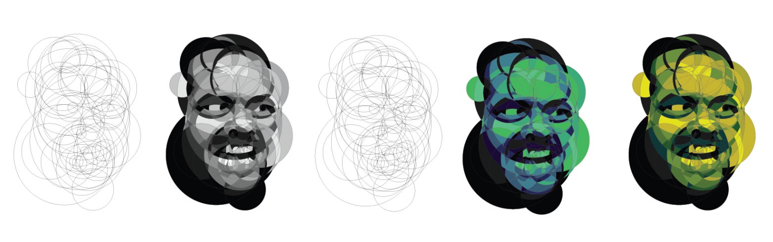
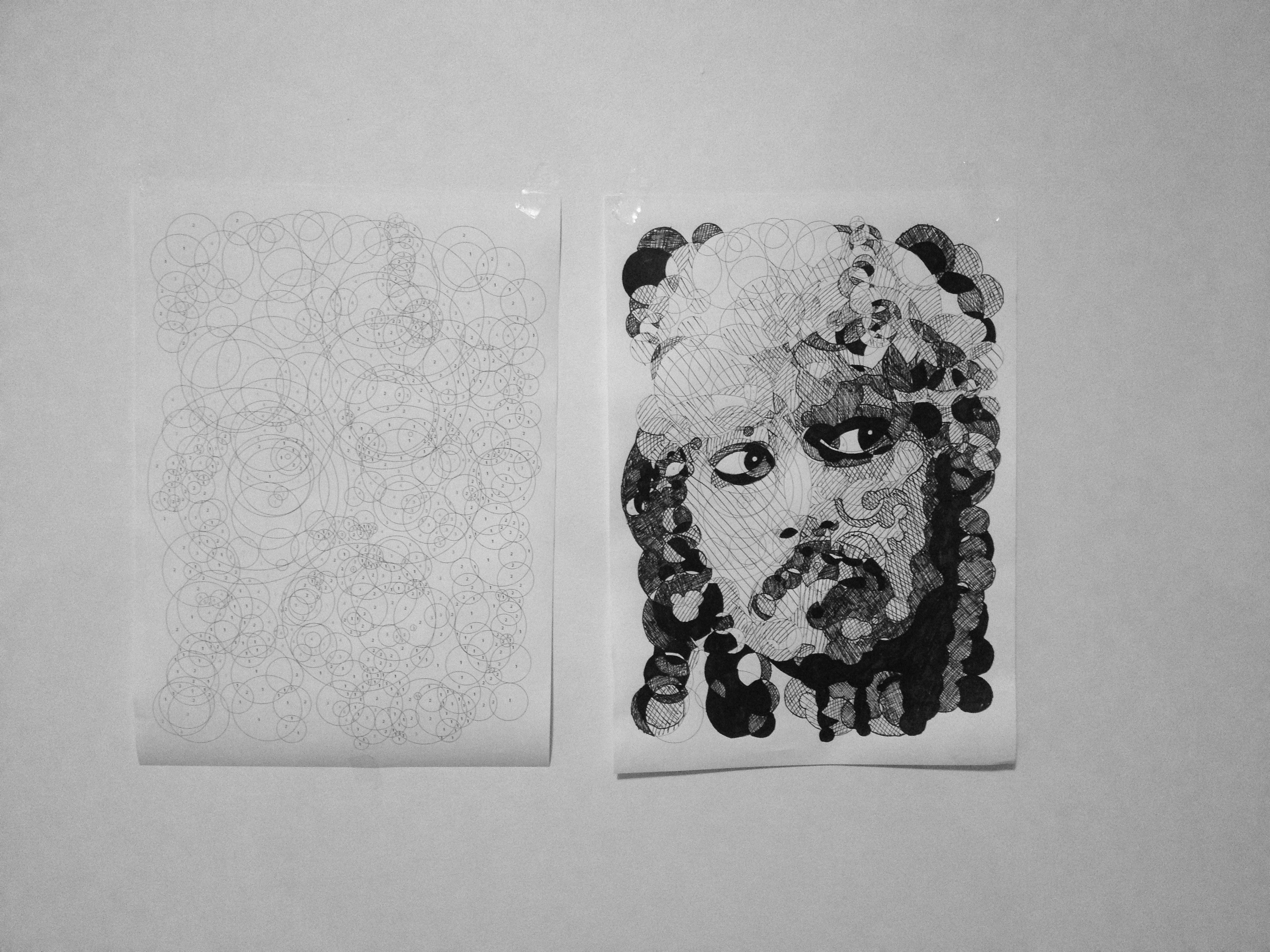
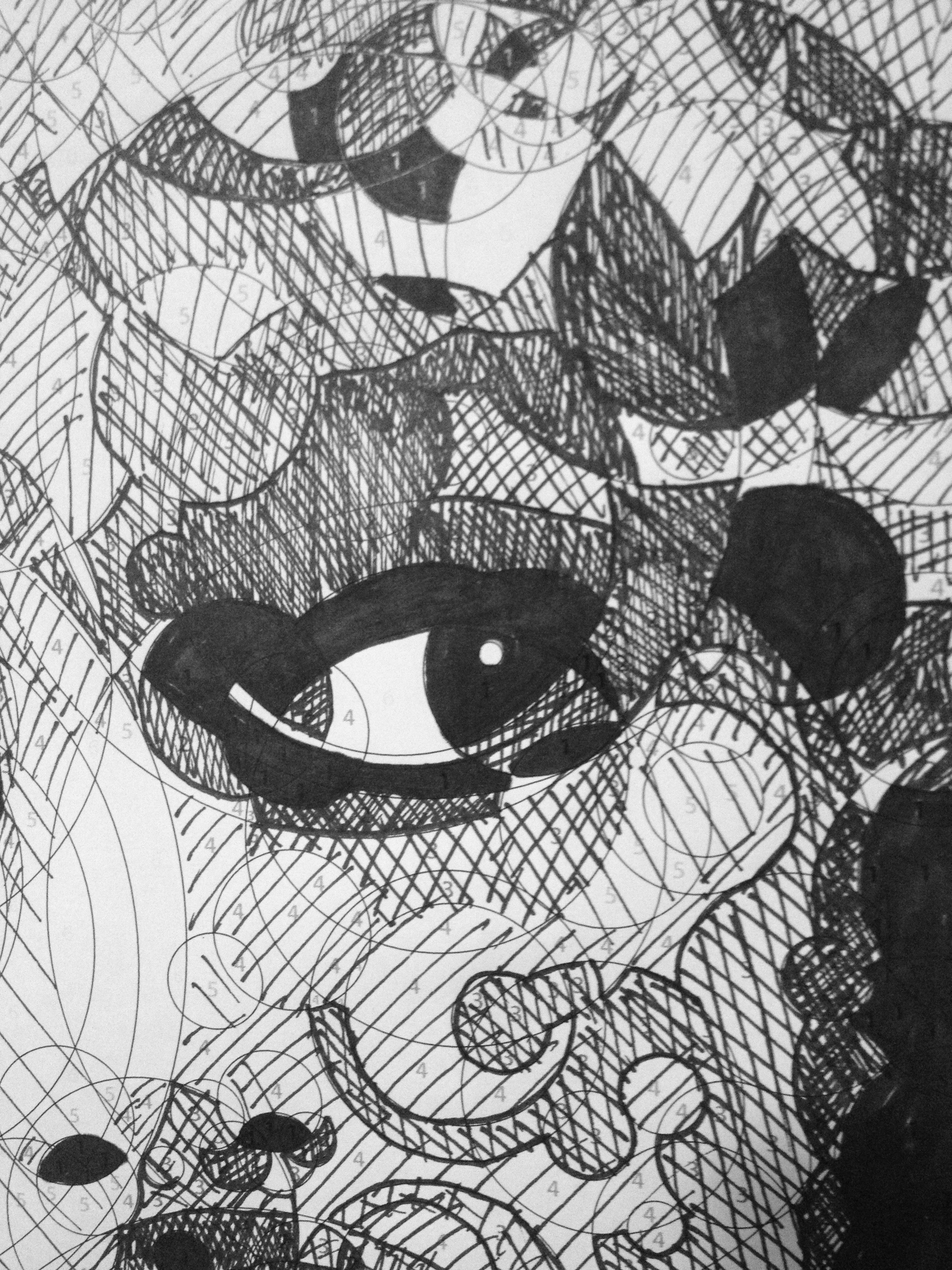

John Walker
10,000 Matchsticks
2011
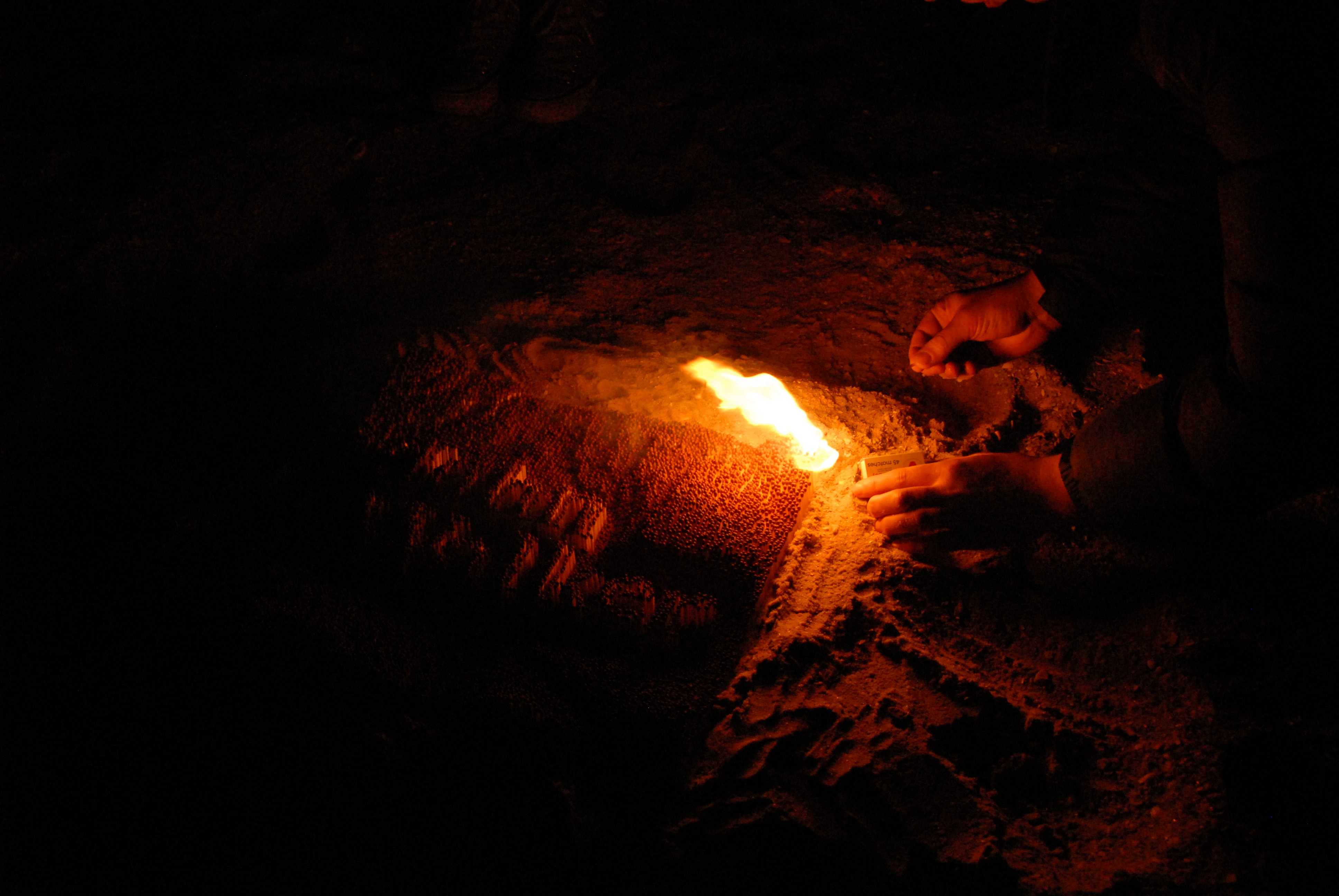
A tribute in matches
This series was born from a desire to honor the minds behind the everyday objects we often take for granted. My first tribute was to John Walker, the inventor of the match. I purchased 10,000 individual matches and spent weeks arranging them into a typographic composition of his name. To conclude the project, I took the piece to the beach and set it alight, a fleeting final nod to his invention.

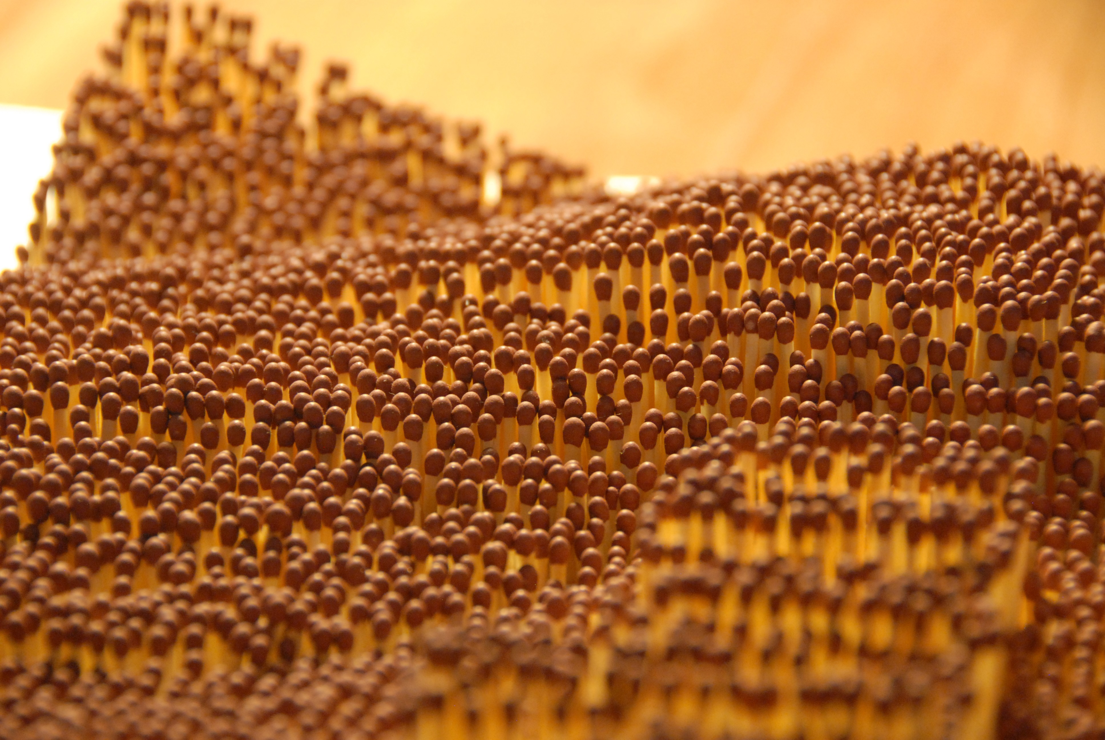
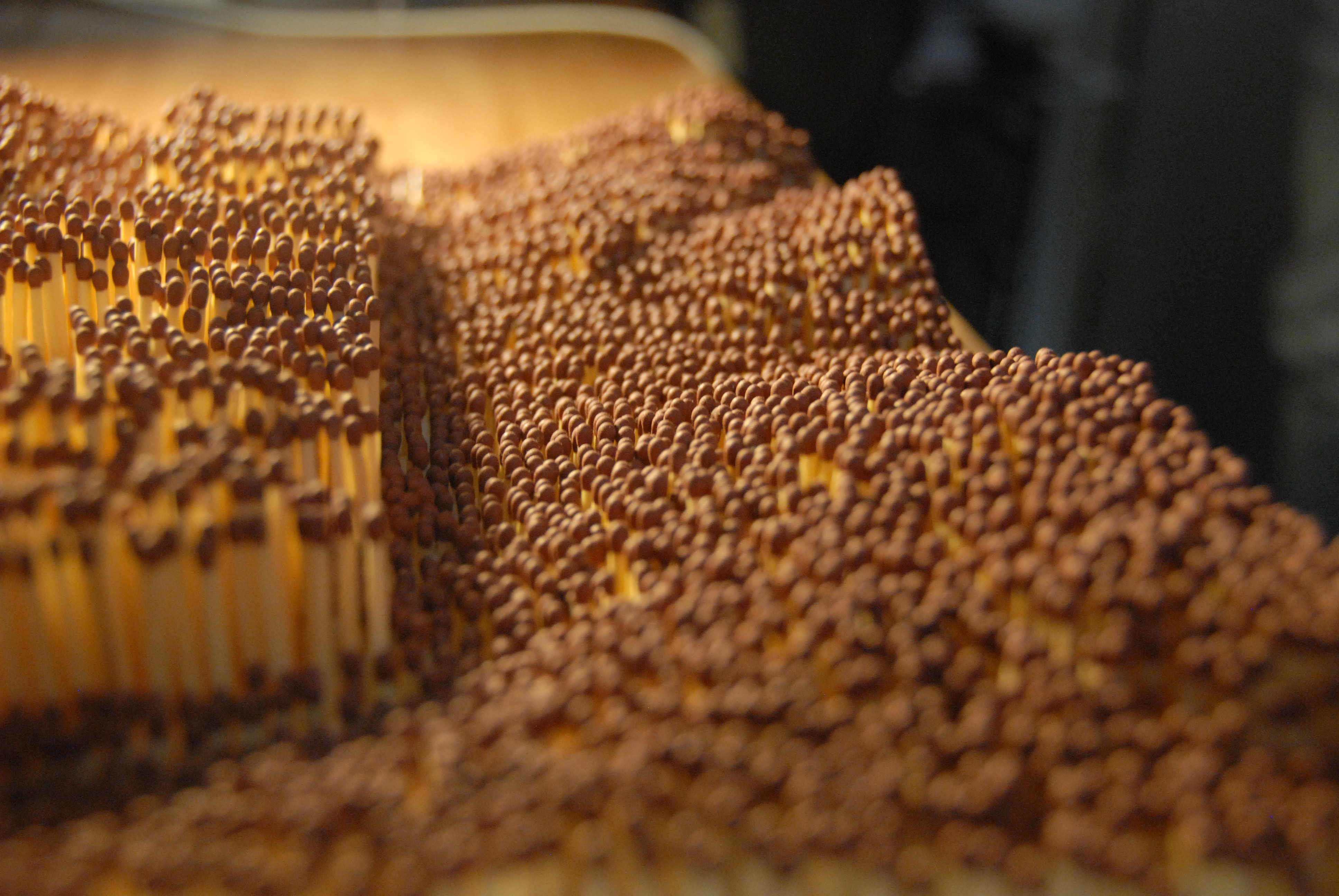
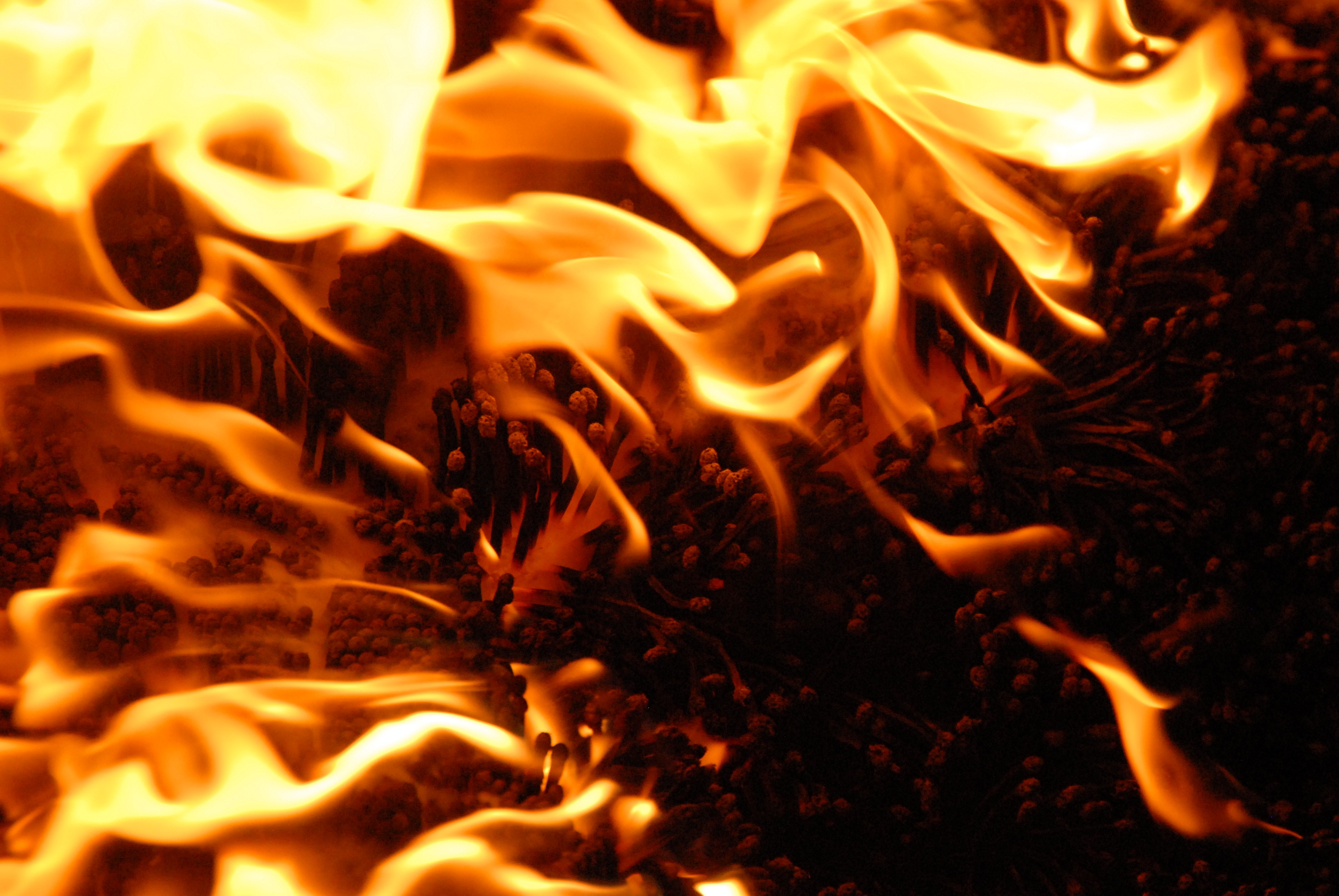
Alan Holloway
Blue Tack
2011
Blu Tack Typography
The second installment of my tribute series focused on Alan Holloway, the man behind Blue Tack. Using the material itself as the medium, I explored its unique tactile properties to create the name of the inventor. It was an exercise in using a household staple to celebrate the quiet impact of simple, brilliant ideas.
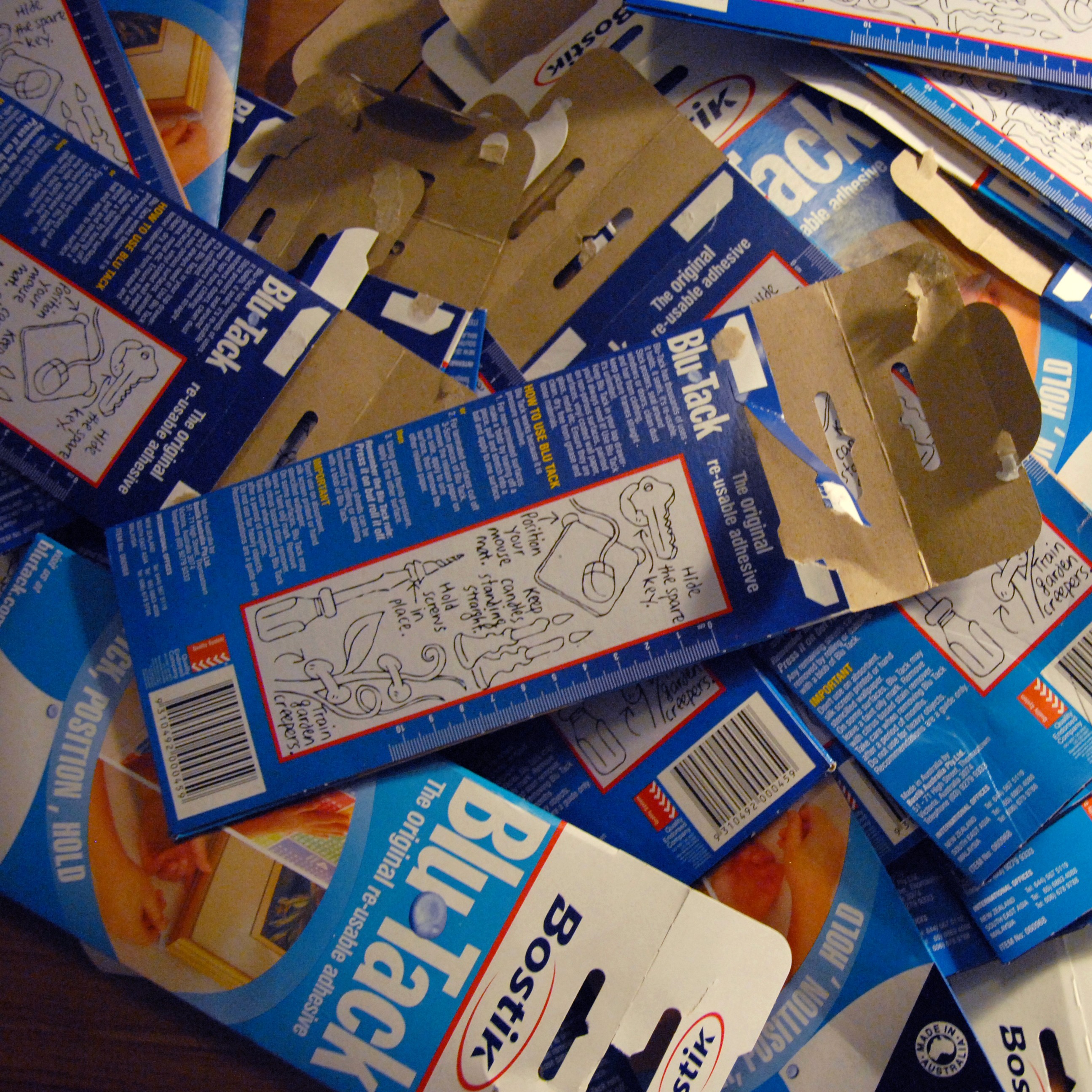

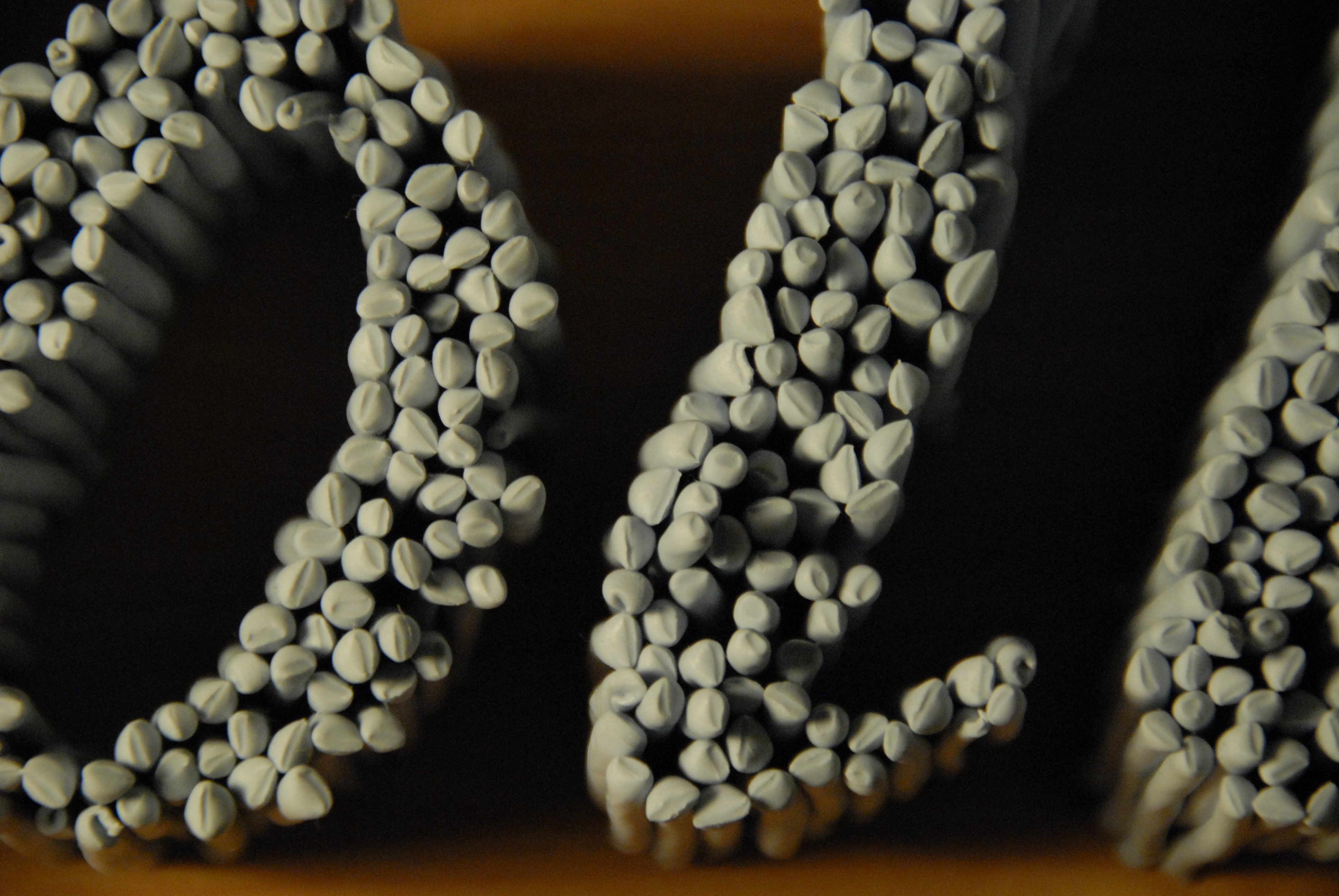
Doodle Cushions
Illustration
2010
100 Icons
I set myself the challenge of drawing 100 vector icons of whatever came to mind, with no specific end goal in sight. Once the set was complete, I wanted to find a way to give these digital doodles a tactile life. I had the icons printed onto textiles and, with the help of a friend’s sewing skills, transformed a digital exercise into a series of cushions.
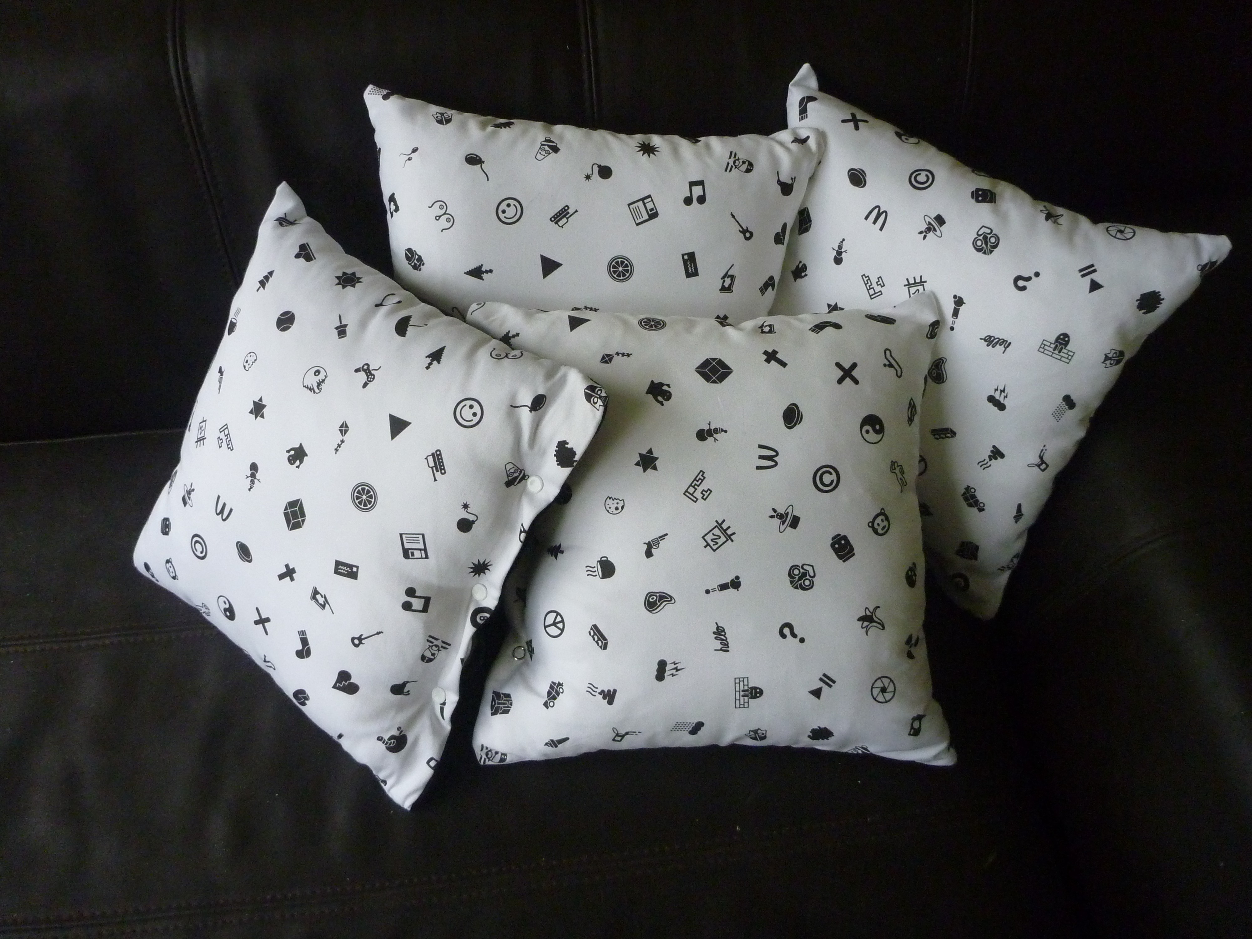
Contour Bowl
Laser Cut 3D
2010
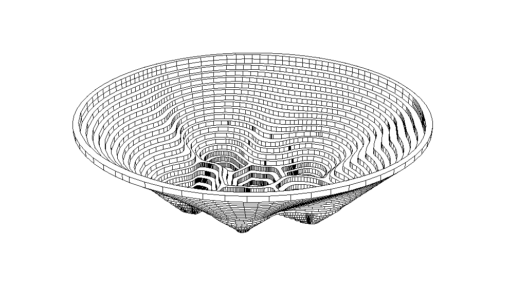
From screen to sculpture
Continuing my fascination with how two-dimensional shapes look in three-dimensional space, I designed a form that mimicked a topographic bowl. This was my first real opportunity to see a digital idea enter the physical world. I had the pieces laser-cut and hand-glued them together, creating a functional object where the play of light and shadow changed based on the viewer's perspective.
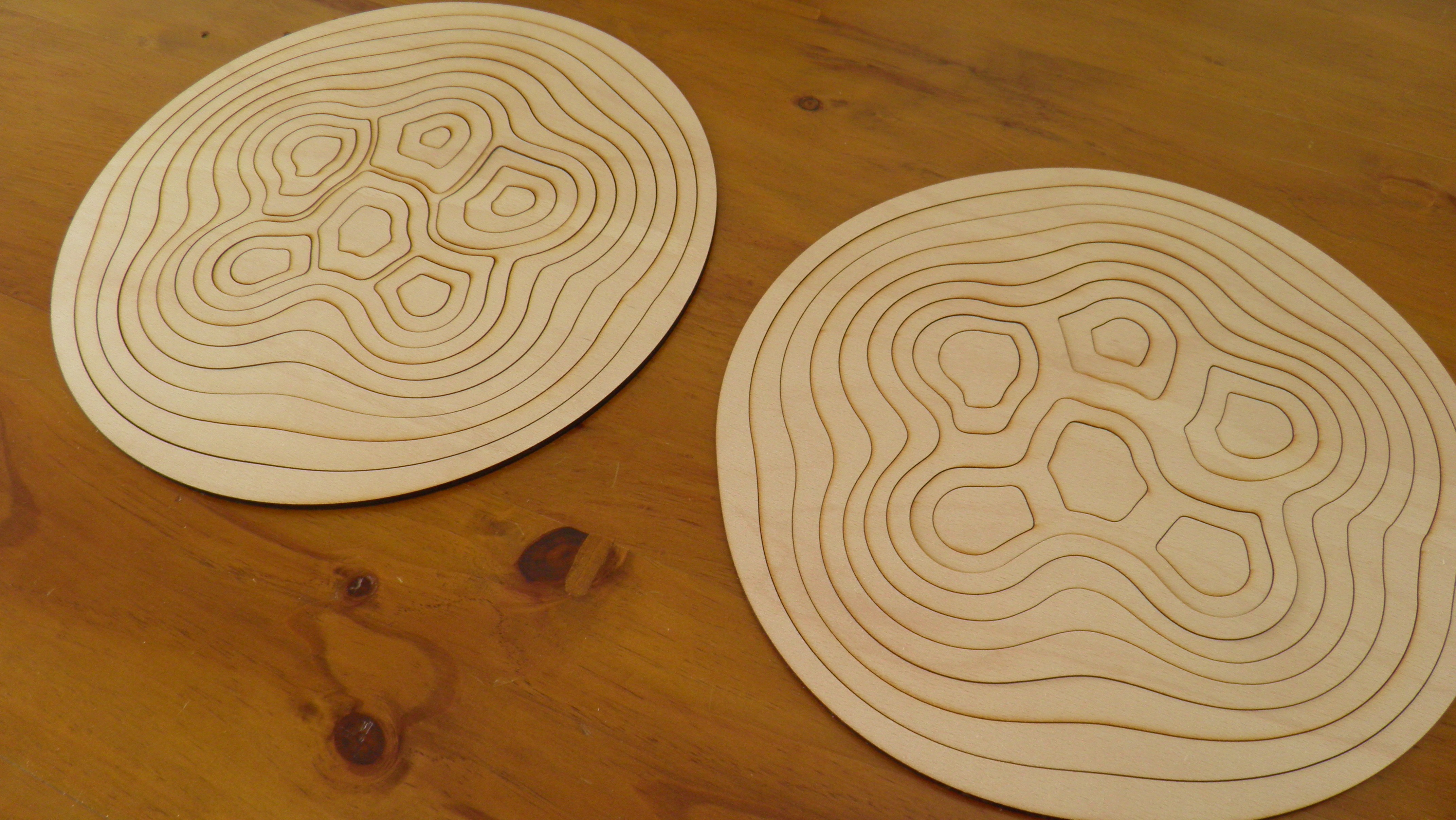
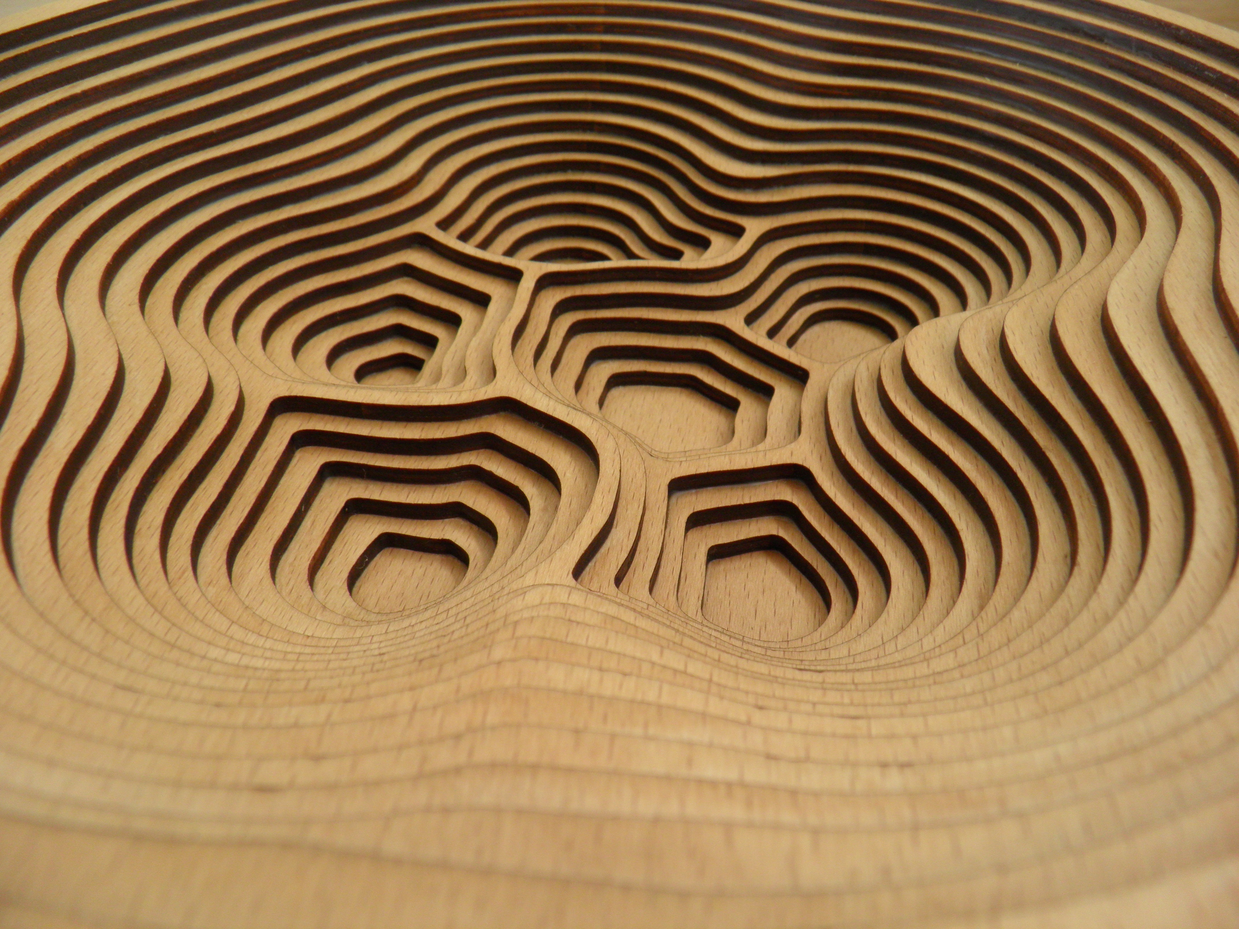
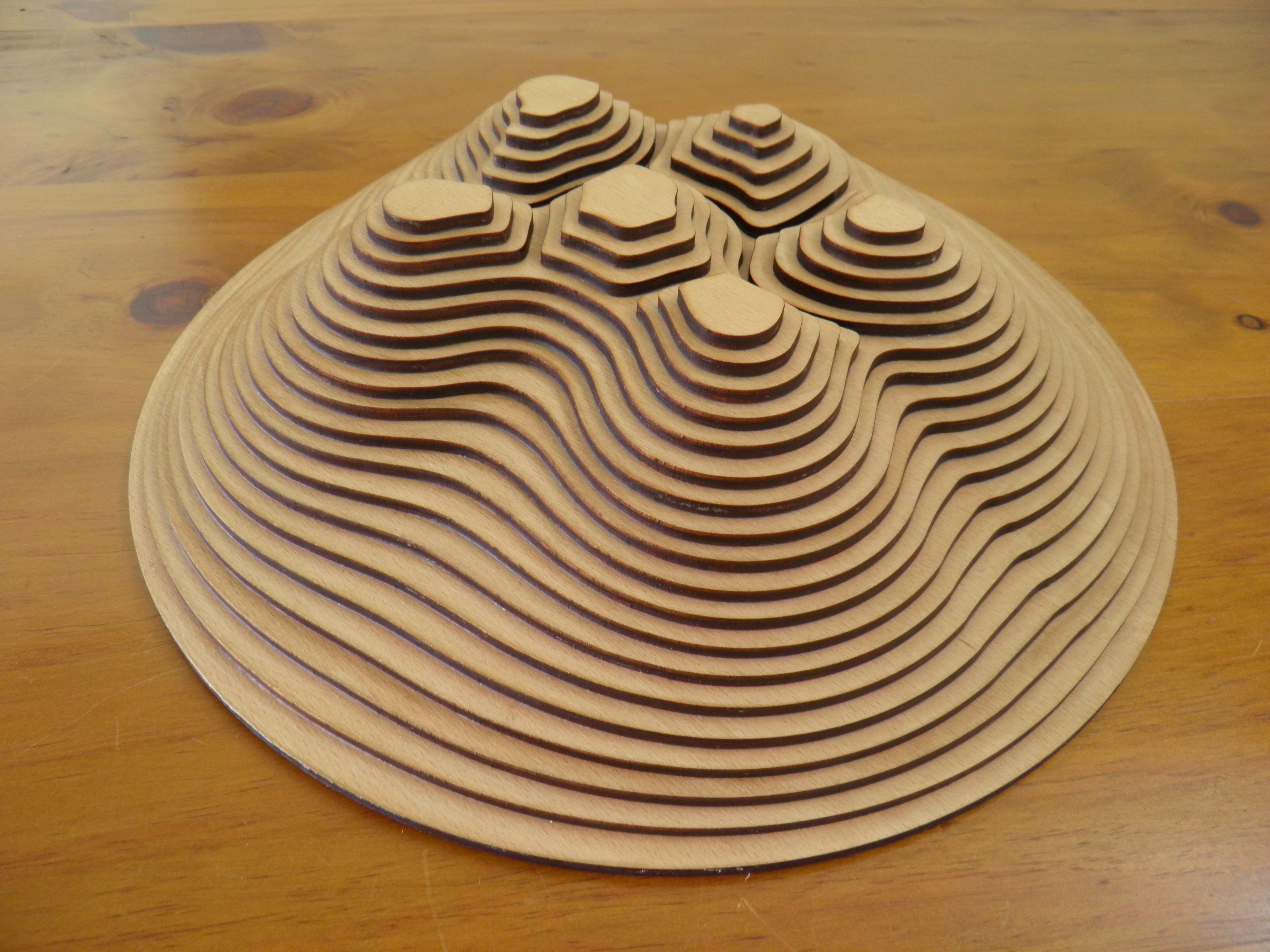
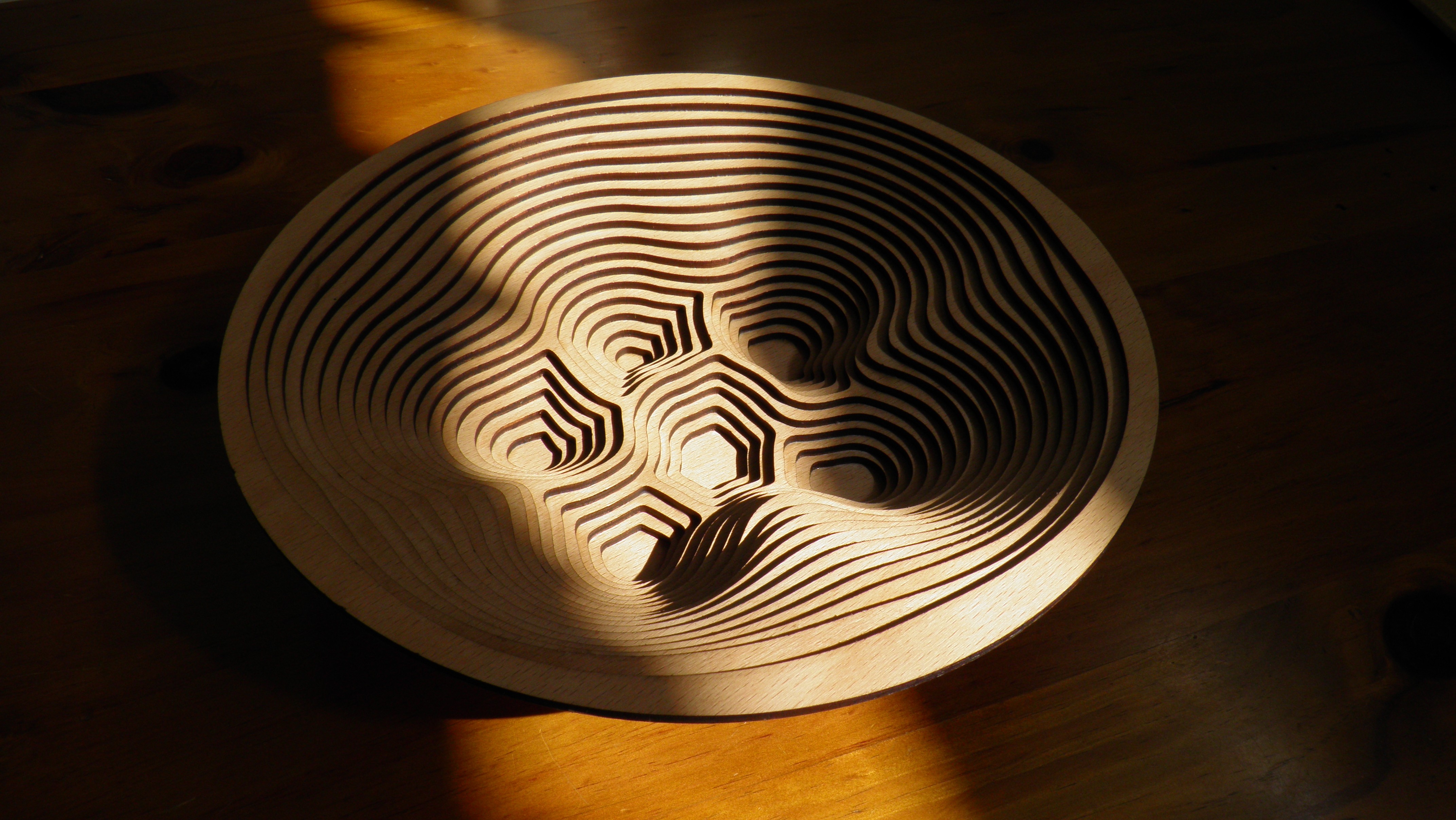
The first Dot-to-Dot
Experimental
2010
A 1,000-point proof of concept
At a time when Barack Obama was a central figure in the global conversation, I chose him as the subject for a creative challenge. I wanted to see if I could transform a childhood activity into a complex, high-fidelity work of art. This drawing was the catalyst for everything that followed, sparking a decade-long journey into the world of published books.
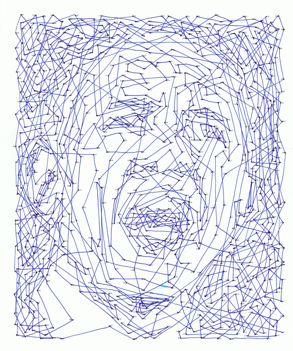
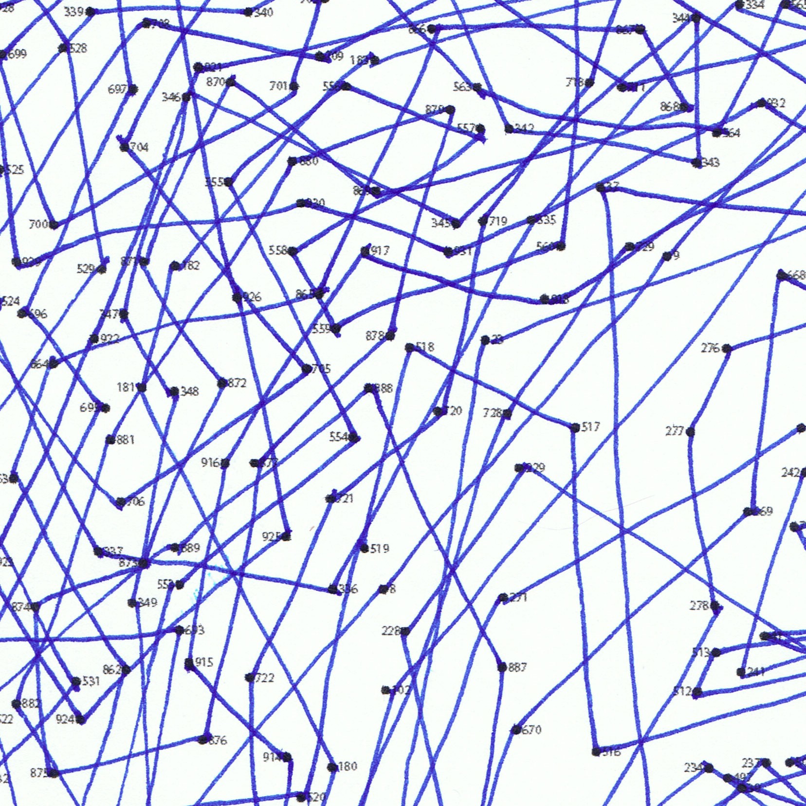
Jesus Iso
Illustration
2009
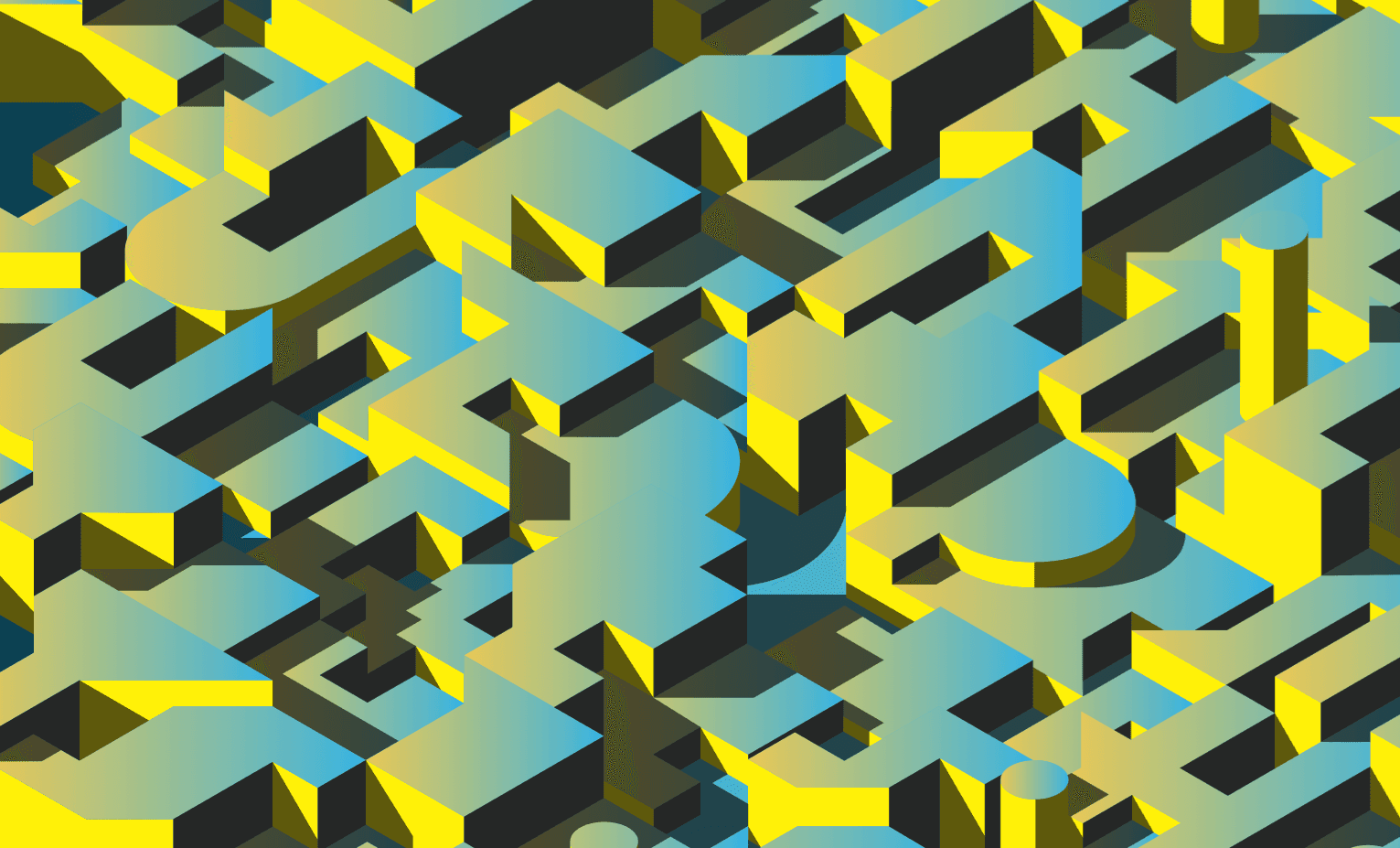
Topographic Typography
This project was a bridge between my interest in music and my desire to learn 3D software. I took the lyrics to one of my favorite Wilco songs and transformed abstract shapes into three-dimensional forms. Working within a signature isometric perspective in Google SketchUp, I explored how language could take on a physical, architectural presence.